The color green results from the combination of two primary hues, blue and yellow. This synthesis results in a visually appealing hue that combines the calmness of blue with the brightness of yellow.
The use of green in branding and logos often indicates a commitment to sustainability. This color is chosen by organizations that are dedicated to environmental stewardship, whether it be renewable resources, conservation efforts, or sustainable practices.
In many ancient wellness practices, such as Ayurveda, the color green is used to signify the healing power of nature. This color brings to mind herbs, natural remedies, and traditional healing methods, bridging the gap between ancient wisdom and modern needs.
Given its inextricable connection to the earth, the various shades of green often symbolize agriculture, emphasizing growth, fertility, and abundance. Similarly, forestry products sourced directly from nature are green, emphasizing their organic origin.
In the modern era, green has become synonymous with recycling and sustainable use of resources. Businesses in this sector use green to emphasize their commitment to reducing waste and developing a circular economy.
Psychologically, the color green often evokes feelings of calmness and rejuvenation. This hue brings to mind green landscapes, calm waters, and serene forests. Its association with wealth stems from the fact that green fields were once a key indicator of a region’s prosperity.
In many cultures, the color green signifies growth in the literal sense – plants, forests – and in the figurative sense – financial growth and personal development.
The versatility of green’s representation – from environmental awareness to health and prosperity – makes it a powerful tool in design and branding.
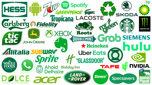
Green Logos Of Famous Brands
Green, a ubiquitous color in nature, is prevalent in landscapes where vegetation thrives. This color colors vast meadows, dense forests, and serene gardens, symbolizing the natural beauty of the planet.
In many cultures, the color green has long been associated with prosperity and abundance. It is no coincidence that currency, especially in some countries, is printed in green, symbolizing wealth and economic power.
Green environments are often teeming with life. From the densest jungles to quiet gardens, where there is green, there is life. It provides a habitat that gives shelter to a multitude of organisms, emphasizing the richness of biodiversity.
Often associated with peace and relaxation, green radiates positive energy. This hue is often associated with harmony, balance, and renewal, reflecting nature’s restorative powers after a long winter or drought.
Throughout human history and across cultures, the color green has been revered for its calming properties. It has also been used to signify fertility, rebirth, and renewal – in keeping with the cycle of life in nature.
In today’s context, the color green is not only associated with nature and money. It is increasingly associated with sustainable development, green initiatives, and the desire for a more balanced lifestyle that prioritizes the environment.
Green can be seen as a call to action because it is associated with positive energy. It encourages individuals and communities to engage in activities that are beneficial not only to themselves but also to the environment as a whole.
The versatility of the meaning of green – from the beauty of nature to economic prosperity and positive energy – confirms its importance in various areas of human life. Its universal appeal and wide range of interpretations make green a color that can be used for a variety of purposes, from branding to self-expression.
7up
7Up, a refreshing lemon-lime drink, has been delighting taste buds around the world for decades. Produced under the auspices of Dr. Pepper and bottled by multinational giant PepsiCo, the drink is caffeine-free, making it stand out in the crowded world of carbonated beverages.
The terminology behind the name 7Up has always been a curiosity. One popular theory suggests that the name comes from the drink’s pH level, which is noticeably higher than seven, emphasizing its alkalinity. Another intriguing story links the name to the card game “7Up,” hinting at the fun and playful nature of the drink.
A unique marketing move by 7Up that differentiates it from Coke’s competitors is its self-naming “Uncola.” This strategic positioning was intended to emphasize its difference from traditional cola drinks and to carve a niche for itself in the market.
Over the years, the 7Up logo has undergone many transformations. The first logo was a monochrome halftone logo that attracted attention with its simplicity. However, it was replaced by a more dynamic red design that lasted until 1967.
In the 1980s, there was a significant shift in visual appearance. A green stripe appeared, elegantly positioned behind the red box with the 7Up name. The inclusion of green was crucial, emphasizing the natural lemon-lime flavor of the drink.
After the 1980s, the main color of the logo became green, complemented by a red circle with the number “7”. In 2014, this design was finalized. Now, the numeral “7” is in pure white color and enclosed in bold green frames. The 3D effect emphasizes its modern appeal.
7Up’s journey as a beverage and as a brand has been filled with evolution and innovation. The modern design embodies the rich heritage of this iconic beverage and its forward-thinking approach.
Acer
Founded in Taipei, Taiwan, Acer has firmly established itself as a global leader in hardware and electronics. Its logo has become iconic, recognized worldwide, and associated with quality and innovation.
From 1987 to 2000, the company’s logo had a distinct purple hue, characterized by the capital letter “A.” Traditionally, purple is a color that combines the stability of blue with the energy of red. For Acer, this hue came to symbolize the balance between innovation and reliability during the company’s founding years.
In 2004, the brand was transformed with a new Acer logo in a lighter shade of green. This change was not only aesthetic but also symbolic. In many cultures, the color green is associated with new beginnings, vitality, and growth. The modern, elegant design combined with the youthful green color reflects the essence of the brand, which meets the demands of today’s consumers and represents environmental awareness, energy, and innovation.
The updated font complements the brand’s transition to a more modern image. Its design is not only modern but also demonstrates Acer’s commitment to customer-centricity. The softer font reflects the brand’s accessibility and commitment to building positive relationships with customers.
The modern green hue and updated logo font embody Acer’s commitment to staying fresh, dynamic, and consumer-oriented in an ever-evolving technological world.
Ahold Delhaize
The merger of Dutch Ahold and Belgian Delhaize Group, which began in 2016, has created a dominant force in Dutch-Belgian retail. This conglomerate, with its operational base in Holland, is a testament to strategic corporate mergers.
The Dutch company Ahold had a blue-colored emblem that symbolized reliability and trust. The Belgian company Delhaize had a distinctive emblem in the form of a black lion, a symbol of strength, pride, and tradition.
The color green often evokes feelings of renewal, vitality, and innovation. Business, especially in retail, often involves new beginnings and innovative strategies. Green is also inextricably linked to nature, suggesting a commitment to sustainability and environmental responsibility.
The new logo for the combined company was designed with meticulous attention to detail. The chosen vibrant green hue serves as a backdrop for the lion, which is now presented in silhouette and facing forward. This choice reflects a forward-looking vision while at the same time respecting the historic symbol of Delhaize. The lion’s head is topped by a Dutch crown, signifying Ahold’s origins and royal heritage.
The new logo is not just an amalgamation of previous logos. It represents the union of two retail giants maintaining their identity and speaking with one voice. The combination of the lion, crown, and vibrant green color emphasizes the collaborative approach and bodes well for the promising future of the joint venture.
The post-merger transformation of Ahold Delhaize’s corporate identity is an example of how two different brands can integrate seamlessly.
Alitalia
Alitalia was founded in 1947 as a result of the merger of several private airlines at the time. This merged company was destined to represent Italy on the world aviation scene, symbolizing national pride and air superiority.
During its formative years, Alitalia used a bright black logo. It was based on winged arrows, a symbol of impetuous motion and unrivaled speed. This early design reflected the airline’s commitment to efficient and practical passenger service.
By 1969, the brand’s visual identity had undergone significant changes. The new logo featured a green hue that became a defining feature of the brand in the years that followed. It is noteworthy that the capital letter “A” also underwent changes: now it is decorated with the tricolor of the Italian flag, which is a kind of tribute to the national heritage. Despite these changes, the other letters of the logo have retained a straightforward typographic style for clarity and simplicity.
In 2005, the Alitalia logo underwent another evolution. The entire font was now italicized, giving it a dynamic and modern feel. Despite retaining the signature green color, the new design reflects the brand’s desire to be dynamic and relevant in today’s aviation world.
The changes made over the years have always remained within the framework of Alitalia’s founding ethos. The consistent use of certain colors and symbols has ensured instant brand recognition, regardless of design variations. This visual uniformity and reputation have made Alitalia a recognizable and trusted brand in the global aviation industry.
For decades, the logo design has reflected the airline’s identity and its commitment to representing Italy’s heritage, innovation, and drive in international aviation.
Android
Created as a mobile operating system for smartphones and tablets, Android has carved a niche for itself in the technology industry. Utilizing touch screen technology, it has made its way into the daily lives of people around the world, becoming an indispensable tool.
The creative inspiration for the Android logo was Google representative Irina Block. Her sketch, which is an image of a robot, has several names, in particular Mike and Bugdroid. This symbol symbolically represents the technological superiority and usability of Android.
The green hue of the emblem has significant symbolic weight. The color green is universally associated with qualities such as growth, prosperity, and freshness. These associations fit seamlessly with Android’s concept of constant development and innovation. This color represents youth, which speaks to the constantly evolving nature of technology and the company’s commitment to staying at the forefront of new trends.
Android’s distinctive green hue is not just a color; it’s an identifier. When a person sees this hue, they immediately have images of the Android operating system. This connection between color and brand is a testament to Android’s widespread influence and the strength of its branding strategy.
The Android logo, featuring a green hue and a memorable robot design, shows the widespread acceptance of this operating system and its desire to evolve.
Animal Planet
Animal Planet is a well-known television channel operated by Discovery Inc. Since its inception in 1996; it has been providing content about the mesmerizing world of wildlife and the fascination of pets.
The channel’s original logo used shades of green synonymous with nature and animal life. The Animal Planet logo was dominated by a more saturated shade, and the letter “M” in a lighter tone was subtly integrated into the logo. In the original design, the letter “M” was placed horizontally and resembled the number “3”.
Keeping the basic design elements intact, a single light green shade was switched to a single light green hue. Further, on the way of brand development, there was a combination of black and green colors. In this variant, while most of the alphabet was highlighted in black, the distinctive letter “M,” mirroring the numeral “3”, stood out in bright green.
Animal Planet took a new approach in its latest brand refresh. The channel now features a whimsical emblem in the form of a blue elephant, abandoning the traditional design. This transition symbolizes the vast expanse of the animal world and is in line with the channel’s new image: more playful and engaging.
The evolution of the Animal Planet brand emphasizes its desire to resonate with viewers. While the essence of wildlife and pets remains central, the channel’s visual identity seamlessly transitions to a new one that reflects its rich heritage and adaptive, forward-thinking approach.
British Petroleum
In the beginning, the logo of British Petroleum, commonly referred to as BP, was very simplistic. The black emblem consisted of the initials “BP” enclosed in quotation marks, which emphasized the brand name and ensured its recognition.
Over time, the BP emblem underwent a number of changes, and by the year 2000, the millennium, it had undergone six different redesigns. Each design change reflected the times and the changing vision of the company.
For a significant period, the BP emblem was enclosed within the outline of a shield. Beneath this protective crest was a green base, symbolizing the brand’s connection to nature and its commitment to sustainability.
In 2000, BP introduced a logo different from the previous designs. The emblem, reminiscent of a blossoming flower or sun, was a combination of green and yellow shades. These colors create an image of vitality and youth, emphasizing the company’s commitment to environmental conservation.
Although green and yellow are the dominant hues in the logo, the careful observer will notice the presence of a muted third color. This lighter shade, which is a soft gradient resulting from the fusion of green and yellow, adds depth and complexity to the design.
BP’s modern logo is more than just a brand identifier; it reflects the company’s ethos. Green symbolizes growth, sustainability, and care for the environment, while yellow symbolizes warmth, energy, and optimism.
The evolution of the BP brand shows its adaptability and commitment to staying relevant. From a simple black emblem to a vibrant spiral of colors, the logo reflects the company’s evolution, challenges, and desires in the ever-changing energy sector.
Carlsberg
The Danish beer group, originally from Copenhagen, is one of the world’s leading producers and marketers of beer and various soft drinks. Thanks to its rich history and commitment to quality, the brand’s influence extends around the world.
It is interesting to note the involvement of the descendants of the company’s founder in the creation of the slogan and emblem that would later represent the brand around the world. This personalized approach allowed the brand’s core values and heritage to be embodied in its visual representation.
A testament to the longevity of the design is how the group’s green emblem has stood the test of time. Although it has undergone minor changes over the course of its existence, its essence has remained intact, a beacon of the brand’s consistency and reliability.
Delving deeper into the design, one can notice a modernized typographic style that features a more elegant aesthetic. Noteworthy are the changes made to the lettering of the “C” and “r,” which have been optimized for a modern audience. However, these minimal changes were executed precisely, keeping the soul of the logo intact.
The leaf above the “r” was an important design element. The recent change in its placement only reinforces its importance and improves the overall look of the Carlsberg logo. The leaf, although small in size, epitomizes the group’s commitment to nature, quality ingredients, and sustainability.
The logo of the Danish brewing company Carlsberg is more than just a brand name. It tells consumers a story of heritage, quality, and commitment.
Dolce Stevia
The vibrant green hue in the Dolce Stevia emblem is not just a color choice; it’s a narrative. It resonates deeply with the essence of the brand and its offerings. Stevia, a plant known for its natural sweetness, has the same hue, symbolizing nature and herbal origins.
The stevia plant has been recognized as a natural alternative to synthetic sweeteners. Its leaves, endowed with sweetness, are the main ingredient in the Dolce Stevia product line. Validated by clinical studies, stevia is characterized by its sweetness and natural origin, which is reflected in the green hue of the brand’s logo.
In diets and products, the color green often symbolizes veganism. By using this hue, Dolce Stevia emphasizes its commitment to offering products that are consistent with a vegan lifestyle, which increases the broad appeal of its offerings.
Green is not just the color of the spectrum; it symbolizes health and well-being. This meaning is in line with Dolce Stevia’s brand ethos. By using green, the company emphasizes its commitment to promoting healthy alternatives in the sweetener market.
Dolce Stevia’s green logo serves as a constant reminder of the brand’s core mission: to offer natural, healthy, and vegan sweetening options. This hue is strategic and symbolic, blending seamlessly with the products offered and the promise the company makes to its customers.
Doublemint
Wrigley’s, a global titan in the chewing gum industry, introduced the Doublemint brand in 1914. The product quickly became synonymous with minty flavor, conveying the essence of freshness in every bite.
The use of the color green in branding often carries the meaning of freshness, vitality, and health. It’s no coincidence that many food products, especially those with natural ingredients and flavors, choose this color.
For Doublemint, green doesn’t just symbolize freshness; it reflects the very essence of the product. The mint flavor, which is the main distinguishing feature of Doublemint chewing gum, blends naturally with the color green. This makes the green logo intuitive and appropriate for the brand.
The association between mint and the color green has deep natural roots. Mint leaves, known for their vibrant green color, serve as a symbol of natural freshness. By adopting this hue for the Doublemint logo, Wrigley’s effectively communicates the refreshing quality and natural flavor of the chewing gum.
Wrigley’s Doublemint epitomizes the brand’s commitment to making every bite of chewing gum feel fresh. The logo is a testament to the brand’s heritage and its unwavering promise of quality and flavor.
Evernote
Evernote, which originated in the technology center of California, is a multifaceted application. Its diverse functionality includes note-taking, archiving, careful planning, systematic organization, and skillful task management.
Central to Evernote’s emblem is a distinctive elephant icon colored green. The choice of this emblem was not arbitrary. The creative team had thorough discussions, experimenting with numerous options before settling on this image.
In various cultures, the elephant is often associated with memory and reminiscence, which fits well with Evernote’s core mission of creating notes and archives:
- Spiraling trunk: This unique curve, different from traditional elephant imagery, symbolizes progress and constant forward motion.
- Dynamic Stance: The deliberate tilt of the elephant’s forehead and muzzle indicates forward momentum. This design nuance embodies the brand’s ethos of constant forward movement and development.
- Eyes that speak: The precision-crafted eyes exude a sense of confidence. Their design subtly conveys the user-friendliness of the app’s interface and its commitment to ensuring accessibility for all users.
Despite the elephant taking center stage, the brand’s typography doesn’t remain in the shadows. The word “Evernote,” typed in bold black font, complements the green icon. The contrast between the two makes it easy to read and emphasizes the brand’s dual focus on innovation (as evidenced by the elephant) and reliability (as evidenced by the bold font).
Evernote’s branding is a testament to the power of thoughtful design. Every element, from color choices to symbolic imagery, is intertwined to create a cohesive and compelling brand story.
Fidelity
Based in the historic city of Boston, Fidelity is a well-known financial services corporation. Its reputation precedes itself: it is recognized as one of the leading asset management groups globally.
Central to Fidelity’s visual identity is its distinctive logo. The Fidelity logo is artfully placed on a green rectangular background, creating an eye-catching contrast.
The word “FIDELITY,” printed in bold capital letters, is slightly slanted by the italicized font. This font choice suggests forward motion and progression, echoing the brand’s forward-thinking approach to financial management. Below the main text is the word “investments,” further emphasizing the brand’s core specialization.
Next to the company name is an intriguing icon – a lighthouse or beacon. This is not an accidental artistic addition. Lighthouses historically symbolize guidance, hope, and a safe path, and in the context of Fidelity, this emblem symbolizes the company’s commitment to guiding investors to fruitful investment opportunities. By illuminating potential opportunities, Fidelity positions itself as a guiding light in the choppy waters of the financial world.
The color choice of white letters on a green background is intentional. This contrasting palette allows the brand to stand out and stick in the viewer’s mind for a long time. White is often associated with clarity, cleanliness, and simplicity – traits that every investor looks for in a financial organization. Green symbolizes growth, prosperity, and stability, which is entirely consistent with the goals of any financial enterprise.
Through careful branding, Fidelity Financial Services conveys not only its name but also its mission, values, and commitment to clients. The combination of vibrant letters, symbolic imagery, and a carefully chosen color palette creates a compelling image of trust, leadership, and financial growth.
Fiverr
In the digital marketplace, Fiverr stands out as a leading international platform offering a wide range of freelance services. Whether it’s designing logos, creating compelling content, skillfully working with WordPress, or developing a social media strategy, Fiverr has become synonymous with quality and efficiency.
The choice of the color green for the Fiverr logo is no accident. In many cultures and contexts, the color green is associated with many positive qualities. In Fiverr’s branding, this color stands for youth, which speaks to the dynamism and constant development of the platform. Green symbolizes financial prosperity, which is in line with the platform’s mission of enabling freelancers to effectively monetize their skills. The lack of stress that this color suggests reflects Fiverr’s user-friendly interface and efficient service delivery that ensures seamless transactions and collaboration.
What makes Fiverr’s green color distinctive is its originality. The company’s commitment to branding is evidenced by the fact that Fiverr’s green color has been assigned a special code in the Pantone shade map. This shade enhances brand recognition and emphasizes its special position in the market.
Logos serve as the face of the company, playing a key role in brand recognition. Fiverr’s choice of bright green color not only ensures its recognition in a crowded digital space but conveys its core values and aspirations. Every time users see this vibrant green color, they are reminded of a platform that stands for progress, innovation, and prosperity.
Fiverr’s emblem, in its distinctive green color, captures the essence of the platform. It’s a beacon of hope for freelancers and entrepreneurs, signifying growth, opportunity, and a promising future.
Glassdoor
Emerging as an independent company, Glassdoor today operates under the umbrella of leading Japanese company Recruit Holdings. The company is a trusted platform for people looking for information about companies, jobs, and corporate culture.
The Glassdoor logo has undergone a significant change over time. The updated logo is more than just a visual change; it carries deep meaning. It conveys the brand’s desire to help job seekers find jobs that match their personality.
The green hue chosen for the logo is energetic and dynamic. It symbolizes growth and opportunity and echoes the brand’s promise to offer exciting and fulfilling career opportunities. This bright hue encourages users to approach their job search with renewed vigor and optimism.
The centerpiece of the design, the glass door, has symbolic weight. It seems that the door is about to swing open, revealing new professional challenges. This image symbolizes the warm welcome of innovation, fresh perspectives, and new talent. The image emphasizes Glassdoor’s role as a bridge between potential candidates and the right work environment.
Glassdoor’s emblem has become instantly recognizable: it is an image of an opening door frame in a vibrant green color palette. It serves as a beacon for employers and job seekers, signaling that the right jobs are available.
The Glassdoor logo is more than just a corporate symbol; it carries hope, opportunity, and growth, reinforcing the company’s position as a trusted ally for job seekers and employers.
Grab
Founded in 2012, Grab Holding Inc., commonly referred to as Grab, has quickly grown into a multi-faceted company that provides services beyond transportation. From ridesharing to just-in-time food delivery to innovative digital payment solutions, Grab has combined various services into a single platform, a branded app.
The choice of color for Grab’s logo is indicative of the company’s strategic branding. Green is associated with growth, environmental responsibility, and financial stability. For Grab, this color goes beyond simple aesthetics. It reflects the company’s steady growth, its commitment to environmental sustainability, and its desire to provide financial prosperity to its shareholders.
One of the hallmarks of Grab’s branding is the use of double lines in the font. These lines are more than just design elements. They symbolize an intricate network of roads and paths, signifying limitless possibilities and opportunities. The lines illustrate the vast scope of the company, hinting at the countless directions Grab takes every day.
The logo also epitomizes Grab’s commitment to its community. The soaring design suggests that as Grab conquers new heights of success, Grab makes sure that everyone associated with the brand – customers, drivers, employees, or the community at large – is with it on this upward journey. This mutual progress reflects Grab’s philosophy of shared success. The emblematic green Grab Holding Inc. logo is a combination of strategic design and deep symbolism.
Green Lantern
Green Lantern’s story goes beyond just being a superhero. Originating in the vast DC Comics creative universe, the Green Lanterns are an elite squad of guardians. Their primary mission? To protect the vastness of the galaxy from sinister forces that threaten peace and stability.
At the heart of Green Lantern mythology is the concept of the Rings of Power. They are not just accessories but essential elements that give power to their wearers. Among the variety of rings, there are nine, each symbolizing a certain emotion or character trait.
The central place in this collection is occupied by a green ring, symbolizing willpower. The choice of this color is not accidental. Green has long been associated with resilience, determination, and vigor. In the context of the Green Lantern, it reflects the indomitable spirit and unyielding determination that these guardians embody.
For a superhero, the choice of color is not just a design decision. It’s a storytelling tool. By choosing green for the Green Lantern badge, DC Comics emphasizes the superhero’s defining characteristic – resolute willpower. This choice harmonizes the visual representation of the character with his core message.
Although the emphasis in the Green Lantern saga is on willpower, the color green has many meanings in different contexts. From growth and harmony to safety and fertility, the many associations of the color green enhance the depth and complexity of the superhero image.
The green lantern depicted in the DC Comics comic book is a prime example of how color can be used to advance a story.
Greenpeace
Greenpeace, a non-governmental organization known around the world, has its origins in Amsterdam as a beacon of hope and change for the environment and peace. Present in more than 55 countries, the organization’s impact on global environmental protection is undeniable.
The emblem representing Greenpeace is both simple and profound. A handwritten font featuring a unique corporate identity displays the organization’s name against a background of vibrant green. More than just a graphic image, this logo tells a story of the organization’s ethics and commitment.
The dominant background hue, a vibrant green, is significant. Traditionally associated with nature, regeneration, and growth, green reflects Greenpeace’s commitment to rejuvenating the environment and creating a sustainable future. The color symbolizes energy and zeal, reflecting the organization’s persistent efforts to protect the environment.
The choice of white for the font is equally purposeful. Known for its associations with purity, peace, and holiness, white represents the core principles Greenpeace adheres to. The choice of handwritten font gives the logo a personalized and human feel. Behind the huge organization are individual hearts and hands working towards a common goal.
Greenpeace’s logo and color palette is more than just a visual representation. It embodies the organization’s mission, ideals, and unwavering spirit.
Heineken
The famous beer brand Heineken, hailing from the Netherlands, has a rich history dating back to 1884. Interestingly, its emblem was developed even before the company was officially founded in 1883.
During the early stages of evolution, the emblem changed periodically. Each time the company won an international award, the emblem was updated. Award names appeared on the logo, reflecting the brand’s heritage of high quality and global recognition.
The mid-twentieth century saw a significant shift in the visual representation of the brand. Heineken introduced a distinctive green hue to its logo, which soon became iconic and was aptly named “green Heineken.” This shade echoes the color of the brand’s signature beer bottle, cementing the association between the product and its logo.
A bright red star is added to the dominant green color. This strategic use of contrasting colors enhances the visibility of the logo and promotes brand recall. The combination of two colors attracts attention and creates a memorable visual image.
In accordance with modern design concepts, the typography in the logo was finalized. The style and font were rethought and became more modern.
Over the years, the Heineken logo has been a testament to the brand’s journey from local recognition to global recognition. Each version of the logo reflects a different chapter of the company’s history.
Hess
Founded in the bustling heart of New York City, Hess has grown into a well-known organization with a wide reach and reputation. Its logo has been a vibrant embodiment of the company’s ethics and vision throughout its journey.
The vibrant green color in the Hess logo is not just a design choice. It carries deep meaning and reflects the company’s commitment to the environment and sustainability. As more and more companies move to green models, the Hess logo is a testament to the company’s early adoption of eco-friendly initiatives.
The color green is synonymous with renewal and rebirth. In the context of Hess’ operations, it suggests a focus on renewable energy. It indicates the company’s forward-thinking approach that favors sustainable energy with minimal environmental impact.
Although Hess is primarily concerned with the production of electricity, the green logo goes beyond that. It symbolizes the power of nature and how it can be used responsibly. It’s a subtle reminder that power generation doesn’t have to come at the expense of the environment. The vibrant green color distinguishes the brand and communicates its values to the world.
Holiday Inn
Founded in 1952, the company quickly rose through the ranks to become a beacon of trust and reliability in the hospitality sector. For decades, it has offered impeccable services that have inscribed its reputation in the annals of hospitality.
Since its inception, the emblematic green color has been a constant element of the company’s branding strategy. This choice was no accident. Green is inextricably linked to feelings of renewal, tranquility, and well-being – essential elements of hospitality. It evokes thoughts of lush landscapes, tranquility, and rejuvenation – attributes that any hotel guest aspires to.
While green has remained a constant color, its hue changed about 12 years ago. This transition marked an important era in the company’s branding history.
Beginning in 1983, the Holiday Inn logo was adorned with a specific shade of green that reflected the essence of the company. This deeper and more subdued shade could symbolize luxury, elegance, and a tradition of excellent service.
After 2007, there was a tangible shift. The company chose a brighter, sunnier, and more vibrant Pantone hue. Green remains the company’s signature color, whether it is the calm and balanced hue of the past or the vibrant and exuberant hue of recent years. Colors play a vital role in brand identity, often conveying more than words.
Hulu
Hulu, a well-known online streaming platform, is a joint venture between major industry players such as Walt Disney Production and Comcast. The platform offers subscribers a plethora of video series and movie products, pioneering the digital transition.
Since its inception, Hulu’s brand identity has remained consistently green. This consistent color choice represents the brand’s freshness and evolution in digital streaming.
The green color of the Hulu logo has undergone subtle changes to reflect the company’s growth and transformation. Originally, the logo was designed as a two-color gradient, creating a dynamic vignette effect reminiscent of the evolving nature of entertainment.
Between 2014 and 2017, the logo took on a brighter green hue, creating a sense of energy, innovation, and forward motion. This color choice can signify the company’s progressive steps in the rapidly changing world of digital entertainment.
In 2017, Hulu introduced a new hue for its logo in conjunction with the launch of its live-streaming service. The cyan-based turquoise green was more than just a cosmetic change. This fresh hue symbolizes the fusion of traditional elements of television with the dynamism of digital platforms. The Hulu logo, with its changing shades of green, symbolizes the brand’s journey into the digital age.
John Deere
John Deere, headquartered in Illinois, is one of the leading manufacturers of equipment for various industries.
John Deere offers a wide range of forestry equipment, farm equipment, diesel engines, lawnmowers, construction tools, etc.
The unique green hue of the logo, known as “John Deere Green,” is not just a green color. It has clear specifications, including a special Pantone hue code and separate CMYK and RGB values.
There are several versions associated with the choice of green for the John Deere logo. One of them suggests that green is a reference to Irish potato farmers, who were among the first to use John Deere tractors. In a broader context, green symbolizes agriculture and forestry, industries to which John Deere has made significant contributions.
Lacoste
In 1933, the world of sportswear and fashion saw the emergence of the remarkable Lacoste brand. Its roots go back to the famous French tennis player René Lacoste. In addition to his prowess on the court, René is remembered for founding the brand, which later became a symbol of elegance and sports sophistication.
René Lacoste was nicknamed “crocodile” for his tenacity on the tennis court. This nickname reflected his personality and formed the basis of the iconic emblem of the brand. The crocodile emblem and the Lacoste brand identity are inseparable, each echoing the legacy of the other.
In its early days, the brand’s emblem was not the familiar green crocodile we recognize today. Back in 1933, it depicted a crocodile in a halftone version. This choice of image was due to a bet made by René Lacoste with his coach. After winning the bet, René received a suitcase made of crocodile skin, which influenced the design of the logo.
Today, it predominantly features a green crocodile with a contrasting white mouth. It is interesting to note that if you flip the color palette of the logo, it turns into a white crocodile on a blank background.
While the Lacoste logo has come to symbolize luxury and elegance, the brand has expanded its horizons. Starting with sportswear, Lacoste now offers a wide range of products, including shoes, leather goods, fragrances, and accessories. Each product with the signature crocodile logo is a testament to the brand’s commitment to quality and style.
The evolution of the logo – from the original halftone crocodile to the current green crocodile – reflects the brand’s growth and commitment to innovation.
Land Rover
Originating from the UK, Land Rover has carved a niche for itself in the premium automotive sector. Known as a manufacturer of high-end SUVs, the brand has been transitioning from Jaguar to its current owner, Tata Motors.
When Land Rover launched its first cars in 1948, the emblem had a distinct character. The shiny silver finish accentuates the dark gray logo on an oval background. The words “Warwickshire” and “England” are on opposite sides of the emblem, indicative of the brand’s roots.
As brands evolve, so does their visual identity. The modern Land Rover emblem reflects this evolution. Retaining its iconic oval shape, the modern Land Rover emblem radiates from an emerald green or forest green background.
The brand name is framed by two thicker and narrower frames combined with a dark green background. Both frames, as well as the brand name, are in pure white. This choice of color keeps the logo visible and easily distinguishable even from afar.
Often symbolizing growth, harmony, and freshness, green blends seamlessly with Land Rover’s commitment to innovation and harmony with nature, taking into account the vehicles’ off-road capabilities.
Monster Energy
Founded as Hansen Natural Company, this American company transformed itself in both branding and corporate identity and was subsequently named Monster Beverage Corporation. Although the genesis of the company can be traced back to earlier times, a significant milestone occurred in 2002 when the energy drink that later became its flagship product, Monster Energy Line, was introduced.
In the vast world of branding, it is very important to have a brand identity that stands out, and the Monster Energy logo is proof of that. This logo, which is a fusion of creativity and strategy, was designed and brought to life by a renowned branding consulting firm in the heart of California.
The main component of the logo’s visual appeal is its simple yet impactful design. The emblem, rendered in a vibrant green color, features the letter “M” clearly outlined against a deep black background. Thanks to this contrast, the letter remains distinguishable even from afar, fulfilling the main purpose of the logo.
At first glance, the design seems minimalistic, but a deeper look reveals a multi-layered meaning. The letter “M” is skillfully executed and resembles claw marks, as if a monstrous creature had cut through the surface. This artistic device refers to the name of the brand and epitomizes power and severity.
The logo image in the form of claw marks is not just an artistic whim. It echoes the brand’s core values and promises inexhaustible energy. The image of a beast’s claw tearing claws signifies unstoppable power, accurately reflecting the essence of an energy drink designed to energize and invigorate.
Monster Beverage Corporation has seamlessly integrated design, branding, and symbolism into its logo. The logo doesn’t just represent the product; it embodies a lifestyle, reinforcing the brand’s presence in the energy drink sector.
Mr. Green
Founded in 2007 in Malta, Mr. Green has a special place in the online gambling industry. The company offers a variety of gaming options, including online casinos, sportsbooks, live casino gaming, and even the classic game of bingo.
The emblem that represents the Mr. Green company is more than just a color or font; it tells a story. The visuals, done predominantly in various shades of green, feature the brand’s name in lowercase and an iconic silhouette. This silhouette – a figure wearing a hat and holding an umbrella – becomes the brand’s distinctive visual identity.
As the company name suggests, the primary color palette is green. Green is often associated with prosperity, good luck, and wealth, which fits seamlessly with the ethos of the gambling industry. Green signifies calm and balance, which speaks to the fair and balanced gaming environment that the company strives to offer its users.
The male silhouette, characterized by style and sophistication, carries a deeper meaning. The figure with an umbrella suggests that the company aims to offer its users a reliable platform and services.
The use of lowercase letters in the brand name gives the impression of accessibility and friendliness, moving away from the norm of capitalization, which can sometimes be perceived as authoritative. The font style looks contemporary, reflecting the modernity of the brand and its alignment with current digital trends.
Mr. Green’s branding strategy, reflected in the logo, is an intriguing combination of modernity, reliability, and dynamism that captures the essence of the brand in the competitive online gambling market.
Nvidia
Based in Santa Clara, California, Nvidia is one of the leading multinational companies in the United States. Its specialized products, particularly graphics processing units (GPUs), are widely recognized.
The name “Nvidia” comes from the Latin term “Videre,” which translates to “perceive, understand, see.” This is fitting for a company deeply entrenched in the field of visualization technology.
If you delve deeper into the brand’s emblem, you’ll notice that it closely resembles the letter “e” in the form of a stylized spiral eye. This design choice is intriguing, offering many options for interpretation. One could even say that the image of two eyes refers to the Egyptian sun god Horus, a deity traditionally associated with the symbolism of two eyes.
Colors play a key role in shaping a brand’s image, and Nvidia’s emblem is no exception. The prominent green hue echoes the themes of growth, identity, and innovation, establishing the brand as a progressive leader in its field. White emphasizes elegance, purity, and excellence. Together, these colors create the image of the company.
The Nvidia logo, despite its apparent simplicity, is rich in symbolism and meaning. Every element, from the etymological roots to the carefully chosen color scheme, contributes to the brand.
Recycle
The globally recognized Recycle logo is an emblem of sustainable and responsible consumption. Although it is unregistered and in the public domain, this symbol carries significant weight in promoting environmental initiatives.
The triangle-shaped logo consists of three bold arrows in a bright green hue, each encased in a smooth black outline. This design is not just aesthetic: each arrow in the triangle plays an important role in conveying the cyclical nature of the recycling process.
- Arrow 1: This arrow symbolizes the initial stage of recycling, where materials are collected for reuse. It indicates the importance of separating recyclables from other waste to ensure a smooth recycling process.
- Second arrow: After collection, the second arrow signifies the transformation of the collected materials. It means separating, processing, and preparing them for further life cycle.
- Third arrow: The third arrow represents the culmination of the process. Here, the transformed materials are returned to the market ready to be reacquired and reused, ensuring efficient reuse of resources.
The color scheme, dominated by green, was not chosen by chance. As a color, green is associated with nature, growth, and renewal. Its use in the Recycle logo emphasizes the positive environmental impact of recycling. The black shell provides contrast, making the arrows stand out and reinforcing the continuity of the cycle.
The versatile Recycle logo is more than just a symbol; it’s a call to sustainability. The three arrows represent the path of recycling, encouraging society around the world to embrace a lifestyle that prioritizes the well-being of the planet.
Roots
Originally from the bustling city of Toronto, Roots has made its mark in the retail and apparel industry. In addition to apparel, the company offers a wide range of leather goods, home décor items, sportswear, and various accessories.
The 1970s was a turning point for Roots. During this period, its logo was developed, which is still relevant today. The logo, skillfully created by the hands of two prominent Canadian designers, elegantly captures the essence of Canadian identity.
Central to the logo design is the image of the beaver, an animal synonymous with Canada. This animal is not only a symbol of national pride but also has important ecological significance. As environmental architects, beavers play an important role in shaping and developing the ecosystems of Canada’s human settlements.
The green color dominating the logo was not chosen by chance. It encapsulates many meanings that resonate with the brand’s ethos. First and foremost, it’s a nod to nature, a force that the founders of Roots revered. Given Canada’s vast expanse of land, dense forests, and pristine lakes, nature holds a special place in the hearts of its inhabitants. The choice of color scheme reflects this overall mood in the best possible way.
It’s not just the founders of Roots who are drawn to nature. For many Canadians, the natural environment is a source of inspiration, recreation, and identity. The vast wilderness, diverse wildlife, and changing seasons influence cultural expression, daily life, and clothing choices.
Roots Canada is more than just a brand identity with a symbolic green logo. It reflects Canadian values and respect for nature and points to the country’s rich ecological tapestry.
Siemens
With a rich heritage and reputation, Siemens sought to further expand its presence on the global stage. As part of this goal, the company sought strategies that could resonate with a diverse audience in an effort to consolidate its position in various markets. To realize its international aspirations, Siemens chose a shade close to turquoise, recognizing its fresh and modern character. One of the undeniable benefits of this shade in branding is its ability to stand out and be memorable. Regardless of the size and scope of an organization, turquoise can give a brand a modern, innovative, and trustworthy image.
For Siemens, the choice of turquoise was not just a color choice but a desire for global recognition and consistency. Siemens’ strategic decision to use turquoise in its branding highlights the profound impact of color on brand perception.
Skoda
Skoda, a name that resonates in the automotive world, began its branding journey with a unique emblem – a blue arrow adorned with wings. This intriguing choice appears to be inspired by the intricate headdresses of Native American warriors, representing a combination of mobility and cultural reverence.
As with many brands, evolution is key. By 1994, Skoda introduced an updated emblem, dramatically different from its original blue hue. The new design harmonized green and black colors. Just 17 years later, in 2011, Skoda took another step in its branding journey with subtle improvements to the 1994 emblem.
The black border framing the emblem points to Skoda’s venerable history, emphasizing its more than a century-long existence. This black border also serves as a canvas for the car’s branding. The green color not only symbolizes youth, vitality, and stability but also emphasizes Skoda’s commitment to preserving the environment.
The modern Skoda logo is a testament to the principles of contemporary design. The design has become elegant, sophisticated, and unmistakably recognizable for Skoda, getting rid of unnecessary complexity. The evolution of the Skoda brand is an example of a brand traveling through time, adapting and redefining its identity, yet remaining true to its core values.
Specsavers
Specsavers is a well-respected chain of optical stores deeply rooted in the UK. Outside of its home country, it has successfully expanded its presence, serving customers throughout the UK, Ireland, and Scandinavian countries. The brand has built its reputation for providing comprehensive optical services.
Specsavers provides customers with access to everything eye-related under one roof, from routine eye examinations to numerous optical products. They offer solutions to meet individual needs, whether it’s stylish sunglasses, prescription eyeglasses, or versatile contact lenses.
The most important aspect of any brand’s identity is its logo, and Specsavers does not disappoint. The logo is eye-catching: two intertwining ovals in bright green. These intersecting ovals are not just a design element; they can be seen as a symbolic representation of two lenses or eyes, reflecting the essence of the company.
At the intersection of these ovals is the brand name “Specsavers.” Written in a combination of uppercase and lowercase letters and contrasting white on a green background, the name stands out, ensuring brand memorability. This thoughtful choice of colors reinforces brand recognition.
Specsavers has carved a niche for itself in optical retailing with its wide range of products and recognizable logo. The logo, with interlocking ovals and contrasting typography, captures the essence of the brand, offering clear solutions for all optical needs.
Spotify
Spotify, a globally recognized company, began its journey as a beacon in the streaming video sector. Initially, the company’s logo represented a carefree and fun-loving entity, in keeping with its then youthful and playful approach.
As the music industry changed and competition increased, Spotify felt the need to evolve. The brand moved from its fun beginning to a more mature and thoughtful image, reflecting its ambition to become a major player in the industry.
The Spotify logo has always been based on the color green. The company’s founder personally chose the original shade. However, after realizing the need for an update and striving to achieve the desired results, the decision was made to choose a new shade of green. The new shade was not just a change in aesthetics; it was symbolic.
This symbolic change came at a pivotal moment for Spotify. The brand was looking to change its image to expand its reach and diversify its audience. It was not just a matter of changing its hue but a strategic move to attract a wider audience and connect more closely with users. The evolution of the Spotify brand traces the dynamics of the music streaming industry.
Sprite
Sprite, the famous carbonated beverage, has always been synonymous with the color green. This color has been a constant since the brand’s inception and symbolizes freshness and zest.
Sprite’s branding journey began with its iconic green color. Between 1972 and 1988, the first major redesign of the brand took place. During this period, the typography of the logo changed, with the text taking on a vibrant green hue. After that, the Sprite logo underwent several transformations, adapting to modern design trends while maintaining its core identity.
A significant turning point in Sprite’s branding history occurred in 2009. A well-known New York agency was given a clear task: to update the visual identity of the brand, emphasizing the originality and freshness of the drink. The task was also to make the product stand out on store shelves, instantly attracting the attention of customers.
The green color in the Sprite logo is not just a color but embodies the essence of the drink. Green represents vibrancy, energy, and nature – elements inherent in Sprite’s flavor profile. The 2009 redesign sought to emphasize these qualities while still being consistent with a modern aesthetic.
With the redesign, the Sprite logo became more than just a brand symbol. It has come to represent the refreshing nature of the drink while at the same time ensuring that it maintains a strong presence on retail shelves. The new design effectively communicated the authenticity and freshness of the product, delivering the desired Opportunity to See (OTS) score, a metric that shows the potential visibility of the product at retail. Over the decades, the design elements of the Sprite icon have undergone changes, but its essence, based on the color green, has remained constant.
Starbucks
Starbucks, a globally recognized leader in coffee and soft drinks, has become synonymous with comfort and quality.
The Starbucks emblem depicts a siren, a figure that dates back to 16th-century Scandinavian engravings. This image pays homage to maritime history and brings an element of mystery and appeal reminiscent of sea tales and adventures.
The emblematic green color in the Starbucks logo is multifaceted. First of all, it illustrates the remarkable growth trajectory of Starbucks as a global company. It evokes the sense of relaxation, tranquility, and stress relief that a cup of coffee can provide.
Beyond its direct association with the brand, the color green carries broader societal meanings. In many cultures, green symbolizes prosperity, ambition, and energy – values that Starbucks embodies in its operations and offerings.
Of note is the unique shade of green. This color has been named “Starbucks green” and included in the Pantone color system catalog. This recognition is a testament to the brand’s influence and demonstrates its distinctiveness in commerce.
Starbucks has successfully woven history, growth, and recreation into its iconic green siren emblem. Through colors and symbols, it conveys a story that goes far beyond just the name and resonates with millions of people around the world.
Subway
Originating from Connecticut, the international restaurant chain Subway has carved a niche for itself by offering delicious sandwiches and salads. With an extensive network of about 42,000 outlets worldwide, the company has firmly established itself as a leading food brand on the global stage.
The emergence of Subway’s emblematic logo is attributed to the creative vision of Fred DeLuca, one of its esteemed co-founders. Throughout the development of the company, although some elements of the logo underwent changes, its essence and the basic color palette, in which the green color is pronounced, remained unchanged.
The original 1965 version of the corporate identity was an orange logo, distinguished by arrows running from the letters “S” and “Y.” This design was innovative and reflected Subway’s desire to move forward and be a leader. However, in 1968, a new element was added to the brand’s visual identity: the color green.
In 2016, the logo underwent a significant change, but the color green remained at the forefront. This choice reinforced Subway’s positioning as a supplier of fresh ingredients and healthy food. As synonymous with nutritious sandwiches and salads, the shade of green perfectly captures the essence of Subway – fresh, healthy, and invigorating.
The evolution of the Subway brand provides valuable lessons in brand consistency and evolution. While the logo has undergone several changes over the years, the brand has wisely retained the core elements, ensuring that it is recognizable and familiar to a broad customer base around the world.
TAFE
Based in Chennai, TAFE (Tractors and Farm Equipment Limited) is a renowned manufacturer of agricultural machinery. The company plays an important role in supplying high-quality tractors and other farm equipment, catering to the diverse needs of the agricultural sector.
TAFE boasts a rich portfolio of tractors of industry-renowned brands. These include the likes of Eicher, Massey Ferguson, and IMT. The company proudly manufactures and promotes its flagship TAFE tractors, reinforcing its position as a market leader.
When looking at the TAFE branding, a quirky combination of thoughtfulness and design excellence catches the eye. The name “TAFE,” typed in capital letters and emphasized in red font, stands out, drawing attention to itself. The TAFE logo motif adjacent to the text adds depth to the entire design.
The name “TAFE” is rendered in a unique green color using stylized typography. The placement of the logo is such that it evokes the image of a tree. Trees are the quintessential symbol of growth, fertility, and nature, so this design choice is in line with TAFE’s agricultural ethos.
The green color of the logo further emphasizes its connection to agriculture. Green is a recognized symbol of life, growth, and nature. As an organization, TAFE demonstrates dedication to the agricultural sector through its products and branding.
Tic Tac
Tic Tac, an iconic product produced by the renowned Italian FMCG group Ferraro, has been around for decades and has not been out of the pages of mints. This hard mint has crossed borders and is available in nearly 100 countries around the world, a testament to its universal appeal and widespread popularity.
The green hue in the Tic Tac logo is not just a random design element. It was carefully chosen to embody the essence of freshness – a quality inherent in every Tic Tac mint. This color choice reinforces the brand’s promise to consumers: the instant refreshing taste of every little mint.
Tic Tac is, first and foremost, a mint dragée, but it offers more than just an explosion of flavor. Its refreshing properties allow it to be used as an oral freshener, making it a versatile choice for those who want to freshen their palate or freshen their breath on the go.
Bold white lettering on a bright green background provides a prominent highlighting of the Tic Tac brand. This strategic design choice ensures easy visibility of the product, making it easy to identify even from a distance on crowded store shelves. It reinforces the brand’s commitment to ensuring that shoppers can quickly select their favorite mint among a variety of products.
The universal use of green in the Tic-tac emblem, regardless of flavor variety or regional market, demonstrates the brand’s continued commitment to freshness. Consistent branding across geographic regions provides a unified brand image, making the brand instantly recognizable to consumers around the world.
Tropicana
Predominantly associated with fruit juices, especially citrus fruits, Tropicana is a significant name in the beverage industry. Part of the vast PepsiCo group of companies, Tropicana has a reputation for refreshing juices that remain unrivaled.
With a history of evolving branding, the Tropicana emblem last underwent a change in 2004. The choice of the green shade for the emblem is not accidental. It effectively reflects the essence of the product – natural, fresh, and inextricably linked to food and nutrition.
Anthony Rossi, whose name is synonymous with design excellence, is the brains behind the creation of the iconic Tropicana logo. His vision for the brand was very clear – to symbolize the untouched beauty of nature and the Earth.
A closer look at the logo reveals Rossi’s meticulous attention to detail. The style and font were carefully chosen to evoke a sense of freshness and connection to the Earth. The subtlety of the design is evident in the lowercase “i” in the Tropicana logo. The leaf-shaped dot serves a dual function. It not only emphasizes the brand’s commitment to natural products but also constantly reminds us of the bounty of nature.
Green, which is widely recognized to represent life, nature, and vigor, is the cornerstone of the Tropicana logo. The choice of this color confirms the brand’s commitment to offering juices that are as close to nature as possible. Freshness and vitality emanate from every drop of Tropicana, and the logo perfectly reflects this promise.
The Tropicana emblem is a symbol and a commitment – a promise to give the best of nature in every glass. By combining design elements and color symbolism, Tropicana remains synonymous with natural freshness.
Uber Eats
Operating in the bustling city of San Francisco, Uber Eats has established itself as a leader in online food ordering and delivery. As a subsidiary of the world-renowned Uber, the platform offers food lovers seamless access to a variety of culinary delights.
The visual style of Uber Eats is simple and is reflected in the two-color logo. The intentional play of black and green highlights the two components of the brand, “Uber” and “Eats.” The former is rendered in crisp black, which creates a sense of sophistication and authority. In contrast, the “Eats” lettering is colored in a vibrant green, evoking a sense of freshness and liveliness reminiscent of fresh produce.
The adaptability of the Uber Eats logo was a key aspect of the design strategy. Two variants of the logo were developed: a horizontal and a vertical variant, ensuring its versatility across platforms and promotional materials.
The horizontal variant, which is more concise in layout, is strategically used in spaces with limited width. This ensures maximum visibility and recognizability even in a limited space. The vertical version of the logo finds its place in spacious rooms, providing an elongated visual appeal that can dominate larger spaces.
This design flexibility is not only driven by the need for aesthetic variety. It reflects a deeper understanding of different advertising media and their spatial challenges. Whether it’s a narrow banner in a mobile app or a large billboard in a busy city square, variations in the logo ensure that the brand message remains unambiguous.
Uber Eats has cemented its presence in the online food delivery market with a visually appealing and responsive logo design.
WhatsApp, which has emerged as a leader in messaging and IP voice services, is globally popular and recognized. Becoming a part of Facebook’s vast portfolio, WhatsApp has made a worthy journey from an independent startup to an essential communication tool.
WhatsApp’s distinctive green-colored WhatsApp logo was designed by the app’s founding entrepreneurs. This emblem has remained unchanged since its early days, reflecting the brand’s commitment to reliability and constant user-centered development.
The color green often symbolizes growth, prosperity, and financial well-being. By using this color in the logo, WhatsApp can indirectly convey the idea of promoting personal growth and constant development.
WhatsApp’s emblem is not just a green bubble. The barely visible tail to its left has a functional function, signifying the successful receipt of a message by the recipient. This design element is inspired by the common text bubble used in various messaging platforms.
The placement of this tail in the logo depends on the status of the message. In the case of received messages, the tail or arrow is placed at the bottom left of the bubble. Conversely, for sent messages, it shifts to the top right corner, allowing users to easily decipher the status of the message.
The WhatsApp logo is not just about aesthetics; it reflects the essence of the brand. Its unchanging design over the years symbolizes consistency and the brand’s unwavering commitment to seamless communication. In addition to the vibrant green hue, elements of the logo, from the text bubble to the tail, enhance usability and signify the brand’s global resonance.
Whole Foods Market
Originally from Texas, Whole Foods is a well-known international supermarket chain in the United States and has established itself as the preferred health food and organic grocery store.
The brand identity is based on the distinctive Whole Foods logo. The green round background serves as the basis for the company’s name, represented by bright white letters. Thanks to this design, the brand remains visible even from afar and is easily recognizable.
At the same time, there are nuances in the logo design. A closer look at the letter “O” reveals images reminiscent of familiar fruits, such as pineapple or apple. These subtle design elements emphasize the brand’s focus on natural foods and draw the observer’s attention, fostering a deeper connection to the brand.
Whole Foods uses a unique shade of green known as “Bangladesh Green.” This specific shade not only echoes the store’s theme of organic and natural but also symbolizes freshness and sustainability – all values that are central to the brand’s ethos.
Typography plays a critical role in shaping brand perception. Whole Foods chose a rounded typeface that creates a sense of accessibility and warmth. The font style is consistent with the brand’s consumer-focused image and emphasizes its desire for a welcoming in-store environment.
Whole Foods’ brand choices, from the subtle logo design to the strategic color palette, result in a cohesive brand identity. This style resonates with its target audience, demonstrating its desire to offer natural, healthy, and fresh products in a consumer-oriented atmosphere.
Xbox
Xbox, a key division of Microsoft Corporation, dates back to 2001. Its headquarters in Washington, D.C., is a testament to Microsoft’s successful entry into the competitive world of gaming consoles.
At a cursory glance at the Xbox logo, one might think it’s just a design, but it carries a deeper symbolism. The design intricately resembles a chromosome, hinting at reproduction and expansive growth. This implies that Microsoft is looking to grow and evolve exponentially in the gaming realm.
Another intriguing aspect of the Xbox emblem is its subtle hint of adventure and treasure hunting. The emblem can be compared to a marked spot on a treasure map, suggesting that the console is a treasure trove of gaming experiences waiting to be discovered.
The bright green color, which is firmly associated with the Xbox, has an interesting origin story. According to the artist responsible for the creation of the logo, the choice of green color was not so much due to strategy as to circumstances. Of the variety of color markers available to him at the time, only green was left. However, this accidental decision led to the birth of a symbolic color that resonates with gamers around the world.
Willingly or unwittingly, the shade of green has become synonymous with Xbox. It exudes liveliness, energy, and a sense of renewal that blends seamlessly with the dynamic world of video games. The Xbox icon, rich in symbolism and backed by an interesting origin story, is a beacon in the gaming industry.
