


Ice cream captures the hearts and tastes of people worldwide, regardless of borders or cultural barriers. Originating in ancient China during the Tang Dynasty, this delicious frozen dessert has evolved over the centuries, inspiring various companies to create unique variations.
The focus will be on well-known American ice cream companies and the strength of their visual branding. Each company’s emblem will be carefully analyzed to determine how its design elements have contributed to the brand’s success.
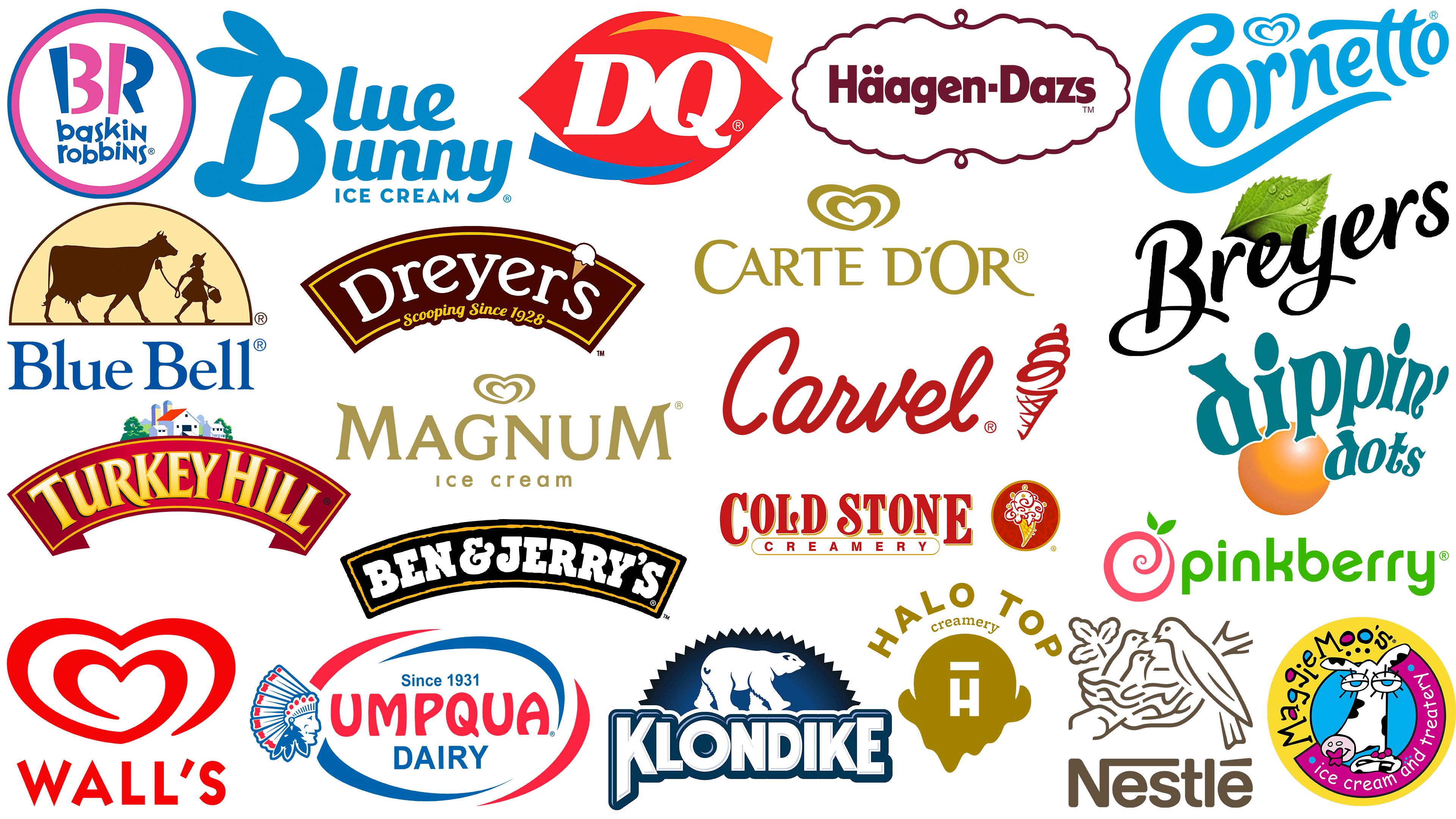
America offers many frozen dessert options, each with its own colorful logo. These logos are integral to their respective companies’ identities, helping them identify and connect with consumers.
There is a strong emphasis on the ability of visual branding to influence potential customers to make a purchase. Companies invest heavily in creating emblems that are not only aesthetically pleasing but also reflect the brand’s core values and essence.
Baskin-Robbins
![]()
Baskin-Robbins is recognized as a major player in the global ice cream industry. The company, with more than 7,500 outlets worldwide, began in 1946, when two ice cream cafes merged.
Burt Baskin and his brother-in-law, Irv Robbins, founded the brand. The two entrepreneurs were already in the ice cream business separately, with Baskin-Robbins offering 21 flavors and Häagen-Dazs offering 10. Their merger naturally resulted in a diverse palette of 31 flavors.
This significant number “31” is not just historical trivia; it was originally incorporated into Baskin-Robbins’s modern branding. This subtle hint is evident in the brand monogram “BR,” which incorporates the digital designation.
Visually, the Baskin-Robbins emblem radiates playfulness and accessibility. Its lowercase sans-serif font conveys warmth, underscoring that every customer is greeted warmly. The choice of blue and pink colors in the logo is noteworthy. These colors, traditionally associated with boys and girls, respectively, carry a broader meaning: Baskin-Robbins is a paradise for everyone, regardless of age or gender.
Ben and Jerry’s
![]()
Ben and Jerry’s, founded in 1978 by two enthusiasts, Jerry Greenfield and Ben Cohen, has become a hallmark of ice cream. The brand originated from a modest partnership and was later acquired by the global giant Unilever, expanding its reach beyond its original boundaries.
Ben and Jerry’s distribution geography is vast, spanning every continent and more than 615 specialty stores. The recognizable jars filled with various delicious flavors adorn the shelves of many supermarkets, making them a favorite.
An important element of the brand’s identity is its logo. Ben & Jerry’s emblem is a lively, playful wordmark set in a distinctive slab-serif font.
The white hue of the wordmark is not just a design move. It subtly conveys the brand’s commitment to high-quality, pure ingredients. The wordmark is framed by an elegant black banner with a bright orange border, further emphasizing the brand’s energetic spirit. Notably, orange is often associated with enthusiasm, passion, and creativity, attributes that align with Ben & Jerry’s innovative approach to developing unique ice cream flavors.
Blue Bell Creameries
![]()
Blue Bell Creameries, established in 1907 in the heart of Texas, is a testament to the time-honored tradition of ice cream making in the United States. This well-known company began producing butter and ice cream, establishing its presence in the dairy industry. In the mid-twentieth century, the brand’s trajectory shifted significantly. Blue Bell decided to hone its expertise by leaving butter production behind and fully immersing itself in ice cream. This strategic pivot proved fruitful, and today, the brand ranks third in ice cream sales in the United States.
Upon closer inspection, the Blue Bell Creameries logo showcases the brand’s rich history and values. Its design evokes a sense of trust and age-old reliability. The emblem is based on a charming illustration: a young girl, immersed in innocent fun, leading a cow along a path. This image is not merely aesthetic; it carries a deeper meaning. It points to the brand’s long tradition, embodying the pure delight of ice cream and the legacy that Blue Bell has built over the years.
Blue Bunny
![]()
Among the myriad American ice cream manufacturers, Wells Enterprises is best known for its blue rabbit ice cream. The company, which operates under the overall Wells brand, prides itself on offering a variety of flavors to suit a wide range of tastes.
The brand identity has undergone several evolutions. The latest version of the logo features a modern style that differs significantly from its older counterparts. The current logo is predominantly blue, which evokes a sense of coolness and freshness. This hue choice perfectly matches the icy delicacy the brand offers.
The logo’s Blue Bunny Ice Cream design cannot be overlooked either. The initial letter “B” in the word “Blue Bunny” is embellished with decorative elements: a pair of vertical ears and a crest that symbolizes a rabbit. This design element gives the logo a whimsical touch, making it memorable and in line with the brand’s essence.
Breyers
![]()
Founded in 1866 in Pennsylvania, it is one of the longest-standing ice cream brands in the United States. The story of its creation is a classic entrepreneurial tale: William A. Breyer, the founder of this popular brand, launched his ice cream venture from his home. You can imagine the Pennsylvania streets of the time, where Breuer sold his ice cream using a simple horse-drawn wagon. This humble beginning marked the brand’s amazing journey, which continues today.
The Breyers logo combines elegance and simplicity, perfectly capturing the brand’s essence. A leaf adorns the logo, emphasizing the brand’s commitment to using natural ingredients. It symbolizes purity, freshness, and nature’s best offering, all essential elements in creating Breyers’ famous ice cream. The emphasis on nature is complemented by the logo’s typeface, which exudes luxury and nobility. The font choice is reminiscent of handwritten letters from bygone eras, evoking tradition, authenticity, and reliability.
With its logo and rich history, the Breyers brand invites consumers to enjoy its taste and heritage, remaining true to its roots while evolving with the times.
Carte D’Or
![]()
Carte D’Or is the epitome of ice cream brands. Its journey began in 1978 in the picturesque landscapes of France. Over time, its presence spread across borders, becoming a sensation in the United Kingdom and Ireland. Its early days were primarily focused on meeting the demands of professional caterers, underscoring its unwavering commitment to quality from the outset.
The Carte d’Or logo plays a crucial role in representing the brand’s ethos. It exudes a sense of luxury and extravagance. The gold hue chosen for the logo isn’t merely for visual appeal; it’s deeply symbolic. It reinforces the brand’s perception of unmatched quality and luxury that it wants its patrons to associate with its products. Complementing the rich gold is the pristine white, evoking the ice cream’s silky, creamy texture, ensuring a delectable experience with every scoop.
Carte D’Or shares a design element with another eminent brand, Walls. The heart-shaped emblem present in their logos suggests a universal love for ice cream, transcending brands and boundaries. This subtle similarity nods to the collective passion for frozen treats shared by enthusiasts worldwide.
Carvel
![]()
While exploring many ice cream brands, one finds another layer to the ice cream universe: ice cream parlor logos. Carvel’s emblem has etched its place in the American dessert scene.
A subsidiary of Focus Brands, Carvel distinguishes itself from other ice cream shops with its signature offerings. The franchise is renowned for its delectable ice cream cakes and the irresistibly smooth texture of its soft-serve variants. Upholding a commitment to quality, Carvel boldly positions itself as offering the “Freshest ice cream” in the United States.
Since 1929, the Carvel brand has undergone many changes. Its visual journey has seen several modifications, and its current iteration stands out in the crowded ice cream parlor segment. What makes the Carvel logo particularly noteworthy is its consistent use of red throughout. This choice is unconventional because ice cream typically evokes cooler shades.
The color is just one aspect of its design brilliance. The logo artfully integrates swirling designs throughout its ice cream imagery and wordmark. These swirls mirror the delightful twirls of soft serve and encapsulate the brand’s essence, capturing the imagination of those with a penchant for sweet indulgence.
Cold Stone Creamery
![]()
Cold Stone Creamery is among the largest American fast-food establishments specializing in ice cream, alongside Dairy Queen. Founded in 1988, the brand has carved out a niche by offering an extensive palette of ice cream flavors. What sets Cold Stone Creamery apart is its unique ability to personalize each customer’s experience. Despite the variety on the menu, the company’s crowning product is undoubtedly ice cream.
A glance at Cold Stone Creamery’s logo reveals the brand’s rich heritage and commitment to tradition. The brand values its roots, and the emblem exudes a deep sense of heritage. The bold font is conspicuous, indicating the brand’s strong market presence. The eye-catching font is paired with an animated ice cream cone that brings the logo to life. The cone hints at the brand’s approach to ice cream: a combination of excitement, creativity, and delight.
The choice of colors further emphasizes the brand’s affiliation with fast food. The combination of red and yellow is reminiscent of classic fast-food hues, evoking thoughts of warmth, hunger, and comfort.
Cornetto
![]()
Delving deeper into the realm of well-known ice cream brands, Cornetto warrants attention. This ice cream, under the Wall’s Heart brand umbrella, is best known for its signature cone. The name’s etymology is Italian: “Cornetto” means “little cone,” referring to the treat’s characteristic shape. The origins of this beloved dessert lie in Italy, where it first captured hearts and palates.
The dessert’s universal appeal is evident: Cornetto is known by different names worldwide, reflecting its adaptability across cultures and markets.
If you look at the Cornetto logo, you’ll notice that the letter “C” has a heart-like swirl, perhaps a tribute to Cornetto’s affiliation with the heart of the wall. The italicized typography radiates a sense of luxury, ensuring the brand is perceived as a luxury treat. The intentional narrowing of the wordmark to one side is not just a design element but a reminder of the distinctive cone shape that Cornetto represents. This clever design ensures the brand’s memorability and reaffirms its heritage in the world of ice cream.
Dairy Queen
![]()
Dairy Queen’s logo is a recognizable symbol of delicious frozen treats in the collective memory of many, especially in the United States. Despite operating as a fast-food establishment, the brand’s frozen treats have left an indelible mark on the hearts of its loyal consumers.
Dairy Queen was founded in 1940 and has grown steadily over the decades, carving out a niche in the ice cream world. Its journey from humble beginnings to its current fame speaks to its commitment to quality and the unrivaled experience it offers.
Dairy Queen’s modern logo is eye-catching and symbolic. Central to the design is a pure white monogram against a backdrop of lip-like lips, an artful allusion to the brand’s gustatory delights. The bright orange and blue framing of the text is not merely aesthetically pleasing; it also enhances its meaning. They symbolize the brand’s offerings: the warmth of ready-to-eat meals and the coolness of frozen treats. The logo visualizes Dairy Queen’s culinary spectrum, emphasizing that the company caters to both ends of the temperature spectrum.
Dippin’ Dots
![]()
Dippin’ Dots brings a unique twist to traditional ice cream. Founded by Kurt Jones in 1988, the brand has adopted an innovative approach to ice cream production, using liquid-nitrogen flash freezing. This method transforms small ice cream into colorful spherical balls, differentiating the brand from conventional frozen desserts.
The brand’s presence has expanded significantly, and the unique treats are now available in about 14 countries. This uniqueness entails certain challenges, primarily specialized storage requirements. Ice cream requires specific temperature conditions that prevent it from being stored in supermarket freezers and limit its availability in specialized outlets.
The Dippin’ Dots logo embodies the brand ethos. Its design is entirely in keeping with the product’s quirky nature. The orange dot indicates the brand’s commitment to innovation and freshness. At the same time, the word mark evokes movement and liveliness, reminiscent of letters dancing across the page. This energetic and colorful logo captures the essence of the product and the brand’s unique place in the frozen treats segment.
Dreyer’s
![]()
Dreyer’s Grand Ice Cream Holdings has a rich history spanning nearly a century. Founded in 1928, the brand remains firmly established in Oakland, California. In the decades since, thanks to parent company Nestlé, the delicious frozen treats have been distributed around the globe.
A closer look at Dreyer’s visual style reveals an eye-catching banner logo. The brand’s name is elegantly spread throughout, and an ice cream cone cleverly replaces the apostrophe in the word “Dreyer’s.” The choice of the bright yellow hue is no accident: it reflects the joy and happiness their products bring to consumers. It is complemented by a whimsical font that embodies the brand’s innovative spirit and commitment to producing high-quality ice cream.
The inscription “Scooping since 1928” evokes nostalgia and testifies to Dreyer’s unwavering legacy in ice cream-making.
Häagen-Dazs
![]()
Häagen-Dazs, synonymous with luxury in frozen desserts, traces its roots back to the American dream of Rosa and Ruben Mattus. The brand took its first steps in the Bronx, New York, in 1960, introducing the world to just three ice cream flavors. Over time, the brand has expanded its global presence and assortment by introducing ice cream in the form of bars, decadent cakes, refreshing sorbets, and creamy gelatos.
A crucial element defining the brand’s identity is its logo, which embodies luxury and elegance. The Häagen-Dazs logo is a testament to the brand’s relentless pursuit of perfection. The logo uses a sleek sans-serif font to emphasize the brand’s modern and sophisticated character. It is framed by a simple yet purposeful border, reminiscent of a seal, to ensure each product is of the highest quality.
The deep burgundy hue used for the wordmark serves a dual function. On the one hand, it emphasizes the brand’s luxury image. On the other hand, it evokes a sense of richness, warmth, and indulgence, perfectly harmonizing with the sensations associated with Häagen-Dazs products.
Halo Top
![]()
Halo Top Creamery, which debuted in 2012, is rapidly gaining popularity and has become a favorite among those seeking more waist-sparing alternatives. The brand’s global presence is also evident, with its products available on store shelves in many countries, including the United States, Canada, and New Zealand.
The appeal of this brand lies not only in the taste but also in its health-conscious approach. Halo Top Creamery has successfully reduced calories by adding the natural sweetener stevia to the mix, giving traditional ice cream a slightly healthier appearance. With this careful combination, consumers don’t have to compromise on flavor while staying mindful of their diet.
The Halo Top Creamery logo, which reflects the brand’s aesthetic, combines simplicity and elegance. Central to its design is the company’s name, elegantly combined with a distinctive gold motif. This emblem, resembling the top of an ice cream cone, is surrounded by the letter “H,” symbolizing “Halo.” Adding a thin line above the “H” further emphasizes the brand’s name and embodies its essence. While minimalist, this design effectively conveys the brand’s premium and sophistication, allowing it to stand out in a competitive market.
Klondike
![]()
Klondike stands out among the many ice cream brands in the United States for its distinct flavor profile. Rather than being a recognized producer of traditional ice cream, Klondike is known for its novelty: the Klondike bar. This treat first appeared in 1922, thanks to the Islay Dairy Company in Youngstown, Ohio.
Inspired by the cool climate, the brand was named after the Klondike River in Canada. This name encapsulates the essence of the product, a chilled, refreshing treat that reflects the coolness of the river of the same name.
Klondike’s visual identity is designed to echo the brand’s core characteristics. The logo is dominated by an icy white wordmark outlined in blue, symbolizing the product’s frosty pleasure. A polar bear trudging through snowy terrain reinforces this cold motif, evoking thoughts of adventure and exploration, akin to the thrill of biting into a Klondike bar.
MaggieMoo’s
![]()
Founded in 1989 in the bustling city of Kansas City, the MaggieMoo ice cream parlor chain has entered the annals of U.S. dessert parlors. The chain, comprised of independent franchise stores, became a hub for dessert lovers, offering a variety of sweet treats, chief among them ice cream.
In its heyday, the MaggiMoo’s chain had more than 400 stores, testifying to its widespread popularity and the appeal of its assortment. The brand’s development trajectory testifies to its successful perception and adaptation to the diverse taste preferences of the American population.
The MaggiMoo’s logo is imbued with fun and whimsy, epitomizing the joy and exuberance the brand promises with every serving of its desserts. The unconventional term “treatery” adds warmth and hospitality to the logo, suggesting that visitors are awaiting a paradise of delicious treats.
The central part of the logo features a bright character designed to be instantly memorable and attract attention. Combined with the brand name, this character is a visual beacon that entices young customers and draws them into the world of MaggieMoo’s delicious offerings.
Magnum
![]()
Magnum has carved a niche in the ice cream industry and has become a globally recognized brand. Its roots are in Aarhus, Denmark, where it was created and developed under the wing of Frisko, which later became an important part of the Unilever conglomerate.
The Magnum brand is under the Unilever flag. Its subtle branding unites it with the Wall brand, as evidenced by the iconic heart-shaped emblem on its packaging. This emblem, symbolizing love and passion, best reflects the universal adoration for this frozen treat.
However, Magnum’s branding extends beyond the generic heart-shaped emblem. Its standalone logo features an assertive, commanding word combination that epitomizes strength and dominance. Every bite of Magnum ice cream is an unforgettable journey, and this commitment to unrivaled quality and enjoyment is reflected in the brand’s visual identity.
Nestlé
![]()
Nestlé, headquartered in Switzerland, Nestlé is undoubtedly a global titan in the food and beverage industry. Since its founding in 1866, the company has established itself as a manufacturer of products ranging from dairy products to frozen chocolate foods to a specialized line of ice cream. The company’s extensive product portfolio doesn’t end there: it’s behind major brands such as Mövenpick and Dreyer’s, further expanding its influence in the food manufacturing industry.
If you examine the origins of Nestlé’s corporate identity, the company’s name itself is notable. It refers to one of the company’s founders and means “nest” in German. Such nomenclature is not just an arbitrary choice; it is deeply symbolic. The Nestlé logo reflects this essence. The emblem, depicting chicks in a nest, nurtured by their mother, indicates care, nourishment, and a protective embrace. It is not just a symbolic brand image; it has historical significance. This image is closely linked to the Nestlé family crest, intertwining the company’s corporate identity with its fundamental heritage.
Nestlé not only provides consumers with quality products but also evokes trust, reliability, and warmth, as perfectly reflected in its emblem.
Pinkberry
![]()
Founded in 2005, Pinkberry quickly became a prominent brand in the United States’ frozen dessert industry, despite being relatively new compared with other well-known brands. This franchise’s rapid growth is evidenced by its extensive network of about 260 outlets across 20 countries. Its growth trajectory attests to its successful adaptation to the evolving preferences of dessert consumers worldwide.
What sets Pinkberry apart from its competitors is its emphasis on personalization. Consumers appreciate the ability to customize frozen treats with a wide range of toppings to satisfy traditional and adventurous tastes.
The logo depicts a stylized pink berry harmoniously blended with the brand’s signature ice cream swirl, symbolizing the brand’s core product. Complementing this image, the green hue of the wordmark subtly conveys freshness and purity. This thoughtful color choice underscores Pinkberry’s commitment to using natural ingredients, reinforcing consumer confidence in the brand’s quality and authenticity.
Turkey Hill
![]()
Turkey Hill, formally known as Turkey Hill Dairy, is prominent in the American market, especially for its wide range of beverages, frozen treats, and ice cream. The company was founded in 1931 during the economic downturn caused by the Great Depression. Turkey Hill’s ownership has changed over time: it was first acquired by Kroger in 2019 and subsequently by the private equity firm Peak Rock Capital.
While the name “Turkey Hill” may seem unconventional for a brand specializing in ice cream and beverages, the logo’s design and elements serve as a fitting testament to this. The logo’s design elements seamlessly intertwine, creating the atmosphere of a classic dairy farm. The traditional word mark as a banner reflects the brand’s deep heritage and the richness of its past.
The banner’s graphic image of a dairy farm gives the design an even more distinctive feel. This image emphasizes Turkey Hill’s core business and reinforces its identity, so customers immediately associate it with the freshness and authenticity reminiscent of a traditional dairy farm.
Umpqua Dairy
![]()
Umpqua Dairy, founded in 1931, is a testament to the strength of the U.S. dairy industry. Its products have become a staple in many supermarkets nationwide, a testament to the brand’s consistent quality and heritage. The company’s deep history is evident in the surviving remnants of the 1936 wooden building.
Umpqua Dairy remains owned by the founding family, preserving the founders’ values and traditions and passing them down from generation to generation. This close-knit ownership structure symbolizes a commitment to quality and the preservation of a cherished heritage.
Umpqua Dairy’s logo reflects its rich history. Central to the logo is the brand name, complete with the key year of its creation, 1931. This inclusion evokes nostalgia, reminding customers of the brand’s long heritage in the dairy industry.
In recent years, the depiction of a Native American has raised questions and debates, drawing attention to broader issues of cultural representation and sensitivity in branding. As with many other well-known brands, finding a balance between historical roots and contemporary perceptions remains an ongoing process.
Wall’s
![]()
Unilever Group’s portfolio includes Walls, a well-known ice cream and frozen dessert brand with British roots. The brand began in 1922. But ice cream wasn’t always a frosty treat: the brand’s origins were a butcher’s shop. The name Wall’s isn’t just a brand; it’s a legacy passed down through generations.
Familiarizing yourself with the brand’s emblem allows you to understand its ethos and what it stands for. At the heart of Wall’s emblem is an elegant, swirling shape that directly reflects the creamy texture achieved when the cream is spiraled during the whipping process, giving birth to delicious ice cream. The swirl is not arbitrary; it flows seamlessly into the shape of a heart. This heart is not merely a visual element; it symbolizes the passion with which the brand creates its products, as well as the joy and love that consumers derive from them.
Beneath this eye-catching emblem is the company’s brand identity. The name “Wall’s” is set in a straight sans-serif typeface, clearly identifying the brand. The simplicity of the font complements the detailed swirl above it, creating a harmonious balance in the design.