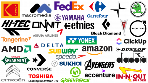
Arrows are present in the logos of many corporations around the world, from well-known ones like Amazon and FedEx to popular fast-food chains such as Subway. Logos often serve as visual metaphors that capture the essence of a company through the strategic use of shapes, colors, and symbols. Arrows are particularly popular in this regard due to the versatility of their meanings.
Arrows signify directionality and dynamism, indicating forward-thinking and constant movement forward. Such symbolism gives a brand a dynamic, active character that consumers can relate to.
Arrows are often associated with progress, drive, and ambition. This association works well for companies seeking to present themselves as a market leader or innovator. The arrows’ pointed tips and straight trajectories can also symbolize qualities such as strength and focus. The strong visual impact of the arrows allows for a memorable logo that effectively communicates the core values of the brand.
In logo design, arrows play a multifaceted role, shedding light on why this particular symbol is often used in different sectors and industries.
Logos with arrows in them
Arrow logos have gained popularity among many brands due to their universal appeal and simplicity of design. Because of their clarity and recognizability, these logos can be a powerful tool for communicating a brand’s core values and mission.
The configuration of the arrow plays a key role in its interpretation. If the arrow has a curved shape, it is a subtle hint of exploration or travel. This may resonate with brands that advocate innovation or are in the travel and adventure industry. On the other hand, an upward-pointing arrow can symbolize uplift, advancement, and overall growth. Companies seeking to create an image of continuous improvement or those in fast-paced industries may gravitate towards this image.
The direction, sharpness, and curve of the arrow in a logo can give insight into a company’s ethics and aspirations. Even in the simplicity of an arrow, a huge amount of meaning can be put into it, making it a versatile choice for a variety of companies.
Accenture
With a history dating back to 1989, Accenture is a prominent company in the information and communications technology (ICT) industry. As a symbol of the company, its trademark features an arrow intertwined with its word mark.
In keeping with the branding trends of many tech giants, Accenture chose a streamlined and elegant design for its emblem. A clear arrow is visible at the top of the emblem, subtly emphasizing the company’s forward-thinking vision and its desire for upward mobility.
The choice of the purple hue in the branding is no accident. This shade often symbolizes creativity, wisdom, and compassion – all qualities that resonate with the company’s ethics. Accenture’s careful combination of logo design elements reflects its commitment to combining technological prowess with human-centered solutions.
Amazon
Amazon’s logo, in the e-commerce industry, is globally recognized. The arrow in the logo serves multiple functions and is a masterpiece of minimalist design with a lot of meaning.
One of the most noticeable features is the orientation of the arrow, pointing from the letter “A” to “Z.” This direction subtly but effectively conveys the huge range of products available on Amazon’s platform from start to finish, or in this case, A to Z. This aspect of the design effectively captures the essence of the company as an all-encompassing marketplace offering a wide range of products.
The color and shape of the arrow add another layer to its interpretation. The orange hue lends a sense of warmth and energy, which aligns well with Amazon’s consumer-oriented business model. The curve of the arrow artfully mimics the shape of a smile, complete with a small indentation at the bottom of the “Z” that resembles a cheek. This gives the brand a friendly and disposable image and subtly hints at customer satisfaction, which is one of the core tenets of Amazon’s business philosophy.
The brand extends this iconic design language to its other products, such as the Amazon Alexa logo, ensuring consistency and brand recognition across platforms and services.
The Amazon logo is a great example of how a seemingly simple symbol can carry a complex and multifaceted meaning. The logo effectively conveys the essence of one of the most influential companies of our time through thoughtful design solutions.
AMD
AMD, one of the world’s leading technology companies, uses an arrow in its logo, which attracts attention with its expressive geometry. The emblem stands out with its avant-garde design. Many sharp angular edges in the design of the arrow show AMD’s advanced approach and the company’s bold position in the world of technology.
The choice of green color for the boom is not just a random aesthetic decision. Green traditionally symbolizes growth, renewal, and vitality. By using this hue, AMD subtly hints at its commitment to its principles in the ever-changing technology sector.
The direction of the arrow – up and to the right – has symbolic meaning. In graphic representations and in many cultures, this direction is associated with progress, optimism, and dynamism. Through its logo, AMD clearly conveys its ethos: a brand that is grounded in the present but relentless in its pursuit of a future filled with potential and revolutionary advances.
Asiana Airlines
Asiana Airlines, the renowned South Korean airline, is characterized not only by its wide coverage of more than 90 global destinations but also by its membership in the world’s leading passenger airline alliance. The airline’s logo design subtly reflects this respected position in the aviation sector.
The centerpiece of the Asiana Airlines logo is an arrow pointing upward and to the right. The trajectory of the arrow can be seen as a metaphor for the airline’s constant desire to excel, push boundaries, and lead passengers to new horizons.
The simplicity of the design, with its clean lines and minimalism, creates a sense of modernity. It shows the airline’s uniqueness to its values, ensures passenger comfort, and utilizes the latest technology. The emblem easily makes it clear that Asiana Airlines is not just about transportation but about progressive travel.
Avengers
The Avengers, the famous superhero team, uses a distinctive emblem with an arrow subtly woven into the design. The observer is able to discern the cleverly integrated arrow within the bold “A” of the word mark. This design element accomplishes several tasks.
It shows the constant evolution of the superhero team. Like an arrow always pointing forward, the Avengers are steadily moving forward, ensuring that justice is served. This choice of design is not an accident but a deliberate move that emphasizes the inexorability of purple.
The presence of the arrow in such an important place in the logo – in the first letter – ensures that it catches the viewer’s attention from the very beginning. It seems to signal the team’s readiness to rush into action at any moment.
This design is a testament to the power of subtle imagery. The Avengers badge as a whole captures the essence of the group, which never falters in its desire to fight the forces of evil.
Black Diamond
Founded as Black Diamond Equipment, the Black Diamond brand is a beacon for enthusiasts of skiing, mountaineering, and various mountain sports. The company’s branding is a symbol of its commitment to excellence, and its design elements reflect the adventurous spirit of its users.
Central to Black Diamond’s visual style is the strategic incorporation of arrow motifs into the logo. Two distinct arrows are present in the logo. The first, located to the left of the diamond, has a bright black outline that emphasizes determination and precision. The second arrow, more subdued, is depicted in the negative space adjacent to the larger arrow and diamond. This original design introduces an element of surprise.
These arrows symbolize momentum and progress and reflect the essence of mountain adventure – the constant upward and forward movement. The Black Diamond branding is a testament to the company’s desire to provide its customers with equipment that meets all the requirements of outdoor gear.
Carrefour
Carrefour, a well-known French retail giant, uses a duo of arrows in its logo, each pointing in a different direction. The symbolism behind this design is in line with the brand’s name, which means “crossroads” in English. In the intertwining of these arrows is successfully placed the letter “C,” skillfully created with the use of negative space.
The inclusion in the emblem of the French tricolor – blue, white, and red – pursues a dual purpose. First, it subtly emphasizes the company’s roots, evoking a sense of national pride. Secondly, it acts as a visual attraction, ensuring that the brand’s French origins are always present in the minds of consumers. The Carrefour emblem as a whole is a harmonious blend of design, meaning, and cultural identity, effectively communicating the essence of the brand.
Citroen
Citroen, a respected French automobile brand, uses the symbolism of arrows in its emblem, representing dynamism and determination. The emblem depicts arrows pointing upward, suggestive of progress and innovation – attributes befitting a cutting-edge automaker.
The arrows, in a minimalist design, immediately become the brand’s identifier, emphasizing its avant-garde ethos. They evoke thoughts of exploration and a journey into the unknown. In the automotive world, where the journey is as important as the destination, these symbols are precisely in line with the aspirations and experiences of drivers. The Citroen emblem embodies the uniqueness of the design brand and evokes emotions of excitement and discovery in the field of automotive excellence.
ClickUp
ClickUp, a well-known developer of project management software, has carved out a niche for itself by offering tools designed to make modern teams more efficient. With the help of this platform, organizations can delegate tasks and closely monitor their performance.
A characteristic feature of the ClickUp logo is an upward pointing arrow harmoniously placed next to the brand name. The arrow is located on a subtly curved element resembling the letter “C.” This design is both inventive and forward-looking, perfectly in line with modern professionals. The upward-pointing arrow reflects the idea of constant forward motion, which encourages the team to increase productivity and success.
Converse
Converse, a world-renowned footwear manufacturer, specializes in a wide range of sneakers and skate shoes. With a presence on many continents, the brand has gained popularity among enthusiasts and casual users alike. The centerpiece of the brand is the iconic emblem that often adorns its products and marketing materials. Inside the emblem is a thin arrow that gives the design depth.
The arrow pointing to the right symbolizes forward movement while not being an overtly dominant element, giving the emblem a special meaning signifying the brand’s unwavering desire for excellence.
The contrast between the boldness of the emblem and the subtlety of the arrow reflects the essence of Converse. The design of the emblem is a perfect match for a brand that exudes self-confidence and, at the same time, takes into account the ever-changing demands of today’s footwear market.
Delta Airlines
Arrow symbols, usually associated with the concepts of movement, direction, and progress, are popular in various industries. In the airline sector, this design element evokes a natural association with travel and exploration. The Delta brand, recognized as one of America’s leading airlines, is a prime example of this design trend.
The visually distinctive Delta logo features two arrow motifs, each of which carries its own semantic load. The first, the unmistakable red arrowhead, stands out prominently. This design exudes confidence, emphasizing the airline’s commitment to efficiently deliver passengers to their desired destinations.
Beneath the primary red arrowhead appears a thinner arrow, skillfully crafted in the white space between two red triangular-shaped segments. This secondary arrow may be less prominent, but its inclusion reinforces the theme of continuous movement and development.
The combination of these two arrows in Delta’s logo embodies the airline’s vision – a desire for continuous growth while providing a seamless and reliable journey for passengers.
Diadora
Founded in Italy in 1948, Diadora is a renowned global manufacturer of footwear and sportswear. With a history spanning several decades, the brand has undergone many evolutions, with logo changes reflecting its growth and adaptation to changing audience tastes.
A key element of the Diadora brand is the emblematic arrow-shaped motif strategically placed above the letter “O” in the wordmark. This sleek and modern design element not only emphasizes the brand’s name but also brings a touch of modernity to its overall aesthetic. The placement of the arrow, reminiscent of an accent mark, lends a European sophistication, paying homage to the brand’s Italian roots. The subtle yet striking elements of the logo demonstrate Diadora’s commitment to craftsmanship and ideas, making it a popular brand for many sportswear enthusiasts around the world.
Dunlop Sports
Originally from the UK, Dunlop Sports has become a leading manufacturer of sports equipment since its founding in 1910. With expertise in a variety of racquet sports, the company has made significant strides in badminton, squash, and tennis. The brand’s emblematic logo adorning the product range can be easily spotted in all arenas and courts.
Featuring familiar elements such as the company’s trademark, the Dunlop Sports emblem includes an arrow motif connected to a circle. Inside the circle is a distinct letter “D” – an indication of the brand of the same name. The compositional image resembles the silhouette of a bird, subtly alluding to the dynamic movement inherent in racquet sports, especially the rapid flight path of objects such as shuttles. This design captures the essence of Dunlop Sport, celebrating its heritage and desire to promote sporting excellence. The logo symbolizes the brand’s enduring excellence in racquet sports, bridging tradition and modern advancements.
Etnies
Headquartered in California, Etnies holds a special place in the world of skateboarding and sneaker enthusiasts. The emblem of this shoe company features an arrow uniquely oriented to the left next to the brand sign.
The leftward orientation of the arrow differs from the common design norm, where most brands choose symbols that point to the right and conventionally signify forward movement and progress. This design deviation provides insight into the deeper essence of the Etnies brand. It hints at the brand’s penchant for challenging conventional norms, echoing its reputation for producing alternative clothing options.
With the symbolic arrow, Etnies seamlessly connects its design philosophy to the brand’s broader message, suggesting that the brand is not afraid to go its own way in fashion.
FedEx
FedEx, a well-known logistics company, utilizes a witty design element in its logo that may go unnoticed. The thin arrow formed in the white space between the letters “E” and “X” is not just a random font arrangement. It serves a specific purpose.
The arrow pointing to the right serves as a metaphor for forward motion and rapid delivery – the brand’s core principles. This subtle design technique shows the brand’s uniqueness in fast and timely service, setting it apart in the competitive logistics sector.
The genius of the FedEx logo lies in its understated complexity. It demonstrates the power of design nuance to influence brand perception, showing that even the most inconspicuous details can make a huge difference.
Greenpeace
Widely known for its tireless advocacy for the environment, Greenpeace is a global independent organization hailing from Canada. Its main mission is to create a more sustainable and healthy world, and this spirit is best symbolized by the image of the Earth on its emblem.
Around this image of the planet are arrows that offer a multitude of interpretations. These arrows allude to the Earth’s continuous rotation, emphasizing the inexorable passage of time and the relevance of the organization’s mission. They allude to the cyclical nature of life on Earth, from origination to decline and rebirth. This cycle symbolizes the delicate balance of ecosystems.
The arrows not only symbolize the rotation of the Earth but also serve as a visual metaphor for the constant effort to preserve the environment. With each revolution and cycle, the logo silently conveys the organization’s promise: to work tirelessly to create a future in which the planet thrives, and its inhabitants coexist in harmony.
Hi-Tec
Hi-Tec, a recognized name in footwear, is synonymous with quality products designed for hikers and outdoor enthusiasts. The emblem of this brand, which specializes in the production of sportswear and footwear of the highest class, bears an arrow made with precision and elegance. The direction of the arrow, pointing to the left, is different from the usual rightward orientation of many logos.
This choice may indicate the fascination of finding low-travel routes and the unexpected pleasures of that quest. Hi-Tec reflects the essence of exploration and discovery – qualities that resonate with outdoor enthusiasts.
In-N-Out Burger
Instantly recognizable by many, especially those who frequent fast-food establishments, the In-N-Out Burger logo is a testament to the power of branding. This fast-food restaurant chain, operating primarily in the southwestern United States, has carved a niche for itself in a crowded market with its delicious food and memorable image.
The choice of bright red and yellow colors as the logo is not just an aesthetic decision. These colors bring thoughts of warmth, coziness, and zest, and remind us of a hearty meal that brings joy. They also hint at the fast service that these establishments are known for, promising a quick and pleasant pastime.
The central place in the logo is occupied by a characteristic arrow, a shape resembling a boomerang. It fulfills several functions. It alludes to retro pointers, often found along highways and beckoning travelers to stop for a quick bite. The arrow doesn’t just indicate a location; it symbolizes dynamism and forward movement. The direction to the right emphasizes the chain’s commitment to progress and its constant desire to provide its visitors with top-notch service and food. This arrow subtly conveys the brand’s promise: fast service without compromising the quality of the culinary experience.
Kodak
Synonymous with imaging, printing, and graphic communications technology, Kodak’s logo subtly conveys the concept of direction. The brand’s story combines the ability to capture moments and provide impeccable professional services.
A close look at the logo reveals the letter “K” made using red geometric patterns. The same pattern with pointed edges and angular orientation can be interpreted as an arrow. This dual representation serves a strategic purpose. On the one hand, the letter “K” stands for Kodak, which shows the uniqueness of the brand. On the other hand, the arrow indicates the brand’s forward-thinking and willingness to innovate.
The sharp and clear design of this symbolic arrow shows the precision and accuracy with which Kodak utilizes its range of products and services. This attention to detail inherent in the logo echoes Kodak’s long-standing reputation for quality and high-end imaging products.
Macromedia
Prior to its acquisition by Adobe, Macromedia was a prominent niche company in the field of website development software and graphics tools. The American company paved the way for ideas in the digital space with iconic products such as Dreamweaver and Flash that changed the dynamics of web design.
The company’s logo was central to the brand and different from the usual arrow logos. Instead of a sharp, angular trajectory, the Macromedia logo had a more curved arrow, introducing an element of fluidity.
The upward-pointing arrow tells the story of a brand aiming high, constantly evolving, and pushing the boundaries of what is possible in digital design.
Onnit
Hailing from the US, Onnit has carved a niche for itself as a prominent manufacturer of nutritional supplements carefully formulated to improve cognitive and physical performance. With a special emphasis on nootropics, the company is taking a deep dive into the burgeoning field of brain-enhancing drugs.
Onnit’s logo is characterized by understated elegance: a rectilinear word mark, slightly slanted to the right, embodies the idea of moving forward. In this logo, the two letters “N” are arrows pointing away from each other. This deliberate design nuance is characteristic of companies showing their wide range of offerings or the versatility of their approach.
Polestar
Recognized in the automotive industry, Polestar, originally from Sweden, has been at the forefront of hybrid sports car production for several years. This brand stands out not only for its innovative cars but also for its symbolic logo.
The design of the logo, which resembles two converging arrows, forms a kind of cross. This interaction can conjure up the image of two stylized birds in flight meeting at a central point. The clean and streamlined design echoes the brand’s contemporary ethos and its unwavering desire for cutting-edge achievements. The converging arrows symbolize unity, suggesting collaboration and a shared vision for the automotive community.
Pontiac
Pontiac’s iconic arrow and star logo is a striking emblem in automotive branding. This brand, once prominent in the U.S. automotive industry, has produced a number of memorable vehicles over the years.
The arrow-shaped design of the logo serves as a symbol of vigor, resilience, and dynamism. The arrowhead seamlessly transitions into the Pontiac crest, representing the rich heritage and pedigree of the brand. With this emblem, Pontiac has elegantly conveyed its heritage, values, and commitment to automotive excellence.
Skoda
Often overlooked because of its subtlety, the Skoda emblem has an exquisite design. The symbol resembles a bird flying gracefully towards its goal. However, upon closer examination, you can see an arrow-shaped figure, the head of which is directed to the right.
This dual interpretation of the emblem serves as a convincing illustration. The bird element signifies freedom and the endless pursuit of horizons. On the other hand, the arrow speaks of direction, dynamism, and forward aspiration.
With this emblem, Skoda effectively conveys its vision: the combination of innovation and tradition. The emblem design subtly conveys the brand’s uniqueness to engineering excellence, moving forward with a clear direction providing customers with the joy of exploration and movement.
Speedo
Speedo, a globally recognized sports brand, has built its reputation by creating swimwear that is used by professionals to compete. As a brand dedicated to smooth and fast movements in the water, it naturally matches the symbolic dynamism represented by the arrow emblem.
Its design, characterized by clear contours, is in a shade that contrasts sharply with the company’s name, thus attracting attention. This arrow, despite its whimsicality, retains a subtlety that reflects the dual essence of the brand.
The arrow pointing to the right emphasizes the brand’s commitment to evolution and improvement, symbolizing Speedo’s constant movement toward excellence in water sports.
Subway
Subway is a prime example among globally recognized brands using the arrow motif. This fast-food restaurant chain, known for its customized “submarine sandwiches”, is present in many countries and its logo is immediately recognizable.
The color palette of the Subway logo, dominated by green and yellow, allows for many interpretations. Green hints at freshness and indicates the natural ingredients that the brand uses, while yellow evokes a sense of joy and enthusiasm, which matches the cheerful mood that the brand aims to offer its customers.
Further reinforcing the brand’s message are the arrows located at either end of the wordmark. The arrows suggest the quick coming and going of the restaurant, echoing the fast-paced lifestyle of many urban dwellers. These arrows symbolize the orderly process of ordering, checking out, and receiving a sandwich, a hallmark of Subway.
The elements of the Subway logo blend together harmoniously to convey the brand’s ethos, offerings, and promise of a quick and tasty snack. The consistent and thoughtful design reflects the brand’s understanding of its target audience and commitment to serving them effectively.
Sukhoi
Sukhoi, which appeared in Russia in 1934, has since established itself as a leading aircraft manufacturer. The company’s corporate identity is reminiscent of some design solutions often used by automobile brands. The bright blue color of the logo is not accidental. Blue is often associated with reliability and dependability, which is very important for an aircraft manufacturer.
Next to this word mark is a remarkable emblem: an arrow surrounded by a circle, reminiscent of a classic compass. This illustration not only emphasizes the importance of navigation in aviation but also focuses attention on landmarks of primary importance in this industry. The arrow pointing skyward subtly conveys the brand’s ongoing commitment to research and innovation in the vastness of the sky. This design choice reflects Sukhoi’s commitment to pushing the boundaries of aviation and breaking new ground.
Tangerine
Tangerine, being a financial institution, stands out from the usual banking sphere with its bright and memorable logo. Unlike many financial brands that prefer a conservative design, Tangerine’s emblem is an explosion of color reminiscent of the zest and brightness of the fruit from which its name was derived.
The reputation of this financial organization has grown significantly due to its accessibility and user-centricity. The wordmark, rendered in a hue reminiscent of a ripe tangerine, serves as a visual cue to the fruit and reflects the brand’s refreshing approach to banking.
The arrow embedded in the logo points diagonally up and to the right and is a powerful symbol. This emblematic arrow unobtrusively reassures customers that the brand is committed to contributing to their financial upliftment. The design effectively combines modern aesthetics and symbolism that resonates deeply with those seeking financial growth.
Toshiba
Toshiba, a renowned electronics manufacturer and innovator, emphasized its forward-thinking nature by incorporating arrows into its logo design. The company’s primary word mark is a rectilinear representation of the brand name. When Toshiba incorporates its secondary tagline, “Leading Innovation,” into its logo, however, the design takes on added significance.
In addition to the simple word, the tagline features three prominent arrows pointing to the right. This choice of direction, especially in cultures that read and develop from left to right, inherently symbolizes forward movement. The multitude of arrows can be seen as a reflection of the versatility of the innovations the company is engaged in. Whether it is consumer electronics, industrial solutions, or cutting-edge research, each arrow can symbolize a different path of development for Toshiba, which is always future-oriented.
In a world where brand messages are often communicated through visual cues, the Toshiba logo embodies its mission and is always moving forward to what’s next.
Volvo
In automotive branding, the Volvo logo incorporates an arrow, a design element that has led to some misconceptions. It is easy to mistake this symbol for a representation of the male gender; however, the arrow stands for the chemical symbol for iron.
The direction of the arrow on the Volvo badge, pointing upward and to the right, subtly shows the idea of progress and innovation. This arrangement speaks to the brand’s forward-thinking nature and its desire for continuous improvement. It lets the consumer know that the company is not only strong but also committed to advances in technology and performance.
The arrow in the Volvo logo is a multi-layered symbol to convey different ideas, from reliability to the desire for progress. This example shows how even a symbol as commonly used as the arrow can be used to create a unique set of values and corporate identity.
Wrigley’s Spearmint
Wrigley’s Spearmint sub-brand stands out prominently in Wrigley’s portfolio, particularly due to its distinctive logo. Unlike the parent company’s main logo, the Spearmint variant includes two pronounced arrows pointing in opposite directions. This bidirectional theme symbolizes the flexibility of the chewing gum’s texture.
Wrigley’s Spearmint emblem, colored in a vibrant shade of green, is an unmistakable hint of the cool and rejuvenating minty flavor that chewing gum promises. The arrows serve as a dynamic element that imparts a sense of movement and elasticity, which goes well with the chewy nature of the product.
The emblem’s double arrow design can indicate a long-lasting freshness that extends in all directions, engaging all the senses, and fully meets the expectations of a leading confectionery brand emphasizing freshness and flavor.
Yamaha
Yamaha, widely known for its music products, has a logo that symbolizes its uniqueness in the art of sound. Central to this logo are three intersecting forks that form a distinctive design. Embedded in each of these forks is an arrow diverging in different directions.
The multitude of directions these arrows point in can be interpreted as an indication of the vast scope of musical creativity and its limitless possibilities. The trio of arrows and forks subtly emphasizes the three basic principles that drive Yamaha: manufacturing excellence, sales momentum, and cutting-edge technology. This artful image embodies Yamaha’s uniqueness in the world of music.
Yonex
Yonex, which has established itself as a leader in sports manufacturing, stands out for its specialized production of equipment designed for badminton, tennis, and golf enthusiasts around the world. In addition to the company’s reputation for quality and durability, the brand image symbolized by its distinctive logo plays a key role in cementing its status in the sports industry.
The logo cleverly integrates two circles, a reference to the balls that play a key role in the sports the company is involved in. These circles, despite their apparent simplicity, carry a deep meaning.
This design features an arrow pointing upwards and to the right. Although it is not immediately obvious, its inclusion is significant. This arrow is an emblem of the company’s relentless pursuit of innovation and unwavering desire for growth. It is a promise that Yonex is not just maintaining the status quo but constantly pushing the boundaries of what is possible in sports manufacturing. The trajectory of the arrow emphasizes the brand’s ethos of constantly pushing for excellence, setting higher standards, and providing athletes, whether amateur or professional, with the best equipment to elevate their game.
Exploring famous logos with arrows
Arrows have long been iconic symbols in logo design, resonating with various brands in different industries. Their popularity is due to their versatility and multiple interpretations. Depending on the orientation, arrows can convey different stories, revealing the essence of what they represent.
The use of arrows in logos often evokes notions of forward motion and evolution, giving the brand identity dynamism and vitality.
