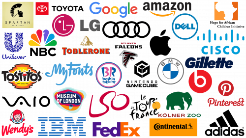
In various industries, logos serve as a visual representation of a brand. However, some logos go beyond mere representation and carry subtle messages that mesmerize the careful observer. Think of the FedEx emblem with its aptly placed arrow or the mountain pattern on the Toblerone logo, which discreetly depicts a bear. Don’t forget the Baskin Robbins emblem, which subtly incorporates the number “31” to hint at the diversity of flavors.
These symbolic designs with hidden nuances have attracted the attention and admiration of the world, demonstrating inventive creativity in brand identity design. While the hidden message strategy is not utilized by every brand, those who master this art are a remarkable testament to the depth of logo design and its potential to create stories.
Even subtle design techniques such as “white space” can create a rich narrative in a logo, encouraging the viewer to delve deeper into the brand’s story. Such design intricacies create intrigue and a sense of discovery, compelling the viewer to delve deeper into the brand’s essence.
In modern branding, an emblem is more than just a symbol; it’s a visual narrative, and understanding the hidden meanings behind some of the most recognizable logos provides invaluable lessons. These wonders of emblematics reaffirm the importance of careful design choices when telling a brand’s story and creating memorable, lasting impressions with audiences.
Why are there hidden messages in logos?
Emblems carry significant weight in brand representation. They serve as a compact receptacle that allows a brand to convey maximum information about its identity and essence in one concise visual image. Emblems are often carefully crafted to convey a particular message or mood, even if it is not immediately obvious to the observer.
Subtle details, whether it be color choice, font, or shape, are thoughtfully integrated to create a specific effect or emotion. Integrating inconspicuous elements into an emblem, such as clever use of negative space or strategic placement of certain components, can give it depth and significance. For example, the hidden bear in Toblerone’s emblem provides a glimpse into the history of the product.
These embedded messages are not just an aesthetic choice; they serve a strategic function. Their main purpose is to create a deeper connection between the brand and its target audience. Studying and analyzing some emblems with hidden meanings allows us to better understand this phenomenon.
The best logos with hidden meanings
In today’s hyper-competitive marketplace, where every detail matters, a logo with a hidden meaning can be a powerful differentiator for a brand. Such complex designs intrigue the observer and create an additional level of engagement, fostering a deeper connection with the audience. Hidden logo elements that are not immediately apparent evoke a sense of discovery and delight when they are noticed. This moment of realization often serves as an emotional hook, making the brand more memorable.
While hidden meanings can add depth and intrigue to a logo, they are not a required element of every logo. The inclusion of subtle messages should be in line with the overall ethos and goals of the brand. If hidden elements are forced or inappropriate, they can distract from the core message or value proposition, resulting in an inappropriate brand image.
Keeping all these nuances in mind, companies should contact professional logo designers. Such professionals can offer the best combination of creativity and strategic thinking to effectively balance explicit and implicit elements. Thanks to their skill, all design decisions – from color schemes to typography and symbols – work in unison to reinforce the brand message.
Contacting a logo designer also allows for a collaborative process where companies can articulate their goals, values, and the specific objectives they have for their industry. The designer can then translate these ideas into a compelling visual identity that will resonate with the target audience and set the company apart in a crowded marketplace. Through collaborative dialogue, ideas are refined, and the resulting logo becomes a robust communication tool capable of conveying both explicit and implicit messages.
A well-designed logo with a hidden meaning can be a strategic asset as brands compete for consumer attention. It attracts immediate attention and invites deeper engagement, providing a market positioning advantage. Achieving this difficult balance is not easy and requires professional expertise. With the right approach, a logo can transform from a simple brand identifier to a complex story woven into the fabric of a brand’s identity, enriching consumer interaction and experience.
Adidas
Adidas, a well-known sportswear and footwear brand, has a rich history. The brand identity, which originated from the name of its founder, Adolf Dassler, carries a deep meaning. The iconic three-stripe design has become synonymous with the brand and is more than just a design element.
This triad of stripes is symbolic and reminiscent of a mountain peak. It symbolizes the many challenges faced and overcome by athletes. The stripes, as a distinctive design feature, are also a testament to Adidas’ journey from humble beginnings in a small town to becoming a world leader in sportswear.
Amazon
Amazon, the global giant in the world of e-commerce, has a logo that is instantly recognizable to millions of people. The striking feature of the logo is a curved arrow that starts from the letter “A” and ends with another letter “A.” At a closer look, this arrow reminds me of a semblance of a smile. The slight curve below the letter “Z” emphasizes this smile, giving the design depth and character.
There is another layer to this design. The trajectory of the arrow from the letter “A” to the letter “Z” symbolizes the vast number of products offered by Amazon. It serves as a visualization of the brand promise: everything you could possibly need or want is available from A to Z. This strategic positioning emphasizes Amazon’s vast product portfolio and its commitment to being a one-stop solution for shoppers around the world.
Apple
In corporate branding, Apple stands out for its innovative products and the depth encapsulated in its logo. The name “Apple” is not just a reference to a fruit; it brings to mind Isaac Newton and the fateful fall of the apple that led to the groundbreaking understanding of gravity.
The Apple emblem, depicting an over bitten apple, is synonymous with innovation and is instantly recognizable around the world. Beyond modern recognition, however, there is a deeper meaning behind this design. The intentional bite mark on the apple is not just an artistic device but a subtle allusion to the biblical story of Eve taking a bite from the forbidden fruit that symbolizes knowledge and enlightenment.
Atlanta Falcons
Sports organizations and teams often use creativity when designing emblems. Animals as mascots have traditionally been the preferred choice, resonating with fans and energizing the brand.
In keeping with this tradition, the Atlanta Falcons have cleverly incorporated the falcon into their symbol. This raptor symbolizes agility, speed, and precision – traits that are undoubtedly valued in sports. But there is more to this emblem than just an agile bird. A closer look reveals that the outline of the falcon, especially its sweeping arc, ingeniously follows the shape of the letter “F.” This clever design emphasizes the team’s initials and exemplifies the combination of form and function in design.
Audi
The iconic Audi logo stands out among automotive emblems with a series of interlocking rings. More than just decorative elements, they carry a deep meaning rooted in the history of the brand. Each ring represents one of the four founding companies that formed the illustrious Audi Auto Union.
This emblem not only adds elegance but also serves as a subtle hint of the brand’s rich heritage. The intertwined rings embody the spirit of cooperation, emphasizing the synergy and unity of these four pioneering companies.
The design of the emblem serves as a constant reminder of the diverse expertise that has come together to form Audi’s unique identity. It emphasizes the brand’s commitment to preserving its heritage while at the same time pursuing a path of progress. With this emblem, Audi seamlessly connects its historic past with its dynamic present, reaffirming the essence of unity and cooperation.
Baskin Robbins
A world-renowned ice cream maker, Baskin Robbins boasts a logo that perfectly captures the joy, exuberance, and energy of youth. But like the layers of ice cream, there’s more than that lurking beneath the surface of this sparkling emblem.
The letters “BR” embedded in the colorful design are made in such a way that the pink areas clearly resemble the number “31”. This is not just a design coincidence. The number “31” is linked to the historical past of Baskin Robbins, symbolizing the original set of flavors that the brand introduced to its customers.
In branding, such nuances don’t just provide aesthetic appeal. They weave the brand’s heritage and values into its visual representation. For the observer, this can be a pleasant realization. However, it further strengthens Baskin Robbins’ position as a brand that has always focused on a broad palette of flavors, ensuring that every visit is a new flavor adventure.
Beats
The Beats by Dre logo features a deceptively simple design and is a lowercase “b” enclosed in a white circle. While at first glance, it may appear to be the name of the brand, the emblem serves a dual function. The Beats logo, in its original idea, resembles a human head adorned with headphones.
This two-layer approach to design gives the brand a more intimate, human-centered aspect. It successfully connects the product with its purpose – to continue the human experience of listening to music. The lowercase “b” is more than just a letter; it becomes a visual image of a person immersed in sound, seamlessly incorporating the product’s primary function into its uniqueness.
This carefully crafted image aims to establish a deeper relationship between the brand and its consumers by creating an instantly recognizable emblem that goes beyond simple aesthetics.
BMW
The emblem of BMW, a company known for its luxury cars, has a rich history and symbolism. At the heart of its logo is a blue and white checkered pattern, which at first glance may seem purely decorative.
The combination of blue and white in the emblem refers to the Bavarian flag, indicating BMW’s roots in the Bavarian region of Germany. The design of the emblem also recalls the movement of propellers against a clear sky. Given BMW’s early involvement in aviation, this can be seen as a tribute to its pioneering role in aircraft construction. The interweaving of visual elements provides a glimpse into the brand’s evolution from aircraft building to luxury car manufacturing.
Cisco
The emblem of Cisco, one of the leaders in communications and networking, is more than meets the eye. The lines running over the brand’s word mark easily resemble the transmission of signals or the invisible but ever-present energy fields of electromagnetism. But there is an additional layer of meaning. These seemingly abstract lines skillfully mimic the structure of the Golden Gate Bridge.
Incorporating such a connection into the logo is both subtle and impressive. It emphasizes the brand’s close connection to its birthplace and pays homage to its roots. This approach to design intrigues the observant viewer.
Continental
Continental’s design is a striking demonstration of the nuances of typographic placement. The clever placement of the letter “O” inside the letter “C” is not just an artistic extravagance.
This design choice creates a distinct silhouette for the tire that perfectly aligns with the brand’s core offerings. This inventive lettering work takes the design beyond mere aesthetics. It has a double meaning: it firmly anchors the brand’s essence in its core product area while also setting it apart in a market saturated with more generic imagery. The harmonious combination of the letters “O” and “C” subtly yet convincingly speaks to the brand’s mastery of tire manufacturing.
Dell
Recognizable to tech enthusiasts and casual users alike, the Dell logo is an intriguing design twist on the letter “E.” Instead of the traditional vertical orientation, the “E” is tilted to the side.
In Dell’s formative years, its goal was not just to become another player in the technology sector but to bring change, challenge norms, and redefine standards. This ambition is symbolized in the slanted “E” of the logo. This slant indicates the company’s desire to look at things from a different angle, to be innovative in its approach, and to make a significant mark in the industry.
FedEx
The FedEx logo is an example of intelligent and thoughtful design in corporate branding. The emblem is characterized by simplicity and features the company’s name in a clear and bold font. This straightforwardness ensures instant brand recognition, whether on board a truck or an airplane.
A closer look reveals a subtle nuance that elevates this design to iconic status. Between the letters “E” and “X” is a distinct arrow carved out of the negative space. The presence of the arrow emphasizes several key attributes associated with FedEx. It serves as a metaphor for the fast and efficient movement of parcels, hinting at the company’s promise of on-time delivery. The arrow pointing forward epitomizes the ethic of innovation and relentless pursuit of excellence. It speaks to FedEx’s commitment to meeting and exceeding customer expectations by always striving for advancements in logistics.
Gamecube
A monumental addition to the gameplay experience, Gamecube wowed players with its gameplay and thoughtfully designed logo. The intertwining of the letters “G” and “C” in the emblem is a clever hint at its name.
A closer look reveals the original combination of the two letters. The dark shade contains the letter “G,” and the contrasting light shade skillfully forms the letter “C.” This whimsical play of shades and spaces in the design effectively embodies the brand, adding to its intrigue. With this logo, Gamecube confirms its status as a combination of craftsmanship and technology.
Gillette
Gillette, the renowned manufacturer of shaving products, has left an indelible mark on consumers around the world. At a cursory glance at its logo, many may think that it is simply the name of the brand written in a stylish font.
The lowercase letter “I” in the logo stands out for its placement and special design element. The truncations at the top and base of this letter mimic the precision of a razor cut. This design choice reflects the brand’s ethos of prioritizing care in both product development and branding. The company skillfully conveys its commitment to precision and quality by incorporating details like this into the logo. This is a prime example of how a simple design edit can increase brand recognition, ensuring that the brand is memorable in a competitive market.
In the vast panorama of corporate branding, the Google emblem is a prime example of out-of-the-box thinking woven seamlessly into the design elements. Bright and varied colors don’t just attract attention or reflect the playful nature of the brand. Companies can stick to a palette of primary colors for simplicity and clarity. Google’s choice deviates slightly from the usual sequence of primary hues: a green “l.”
This deviation in color choice is emblematic of Google’s broader ethos. It demonstrates the company’s ongoing commitment to innovation, willingness to experiment, and eagerness to implement change even in established systems.
Hope for African Children Initiative
The Hope for African Children Initiative logo is a beacon of thoughtful design and deep meaning. The image evokes familiar outlines reminiscent of Africa on world maps. This marks the geographic region to which the initiative is dedicated and emphasizes pressing issues unique to that part of the world.
The beauty and depth of this logo lie in its intricate details, which are waiting to be seen by the attentive eye. Amidst the outlines of the African continent, subtle orange hues reveal an intimate scene: a child, representing hope and the future, gazing upwards towards the figure of an adult. The child’s upward gaze signifies aspiration, thirst for knowledge, and trust in the guidance of the elder. The adult, in turn, represents the pillars of guidance, protection, and the storehouse of wisdom that comes with experience.
The color orange is key to the emotional resonance of the design. Traditionally associated with warmth, enthusiasm, and passion, orange elements evoke optimism and determination. These emotions align perfectly with the mission of the initiative, emphasizing the desire to educate and uplift Africa’s younger generation.
IBM
IBM, the world-renowned technology giant, showcases a unique design for its logo that often evokes curiosity. Instead of solid letters, the brand has opted for stripes, which at first glance may seem like a simple aesthetic decision.
The stripes within the letters resemble equal signs. This choice is not accidental; it symbolizes equality and says that all interactions, innovations, and solutions of the company are based on fairness and balance. The striped design is characteristic of the technology sector and emphasizes IBM’s constant striving for innovation. By moving away from the familiar lettering, the company demonstrates a willingness to think differently and approach challenges from a new perspective.
Kolner Zoo
The Kolner Zoo logo is a testament to design ingenuity and creative expression. At a glance, one can easily recognize the majestic silhouette of an elephant, symbolizing the majesty and awe of wildlife.
A closer look reveals there is more to the elephant frame than meets the eye. Hidden in the skillfully carved white space are the figures of a giraffe and a rhinoceros. These animals, unique in their own right, emphasize the diversity of species at the Kolner Zoo.
But the tribute does not end with the animal world. The Cologne Cathedral, an iconic tower that has stood the test of time, is seamlessly integrated into the project. This multifaceted approach to design not only enhances visual appeal but also reflects the essence of the zoo – a celebration of the diversity of wildlife and a reference to the cultural heritage of Cologne, Germany.
Le Tour De France
The Tour de France emblem is not just a visual representation of one of the world’s most famous cycling races; it is a well-designed symbol that carries multiple meanings. It is a simple, modern typography.
You can notice how original the symbols are constructed if you break them down into their elements. For example, the letter “O” in the word “Tour” is not just an ordinary letter – it cleverly repeats the wheel of a bicycle. The adjacent letter “R,” which has a clear curvature and elongation, reflects the movement of the cyclist. The yellow circle of the logo is not just a decorative element. It complements the letter “O” in the word “Tour,” completing the image of the bike, but its bright hue has its own meaning. The choice of yellow is not accidental; it emphasizes the daytime nature of cycling, creating a luminous aura reminiscent of the glow of the sun. This color also echoes the brightness and energy associated with the prestigious event.
The Le Tour De France logo epitomizes the magic of design, where craftsmanship meets intention. Every element, from the choice of letters to the colors, is carefully considered to convey meaning, tell a story, and strengthen the brand’s connection with the audience.
LG
LG, a globally recognized communications manufacturer, boasts an emblem that contains more than just the brand’s initials. The prominent red symbol next to the “LG” symbol is very original. In it, you can distinguish the letters “L” and “G.” The genius lies in the strategic placement of these letters within it. Enclosed in a pure white circle, they join together to form a face-like shape.
This intentional design choice to incorporate anthropomorphic features is not just aesthetic. It is strategic. Incorporating humanoid features into branding often humanizes the brand, bridging the gap between corporation and consumer.
LSO
The LSO emblem, representing the London Symphony Orchestra, combines design and meaning, embodying form and function. A cursory glance reveals the intertwined glyphs of “LSO” in smooth handwriting, reminiscent of a maestro’s stroke on a musical score. But therein lies the genius: a closer look at this seemingly simple design reveals the silhouette of an orchestra conductor in a half-sleep, with his hands raised, ready to open a symphonic masterpiece.
This dual image gives the brand a dynamic feel and serves as a symbolic reference to the essence and heart of the orchestra. Combining the initials and the image of the conductor, the emblem paints a vivid picture of the harmonious relationship between the institution and its driving force – the maestro. Through this design, the London Symphony Orchestra invites audiences to experience the visual and aural symphony it presents.
Museum of London
The Museum of London logo may seem like an eclectic set of colorful shapes with no obvious meaning. In fact, this emblem carries a depth of meaning that is not immediately obvious.
Each colored shape serves as a mute marker reflecting certain historical stages of the region’s development. All of these layered elements combine to create a vivid picture that reflects the complexities and transformations that have taken place in London over the centuries. Although the design does not use words, its graphic elements tell a compelling story of change, adaptation, and evolution. Through the ingenuity of the design, the Museum of London logo acts as a silent but eloquent messenger of the institution it represents.
My Fonts
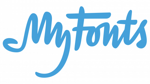
The My Fonts logo is another complex word mark. If one delves into the nuances of its design, one discovers a multi-layered story. The section denoting the word “My” is not just letters placed next to each other; it skillfully imitates the outline of a human hand with distinct fingers and an opposable thumb.
This original inclusion of a hand silhouette in the brand name is not just aesthetically pleasing. It serves a purpose that is directly related to the brand’s core message. The symbolism suggests that users have the freedom and convenience to choose and “grab” their preferred typography, echoing the brand’s promise of accessibility and user-centeredness. The My Fonts logo stands out in a world saturated with logos and emblems. It masterfully combines text and visual imagery, embodying the essence of the brand promise in a seemingly simple yet profound design.
NBC
NBC, a well-known broadcasting company, boasts an emblem that is visually appealing and filled with symbolism. At the heart of its design is a white figure surrounded by a brightly colored drop pattern that subtly alludes to the image of a peacock.
The peacock, a bird famous for its brightly colored plumage, was an apt metaphor during NBC’s early days. It was a pivotal period in the history of television when screens were moving from monochrome to color. The brightly colored peacock image symbolized this evolution and underscored NBC’s commitment to innovation in television viewing.
The colors themselves are more than just an aesthetic choice. Each of the six different hues symbolizes NBC’s six foundational divisions. This emphasizes the diversity of the segments operating under the NBC umbrella, each contributing uniquely to the conglomerate’s success.
Pinterest, the leading online platform for visual inspiration, came up with its name by combining the words “Pin” and “Interest.” If you delve into the logo design, you’ll find an intriguing element: the intentional inclusion of a protrusion at the bottom of the letter “P.” This detail is reminiscent of a tack or pin.
This design choice echoes the core function of the platform. Just as a clothespin can be used to pin notes or photos to a bulletin board, Pinterest users “pin” their favorite images, ideas, and inspiration to virtual boards.
The logo design subtly captures the essence of the platform. It emphasizes the tactile, personal experience of curating one’s interests, much like a physical board. Incorporating this visual cue into the initial letter of the brand name emphasizes the main feature of the platform and ensures that users remember it.
Spartan Golf
The Spartan logo is a masterclass in layered design, subtly weaving multiple meanings into a cohesive visual representation. The emblem invites the viewer to participate in a game of perception, offering different interpretations depending on the point of view.
To the uninitiated observer, the foreground of the emblem may appear to depict a golfer sitting in the middle of a swing. The dynamic stripes above the club emphasize movement and indicate the power and energy behind the swing. If one delves deeper into the intricacies of the design, an alternative image can be found. The contours of the golfer’s figure cleverly incorporate the silhouette of a Spartan warrior’s helmet. If you look more closely, the Spartan warrior’s face materializes in front of us, organically combining with the golfer’s stance. Intertwining these images, the logo suggests that there is a spirit of perseverance and excellence in every endeavor, be it sport or battle.
Toblerone
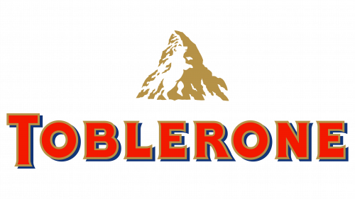
The Toblerone emblem is an iconic brand symbol with a multi-layered hidden narrative. While a closer look may make it appear to be a simple depiction of the majestic Swiss Matterhorn mountain, there is actually more to this image than meets the eye.
A closer look reveals the silhouette of a bear nestled in the white space of the mountain. This is not just an artistic choice. The bear is a tribute to Bern, the city of bears. It is a subtle hint at the roots and origins of the brand.
The bear’s presence has another meaning as well. It playfully hints at the honey ingredient in Toblerone chocolate and provides a sweet surprise to those who spot it. This dual symbolism – of origin and ingredients – captures the essence of the Toblerone brand story.
Tostitos
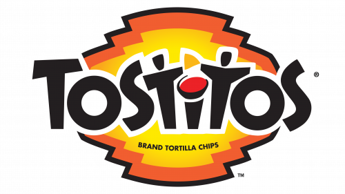
The Tostitos logo is a prime example of how thoughtful design can give branding character. The emblem represents the brand’s name in bold colors, making it easily visible on store shelves.
In the center of the emblem, the letters “TiT” artfully transform into a scene of camaraderie. This part originally depicts two people enjoying time together over a bowl of salsa, in the center of which lies a triangular chip synonymous with the Tostitos product. The transformation of letters into shapes emphasizes the brand’s core proposition and introduces an element of surprise to the careful observer.
The inclusion of two shapes emphasizes the brand’s focus on developing connections. Tostitos is not just about delicious appetizers and creating memorable moments with friends and family. The image encapsulates the universal appeal of sharing a meal – an act that transcends different cultures and is often synonymous with togetherness, celebration, and cohesion.
Toyota
The Toyota emblem is a testament to thoughtful design, carrying stories and symbols that resonate deeply with the brand’s identity. While at first glance, the emblem may appear to be a stylized version of the letter “T,” a deeper examination reveals a more complex story.
The intertwining circles on the emblem serve a dual purpose. They signify the unity of Toyota’s products and its loyal customers, illustrating their mutual trust and synergy. The smooth intersection of the circles emphasizes the brand’s commitment to producing products that meet the needs of its customers.
Many design enthusiasts note the artistic twist in the design. By highlighting certain areas of the emblem, it is possible to distinguish figures representing each letter of the word “Toyota.” This is not just a design move but a symbol of the brand’s overarching identity, emphasizing the importance of every detail and letter in establishing Toyota as a well-known brand.
Unilever
The Unilever emblem, at first glance, may appear to be a complex mosaic of different motifs. Upon closer inspection, these intricate patterns hint at the wide range of products the company produces. The splendor of the emblem lies in its intricate detailing, where each design element flows seamlessly into a common “U” – a reference to the company’s name.
This integration of different elements into a single whole embodies Unilever’s extensive product range, emphasizing its adaptability and broad market presence. The emblem is more than just a name. It offers a visual journey through the brand’s extensive product range. The complexity of its design is a tacit testament to Unilever’s broad reach and commitment to meeting a wide variety of consumer needs.
Vaio
Often synonymous with cutting-edge technology, Sony’s Vaio brand has attracted attention and admiration around the world for its innovative products. At a cursory glance at its logo, it may seem simple and even basic. As with many Sony Vaio products, the simplicity hides a deep meaning.
In the structure of the logo, the merging of the letters “V” and “A” mimics the shape of an analog signal. This is a reference to traditional technology, suggesting the continuity and development of technology from analog roots. On the other hand, part of the “IO” emblem cleverly incorporates the numerals “1” and “0”. These digits are numeric and represent the fundamental binary code underlying the digital world. This intricate detailing of the Sony Vaio emblem is an elegant reminder of the brand’s commitment to harmonizing the old with the new.
Wendy’s
The Wendy’s logo, familiar to many fast food lovers, contains an intricate detail that often goes unnoticed by the casual observer. In the center of the Wendy’s collar is a design element that, upon closer inspection, closely resembles the word “mom.” This is no mere coincidence or unintentional design element.
By integrating this element into the logo, Wendy’s seeks to convey to the consumer that the food it offers is not your average fast food but food that resembles home-cooked meals prepared with care and attention.
Wendy’s aims to bring a family-style dining experience to the fast food industry. By associating its brand with the figure of a caring mom, the company emphasizes its commitment to quality and family spirit, reinforcing the idea of wholesome food in a hurried world.
How do I make a logo with a hidden message?
In branding and corporate identity, logos play an important role in communicating ideas and values. One of the techniques to put deeper meaning into these visual symbols is the strategic use of hidden meanings. There are various methods for this purpose. For example, some logos include elements that indicate geographical origin. A prime example is BMW, whose logo uses the colors of the Bavarian flag to subtly pay homage to its roots and emotionally impact the audience.
Another approach is to use shapes that have cultural or associative significance. An example is the Toblerone logo. It includes a silhouette of a bear, cleverly alluding to the brand’s connection to Switzerland, known for its alpine regions where these animals live, and indirectly alluding to the honey ingredient in the product.
To successfully realize hidden meanings, designers often manipulate negative space and use precise positioning. Color palette and contrast also play an important role in enhancing the depth of an image. These are not simply aesthetic choices but purposeful elements carefully considered to create additional layers of interpretation. However, taking all these nuances into account when creating a balanced and effective logo can be a challenge, especially for those who need specialized design knowledge.
Many companies enlist the services of professional logo designers who have experience with complex design elements such as negative space. In collaboration with these professionals, a company can articulate the messages and meanings it wants to put into its logo. The designer must then translate these abstract concepts into a cohesive, impactful visual. This ensures that the logo not only aligns with the company’s vision but also resonates with the target audience.
Creating a logo filled with hidden meaning is often a complex interplay of cultural significance, artistic ingenuity, and psychological impact. It requires an understanding of design principles and an awareness of the brand’s ethos and the messages it seeks to convey to its audience. This multifaceted approach to logo design can take it from a simple visual representation to a nuanced narrative that can evoke a deeper connection with the audience.
