


The motorcycle industry is replete with many famous brands and their iconic emblems. For example, the mighty Japanese manufacturers Yamaha and Honda have long been staples of the motorcycling world, and their prominence rivals that of American legend Harley-Davidson. These companies share common traits across their diverse backgrounds: distinct personalities, product ranges, and rich histories.
Branding in the motorcycle industry follows the same principle as in the automotive industry. The goal is not limited to superficial consumer appeal but to establish deep connections. Motorcycles are more than just mechanical constructs to many. They represent a deeper ethic, a lifestyle, and, for some, an unbreakable connection to a particular tribe or community. The emblem on the tank and the brand name on the engine case are symbols proclaiming allegiance to a particular creed.
Not all manufacturers adopt a monolithic branding approach. Companies like BMW prefer to use a single logo across all models. This single emblem serves as a beacon of continuity and brand recognition. Some manufacturers leverage brand diversity by creating distinct logos for different product segments.
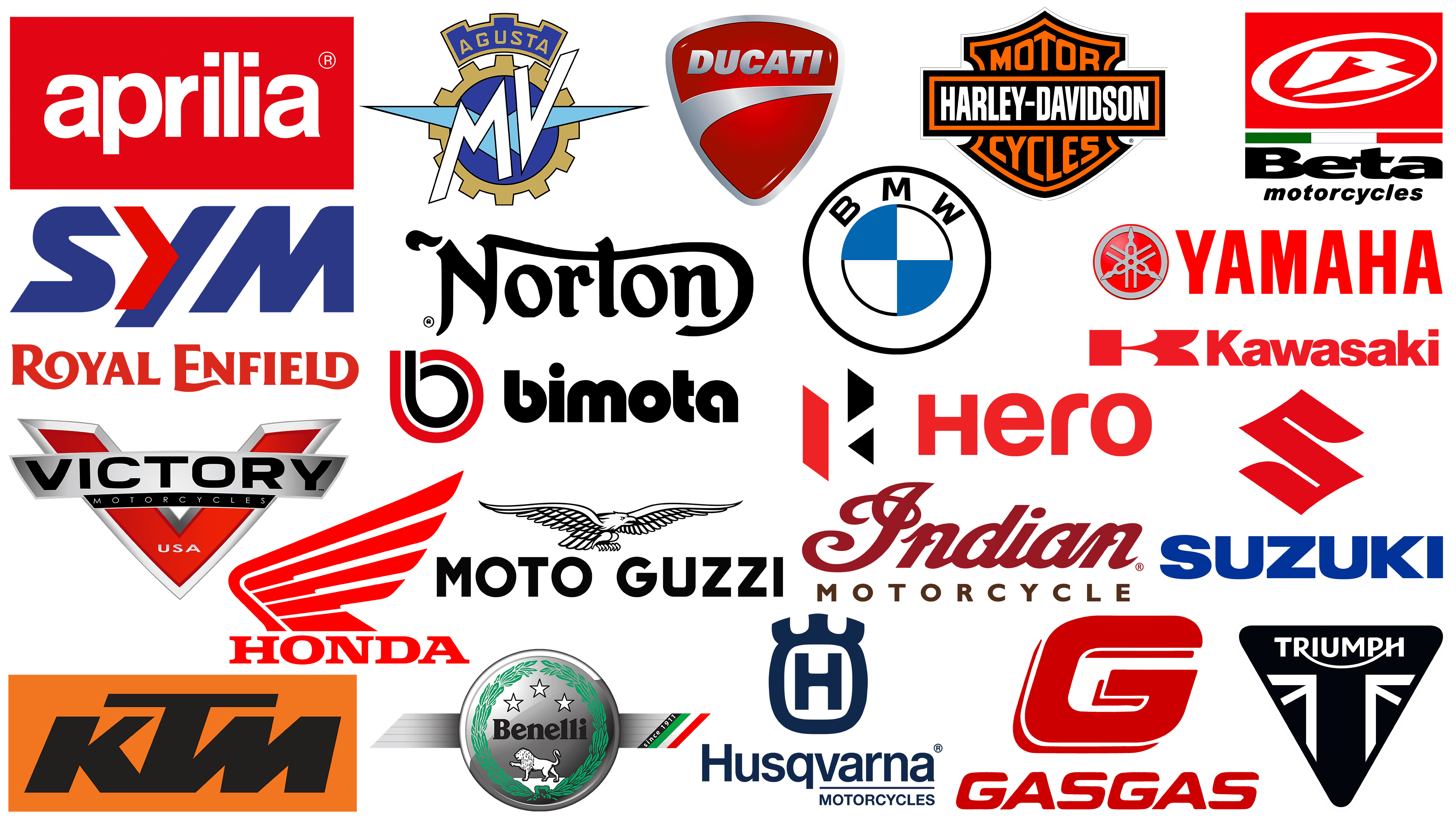
There are many motorcycle brands worldwide, each with a story to tell through its name and logo. They represent more than just corporations; they symbolize unique stories, cultures, and heritages. Each emblem and brand name carries essence, soul, and history, and this uniqueness captivates motorcycle riders and fans worldwide.
Aprilia
![]()
Emerging from the ashes of World War II, Aprilia grew from a humble Italian bicycle manufacturer to an influential name in the motorcycle and scooter industry. The post-war era was challenging, but Aprilia’s resilience and innovation enabled it to navigate these turbulent waters by switching from bicycles to motorcycles.
Aprilia’s reputation is not limited to producing only everyday bikes. The brand has carved out a niche in the sports bike segment and has a prominent footprint in motorcycling. Success stories on race tracks worldwide testify to Aprilia’s engineering prowess and competitive spirit.
The heart of the Aprilia brand is its emblem, a model of simplicity and efficiency. On the emblem, the brand name is in lowercase. This subtle font choice creates a sense of accessibility and warmth, suggesting that the brand is not only about high-end performance but also about connecting with the masses.
The emblem embodies several meanings. The choice of red for the background is not accidental. It evokes the passion, energy, and dynamism deeply rooted in Aprilia’s DNA. This color palette, combined with the unpretentious font, balances the brand’s racing heritage with its commitment to producing motorcycles for enthusiasts from all walks of life.
Benelli
![]()
Benelli Motorcycles, founded in 1911, has cemented its status as an iconic Italian motorcycle brand hailing from the picturesque Italian region of Pesaro. Although not as widely recognized as some other titans, Benelli’s symbolism and motorcycles resonate with enthusiasts worldwide.
Benelli operates under the Qianjiang Motorcycle brand, a subsidiary of the huge Geely holding company. Its wide range of models includes racing and touring motorcycles, sport bikes, and efficient scooters.
The Benelli emblem is the foundation of its identity, a carefully crafted badge that seamlessly combines the brand’s rich history with its prominent status in the Italian motorcycle scene. The emblem features a lion, an eternal symbol of power and authority, representing the might and enduring heritage of Benelli Motorcycles.
Beta
![]()
Beta, a testament to the longevity of iconic motorcycle brands, is Italian and traces its history back to the early 20th century. Founded in 1904, this renowned company is still actively producing its machinery today, with a particularly strong reputation in trike motorcycles.
Beta motorcycles have not gone unnoticed. Names like Albert Cabestany, Dougie Lumpkin, and Jordi Tarres resonate in trials, underscoring Beta’s competitive edge. Regarding the brand’s achievements, 2018 was a landmark year, with more than 20,000 motorcycles produced.
The Beta emblem is filled with a bright and dynamic spirit. Its design is notable for combining elements uniting the printed sans-serif letters with the company’s name. At the center of attention is a pronounced “B” in a bright red circle, reflecting the brand’s essence and exuberant character.
Bimota
![]()
Founded in Italy, Bimota draws on a rich tradition of motorcycle building and stands out among other brands. Founded in 1973, this custom and production motorcycle company carries a heritage deeply intertwined with its founders, Bianchi, Morri, and Tamburini. Their influence is so great that the brand name amalgamates their surnames, skillfully transformed into a portmanteau that resonates with motorcycle enthusiasts.
Bimota has produced many racing motorcycles, with models such as the HDB1 and Bimota YB3 leaving a significant mark on the racetrack. The constant evolution of Bimota motorcycle design and performance is evident in recent models such as the KB4 and Tesi H2, further cementing the company’s reputation as a high-performance machine manufacturer.
The Bimota logo is the epitome of modern simplicity. The bold sans-serif font with all lowercase letters vividly and memorably represents the brand name. The design of the letter “B” in the emblem is intriguing. The emblem’s abbreviated ascending part cleverly follows the wheel’s shape, symbolizing movement.
BMW
![]()
As a leader in the automotive industry, BMW is not limited to producing four-wheeled vehicles. A lesser-known aspect of BMW’s extensive heritage is its motorcycle manufacturing under the BMW Motorrad banner. This division has operated since 1921, reflecting the brand’s long-standing commitment to the design and development of two-wheeled vehicles.
An important milestone in BMW Motorrad’s glorious history was the introduction of the R32 in 1923. This motorcycle, equipped with a distinctive boxer engine, marked BMW’s first entry into the motorcycle market.
The logo adorning BMW motorcycles testifies to the company’s deep history and pride in its origins. The circular emblem, identical to the car emblem, pays homage to the company’s Bavarian roots. Originally, the emblem inverted the colors of the Bavarian flag, subtly emphasizing the brand’s rich heritage and connection to its homeland.
The emblem’s iconic blue-and-white quarters are more than just colors; they tell a story. They emphasize BMW’s commitment to excellence, precision, and continuous innovation, traits the brand has consistently demonstrated since its inception. Whether it is a luxury sedan or a powerful motorcycle, the emblem is a beacon of trust.
Ducati
![]()
Ducati, hailing from Italy, is synonymous with high-performance motorcycles. A notable aspect of its corporate structure is that it is a subsidiary of Ducati Motor Holding, owned by Lamborghini and part of the colossal Volkswagen Group. This multi-level ownership structure reinforces the brand’s importance in the automotive sector.
Ducati’s motorcycle division, dating back to 1926, has quickly earned a reputation for producing some of the most maneuverable and fastest motorcycles ever to hit the roads and trails. More than just for transportation, these motorcycles have come to symbolize innovation, design excellence, and extraordinary speed, setting benchmarks that competitors strive to equal.
The Ducati emblem, a shield, speaks volumes while keeping it simple. The motorcycle’s design seamlessly complements the emblem.
The bright red color scheme is not just an aesthetic element; it embodies many of the brand’s values: zeal, determination, and a relentless pursuit of progress. More than just a color, it embodies Ducati’s corporate philosophy and is a tribute to the company’s Italian heritage, known for its passion for design and engineering.
The “Ducati” lettering is presented in bold block letters that stand out well, especially against the red background. This trademark is not just designed to be read; it is designed to be memorable. The letters are immediately eye-catching, emphasizing the brand’s influential position in the high-powered motorcycle market.
Gas Gas
![]()
Founded in 1985, Gas Gas is a Spanish brand that produces off-road motorcycles. Designed specifically for enduro and trial competitions, these motorcycles have carved a niche in the off-road segment.
In 2019, the brand underwent a major change when it was acquired by KTM Motorcycles. This transition led to the sale of Gas Gas’s off-road models to Rieju Motorcycles.
Gas manufactures motorcycles and forges ties with famous figures in the motorcycle sport. A prime example is the acquisition of famous champion Jordi Tarres, who was persuaded to switch from Beta to Gas. This move raised Gas Gas’s profile and cemented its reputation as a formidable player in the Trials and Enduro circuits.
Branding is another aspect in which Gas Gas reflects its dynamism. The company’s logo uses intense red hues to convey the brand’s passion and power. The design creatively uses white space to form the letter “G,” which spells out the company’s initials.
Harley-Davidson
![]()
Harley-Davidson is a brand hard to miss in the motorcycle industry and one that resonates worldwide. The American company, founded in 1903, has grown into one of the largest motorcycle manufacturers with a significant global presence.
The Harley-Davidson emblem is easily recognizable and features many design elements that set it apart. It consists of a black banner outlined in orange, featuring the company’s name. This banner overlaps a shield-shaped element reading “Motorcycles” and featuring the brand’s distinctive orange-white-black color scheme. The bold hues contrast sharply, making the emblem easily visible even from a distance.
The large, stylized text on the emblem conveys strength and reliability, reflecting the brand’s heritage of building reliable, robust motorcycles capable of overcoming any obstacle.
Hero
![]()
The Hero MotoCorp group of companies, best known as Hero Honda, has firmly established its roots in India and grown into a prominent multinational motorcycle and scooter manufacturer. Its credibility is very high, and it is recognized as the leading manufacturer of two-wheelers globally. In the vibrant Indian market, this titan holds a 37.1% market share.
The company is responsible for launching various vehicles that have gained global attention. Models like Hero Honda Passion and Hero Karizma R have brought the company’s name into the annals of motorcycle history. There was a period when Hero MotoCorp and Honda collaborated on joint endeavors, but this alliance ended in 2010.
The Hero logo artfully combines various geometric shapes and masterfully uses negative space. The culmination of this design strategy is the symbolic letter “H,” composed of three colors: black, white, and red. Beneath this emblem is the inscription “Hero” in a distinctive font.
Honda
![]()
Although Honda is best known for its automobiles, it is also active in the motorcycle industry. Unlike the automobile division, the motorcycle division uses a separate emblem specifically designed for a different market audience.
The motorcycle emblem retains the Honda word mark but features a darker red shade than its automotive counterpart. However, the emblem is not the only distinguishing factor. Instead of the usual silver letter “H” that adorns the emblem of the automotive division, a wing in a deep red color draws attention.
The fender conveys the motorcycle’s key characteristics: speed and power. The rich red color emphasizes the brand’s commitment to performance and reliability.
With this unique emblem, Honda aims to resonate with motorcycle enthusiasts by emphasizing the performance and engineering quality the brand is known for worldwide. Each component of the emblem, from the font to the color to the fender element, is carefully selected to contribute to the overall brand picture that sets Honda’s motorcycle division apart in a highly competitive market.
Husqvarna
![]()
Originally from Sweden and now based in Austria, Husqvarna Motorcycles GmbH may not be immediately recognizable like some of its peers in the motorcycle industry. However, its heritage is undeniable in motocross, supermoto, and enduro.
Based in Sweden, Husqvarna began its journey in the motorcycle industry as an extension of a larger organization. Pivots and business evolution led to the company’s acquisition by PIERER Mobility Group, further strengthening its presence in the motorcycling world.
One of Husqvarna’s hallmarks is its emblem, which perfectly reflects the brand’s pedigree and tradition. Moving away from the often-used red hues in motorcycle logos, Husqvarna has opted for a deep blue, staying true to the brand’s historical roots.
Indian Motorcycle
![]()
Founded in 1901, Indian Motorcycle is one of the most iconic American motorcycle brands with over a century of heritage. The company originally operated under the “Hendee” brand name, but rebranded in 1923 as the Indian Motorcycle Manufacturing Company.
The company boasts an extensive lineup of motorcycles. Notable among them are the Challenger and Challenger Dark Horse models, which debuted in 2020 and reaffirmed the brand’s commitment to quality design.
The brand’s emblem reflects its rich history. Combining an elegant cursive typeface with a crisp sans-serif, the logo blends tradition and modernity. The color scheme, a combination of red and brown, conveys the brand’s passion and strength.
With this logo, Indian Motorcycle conveys its values, rich history, and forward-looking vision, resonating with longtime enthusiasts and new motorcyclists alike.
Kawasaki
![]()
Kawasaki is one of the largest motorcycle manufacturers and is part of Kawasaki Heavy Industries Ltd. This global conglomerate has a hand in a range of products, from aerospace equipment to two-wheelers that enthuse enthusiasts worldwide.
Kawasaki’s motorcycle lineup is as extensive as it is impressive. From adrenaline-charging Ninja sportbikes to relaxed cruisers, rugged dual-purpose motorcycles, and motocross bikes, there is a Kawasaki motorcycle for every rider.
The centerpiece of Kawasaki is its emblem. The bright red emblem is immediately eye-catching and symbolizes the brand’s energy and enthusiasm. The straight sans-serif font creates a sense of modernity and accessibility. However, the distinctive design of the letter “K” sets the brand apart, making it clear that the company strives to stand out in a crowded market.
The emblem is a beacon for riders and enthusiasts, promising unrivaled performance and thrilling adventure.
KTM
![]()
Kraftfahrzeug Trunkenpolz Mattighofen, often abbreviated as KTM, is an Austrian company with a rich history of manufacturing motorcycles, sports cars, and bicycles. With historical roots dating back to 1934, the company emphasizes its “official” founding in 1992, a turning point in its journey.
Known primarily for its craftsmanship in off-road motorcycles, KTM produces high-performance machines, including enduro and motocross bikes, as well as agile superbikes. KTM’s reputation in motorcycling is undeniable and resonates with enthusiasts and professionals alike.
The KTM emblem features a striking combination of orange and black. Bold black typography, reflecting the brand’s reliability and long industry heritage, anchors the emblem.
A notable aspect of KTM’s branding is its choice of orange, a hue rarely used in the automotive industry. Only a few, including Harley Davidson, use this hue, making KTM’s decision even more striking and memorable in the marketplace.
Moto Guzzi
![]()
Founded in 1921, Moto Guzzi is a testament to Europe’s success in motorcycle manufacturing. As one of the pillars of Italian motorcycling, it has influenced motorcycle design and functionality worldwide, driving revolutionary changes.
Moto Guzzi is at the forefront of reshaping the motorcycle industry. The brand has pioneered several groundbreaking innovations, including the revolutionary motorcycle center stand and the powerful eight-cylinder engine, significantly impacting motorcycle design and mechanics.
At the heart of the Moto Guzzi brand is its emblematic logo, with its name printed in a strict sans-serif font. Above it, a stylized bird in flight symbolizes motorcycles’ unbridled freedom and breathtaking speed. This emblem resonates with enthusiasts, conveying Moto Guzzi’s rich heritage and the eternal thrill of motorcycling.
MV Agusta
![]()
In 1945, MV Agusta Motor S.p.A., commonly known as MV Agusta, became a separate division of the famous aircraft manufacturer Agusta. Its name is an acronym where “MV” stands for “Meccanica” or “Mechanics” in English, intertwined with “Verghera,” the place where the first motorcycle models were born.
The MV Agusta racing team has left an indelible mark on the competition scene. Their track record includes many victories and rare and classic street motorcycle models that have been admired over the years.
Some observers say MV Agusta’s emblem leans towards traditionalism but retains its distinctive character. The prominently gleaming gold gear is complemented by elegant blue wings, symbolizing speed and freedom. MV Agusta’s unique color palette highlights its rich heritage and positions it among its contemporaries in the motorcycle industry.
Norton
![]()
Founded in 1898 as Norton Motors, the company is based in Birmingham, England, a region with a rich industrial heritage. After a brief hiatus, the company was reborn in 2008, marking its return to production.
Norton continues on its journey, catering to a loyal following of fans who appreciate the brand’s historical significance and engineering pedigree. Norton motorcycles represent a unique blend of traditional British craftsmanship and modern technology that buyers appreciate.
The company logo is central to the brand identity and a testament to Norton’s heritage. Despite its apparent simplicity, the logo has a surprising impact. The letters of the logo are in a decorative font, intricately linked and reminiscent of a motorcycle’s streamlined body. This clever design subtly emphasizes the brand’s core focus on motorcycle manufacturing.
Royal Enfield
![]()
Founded in 1955, Royal Enfield is a testament to the enduring legacy of British craftsmanship in motorcycle manufacturing. Although it is headquartered in Chennai, Tamil Nadu, India, Royal Enfield is known as the world’s oldest motorcycle brand, with uninterrupted production since 1901, albeit under a different nomenclature.
The Royal Enfield emblem exudes classic elegance. It features the company’s name in a customized font.
Royal Enfield’s trademark is painted red, like many famous motorcycle logos. This choice is not accidental. The color red evokes enthusiasm, dynamism, and intensity attributes that align well with the energetic ethics of motorcycle enthusiasts.
Suzuki
![]()
Suzuki Motor Corporation, hailing from Minami-Ku, Japan, is one of the leaders in the global automotive industry. With a rich history and vast scope, this brand is known for its wide range of automobiles. While many people know Suzuki for its automobiles, its portfolio extends far beyond ordinary cars. From all-terrain vehicles to motorcycles and even specialized mobility aids like wheelchairs, Suzuki’s commitment to serving a wide range of transportation needs is evident.
Having established itself as a major player in the automotive world, Suzuki’s commitment to quality is reflected in its diverse range of vehicles.
The Suzuki emblem consists of a stylized “S” in bright red. The blue brand name complements the dominant red color. The combination of red and blue creates a visually appealing logo with a symbolic component.
SYM Motors
![]()
Sanyang Motor Company, known as SYM, was born in 1954 in the heart of the Taiwanese city of Hukou. Over the years, this Taiwanese company has expanded its presence and has three central manufacturing hubs strategically distributed across Taiwan, Vietnam, and China.
SYM is known for producing a wide range of motorcycles, scooters, and ATVs, but its expertise extends beyond them. The company is expanding its range by producing mini trucks and passenger cars. These vehicles proudly bear the Hyundai brand name, signaling a collaboration that expands the capabilities of both companies.
SYM Motors presents an emblem that is nothing short of captivating. The emblem’s combination of blue and red colors subtly conveys the reliability and fresh excitement that drives the brand forward. This image is further enhanced by the font, which is slightly slanted to the right, reflecting the notion of forward motion and maneuverability. A notable detail of the word mark is the letter “Y” with a bright red arrow pointing to the right, symbolizing the brand’s momentum, direction, and unwavering commitment to progress.
Triumph
![]()
Triumph Motorcycles Limited, founded in 1902, underwent a major revitalization in 1983. This revival took place under the leadership of John Bloor, who revived the brand when the original company faced financial difficulties. The revived company continued motorcycle production and introduced innovations, thereby ensuring quality.
While Triumph is best known for lightweight motocross motorcycles, the company’s offerings are diverse. The Triumph lineup caters to a wide range of motorcycling enthusiasts, from the prowess of motocross variants to the stability and comfort of touring motorcycles. The company has made strides in exploring and producing alternative vehicles, further expanding its market reach.
Triumph’s branding is a design that epitomizes simplicity yet speaks volumes. The logo primarily features the brand’s name in a brightly colored serif font, with the black letters sharply contrasting against the pure white background. This minimalist approach is punctuated by a thoughtful design element, albeit a very subtle one. A linear connection between the letters “H” and “R” is found within the wordmark. This line, reminiscent of a winding road, symbolizes the journey and adventure that riding a Triumph motorcycle promises.
Victory
![]()
Founded in 1998, Victory Motorcycles quickly became a well-known American motorcycle manufacturer. The brand has carved out a niche over almost two decades by introducing models that resonate with motorcycle enthusiasts. Models such as the Vegas, Gunner, and Hammer 8-Ball have become iconic in the motorcycle community.
Although motorcycle production was discontinued in January 2017 and Indian Motorcycles succeeded the brand, the city’s streets still bear witness to Victory’s legacy. Many fans ride their favorite Victory motorcycles with care and concern for their heritage.
The brand’s identity is enshrined in its logo. The logo is more than just a visual representation of the company’s name on a sleek silver banner overlaid with a bold combination of silver and red in the shape of a “V.” It embodies Victory Motorcycles’ dynamism, vitality, and resilience. Red and silver colors are eye-catching and evoke a sense of passion and power.
Yamaha
![]()
Firmly rooted in Japan, Yamaha is a testament to the country’s engineering prowess and pioneering spirit. Emerging in 1955 as Yamaha Corporation, the company soon carved out a niche in motorcycle and marine products.
While Yamaha is globally recognized for its signature motorcycles, its range extends far beyond them. Yamaha’s commitment to engineering excellence and adaptability is evident from maneuverable scooters and advanced electric motorized bicycles to sophisticated sailboats and high-performance personal watercraft. This broad lineup underscores the brand’s significant presence in Japan and globally.
The Yamaha logo, in vibrant red, represents the company’s dynamism and commitment to new experiences. In addition to the color, the logo contains a distinctive symbol consisting of three crossing forks. At its core, this logo symbolizes the harmonious trinity of production, technology, and sales.
The Power and Legacy Behind Famous Motorcycle Brand Logos
Motorcycle manufacturers worldwide realize the importance of spectacular images and distinctive logos. Beyond illustrations, these emblems are powerful tools for establishing a deep connection with a global audience and communicating a brand’s essence.
Like their counterparts in the automotive industry, motorcycle companies use their emblems to accomplish two critical tasks: carving a niche in a competitive marketplace and evoking an emotional response from their customers. These emblems largely translate the brand’s heritage, philosophy, and core values, embodying its spirit in a limited space.
There are some common design trends in the world of motorcycle logos. These include large block text and the dominance of red. Within these common design elements, there is a spectrum of innovation. Each brand strives to incorporate a unique narrative, heritage, and vision into its emblem. The result is a mosaic of logos, each telling a different story while reflecting the rich tapestry of the motorcycle industry.
From established giants with decades-long legacies to new players offering fresh perspectives, motorcycle brand symbols are as diverse as the motorcycles they represent.