Firms that use owl imagery in their logos seek to convey traits such as wisdom, mystery, and a sense of wonder in their branding. Using animal symbols in branding is an effective strategy because different creatures carry inherent meanings that have been developed over centuries in different cultures. While logos with owls may not be as common as logos with other birds or mammals, such as horses or tigers, the owl resonates particularly with a wide range of consumers.
Examining the symbolism embedded in well-recognized owl logos can provide valuable insights for developing an effective brand strategy. Understanding in what context the owl and other animal symbols should be used when creating a logo is very important for a brand. While owls primarily symbolize wisdom and mystery, they can convey other nuances depending on the overall design elements, such as color scheme and the industry in which the company operates.
The relative rarity of owl logos in the corporate world can also be an advantage, allowing a brand to stand out in a crowded market. Opting for an owl image can help set a company apart, capture consumer attention, and create an image of sophistication and depth.
The inclusion of owls in logos serves a variety of strategic functions. From embodying wisdom and charisma to differentiating itself in the marketplace, the owl is an attractive choice for any organization looking to create a distinctive and meaningful brand. Understanding the complex symbolism associated with owls can prove invaluable for companies considering animal symbols in their branding strategies.
Why do companies use logos with owls?
Incorporating an owl into a company’s logo allows them to utilize the rich set of associations and emotions associated with this nocturnal bird. Similar to the iconic symbols used by popular brands, the owl can convey a myriad of messages depending on its image.
Revered in various cultures and mythologies, the owl is primarily associated with wisdom and intelligence. However, the versatility of this bird allows it to embody other diverse ideas. For example, its nocturnal lifestyle symbolizes mystery and the unknown and a keen sense of smell – vigilance and attentiveness.
In order to draw attention to certain emotions or concepts, you can emphasize specific features of the owl. Emphasizing the owl’s wide-set eyes can evoke feelings of curiosity, wonder, or even humor. Similarly, depicting other animals in logos can evoke certain attributes, such as the agility of a cheetah or the loyalty of a dog.
However, the interpretation of owl-centered logos is not static. Several factors influence the perception of these emblems, including:
- Color choice. The color scheme of an owl emblem often provides insight into its meaning. Deep hues suggest mystery, while bright tones evoke enthusiasm and dynamism. For example, blue tones are often associated with reliability and dependability.
- Posing. The pose and posture of the owl in a logo greatly influence its interpretation. Given their predatory nature, the image of an owl with wings spread, talons outstretched, and beak ready for capture can reinforce the aggressive tone of the logo. On the other hand, a calmer or contemplative pose can convey wisdom and serenity. Design details play a critical role in determining the overall perception of such emblems.
- Accents and proportions. Emphasizing certain features of the owl in a design can determine the emotions and ideas it evokes. Enlarging the eyes or highlighting the head may suggest innocence, curiosity, or a sense of wonder that is typically reserved for young individuals. Conversely, highlighting the wings of a bird can symbolize freedom, strength, and dominance.
Exploring the different variations of the owl emblem around the world provides further insight into these interpretations. Each design can tell a unique story based on accentuated elements, from minimalistic outlines to intricate imagery. Sharp talons, the curve of a beak, the fluffiness of feathers – each detail can give a logo a specific meaning or message.
Famous owl logos
Collingwood Fighting Owls
The symbolic depiction of the owl on sports teams and educational institutions has become a familiar theme. With their keen eyesight and predatory nature, owls echo the competitive spirit and tenacity inherent in sports. Among such images is the Collingwood Fighting Owls emblem.
The Collingwood Fighting Owls emblem design, based on the Warren Wilson Athletics emblem, emphasizes the owl’s formidable and strong features. The carefully crafted image presents the bird with its talons extended forward, creating the illusion that it is lunging at an opponent. This choice of design conveys the essence of the competition and introduces an element of anticipation and excitement.
The dynamism of the logo is enhanced by the image of an owl soaring through the air, representing agility, speed, and action. Overall, the choice of the owl in this image, especially with the emphasis on its fierce nature, emphasizes the determination, energy, and indomitable spirit inherent in competitive sports.
Columbus Owls
The Columbus Owls, a team once prominent in the professional hockey league, introduced an original approach to using the owl image in the team’s corporate identity. Instead of the typical image of an owl radiating aggression or a fighting stance that is usually found in sports logos, the design chosen for the Columbus Owls deviated from the norm.
One of the hallmarks of the emblem is its intriguing approach to detail. The lower part of the owl, particularly the feathers, in its originality, resembles the fingers of a hand firmly holding a hockey stick. Such an original design is memorable for spectators and fans.
This clever design harmoniously combines the main element of sport – the hockey stick – and the team mascot. With such innovation, the brand makes an impression, ensuring that the Columbus Owls remain a talking point among hockey fans.
Dijon
Founded in 1998, the Dijon Football Club came from the merger of two regional soccer teams. Although this French soccer club is known mainly within France, its emblem has great cultural and historical significance.
From the very beginning of its existence, the club chose an owl as its mascot. This choice was not arbitrary. The owl holds a special place in the heart of the people of Dijon. It is not just a bird but a symbol that personifies the city of Dijon itself. Its presence is deeply rooted in local lore, and the bird is an integral part of the iconic Notre Dame Cathedral.
By incorporating the owl into its brand identity, Dijon Football Côte d’Or is doing more than just adopting a mascot. The emblem unites sport and tradition, evokes local pride, and makes every match more than just a game.
Duolingo
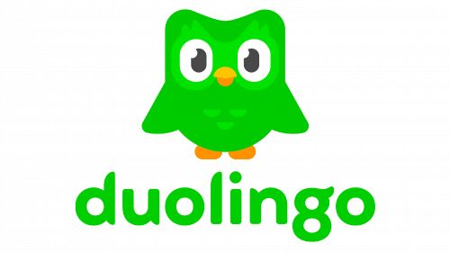
The Duolingo emblem, an owl that is sometimes missing from specific branding initiatives, remains synonymous with the brand. Duolingo, recognized by many as an online platform for learning multiple languages, chose the owl as its spokesperson for a reason. Owls are traditionally associated with wisdom and intelligence, which fits the essence of language learning.
The brand’s color palette, dominated by shades of orange and green, is wisely chosen. Orange is often associated with innovation and enthusiasm, reflecting the desire to learn a new language. Green evokes feelings of growth, renewal, and the excitement of discovery, which goes well with learning a new language.
Florida Atlantic Owls
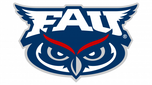
Florida Atlantic University’s athletic representation, the Florida Atlantic Owls, is in keeping with the centuries-old significance of the owl. These nocturnal creatures, often symbolizing intelligence and insight, become a fitting mascot for educational institutions.
The team has earned a reputation, especially in baseball circles, distinguished by athletic achievements and unique branding.
A special element of the brand identity is the original word mark. The letters “F” and “U” are decorated with a pattern resembling the wings of an owl. Such attention to detail turns a simple font into a more layered and dynamic image. Complementing the word mark is an image of the owl’s face. Its sharply narrowed eyes exude the determination and ambition of a team striving for excellence.
Green Owl Renovations
Based in the heart of London, Green Owl Renovations has carved out a niche for itself as a reputable property renovation firm. While the owl emblem may not be globally recognized, it highlights the adaptability and versatility of owl symbols, fitting easily into a variety of businesses and industries.
The design exudes a certain warmth and friendliness. This friendly vibe is essential for a company in the renovation industry, where trust and comfort are paramount. Green Owl Renovations’ elaborate logo subtly conveys the company’s professionalism and makes customers feel at ease entrusting their property to its care.
Hoot Design Studio
Warren Wilson College in North Carolina isn’t the only organization using owl symbolism. The Hoot Design Studio is also worth mentioning. This renowned illustration studio, which is also deeply immersed in the craft beer industry, utilizes the appeal of the owl to represent its uniqueness.
Creating craft beer labels requires precision, creativity, and the ability to understand the essence of the beverage. Hoot Design Studio has successfully captured that essence in its logo. Instead of the standard owl image, the logo ingeniously incorporates the owl’s eyes into the studio’s name. The placement of the eyes instead of the two “O’s” in the word “Hoot” creates a visual play on words.
This creative deviation from the norm captures the essence of Hoot Design Studio: imagination, originality, and a bit of unconventionality. It’s a testament to the power of branding when a simple logo can tell a lot about a company’s direction.
Hooters
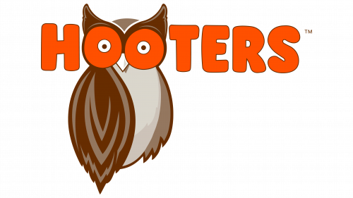
The Hooters logo in the form of an owl is one of the most iconic and widely recognized in branding. The choice of the owl symbol seems appropriate, especially since “Hooters” reflects the distinctive hooting sounds of these nocturnal birds.
The logo design draws attention to the owl’s bright eyes and artfully hints at the mixture of awe and delight that customers feel when they meet the charismatic waiters at Hooters establishments. It’s as if the owl’s gaze encapsulates the essence of a pleasant and memorable experience.
The choice of orange in the design is not accidental: this shade, often associated with originality, zest, and vivacity, emphasizes the lively and energetic atmosphere that Hooters strives to create. The combination of these elements echoes the playful and energetic spirit of the establishment. This approach to design provides not only a visual reference point but also an insight into the character of the brand and what visitors can expect from their visit.
Kennesaw State Owls
Kennesaw State University, known for its academic and athletic excellence, has chosen an owl as the symbol of its soccer team, the Kennesaw State Owls. The team, competing in the Big South Conference since 2015, proudly wears the owl emblem to reflect both athletic prowess and dedication to academics.
The gold and black colors chosen for the emblem don’t just showcase the official hues of the university. Across cultures and eras, the owl is associated with wisdom, knowledge, and insight, making it a worthy representative of an institution of higher learning’s athletic team.
The owl image on Kennesaw State’s emblem, although it has the usual outstretched talons as is common in other athletic logos, represents a calmer and more thoughtful pose. It indicates a balance between athletic energy and a thirst for knowledge.
Kentucky Owl Bourbon
Among historical alcohol brands, the owl emblem holds a special place. It’s not just an ordinary image but an intricate, classic design with an age-old aesthetic charm.
The emblem’s motto, “The Sage’s Bourbon,” emphasizes the owl’s deep association with discernment. The detailed depiction of the owl evokes a sense of nobility, elegance, and distinction.
This design is a striking reminder of the brand’s heritage and its commitment to modern minimalism. This emblem, infused with rich historical meaning, remains an enduring symbol in today’s fast-paced beverage market.
OVO
October’s Very Own, often abbreviated OVO, is a testament to the fashion influence of hip-hop artist Aubrey Drake Graham, aka Drake. If you delve into the brand’s logo, you’ll notice an owl-inspired design, where the double “O” represents the creature’s eyes and the “V” artfully represents its beak. Characterized by simplicity and minimalism, this symbolic design echoes the brand’s aesthetic ethics in fashion and design.
The beauty of this design lies in its adaptability. In some cases, an extended version of the logo can be seen. This version enlarges the facial features of the owl, emphasizing the striking visual of the eyes combined with the beak, located on a larger canvas.
OVO’s signature style, embodied in this owl motif, seamlessly blends contemporary fashion trends and wildlife inspiration. Its understatement and boldness emphasize the brand’s commitment to creating a distinctive and memorable image in the fashion world. The brand is attracting the attention of fashion lovers and cementing its place as an iconic symbol in the industry.
Red Owl
Founded in 1922, Red Owl is a testament to the lasting influence of branded retail chains in the United States. This grocery store chain, whose operations were controlled by a private equity firm, became widely known for the symbolic red owl that adorned a variety of products ranging from food to essentials such as herbs and spices.
Choosing a bright red hue for the owl was not just a fancy design decision. Such a bright color serves a dual function. It plays the role of a beacon, attracting the eyes of potential customers, whether they are passersby or motorists driving by. On the other hand, the boldness of the red color combined with the owl’s assertive behavior reflects the brand’s fierce presence in the market and its desire to stand out in the competitive retail sector.
Although owls are usually associated with wisdom and calmness, this image is somewhat different from conventional wisdom. Its strong and somewhat tense appearance may well symbolize the brand’s resilience and longevity to thrive in the ever-changing world of retail.
Rice Owls
Originating from Rice University in Texas, the Rice Owls brand represents a respected college sports program in the United States. The program has 14 teams, with both men and women playing a variety of sports, including basketball, baseball, and soccer.
The Rice Owls logo features an owl, a symbol that resonates deeply with the identity of the program. In 2010, the decision was made to drop the bird image from the emblem. The legacy of this iconic image remains. In an earlier version, the owl was depicted with its wings spread, creating a sense of dynamism and emphasizing the concepts of forward motion and momentum.
Even without a direct image, the Rice Owls epitomize agility and excellence in college sports. In college sports, where tradition and innovation often intersect, the Rice Owls exemplify how a brand can honor its past while looking to the future.
Standaard Boekhandel
The logo of Standaard Boekhandel, a well-known Belgian retailer specializing in books and other merchandise, including board games, uses the image of an owl wisely and meaningfully. The design strongly emphasizes proportions, especially the owl’s eyes, to subtly hint at the importance of reading or close observation. This makes sense, considering that the store’s main product is books.
The structure of the logo also has an intriguing nuance. The lower part of the owl figure is sort of divided, which serves a dual symbolic purpose. On the one hand, it gives the impression of two different wings, emphasizing the agility and versatility of the bird. On the other hand, this division resembles the shape of an open book, subtly emphasizing the literary orientation of the store.
TAS Group
TAS Group, a leading fintech company, offers cutting-edge platforms that meet the ever-changing demands of digital payments, payment networks, and intraday liquidity. The company’s emblem – an owl – is not just an arbitrary choice. It epitomizes the qualities of reliability and deep knowledge that are paramount in the interplay of finance and technology.
The image of the owl differs from the conventional one. Rather than depicting a stoic or authoritative bird, this representation leans towards an abstract, playful, and intriguing design.
Complementing the owl is a crisp sans-serif font in a successful combination of orange and blue. The blue shade emphasizes stability and trust – the two pillars of the financial sphere. The bright orange shade stands for innovation, dynamism, and zest characteristic of the world of technology. The TAS Group branding synthesizes the main elements of the financial and technological sectors.
Temple Owls
Temple University, located in Philadelphia, has historically been associated with the symbolism of the owl as its mascot. Recognizing changing trends and the need for modernization, the institution took the bold step of updating its emblem in 2020, moving from the familiar owl image to an exclusively typographic design.
Despite the change, Temple University’s recognizability and associations with the owl image remain unchanged. For many, the former emblem still lingers in the memory. The former emblem depicted the owl with a ferocious temperament, and its eyes, brightly lit in yellow, reflected the bird’s keen senses and predatory nature. In addition to the owl itself, the word “Owls” in the design was imbued with a feather-like texture, giving it a realistic feel and connection to the creature.
This metamorphosis in Temple Owls branding demonstrates Temple University’s forward-thinking approach, with the evolution of the logo reflecting a journey from a tangible image of an owl to an abstract perception of its essence.
Tripadvisor
Tripadvisor shares with establishments such as Hooters a place on the list of well-known brands with an owl image. Originating from the United States, this digital travel service has been a compass for over two decades, guiding numerous enthusiasts to exceptional destinations around the world.
Analyzing the Tripadvisor emblem reveals a masterful blend of design and meaning. The platform conveys a profound message by utilizing the owl’s distinctive features. The owl’s piercing eyes are an aesthetic element. A closer look reveals that these eyes bear a striking resemblance to binoculars. This design choice is not accidental. Binoculars, long-range observations, and adventure tools reflect the essence of the platform – to help users seek out and discover amazing places far from home.
Vanoss Gaming
Evan Fong, a Canadian native, is better known in the digital sphere as Vanoss Gaming. Since launching his YouTube channel in 2011, he has gained significant recognition in the video game commentary community.
Initially, Fong chose a simple logo that utilized the initials “V” and “G” to represent his gaming identity. Over time, the logo transformed, featuring the image of an owl. This choice was not accidental: it reflects the owl mask worn by Fong’s character in the popular game GTA Online.
This modern version of the logo embodies minimalism at its best. It emphasizes the characteristic features of the owl – pronounced ears, piercing eyes, and expressive beak. The simplicity of the design complements its elegance, making it easily recognizable and memorable to the channel’s wide audience.
Warren Wilson College
Warren Wilson College, located in the state of North Carolina, is characterized by an original approach to education. The curriculum of this private liberal arts institution intertwines work, study, and service, making it unique in the academic realm. But beyond its academic achievements, the college has a unique emblem for its athletic teams – an owl.
Warren Wilson’s emblem leans toward the formidability of this bird. The emblem emphasizes the owl’s bright white talons and broad wings, drawing attention to its strength and capabilities in the wild. Such an image fits perfectly with the competitive nature of the sports arena.
This emblem, reflecting the power of the owl as a fearsome predator, blends seamlessly with the spirit of sport. In a world of athletic competition where perseverance and strength are celebrated, the owl emblem chosen by Warren Wilson College symbolizes more than just wisdom.
White Owl Cigars
White Owl Cigars, founded in 1887, has become a hallmark of the American cigar industry. Owned by Swedish Match, this iconic brand has consistently used the image of the white owl as its main mascot.
The logo features a white owl perched on a cigar, which serves as a creative substitute for a tree branch. Overall, the design is more traditional, emphasizing careful attention to detail. This sets it apart from the more modern or simplistic designs of other branding initiatives. The nuances of the illustration make the brand instantly recognizable and memorable. Each feather and outline of the cigar is carefully crafted, giving attention to detail.
Unlike other owl images that emphasize the bird’s predatory or aggressive features, the white owl in this logo exudes a calmer and wiser aura. The white owl is a mascot and emblem that represents the brand’s values and its long-standing reputation as a manufacturer. This thoughtful combination of elements and brand ethos has helped White Owl Cigars remain relevant in a highly competitive market, attracting fans from around the world.
Meaning of brands with owls in their logos
With their enigmatic aura and symbolic depth, owls often become central figures in logo designs. They may not suit every business, but with a thoughtful approach, these birds are able to encapsulate a multitude of ideas and meanings.
Animal motifs in branding are not a mere coincidence. The most important aspect of logo design is conveying deep meanings through minimalistic imagery. To create such logos, commonly recognized symbols are often used to establish direct contact with the audience. Naturally, animals with their deep cultural and symbolic connotations prove to be the most preferred.
In the commercial sphere, the potential of an animal-oriented logo is undeniable. For example, the Jaguar emblem effectively uses the strong image of a wild cat, symbolizing agility and skill. On the other hand, the Porsche emblem, even if it is not exclusively animal-oriented, evokes notions of sophistication and grandeur.
If we look again at the owl, it is predominantly associated with discernment. But the beauty of the owl symbol lies in its adaptability. In addition to wisdom, it embodies a variety of meanings ranging from power and mystery to perseverance.
The academic sector seems to favor owl-centric branding. Educational institutions use the owl image to reflect values such as hard work, intellectual curiosity, and the relentless pursuit of knowledge. However, the ubiquity of owl logos is not limited to the academic sphere. Their versatility ensures their relevance in a wide range of industries.
Owls as branding elements can embody:
- Intelligence and insight: Throughout the world, in fairy tales and folklore, the owl is considered the embodiment of erudition and deep insight.
- Dominance and Power: Beneath the owl’s graceful shell lie powerful predators that know how to survive.
- Mystery and Intrigue: The nocturnal lifestyle of owls and their characteristics symbolize mystery.
- Search and Exploration: The broad outlook of the owl symbolizes the search, discovery of the unknown, and going beyond the horizon.
- Distinctiveness and novelty: With their unique physiological features, such as the ability to turn their heads, owls stand out in the feathered world, making them suitable for brands looking to emphasize their individuality.
The symbolism behind famous owl logos
As central figures in logo design, owls offer many types of decorative elements that can effectively shape a brand’s image. Famous owl logos can range from lighthearted and fun, such as the Hooters brand, to more authoritative and commanding, as in some college sports club logos.
When choosing a brand symbol, you need to think carefully about the core values, ideals, and messages to be conveyed. For example, an owl may be congruent with brands seeking wisdom, mystery, or authority. It’s equally important to consider how this symbolism aligns with the brand’s ethos and target audience.
For those who have doubts about whether to use the owl motif, experienced logo designers can be of invaluable help. Such professionals know how to match the brand values with the right symbolism so that the final version attracts attention and resonates with the target audience. Whether it’s a mysterious owl or any other symbol, the right logo can be a powerful brand ambassador, capturing the essence of the brand at a glance.
