


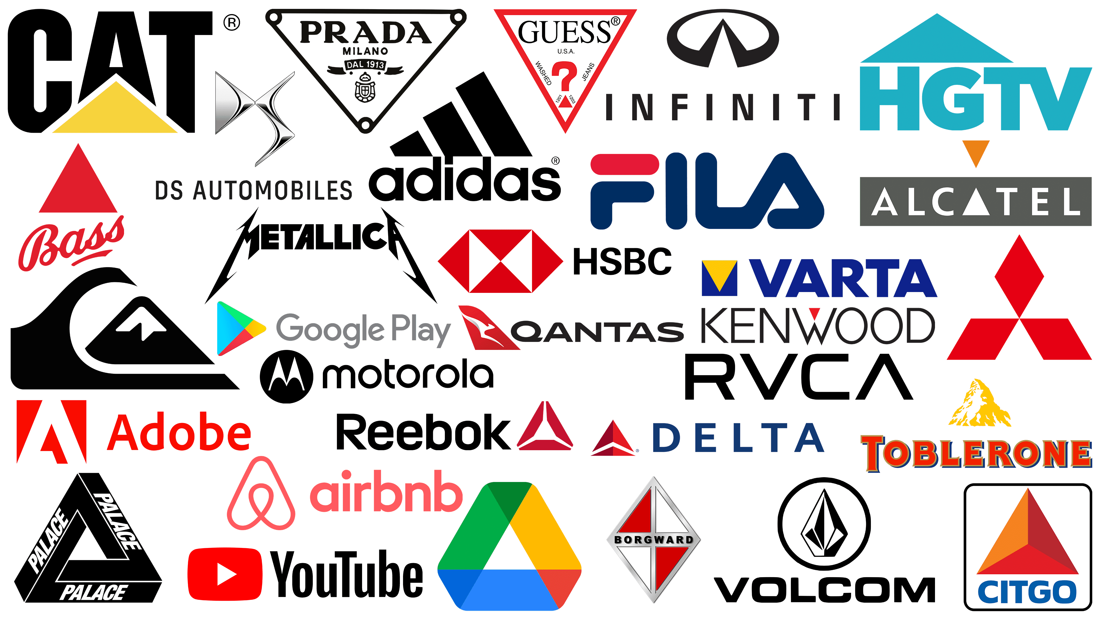
The design world has witnessed a proliferation of logos that utilize the powerful image of a triangle. For example, Google’s iconic “Play” sign or Fila’s striking word mark have both used this geometric shape to leave an indelible mark on their audiences’ minds.
Like colors and fonts, shapes play a key role in branding. They carry a specific connotation that can influence perception. Branding is a complex dance of visual elements deliberately chosen to convey a desired message about a brand or organization.
The square, balanced sides, and equal angles evoke a sense of reliability, groundedness, and solid foundation. It is often associated with brands that strive to create an image of reliability and consistency. On the other hand, the circle represents inclusiveness, wholeness, and unity. The continuous outline of the circle symbolizes communities and connections, making it a favorite for brands looking to build a sense of belonging.
Triangles, however, bring their unique twist. They are dynamic, evoking notions of cuteness, progress, and direction. Depending on their orientation, triangles can indicate upward movement, signifying growth and aspiration, or stability when placed on a flat base. Their boldness is often associated with brands that want to stand out, make a statement, or direct attention.
The field of logos dominated by triangles provides insight into how brands utilize the shape’s inherent qualities. Whether it’s a symbol of innovation, forward motion, or a disruptive stance, the triangle has proven its versatility in the hands of designers.
What do triangle logos mean? An introduction
Triangular logo design has a rich history and many interpretations. The triangle symbolized power, charisma, and masculinity in Druidic and Masonic circles. In pagan traditions, it was often personified as the feminine.
Like other geometric figures, triangles can carry different meanings. While squares signify stability, triangles often carry a dynamic aura, suggesting innovation and action. Their internal structure directs the viewer’s gaze, allowing designers to control perception. The Guess logo draws the eye with its downward-pointing triangle, creating a reflective stance. The rightward-pointing triangle of Google’s “Play” emblem indicates progress and forward movement.
It is worth noting the triangle’s adaptability in the design. When multiple triangles are combined, they can form intriguing patterns, each adding depth to the logo. Based on its orientation, a freestanding triangle can act as a focal point, directing the viewer’s attention.
The association of this geometric figure with research, progress, and evolution makes it a preferred choice in certain industries. Not surprisingly, triangular motifs often adorn logos in the technology sector, symbolizing cutting-edge innovation. Similarly, triangles, with their strength and forward-looking nature, resonate in industries such as construction and finance, projecting growth and stability. In the legal sector, where precision and clarity are paramount, the sharp edges of the triangle are also reflected. The fashion world is no stranger to bold statements and avant-garde design, where triangular patterns often symbolize modernity and trend.
With their versatile interpretation and dynamic geometry, triangles remain a favorite in logo design, resonating across industries and audiences.
Adidas
![]()
The globally recognized Adidas emblem features consecutive stripes that converge into a triangular shape. This symbolic pattern eventually became one of the main symbols in sportswear. The iconic image adorns the brand’s footwear, making it instantly recognizable to enthusiasts and casual observers.
The triangular configuration of the Adidas mark evokes images of mountain peaks. This visual metaphor subtly captures the essence of challenges, aspirations, and man’s relentless drive to overcome obstacles.
Adobe
![]()
Adobe, synonymous with cutting-edge design software, enjoys a well-deserved reputation worldwide. With a set of products often cited as industry benchmarks, it’s no wonder the company is highly respected by professionals and enthusiasts alike.
The emblem, complete with triangular elements, is at the heart of the company’s visual identity. These geometric shapes resemble the letter “A,” which anchors the brand’s uniqueness. But it’s not just an alphabetical representation. The upward-pointing triangles evoke thoughts of ascension and advancement.
Airbnb
![]()
With its iconic logo, Airbnb reimagined the use of triangular motifs in branding. Instead of a rigid triangle, their symbol is shaped like an inverted heart, with the edges curving gently. This evokes a sense of warmth and accessibility.
This uniquely shaped triangle serves a dual purpose: It captures the essence of hospitality and embodies the brand’s ethos of creating a sense of belonging for its users. Inside the emblem, a design resembles a pin on a map, subtly hinting at destinations and the idea of finding the perfect place to stay. Additionally, this silhouette resembles the letter “A,” inadvertently hinting at the brand’s name.
Including these elements in the Airbnb logo reflects the company’s commitment to connecting travelers with the perfect home away from home.
Alcatel
![]()
Alcatel’s emblem demonstrates a keen sense of geometric design and includes two triangles. One of the triangles, rendered in yellow-orange colors, points downward, drawing the eye toward the brand’s name. The letter “A” in the wordmark is not a typical letter design. A pure white triangle represents it, harmoniously mirroring its colored counterpart.
This symmetrical arrangement creates an aura of balance and harmony, which is very important for a brand based on seamless interaction. The repeating triangular motifs subtly emphasize the essence of interconnectivity. For a company in the communications equipment industry, this design aligns with the brand’s mission to facilitate easy communication across multiple platforms and channels.
Bass
![]()
The bright scarlet triangle synonymous with the Bass brand certainly stands out in the complex realm of beer emblems. With roots dating back to 1777, the Bass brand has carried its history through the tapestry of time, and its enduring position in today’s marketplace is largely due to its compelling graphic representation.
In 1876, this emblem carved its niche in the annals of branding. That year, it became the first trademark officially recognized by British regulatory authorities. The triangular design, colored a rich scarlet and pointing skyward, often symbolizes foresight and the relentless pursuit of development.
Borgward
![]()
Borgward Manufacturing Company, in its heyday, displayed an emblem featuring several triangles skillfully joined to form a distinct diamond pattern. This emblem, rendered in red and white colors, was not just a design but an embodiment of values. While Borgward may no longer dominate the market as it once did, its carefully crafted logo is a testament to the impact triangular motifs can have on branding without losing their relevance.
CAT
![]()
The emblem of CAT, a leading construction company, is a bright yellow triangle superimposed on the brand name. The bright hue of this triangle attracts attention and generates interest.
The choice of yellow color is not only for aesthetic reasons; it conveys emotion. This shade is often associated with optimism, vitality, and enlightenment.
Triangles are elementary geometric figures that radiate balance and solidity. When a construction equipment company uses this figure in its logo, it carries a certain meaning. It subtly hints at the strength and reliability of its products.
Citgo
![]()
Citgo is a prominent company in the oil and gas sector. This privately held company is known for its achievements in refining, transporting, and commercializing transportation fuels, petrochemicals, and lubricants. It has a wide presence, especially in the United States.
The Citgo emblem is not a simplistic triangular shape but a fusion of three triangles, each with a different hue. The design emphasizes the company’s diverse capabilities and the wide range of products it offers.
Delta Airlines
![]()
Delta is a well-known airline company with a prominent logo. Although the logo has undergone several changes, the triangular motif remains constant.
This symbolic shape corresponds to the company’s name, formed from the Greek letter “Delta,” which is triangular and serves a dual function. The skyward arrow subtly emphasizes the company’s core mission: to promote flight and connect the world to the sky. The triangle, conveying stability and upward momentum, reflects the desire for progress in aviation.
DS Automobiles
![]()
DS Automobiles, a well-known automobile manufacturer, boasts an emblem that, at first glance, may seem like a simple amalgamation of the letters “D” and “S,” representing the brand name. However, a deeper look reveals intricate triangular formations within these letters.
The inclusion of such geometric shapes serves a dual purpose. The triangles subtly hint at the brand’s perspective and innovation. Such details are not just a design choice but a conscious statement of the brand’s identity and vision.
Fila
![]()
The famous Italian clothing brand Fila exemplifies the ingenuity of intertwining geometric shapes in typographic design. Their brand mark’s final “A” design, which is characteristic of the mark, strikingly resembles a triangular shape rather than a traditional letter.
If one delves into the brand’s history, one can understand the purpose behind this design. Many people perceive it simply as a stylized letter, but there is more to it than meets the eye. It refers to the brand’s origins when it created clothes for people near these majestic mountains. By incorporating this subtle element into its logo, Fila stands out and pays homage to its roots, giving the brand a unique identity.
Google Drive
![]()
The Google Drive emblem appears to be a triangle with softened edges at a cursory glance. A closer look reveals a multi-faceted design. Inside the central part is another triangle, and three smaller triangles intersect at the intersection of clear color lines.
These varied colors and geometric shapes have deep significance. They symbolize the various tools and applications integral to the Google ecosystem. Each hue corresponds to a specific tool, such as Google Docs, Sheets, and Slides. In this logo, Google captures the essence of its platform—a single space for various functions.
Google Play
![]()
Google often uses triangles in its design. The Drive logo and the Google Play emblem also have this shape. The latter emblem resembles the universal “play” icon found on various devices such as media players, TV remotes, and other digital platforms, similar to the YouTube sign.
The rectangular triangle is globally associated with progression, forward movement, and dynamism. In many cultures and contexts, it symbolizes pushing boundaries, moving forward, and initiating action.
Guess
![]()
The recognizable and eye-catching Guess emblem is a testament to the power of innovative fashion branding. Although the triangle is not present on all products, its presence is undeniable in many of the company’s clothing collections and promotions.
This logo’s bright hue and distinct shape evoke liveliness and enthusiasm. The triangular motif, intriguingly pointing downwards, departs from the traditional upward design and signifies a unique combination of ingenuity and originality.
The triangular-shaped question mark further emphasizes the brand’s desire to combine curiosity with style in high fashion.
HGTV
![]()
HGTV is a well-known television network with the acronym Home & Garden Television, owned by Warner Media and Discovery. Targeting an audience that enjoys home improvement and real estate, the channel offers a wealth of content on these topics.
In HGTV’s visual presentation, the triangular motif is not just a random geometric inclusion. This shape above the brand’s lettering echoes the silhouette of a home’s roof. It subtly conveys the concepts of progress, evolution, and limitless horizons of possibilities in home and garden improvement.
HSBC
![]()
With its geometric appeal, the HSBC logo initially appears abstract. However, a closer look reveals an elaborate composition of six triangles. This intricate arrangement creates the illusion of a container revealing its contents.
The palette, dominated by the red and white hues in the triangles, carries more than just aesthetic appeal. Red traditionally denotes energy, vigor, and determination, while white denotes purity, clarity, and precision.
Beyond colors, combining triangles in a quasi-square design is not just a random artistic choice. It subtly conveys the bank’s underlying solidity, steadfastness, and unwavering loyalty to its customers worldwide.
Infiniti
![]()
The triangle has long been a favored geometric figure in automobile brand imagery. Consider the emblem of the famous Japanese automobile brand Infiniti, made in the style of “master class. ” This emblem is a triangle with negative space enclosed in an oval.
The triangular shape conjures up the image of a road smoothly merging with the distant horizon. This image symbolizes Infiniti’s unwavering commitment to developing its lineup, especially its ambitions for electric and hybrid vehicles.
Kenwood
![]()
With understated elegance, the Kenwood emblem combines a simple sans-serif font with a bright red triangle, making it an eye-catching centerpiece. This design choice sets the brand apart in a competitive market and carries significant symbolic value.
The triangle stands out in its orientation and symbolizes innovation, peak performance, and a solid foundation. Gracefully placed at its apex, it conveys a sense of balance and precision. These design elements emphasize Kenwood’s commitment to excellence and industry-leading breakthroughs. The choice of red for the triangle further emphasizes its significance by highlighting passion, energy, and determination.
Metallica
![]()
Metallica, a name with deep resonance in the music industry, uniquely, albeit in a different way, captures the essence of triangles in its branding. Known for their sharp angles, triangular shapes naturally convey notions of edginess, aggression, and departure from the norm.
Metallica’s symbolic representation prominently emphasizes the sharpness of the letter “A” at the center of its name. In addition, the first and last characters of the name have a pronounced angularity. The band’s emblem reflects its aggressive, innovative spirit and is a testament to its legendary status in rock music.
Mitsubishi
![]()
The Mitsubishi emblem contains complex design elements that are not immediately noticeable. The three diamonds are the first to catch the eye, but the negative space between them is equally important.
These individual triangular spaces, converging at the center, convey a theme of fusion and cohesion. The design suggests a gathering point or node, subtly hinting at unity and collaboration.
When viewed holistically, the trio of diamonds generally echoes the theme of the triangle. The apex of this large triangle points skyward, indicating an upward trajectory. The Mitsubishi emblem conveys the brand’s uniqueness based on progress, research, and relentless forward movement.
Motorola
![]()
The Motorola logo, depicting a stylized letter “M,” has a deep symbolic meaning. The two pronounced peaks of the letter “M” evoke images of towering mountain ranges. A triangle is thoughtfully embedded in the design in the negative space between the two vertices.
Including geometric elements further emphasizes Motorola’s commitment to pushing boundaries and continual development. By employing this design, Motorola differentiates itself from many other telecommunications brands that lack recognizable geometric motifs.
Palace
![]()
Winning gold in extreme sports, Palace skateboards offer a new take on the classic triangular motif. Their distinctive design creates a mesmerizing optical illusion that captures the observer’s attention and stimulates cognitive intrigue. Palace Skateboards showcases its products and epitomizes the dynamic, free-spirited nature of skateboard culture.
Prada
![]()
Prada, a well-known fashion company, uses various emblems and symbols across its products and promotional materials. The emblem, which contains the brand name, the city of origin, and the foundation year in a downward-pointing triangle, is particularly notable.
The choice of an inverted triangle in the design has a multifaceted purpose. First, it directs the observer’s gaze downwards, naturally drawing it towards the focal point, often the garment or accessory it adorns.
Qantas
![]()
The Qantas badge is a unique geometric shape resembling a triangle, with a curved top that forms a diamond. The design is influenced by the tail section of the Qantas airplane, which serves as a visual embodiment of the brand’s core business: aviation. The upward-pointing apex of the triangle symbolizes ascension, pointing to the boundless skies and limitless possibilities of air travel. This choice of flight design underscores Qantas’ commitment to raising standards and improving the passenger experience.
Quiksilver
![]()
Founded in 1969, Quiksilver has carved out a special niche in surfwear, targeting a specific group of enthusiasts and athletes. Since its inception, the brand has expanded its horizons, reaching a global audience with its unique offerings.
The Quiksilver badge is a collection of abstract triangles shaped like a mountain. This design choice symbolizes the formidable force of nature and reflects the relentless waves surfers struggle with.
The upward-pointing arrows emphasize the Quiksilver logo’s perspective. These arrows signify sublimity and reflect the brand’s desire to evolve its ambition. This subtly emphasizes that Quiksilver is more than just clothing; it’s about pushing boundaries, chasing dreams, and the spirit of adventure.
Reebok
![]()
Reebok’s branding often features triangular patterns, a testament to its ability to utilize geometry in its visual identity. The distinctive triangular slashes can be found on many of Reebok’s footwear models. The modern emblem, dubbed “Delta,” intertwines three different geometric components, resulting in a triangular design.
Unlike some of the industry’s sharper triangular logos, the “Delta” emblem exudes a softer aura. The softened edges and truncated corners give the logo a friendly, approachable character. These design nuances hint at Reebok’s commitment to progress and creativity while creating an aura of inclusivity and warmth.
RVCA
![]()
Founded in 1999, RVCA is a testament to the burgeoning California fashion scene. The brand’s emblem has an eye-catching element: the central part of the letter “A” resembles an inverted “V,” echoing the shape of a triangle.
The interaction of the letters “V” and “A” in the RVCA logo is not just a design choice; it symbolizes the brand’s core values. By creating a logo that seamlessly combines these two letters, RVCA visually conveys its ethos of harmonizing “opposites” by bringing together contrasting worlds and ideals. This innovative design strategy emphasizes the brand’s unique identity in the fashion industry.
Toblerone
![]()
Triangular shapes, prevalent in both natural and man-made structures, evoke a sense of familiarity and stability. These triangular shapes are evident in towering mountain tops, gentle hills, and architectural structures, including bridges and skyscrapers.
One prime example of this design philosophy is the Toblerone logo. The logo depicts a golden triangular mountain that echoes the famous Swiss Matterhorn. The design serves a dual purpose: it solidifies Toblerone’s identity rooted in its Swiss heritage, showcases the brand’s rich heritage, and subtly emphasizes its commitment to using pure, natural ingredients in its confectionery products.
Varta
![]()
With deep roots in battery manufacturing, German company Varta has carved out a niche in the industrial, consumer, and automotive segments. Although the company cannot match the popularity of other world-renowned brands, its emblem stands out.
The Varta emblem is an inverted yellow triangle. This geometric figure cleverly hints at the initial letter “V” in the brand name. The triangle design resembles a flashlight beam. This design choice subtly emphasizes the variety of applications for Varta batteries, highlighting how their products power and light various devices. The triangular motif in the emblem enhances brand recognition in the battery technology sector.
Volcom
![]()
Volcom, the quintessential lifestyle brand, showcases a striking emblem affectionately called “the rock.” This emblem skillfully combines geometric elements rendered in monochromatic tones to create a dynamic 3D look. Two downward-pointing triangles encompass the central rhombus in its design, creating a whimsical intertwining of shapes.
Volcom’s logo design mesmerizes the viewer and gives it a certain edginess. Given that Volcom is closely associated with high-adrenaline sports such as snowboarding and skateboarding, “Stone” is a fitting illustration.
YouTube
![]()
While the YouTube emblem is not always a prominent white triangle on a red background, it is deeply ingrained in the collective consciousness of Internet users. This branded design is often seen when installing the YouTube mobile app.
In Western culture, this triangle pointing to the right has significant symbolism. Pointing to the right is often synonymous with moving forward, making progress. In the context of YouTube, this triangle further emphasizes the platform’s role in developing digital content, pushing boundaries, and the constant evolution of online media. The simplicity of this symbol, combined with its universally understood message, makes it an effective and powerful branding tool. It stands for video playback and symbolizes the constant development and innovation of the digital age.
Using logos with triangles
In logo design, the triangle is a formidable symbol that has been the subject of numerous interpretations. The symbolic presence of this geometric figure in numerous famous logos underscores its versatility in representing diverse concepts and ideas.
A closer look at using the triangle in branding reveals complex nuances. The triangle’s precise placement, style, and orientation can provide many insights into the brand it represents. This attention to detail can greatly shape and guide the brand narrative.
Sharp triangles tend to exude an aura of boldness, determination, and innovation. This design often resonates with brands that pride themselves on breaking new ground or championing avant-garde innovation. Triangles with softer, rounded edges evoke associations with unity, warmth, and sociability. They embrace each other visually, reflecting the brand’s penchant for collaboration and inclusivity.
The orientation of the triangle further emphasizes its communicative qualities. If it is pointing to the right, it indicates dynamism, continuity, and steady movement into the future. A triangle pointing upward serves as a beacon of aspiration, hinting at the brand’s upward trajectory and its constant striving for perfection and invention.
Experts are necessary to crystallize the brand’s ethics in a triangular logo. Experienced graphic design professionals can be invaluable in this endeavor. They have the insight to determine the optimal logo design that captures the brand’s essence and resonates deeply with the audience.