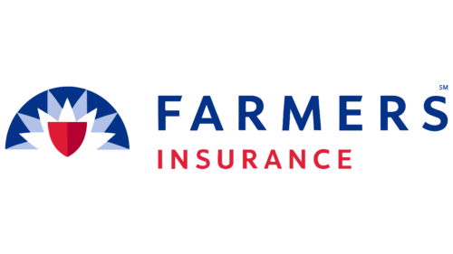
The designers who created the Farmers Insurance logo built on the company’s long heritage and the first emblem, designed in 1928. They retained two iconic elements: the shield and the rising sun. The shield symbolizes protection, and the rays represent the hope and optimism of each new day.
Farmers Insurance: Brand overview
| Founded: | 1928 |
| Founder: | John C. Tyler, Thomas E. Leavey |
| Headquarters: | Los Angeles, California, U.S. |
| Website: | farmers.com |
Farmers Insurance is the third largest insurance group in the United States of America. Its founding year was 1928, when Thomas E. Leavey and John C. Tyler founded and ran the Farmers Automobile Inter-Insurance Exchange with a loan from Bank of America. They started with auto insurance, then moved on to home insurance and other types of services.
The Farmers group includes three companies that provide insurance services throughout the United States. There is also a division of Farmers Financial Solutions, LLC., offering a range of financial products to clients.
Meaning and History
The trademark has a recognizable identity, including a logo with a shield and a rising sun. He looks optimistic and, at the same time, inspires hope for a better future. The graphic symbol has changed several times, which was facilitated by the transition to new design standards in connection with the evolution of style.
What is Farmers Insurance?
Farmers Insurance is a common brand of three insurers: Truck, Fire, and Farmers. It is also one of the business segments of the Swiss insurance company Zurich Insurance Group Ltd. It provides Farmers Management Services, which includes property, life, motorcycle, auto, and home insurance.
1928 – the 1940s
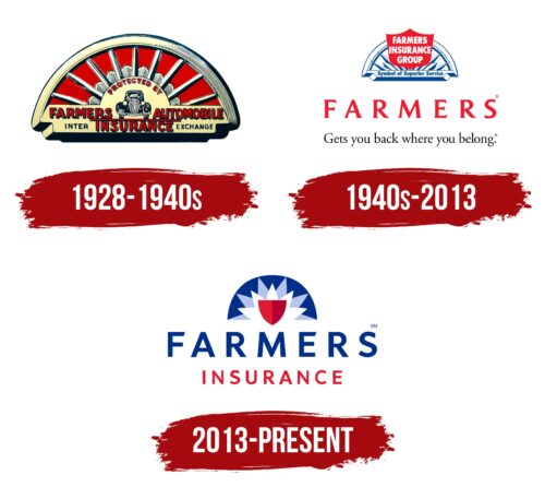
Thomas E. Leavey and John C. Tyler decided to start their own auto insurance company in the early 1920s. They believed that ranchers and farmers were careful drivers and deserved low insurance premiums. In 1927, two entrepreneurs took out a loan from Bank of America and a year later opened their own company with this money and called it Farmers Automobile Inter-Insurance Exchange. The organization’s logo was fan-shaped because the upper half of the rising sun was depicted inside it. The rays, of which there were nine in total, resembled sword blades. Each of them consisted of two multi-colored halves: dark and light. And between the rays were short and wide elements, similar to stylized flower petals.
The semicircle of the sun formed the basis for a small dark gray car. The car stood on a long horizontal line and was surrounded by inscriptions. The phrase “PROTECTED BY” formed an arch at the top. On the left was the word “FARMERS”; on the right – was “AUTOMOBILE,” below – “INTER INSURANCE EXCHANGE.” The bold red font was used for the text, and only “INTER” and “EXCHANGE” were written in thin black letters. The base on which the beams were placed was red. The frame and the sun are light yellow, while the shadows and outlines are dark gray.
1940s – 2013
During this period, a new important element appeared on the Farmers Insurance emblem – a large red shield. It occupied the central part, and in the background was a white and blue composition of the sun and a high arch. The rays had different sizes and now, even more, resembled sword blades because they had pointed at the ends. Inside the shield was a white three-level inscription, “FARMERS INSURANCE GROUP.” All letters were capital, bold, and had no serifs. In a frame under the sun was the phrase “Symbol of Superior Service” in blue.
At the very bottom, there was a place for a few more inscriptions. The first is the wordmark “FARMERS,” consisting of contrasting glyphs with short sharp serifs. And in the second line was the phrase “Gets you back where you belong,” with a dot at the end. It was black and smaller than the brand name. The designers specifically placed the company’s motto on the logo to emphasize its advantages and show the advertising concept.
2013 – today
The insurance group’s in-house designers created the new Farmers Insurance logo in creative partnership with New York-based Lippincott. The “Gets you back where you belong” slogan has been removed because it is no longer used: the 2013 advertising campaign was based on the slogan “We Believe in Smart.” The redesigned badge was chosen for its digital compatibility. Companies must adapt their visual symbols to large and small screens to stand out in today’s insurance market. For Farmers Insurance, this was especially important because its logo was last updated in the middle of the last century.
At the same time, the emblem’s designers tried to preserve the 85-year heritage of the Los Angeles insurance group and relied on the first graphic sign, introduced in 1928. They depicted the rising sun as a white flower with five triangular petals, in between which are depicted additional light-blue petals. In the sun’s center is a red shield, divided into two halves with different shades. The background for the picture is an uneven dark blue semicircle. The organization’s name is written at the bottom: on one line is the blue word “FARMERS”; on the other is the red “INSURANCE.”
The rising sun on the Farmers Insurance emblem represents warmth, hope, optimism, and positive expectations. In turn, the shield is a symbol of security and reliability. Together they represent an insurance company that protects clients’ financial interests and inspires confidence.
Font and Colors
The organization’s name uses a sans-serif typeface similar to Frutiger Bold Italic by Adrian Frutiger. The designers have converted both words to uppercase so that they are visible and highlighted them with two rich colors: red and blue. The shield is also red, but its right half is darker than the left. The stylized sun is white and light blue, while the base behind it is dark blue.
Farmers Insurance color codes
| Air Force Blue | Hex color: | #003088 |
|---|---|---|
| RGB: | 0 48 136 | |
| CMYK: | 100 65 0 47 | |
| Pantone: | PMS 661 C |
| Light Steel Blue | Hex color: | #b5c4eb |
|---|---|---|
| RGB: | 181 196 235 | |
| CMYK: | 23 17 0 8 | |
| Pantone: | PMS 658 C |
| Crimson Glory | Hex color: | #b30032 |
|---|---|---|
| RGB: | 179 0 50 | |
| CMYK: | 0 100 72 30 | |
| Pantone: | PMS 186 C |
| Medium Candy Apple Red | Hex color: | #e21931 |
|---|---|---|
| RGB: | 226 26 49 | |
| CMYK: | 0 89 78 11 | |
| Pantone: | PMS 185 C |
