![]() FCA Logo PNG
FCA Logo PNG
The designers who created the FCA logo incorporated the organization’s name into it. It is presented in two versions: full and abbreviated. The abbreviation is located on the left side and partially inscribed in a parallelogram. The phrase “FINANCIAL CONDUCT AUTHORITY” is in the right part of the emblem and occupies three lines.
The roots of the UK Financial Conduct Authority go back to 1985, when the Securities and Investments Board, or SIB, was created. At the time, financial services were overseen by separate bodies for different sectors. In 1997, the UK Treasury began forming a single financial regulator, the Financial Services Authority, or FSA. The Financial Services and Markets Act 2000 gave it legal powers, and on December 1, 2001, the FSA formally began work.
The unified model reflected a broader regulatory shift, also evident in bodies such as the US Securities and Exchange Commission, founded in 1934, and Germany’s BaFin, founded in 2002. The 2008 financial crisis damaged the FSA’s standing after major bank failures. Its reputation was further weakened by the PPI mis-selling scandal and the LIBOR manipulation scandal, in which major banks falsified benchmark rates for their own benefit.
In June 2010, the government announced that the FSA would be abolished. The Financial Services Act 2012 created the legal basis for the change. On April 1, 2013, the FSA was replaced by the Financial Conduct Authority and the Prudential Regulation Authority. FCA took responsibility for market conduct and consumer protection, while PRA oversaw major banks, insurers, and investment firms.
FCA is independent of government and funded by fees from the financial industry. It later imposed major penalties, including £87.5 million against RBS in 2013, £226.8 million against Deutsche Bank in 2015, and £1.1 billion across five banks for foreign exchange misconduct. It launched Project Innovate and the regulatory sandbox for fintech testing. In 2020, Nikhil Rathi replaced Andrew Bailey as chief executive, introduced Consumer Duty, led listing reforms, and was reappointed in 2025 until September 2030.
Meaning and History
![]()
The Financial Conduct Authority, better known as FCA, uses both versions of its name in the logo. Its first wordmark appeared in 2013 when the Financial Services Act 2012 came into force, implying the abolition of the Financial Services Authority and the creation of a new financial control system in the UK. Designers played with the three letters of the abbreviation, presenting them in the negative space of different colors. Later, they changed the emblem’s structure, making it more minimalist. The design work involved separating the inscriptions and removing a common base.
What is FCA?
FCA is the Financial Conduct Authority. It is an independent body from the UK government that oversees financial institutions. It was formed in 2013 and replaced its predecessor, the Financial Services Authority. Its controlled objects are mutual aid cashiers, banking firms, and independent financial consultants.
2013 – 2017
![]()
The first logo took the form of a bank card: a horizontally oriented rectangle with rounded corners. The designers specifically sought such an association because FCA has controlled banks, credit unions, and independent financial consultants since its inception. However, the emblem’s base was not solid: the central part was missing from the top half. In its place was a white depression shaped like a parallelogram. All the remaining space was painted in a burgundy gradient with many light, wavy horizontal lines.
At the top was the abbreviation “FCA.” The white “F” and “A” occupied the free space on the sides, while the burgundy “C” with a striped pattern was in the middle, where the base was missing a part. Below the large letters, the phrase “FINANCIAL SERVICES AUTHORITY” was written in small font. All the glyphs were uppercase and had short, sharp serifs.
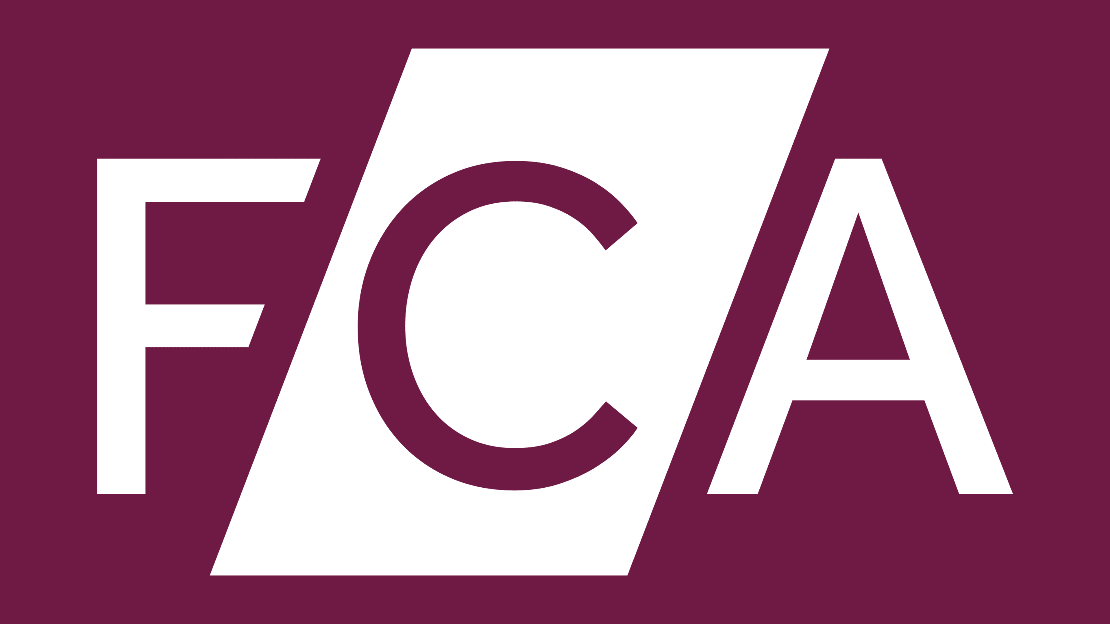
2017 – today
![]()
In 2017, advertising giant Saatchi & Saatchi developed the current logo for the regulator, receiving £57,600 for the entire range of services. After the redesign, which was timed to coincide with the move to new offices in Stratford, the common base disappeared. The letters “FCA” were on the left side, with two of them (“F” and “A”) now in purple, on a blank white background, while the middle “C” was painted white and placed inside a purple parallelogram.
The cuts at the ends of the horizontal strokes of “F” and the slant of the left diagonal of “A” are parallel to the quadrilateral’s sides, creating visual harmony. The organization’s full name is written to the right of the abbreviation and divided into three lines with left-aligned text. The bold sans-serif font looks imposing and solid.
The geometric symmetry and clear shapes make the FCA logo consistent with the essence of this organization. After all, it should be associated with correctness, structure, consistency, reliability, and incorruptibility. At the same time, the emblem is disproportionate: the white letter “C” inside the purple parallelogram stands out from the overall picture. This demonstrates the Financial Conduct Authority’s innovation and modernity.
Font and Colors
When creating the new logo for FCA, the designers at Saatchi & Saatchi started with the idea that the words “FINANCIAL CONDUCT AUTHORITY” should be highly visible, clear, and legible. Therefore, they used a bold sans-serif font for the inscription, similar to Durotype’s Aspira Wide Bold. Notably, the standalone letter “F” in the abbreviation has been cut at the ends, parallel to the adjacent side of the parallelogram. The main colors of the wordmark are white and purple.