


![]() Feeding America Logo PNG
Feeding America Logo PNG
The Feeding America logo illustrates the company’s commitment to food security. The organization distributes fresh food and helps the hungry across the country. Hence, its emblem is associated with care and overall well-being.
Feeding America grew from John van Hengel’s work in Phoenix, Arizona, in the late 1960s. While volunteering in a charity kitchen, he saw grocery stores, farms, and restaurants discarding usable food. At the same time, people in the same city struggled to eat. He began building contacts with local supermarkets and farms, asking them to donate surplus products rather than send them to waste.
In 1967, van Hengel opened St. Mary’s Food Bank, the first food bank of its kind. The model was based on a simple storage principle: donated food could be collected in one place, kept safely, and distributed through charities. The idea spread during the 1970s, as food banks appeared in other U.S. cities. However, many still worked separately and without shared standards.
In 1979, van Hengel founded America’s Second Harvest to connect regional food banks into a national network. The organization linked local banks with food producers, retailers, farmers, and community agencies. It accepted surplus goods, near-expiration products, and items with damaged packaging, giving companies a practical alternative to disposal. Legal protection for food donors helped reduce fears of lawsuits and encouraged larger corporate donations.
During the 1980s and 1990s, America’s Second Harvest expanded its network, established standards for storage and transport, and trained staff and volunteers. It represented hunger-relief issues at the federal level. In 2008, it was renamed Feeding America. By the early 2010s, it connected about 200 regional food banks with 60,000 local partners, including pantries, shelters, and meal programs. Its work existed alongside SNAP, while Bread for the World focused more on food policy and legislation.
Meaning and History
![]()
Until 2008, the charitable organization was known as America’s Second Harvest. However, despite its nearly 29-year existence, this brand was not well-known to the general public. The company changed its visual identity to draw attention to its efforts to help the hungry. Its new name, Feeding America, motivates the public to fight the hunger crisis in the United States and ensure universal food security. The logo serves the same purpose: it communicates that the organization distributes fresh, healthy food across the country.
What is Feeding America?
Feeding America is a distributor of food aid. The organization oversees the activities of food banks in the U.S. and is involved in the fair distribution of food among those in need. It was founded in 1979 by volunteer John van Hengel and was originally known as America’s Second Harvest. The company expanded in 2001 by merging with Foodchain, and in 2008, it adopted its current name.
1979 – 2008
![]()
The emblem features the company’s old name: “America’s Second Harvest”. It is positioned at the top and split into two lines, aligned to the left. Beneath it is the phrase “The Nation’s Food Bank Network,” also two-tiered but aligned to the right. The same bold font with narrow, vertically stretched letters is used for both parts of the inscription. The colors differ: the top half is gray, while the bottom is blue.
Between them is a trapezoid, stylized as a picnic mat. The checkered pattern mimics the red, white, and blue U.S. flag. The image is associated with outdoor dining, yet paradoxically, the mat is empty; nothing lies on it. It symbolizes the millions of Americans facing hunger, reminding us that the organization’s main task is to provide food to all in need.
2008 – today
![]()
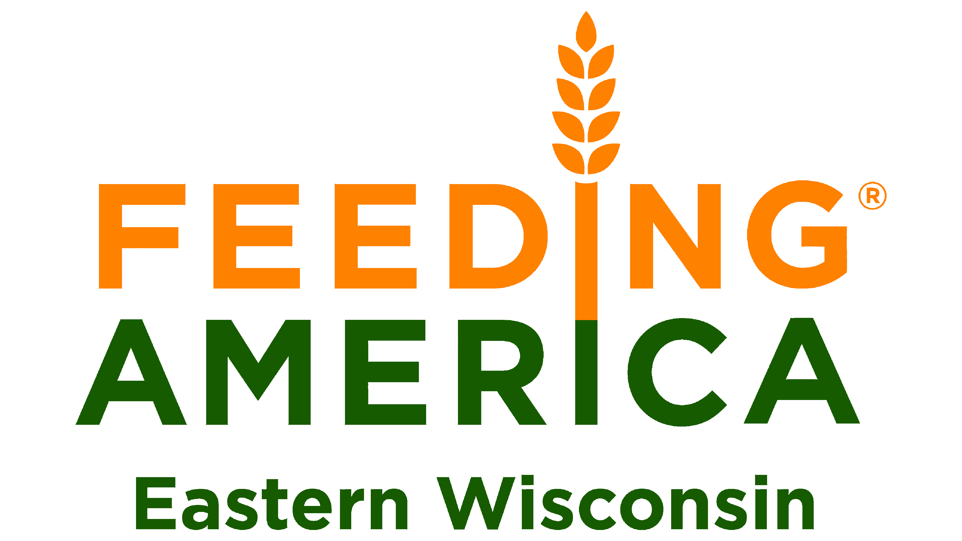
In 2008, the company underwent rebranding to further associate with food security. It changed its name to Feeding America and incorporated it into its new logo. The inscription is in a balanced, sans-serif font with wide letter spacing. Instead of the familiar U.S. flag colors, a different palette is used: orange and olive.
The words are positioned one below the other, so the two “I”s on different lines align to form a continuous vertical stripe. Designers have depicted this as a wheat stalk with a characteristic grain pattern at the top. Wheat, a primary food source in world culture, symbolizes satiety, prosperity, and fertility. Its ability to grow and develop represents Feeding America’s expansion and commitment to a global solution to hunger in the U.S.
Font and Colors
Until 2008, the company favored a narrow font with elongated letters. After renaming, it switched to a more readable typeface, bold grotesque, adapted for the digital space.
The orange color of the logo is associated with fresh baked goods, vegetables, and fruits. It symbolizes the sun and hope as Feeding America comes to the aid of those in difficult situations. Olive color, in turn, highlights the importance of healthy eating and the connection with eco-friendly food production methods.