The symbols of the emblem contain diversity and harmony. The Fendi logo is stylish and perfectly balanced, as is the image that the company’s accessories create. The company offers a full range of products for a flawless toilet.
Fendi: Brand overview
| Founded: | 1925 |
| Founder: | Adele and Edoardo Fendi |
| Headquarters: | Rome, Italy |
| Website: | fendi.com |
Meaning and History
The Fendi fashion house is named after its creators – spouses Adele Fendi and Edoardo Fendi. Adele opened his first store in 1918, but the company’s official founding date was 1925, when the young entrepreneur married Edoardo. Later, all their children joined the business – five daughters who saved the family business after World War II. Together, they returned Fendi to its status as a prestigious manufacturer.
They would have failed if it hadn’t been for Karl Lagerfeld. He was first hired to modernize a fur line, but in 1962 the German designer signed a lifetime contract and was appointed Creative Director to lay the foundation for the new brand. He completely changed the style of the collections, transforming rough and heavy clothes into sophisticated and flying outfits. In addition, the “king of fashion” influenced Fendi’s image. Lagerfeld designed the famous Double F, believing that the emblem is the core of any globally recognized brand.
The monogrammed symbol once adorned most Fendi products. It was on clasps, straps, bracelets, the inner lining of bags. It was used on jacquard fabric in black and tobacco colors. The letter emblem became especially popular in the 1980s. However, with the onset of the new millennium, it faded into the background: it was completely replaced by the logo with the inscription “FENDI.” The Double F received a second life in 2018. After a revival, the iconic sign retained the spirit of the original but took on a modified form and was downgraded to the status of a secondary symbol.
What is Fendi?
Fendi is a fashion house from Rome owned by the conglomerate LVMH Moët Hennessy Louis Vuitton. It was named after its founders, who opened a shop selling fur and leather goods in 1925. Since then, the company has repeatedly returned to leather and fur products, creating exclusive collections using expensive materials. Currently, it produces accessories, clothing, footwear, and perfumes, adhering to the principles of luxury and innovation.
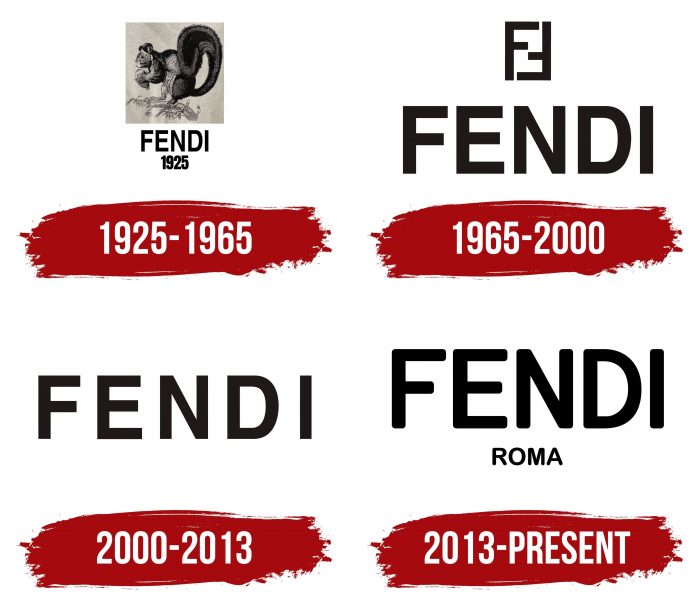
1925 – 1965
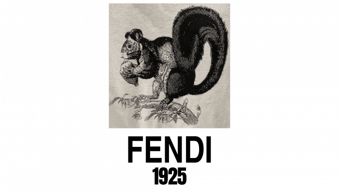
The badge, consisting of two letters “F,” appeared only after the arrival of Karl Lagerfeld. Before that, the company’s mascot was a squirrel that gnawed a nut while sitting on a tree branch. The illustration was inside a light yellow square, and the free space below it was occupied by the name and year of the company foundation. The lettering “FENDI 1925” was blue-green.
The squirrel image was not chosen by chance. Edoardo compared his wife to this animal because she was constantly working. So the brand’s debut logo was very symbolic for the Fendi family.
1965 – 2000
In the early 1960s. Karl Lagerfeld created the iconic double FF badge known as the inverted Zucca. Later, the Parisian designer admitted in an interview that it took him only three seconds. The inspiration came from the first meeting with the Fendi sisters, who made Karl Lagerfeld the brand’s artistic director. The designer did not even imagine how famous the result of his lightning-fast creativity would become.
In addition, in 1965, the company began to use a minimalist wordmark containing the single word “FENDI” instead of the squirrel logo. The short lettering consisted of sans serif bold capital letters, with all strokes of the same thickness. The Double F symbol was placed on top.
2000 – 2013
The inverted Zucca became incredibly popular, reaching its peak in the mid-1980s. But by the early 1990s, people stopped wearing clothing with emblems because such things were considered bad taste. Therefore, the fashion house has abandoned its iconic monogram of the letters “FF,” retaining only the stylish lettering. The shapes and proportions of the signs have not changed.
2013 – today
In 2013, the designers updated the text on the logo for the first time. They rounded the edges of the letters so that not a single corner was left. The word “ROMA” is written in the same font, which appeared at the bottom. It denotes the city where the company was founded. This version of the identity is very similar to the very first sign in 1925. At least the developers tried to draw parallels between them.
In the distant past, Fendi had a monogrammed emblem of two Fs. One letter (on the left) stood straight, and the other (on the right) was in an inverted position so that together they formed a rectangular shape. This symbol represented the core of the Karl Lagerfeld concept, which can be summed up in the words “Fun Furs.” According to another version, two “F” were taken from the founders of the company: Adele Fendi and Edoardo Fendi.
The company used its iconic sign, decorating absolutely everything with it – from clothes to accessories. But he exhausted himself when minimalism came into fashion, and world manufacturers abandoned the obsessive desire to cover dresses, T-shirts, and bags with their emblems. Following current trends, Fendi has removed the Double F from the main logo.
Font and Colors
The company name has always been written in capital letters using a bold sans serif typeface. Previously, the fashion house favored Helvetica Bold. Linotype Foundry published this grotesque in 1983. The typographers who developed it adhered to the concept of simplicity, purity, and minimalism, which perfectly complemented the Fendi aesthetic. In 2013, designers chose a custom typeface for the word mark with rounded ends similar to Sommet Rounded.
The main logo color is black (# 000000), although Fendi branding guidelines also allow white lettering on dark backgrounds. This combination (black plus white) symbolizes elegance and excellence. Another valid color is yellow (# FDDB00). According to official documents, both the name of the company and the surrounding space can be painted with it. The exact choice of palette depends on the visual context because the Fendi brand must always create contrast.
Fendi color codes
| Black | Hex color: | #000000 |
|---|---|---|
| RGB: | 0 0 0 | |
| CMYK: | 0 0 0 100 | |
| Pantone: | PMS Process Black C |


