The players in the team are nurtured like green sprouts. Thanks to care and protection, they grow into strong athletes for the glory of Turkey. The Fenerbahçe logo tells the story of one of the country’s landmarks, the memory of which the club passes on to the younger generation.
Fenerbahce: Brand overview
| Founded: | 3 May 1907 |
| Founder: | Ziya Songülen, Ayetullah Bey, Necip Okaner |
| Headquarters: | Istanbul, Turkey |
| Website: | fenerbahce.org |
Fenerbahçe is a kind of memorial to the lighthouse that rises in the Kadiköy district of Istanbul. Even its name speaks about it: the word “fener” is translated as “lighthouse,” and “bahçe” means “garden.” The theory is supported by the fact that the first form of the club was yellow and white because daffodils of the same color grew around the lighthouse.
Founded in 1907, Fenerbahçe Spor Kulübü initially acted as an underground organization because Sultan Abdul Hamid II banned the Turks from playing football. It came out of the shadows only in 1908, when a decree appeared on sports teams’ compulsory registration.
Meaning and History
The lighthouse influenced not only the players’ name and shape – it was even reflected in the first Fenerbahçe emblem, which was yellow and white. But then Ziya Songülen chose the new official colors of the club: blue and yellow. To match the graphic sign, the original design was changed in 1910.
What is Fenerbahçe?
Fenerbahçe is a professional football team from Turkey. Its base is located in Istanbul, and the team is a member of the Super League, never having been relegated from it. It is the most successful sports club in the country, competing in the UEFA Europa League and the Turkish Cup. The club was founded in 1907.
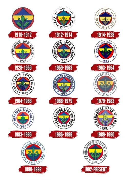
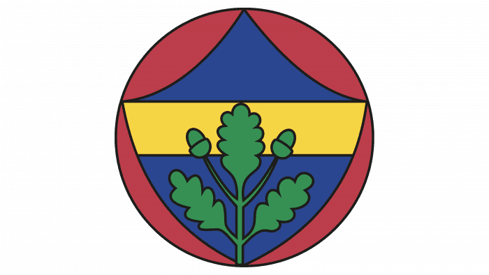
1910 – 1912
The logo was designed by Hikmet Topuzer – Fenerbahçe’s right-winger. He drew a red circle containing a blue and yellow shield with three green oak leaves and two acorns.
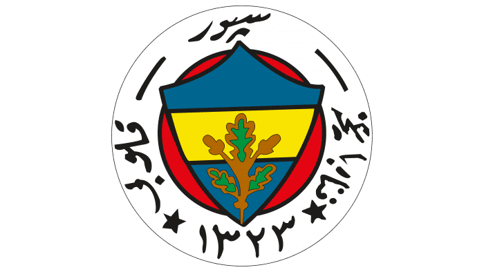
1912 – 1914
The designers extended the shield and made the bottom corner sharp, so it no longer fits into the circle. The oak branch turned brownish-green. A-frame appeared in the form of a white ring with black outlines and the club’s name, written in Arabic letters.
1914 – 1928
The new emblem uses dark shades of the same colors as before. Only black and brown are gone: the inscription, the outlines, and the oak branch are now golden.
1928 – 1959
Another redesign took place in 1928, immediately after the reform of the Turkish language. Arabic letters were replaced with European ones so that the inscription in the ring became “FENERBAHÇE SPOR KULÜBÜ 1907”. At the same time, it turned black again, like the only remaining outline.
The oak branch is completely green – it doesn’t even have a dark outline. The shield has been reduced to fit entirely within the red circle. Primary colors are lighter and brighter than the previous version.
1959 – 1963
The designers have updated the centerpiece with a circle, shield, and oak branch, replacing it with the Hikmet Topuzer emblem. Also, they expanded the outer outline and separated the year of the club’s creation with two bold dots.
1963 – 1964
The inscription’s font has changed: now the letters are blue, thin, small, and have practically no spacing. The dots next to the number “1907” have turned into two five-pointed stars. Not without metamorphosis in the graphic part: acorns on the branch became two additional leaves. Very intense colors were used for the shield and circle.
1964 – 1968
Fenerbahçe brought back the 1959-1963 logo but retained a five-leafed oak and two stars separating the club’s name from the foundation year. The palette is muted again.
1968 – 1979
The lettering and outlines around the edges of the ring have turned blue. The extra leaves turned into acorns again. The remaining three leaves have detailed veins. The colors are light for the first time in many years.
1979 – 1983
The contours and letters are thin. The oak branch is enlarged: it is so large that it takes up almost all the shield space. The color scheme includes dark and very pale shades.
1983 – 1986
The designers expanded the white ring by reducing the red circle with the shield. The oak branch also became smaller, and the shape of the top leaf changed noticeably. The lettering and outer outline of the logo are blue. The colors are not as muted as in the previous version.
1986 – 1989
The shield has acquired a triangular shape, due to which the proportions of the red circle are violated. The white ring is outlined in black on both sides. The letters and numbers are also black, and they are increased in size and moved closer to the center.
1989 – 1990
The red circle is expanded again. The undersides of the shield are rounded. The oak branch is large and detailed. The brightness of the color palette is reduced.
1990 – 1992
All contours, except the outer one, have disappeared again. Items in the white ring turn blue. The oak branch is the same schematic as on the 1979-1983 emblem.
1992 – today
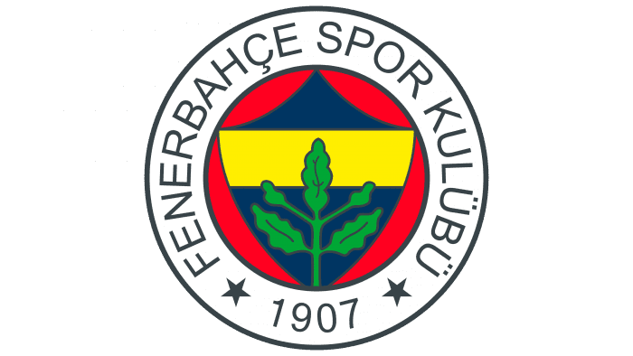
The current emblem looks brighter and more proportional. The red circle is reduced, letters and numbers are evenly distributed in the ring. Oak leaves no longer take up the entire space. Harmony is disturbed only by the shield’s cut-off bottom corner, which does not fit in the circle. On the T-shirts, the top’s logo is complemented by three stars, which indicate the number of championships won.
Fenerbahce: Interesting Facts
Fenerbahçe is a famous soccer team from Turkey, and they’ve been around since 1907. Their name comes from their neighborhood in Istanbul, meaning “lighthouse garden” because of a lighthouse there.
- Colors and Emblem: They love yellow and navy blue, which stand for being noble and strong. Their symbol has an oak leaf for power.
- Winning Lots: Fenerbahçe has won many games and trophies in Turkey. They’re known for being good at soccer.
- Their Stadium: They play at the Şükrü Saracoğlu Stadium in Istanbul. It’s big and loud, and fans love cheering there.
- Big Rivalries: They have huge rivalries with Galatasaray and Beşiktaş, two other big teams in Istanbul. Games against Galatasaray are super intense because it’s like a battle between two sides of the city.
- Playing in Europe: They’ve done well in European tournaments, making it far and earning respect.
- More Than Soccer: Fenerbahçe isn’t just about soccer. They also play basketball, volleyball, and other sports, and they’re pretty good at those, too.
- Fans Everywhere: They have many fans in Turkey and worldwide. These fans are super passionate and love to show their support.
- More Than a Team: Fenerbahçe is a big deal in Turkey, not just for sports but for bringing people together and doing good things in the community.
- Making History: They were unbeatable at home in European games for 15 years, from 1975 to 1990, which is pretty awesome.
Fenerbahçe isn’t just a soccer team; it’s a big part of people’s lives in Turkey, with a history of being strong, winning, and bringing joy to lots of fans.
Font and Colors
The modern graphic sign is based on the drawing of the soccer player Hikmet Topuzer. The designers have completed it with a white ring to represent the name and year of the Fenerbahçe foundation. The oak leaves symbolize the strength of the club.
The font used is considered grotesque because the letters do not have serifs. Green stands for success, blue stands for generosity, yellow stands for opponents’ envy, red stands for Turkey’s flag and love, and white stands for sincerity and purity.
Fenerbahce color codes
| Canary Yellow | Hex color: | #ffed00 |
|---|---|---|
| RGB: | 255 237 0 | |
| CMYK: | 0 7 100 0 | |
| Pantone: | PMS 102 C |
| Dark Midnight Blue | Hex color: | #163962 |
|---|---|---|
| RGB: | 22 57 98 | |
| CMYK: | 78 42 0 82 | |
| Pantone: | PMS 2955 C |
| Cadmium Red | Hex color: | #e20025 |
|---|---|---|
| RGB: | 226 0 37 | |
| CMYK: | 0 100 84 11 | |
| Pantone: | PMS Bright Red C |
| Pigment Green | Hex color: | #39a642 |
|---|---|---|
| RGB: | 57 166 66 | |
| CMYK: | 66 0 60 35 | |
| Pantone: | PMS 354 C |
