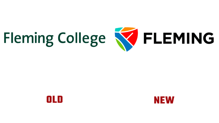
On June 21, 2021, FLEMING COLLEGE announced in its press release about the rebranding of the logo of the educational institution. The new emblem most accurately reflects and unites the rich heritage of the college, its history, which began in 1967, innovative development, a unity of views on the future, and a common aspiration to achieve the set goals of all members of the FLEMING community.
In developing the design, a lot of work was done to study the opinions of Fleming College members – students and alumni of previous years, employees and investors, partners who support the institution. Consultations were held with all interested parties, including representatives of the indigenous peoples of Crooked Lake – Mississauga of the great nation of Anishnaabe, on whose lands the entire architectural composition of the educational institution is located. The professionals of the Blazing Agency company, with which the college’s marketing team worked closely, provided great assistance in the rebranding issue.
The result of this interaction was creating a logo that, with its form and design, was able to express the very essence of Fleming College – “One brand. One community. One Fleming. “It was possible to most accurately reflect not only the unity of all who are closely connected with the history and life of the college, their grit and desire for change, further improvement. But also the unity, harmony with the nature of the entire architectural complex, historical continuity, courage of views on the future.
A shield was chosen as the form of the logo, symbolizing stability, protection, durability. Its internal filling imitates the veins characteristic of tree leaves, which echoes the unique properties of nature itself – its unsurpassed beauty and reliability. This is also true of each college campus, with a distinctive color scheme surrounded by natural beauty. At the same time, these symbols show a tribute to the indigenous people of the northern shores of Lake Ontario and its tributaries, whose territory is used based on the Williams Treaties.
The centerpiece of the emblem is the letter F, the capital letter of the college’s name formed by converging lines.
The original new logo presented was able to fully reflect Fleming College’s desire to lay a solid foundation for the development and growth of the educational level of students and the entire community.


