 Florida Atlantic University (FAU) Logo PNG
The logo of Florida Atlantic University emphasizes the university’s coastal location and its dedication to oceanographic research. This reflects the ancient traditions upon which the FAU brand was built. Additionally, the emblem connects all structures of the educational institution, uniting various colleges into a cohesive system.
FAU (Florida Atlantic University): Brand overview
Meaning and History
When FAU was under construction, the Fort Lauderdale News organized a contest to name it. Among the suggested names were A-Okay, Gulfstream, Peninsula, Palm State, and others. The final decision was made by the Board of Control, which in 1962 decided to name the educational institution Florida Atlantic University. This was two years before its official opening. Now, the chosen name is used in the university’s logo: it is presented in both its full and abbreviated forms. The visual sign emphasizes the individuality of the educational institution, its modernity, and its adherence to tradition.
What is Florida Atlantic University?
Florida Atlantic University is a public educational institution created in 1964 for residents of the densely populated southeastern region of the state who needed accessible education. It has a main campus in Boca Raton and several additional ones in Broward County, Palm Beach County, and St. Lucie County. There are more than ten FAU colleges offering undergraduate and graduate programs.
1961 – today
At the top of the emblem is the word “FAU.” Designers played on the university’s proximity to the ocean by connecting the “A” with a tall wave, the crest of which replaces the crossbar of the letter. Below the abbreviation is a long horizontal red stripe. The inscription “FLORIDA ATLANTIC UNIVERSITY” is divided into two lines and centered. The text is in a font with thin serifs and painted in blue – the official color of the educational institution.
The Seal
Archival documents have preserved information that in 1964, the university began using an oval seal created by Henry A. Schubert, who was then the Director of Graphics. It contained a map of the southeastern part of the USA, highlighting the state of Florida and indicating the city of Boca Raton, where the main campus of FAU is located. It also featured the name of the institution and its motto, “Where Tomorrow Begins,” also coined by Schubert. On both sides, torches were depicted.
However, the old version did not survive our times – it has been replaced by a new seal, which looks quite different.
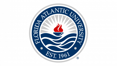
- In the center, there is the so-called lamp of knowledge with a red flame. It symbolizes a commitment to high academic mastery.
- From the fire, white rays in the form of elongated triangles spread out in all directions. This represents the energy that allows the university to grow and develop. Also, the rays form a sun, as Florida is a sunny state.
- The lamp of knowledge floats on blue waves. They show the university’s unique coastal location and emphasize its interest in oceanographic research.
All graphic elements are within a circle, which is placed in a dark blue ring with white and grey contours. There, information about the university is written: “FLORIDA ATLANTIC UNIVERSITY EST. 1961.” The text is in white and uses a font with thin serifs.
Font and Colors
In the logo, seal, and formal communications, FAU uses fonts from the Palatino family, named after a master calligrapher. German typographer Hermann Zapf created these fonts with long, thin serifs in 1948 and subsequently produced by several foundry companies. A feature of the Palatino fonts is their high legibility.
The university’s visual identity is built on the following colors:
- dark blue (#003366);
- red (#CC0000);
- grey (#CCCCCC).
Blue is especially significant: it shows the close connection of the institution with oceanographic research. White is used as a background for the verbal sign and as the main color for some elements of the FAU seal.


