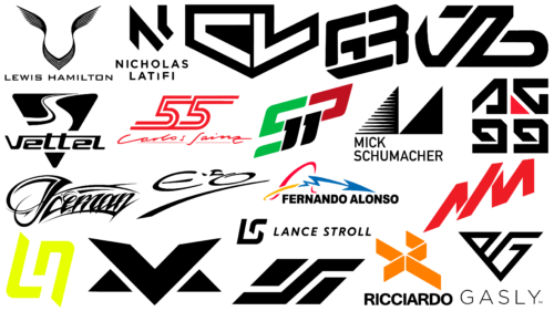
Sports symbols in the form of emblems and logos reflect the individuality of teams and players. This is especially true for such a type of it as exclusive logos of Formula 1 pilots. Here, the personal qualities and professional features of each of the pilots become no less important than the characteristics and models of cars. Being an elite sport, Formula 1 requires a well-considered visual identity like no other. The high importance of emblem visualization in the modern sports environment is reflected in the individual visual characteristics of the pilots, who became distinguished by original and unique personal emblems. The personal visual composition always reflects the character of the driver or his behavior and style on the track. In some cases, the symbolism may contain the athlete’s individual data. In this area, everything is aimed at drawing attention directly to the personality and characteristics of the main participants in sporting events.
1 Lewis Hamilton
In the Mercedes team, Lewis Hamilton, one of the leading British drivers, is the owner of the most elegant logo in F1 history. The image of a stylized winged figure resembles the letter “V,” representing the speed, freedom, and the imperative to win. In its execution and style, the sign is very similar to the emblems of iconic British car brands such as Aston Martin, Bentley, and Rolls-Royce. It especially echoes the Spirit of Ecstasy model. The fenders are positioned upwards and to the sides, creating attractive flowing side arches. They create a feeling of lightness, flight, and airiness.
2 Sebastian Vettel
Aston Martin’s German racing driver Sebastian Vettel has the most playful emblem. The graphics of its design ensured that the symbol is easily recognizable and easy to visually link the symbol to its owner. It is based on a geometric sign – an equilateral triangle with rounded corners. The symbol in the upper part has a negative space in the form of a stylized letter “S” in the first third. At the same time, the execution refers the viewer to the perception of the image as a winding road divided by a black line into two stripes of different sizes. One of the main differences of the logo is the smooth contours of the emblem, the competent use of the entire space, in which the lower third is allocated to the name of the rider, made in modern letters, with an “accelerating” right slope.
3 Kimi Räikönen
The street style of Los Angeles inspired Finnish racer Kimi Räikönen to create one of the most recognizable driver logos in the sport. His emblem is a textual embodiment of the Iceman inscription. It is distinguished by its clarity and impact on the viewer, which is unique to the iconic LA style. Accenting the image is the original graphic of the letter “I,” the upper and lower ends of which are elongated to the left. The upper part has a variable thickness and is separated by a white stripe, which provides volume formation for this letter. The lettering is slightly curved and contrastingly highlighted, with strokes at the top and bottom to enhance appeal and recognition.
4 Nicholas Latifi
The Williams Racing team is led by Nicholas Latifi, a Canadian-Iranian driver who introduces himself using a minimalistic logo. Like many other athletes, he chose a monogram of his first and last name as his emblem. Thanks to the simplicity and strictness of the lines, as well as the rejection of some graphic elements in the execution of the letters, the emblem acquired a progressive and powerful orientation. The original solution was to combine the right line of the letter “N” with the letter “L,” made in the form of a small line with a sharp-angled transition from the main line to its stem. The minimal distance between these elements forms a visual “tunnel” between these two symbols.
5 Lando Norris
Another McLaren driver who is a fan favorite is British-Belgian athlete Lando Norris. Lando Norris is an adherent of minimalism, and this passion is reflected in a concise but bold personal logo in the form of a monogram of the first two letters of his first name and surname – Ln. Each letter is in a different register, L in the upper case and “n” in the lower case. At the same time, the unified style of the abbreviation and the unity of letter sizes were graphically ensured. The letters have thick, solid lines and diagonal cuts at opposite ends of each. Rounding of the corners gave the composition sharpness and dynamism.
6 Nikita Mazepin
Russian racer Nikita Mazepin followed in the footsteps of his colleagues. Protecting the interests of the American Haas F1 Team, he uses as an emblem laconic but memorable badge. At the heart of the sign is the abbreviation NM, which consists of the first letters. They are arranged diagonally, rising from left to right, which symbolizes the constant striving for improvement and victory. The letters have a common feature – they are placed at the same distance from both letters. The use of small sloping negative space elements – extended at one end – has given dynamism and the transmission of movement to all the simple shapes of the bands that make up the composition.
7 Charles Leclerc
Charles Leclerc, representing the Scuderia Ferrari team, is a racing driver from Monaco. For his logo, he chose a bold and solid composition based on the classic shape of a coat of arms stretched horizontally. The inner space is “filled” with black color framed by a white border. It is occupied by stylized letters – “S” and “L,” representing abbreviations of the first and last name, formed at the expense of negative space. The graphics create a massive and confident left side, contrasting the right side, giving it lightness and impetuousness. Despite its simplicity, the logo is well recognizable thanks to a small cutout on the upper right side.
8 Pierre Gasly
The personalized logo of French racing driver Pierre Gasly of Scuderia AlphaTauri is highly stylish and visually impactful. The original execution of the image, which is a composition of two letters of the athlete’s initials inscribed in an equilateral triangle, makes the emblem especially recognizable. The figure, directed downward, creates a visual perception of it as a heraldic coat of arms. The letter “P” is given less space in the left part of the emblem. On the right, more space is given to the stylized letter “G.” Thus, it was ensured the best clarity of execution of the second letter of the name, which becomes the basis for the creation of the correct square shape in the geometry of the crest of the emblem.
9 Fernando Alonso
Fernando Alonso, the racing driver of the Spanish Alpine team, sports a quirky emblem. The graphics and execution of this symbol are strikingly different from similar logos in the sport. The non-standard italic font provides uniqueness in the execution of the full name of the athlete. The text module is combined with an elongated bold arrow symbolizing lightning or electric discharge. It has a zigzag tail starting with a looping shape, overhanging the beginning of the word mark. This composition allows this symbol to be perceived as an abstract representation of the letter “A” or “F.” A small dash under the zigzag arrow gives the logo an Asian twist, making it more interesting and stylish.
10 Sergio Perez
His country, Mexico, is successfully represented by a driver from Red Bull Racing – Sergio Perez. The emblem of the pilot is unique; it uses his number, which is quite rare. The composition of the logo used a nominal abbreviation of the name and surname of the racer – SP, which, as in most automotive and sports logos, has a diagonal arrangement from bottom to top and from left to right. The stylized letters are bold, where the closely spaced vertical bars of each letter are replaced by two “1” numbers.
11 Lance Stroll
One of the athletes of the Aston Martin team – Canadian-Belgian car racer Lance Stroll – has his own concise emblem. Its execution is standard for Formula 1 athletes and is based on the abbreviation of the athlete’s initials. The stylized version of the LS is made using two contrasting colors – white and red – to increase recognition and ease of remembering. They differ in the place of application – between the background and the letters. The monogram has a pronounced execution and modernity, perfectly lifting the mood and demonstrating the power of a simple but perfectly balanced sign. The lower part of the “S” is visually formed on the elongated end of the “L.”
12 Daniel Ricciardo
Australian racing driver Daniel Ricciardo represents the McLaren team. For his logo, he chose an original geometric figure made in three-dimensional interpretation. It is distinguished by strict thin lines, creating a stylized visual representation of the combination of two letters – DR. The letter D is formed by means of a triangular arrow, which has no vertical line. The apex of this triangle is in contact with one of the apexes of the figure in the form of a zigzag, which is an element of the letter R, also executed without a vertical line. In this way, the pilot’s personal information – in the form of the two initial letters of his first and last name – was represented.
13 Yuki Tsunoda
Japanese Scuderia AlphaTauri driver Yuki Tsunoda represents himself using a modern geometric logo. Its uniqueness is ensured by the original shape and architecture of the emblem, a combination not found in other F1 competitors. The elongated parallelogram shape has no connection with the owner’s initials. However, the spirit, style, and color are full of Asian orientation. The composition has one sharp element resembling the letter “S,” separating two small vertical figures. In its architecture, the badge resembles a flag. The right slant symbolizes speed and movement.
14 Valtteri Bottas
The Alfa Romeo team has a sportsman from Finland – Valtteri Bottas, who performs under an interesting personal emblem. The emblem is characterized by original execution due to lowercase letters – initials of his name, made in a style reminiscent of the Arabic spelling of words. This is especially true of the elegant letter “V,” the left stripe of which has a pointed upper end and a smooth curve to the bottom line. The confident execution of the letter “V,” the initial of the driver’s name, is characterized by its elongation in the horizontal direction, which creates a visual impression of massiveness. This graphic balances the elegance of the first letter and creates an effect of brutality and strength for the entire composition.
15 Max Verstappen
The most solid, brutal logo belongs to the driver of the Red Bull Racing team, Belgian-Dutch athlete Max Verstappen. His symbol is a stylized monogram in the form of the letter “V” and small equilateral triangles located on each of its sides. Thanks to this design, the visual perception of the composition is provided as an originally constructed letter “M,” which is the first letter of the surname of the athlete. The badge is simple in its design structure. Its attractiveness is provided not only by the originality of the composition but also by the strict adherence to the thickness of the line and the presence of sharp corners, which makes the badge strong, confident, and easily recognizable.
16 Mick Schumacher
One of the most famous Formula 1 drivers, Germany’s Mick Schumacher, who drives for the Haas team, has the most stable and geometrically correct logo. It consists of two identical regular triangles. They are located on the same line, touching the bottom corners. This configuration allows you to notice the stylized letter “M” – the first letter of the last name of the athlete. The left figure has a pattern filling the inner part with horizontal stripes of light color. Both figures are filled with black color, and their borders are white. This design gives the emblems energy and dynamism, creating a visual sense of movement and speed.
17 Antonio Giovinazzi
Antonio Giovinazzi, the Italian driver of the Sauber Alfa Romeo team, completes the list of drivers using personalized emblems. His emblem is distinguished by the strength and massiveness of the letter elements, which represent the stylized initials of the driver. The rectangular triangle is a letter “A” with an unfinished bottom edge and a hypotenuse trimmed from below. The letter “G” creates the visual perception of a square, with a red triangle as the negative space filler. It resembles the first letter turned upside down and reversed to the other side without an oblique cut. The logo is characterized by simplicity, ease of perception, and lack of overload of elements despite the additional pattern under the letters, reminiscent of the number 99.
18 Carlos Sainz
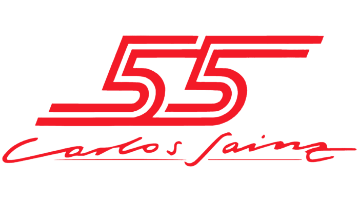
The Scuderia Ferrari sports team is represented by Spanish racing driver Carlos Sainz. He is the only sportsman whose emblem is completely formed of numerical symbols. The accent element of the emblem is a combination of two fives, which can be conventionally read as stylized letters “S” – the first letter of his name. They are distinguished by the presence of a double line, where the lower part of the left digit connects with the upper part of the right. This design extends the inscription, creating a sense of speed and movement. Red color provides ease of perception and memorability of the sign. The surname and first name of the athlete, italicized under the figures, emphasized by a thin red line, play the role of an additional amplifier of the emblem, distinguishing it from competitors.
19 Esteban Ocon
The representative of the Alpine racing team is Esteban Ocon from France. He has an elegant and distinct emblem consisting of his initials. In its architecture, it represents two letters, “E” and “O,” made as if by hand, accented by an attention-grabbing lower stroke. The line has a variable thickness and a pointed upper end. The unconventional italicized design, forming smooth and graceful letters separated at the top by the original apostrophe, distinguishes the logo noticeably from similar emblems.
20 George Russel
Brutal emblem, stable and easy to remember, is used by British Formula 1 driver George Russell, representing the Mercedes team. The image of the emblem is an abbreviation of the initials of the athlete, enclosed in a virtual square shape and made with a slight slope to the right, which creates the illusion of acceleration and forward movement. To make the composition harmonious, the lower edge of the element has a bold underline representing the stylized letter “G.” The whole composition is made with the use of bold lines. The completeness of each of the letters is complemented by the lower line, which closes the contours of the icon, forming the completeness of the whole image.


