


![]() Fruit of the Loom Logo PNG
Fruit of the Loom Logo PNG
The company sews its clothes as masterfully as trees and shrubs produce juicy, sweet fruit. The emblem indicates the perfection of styles and a variety of colors. The Fruit of the Loom logo guarantees the buyer will enjoy wearing the items.
Meaning and History
![]()
The company’s professional career began when the Knight brothers bought Pontiac Mill from Warwick and founded B.B. and R. Knight Corporation. In 1856, they renamed it Fruit of the Loom and launched their first product, muslin.
The goods were sold through the Rufus Skeel store in Providence (a friend of Robert Knight). Skeel had a daughter who drew labels for rolled fabric. Since she liked fruits and berries, she portrayed them. As a result, the demand for the products increased. Fabrics with the Apple logo were especially in demand.
The Knight brothers decided these emblems would be the perfect symbol for the brand. They linked the concept of fruit to biblical motives and their brand name. Therefore, this expression refers to clothing and the phrase “fruit of the womb,” which means children. The exact saying is found in Psalm 127:3 of the Bible.
In 1971 (after Congress passed the first trademark legislation), the company’s owner immediately obtained a patent on the logo, which was assigned number 418. The Fruit of the Loom brand is registered under this logo. Throughout history, he has had seven emblems.
What is Fruit of the Loom?
This is an American company that produces underwear and basic apparel. It specializes in creating high-quality, affordable products for everyday use, branding, and personalization, including T-shirts, hoodies, underwear, and socks. The company provides comfortable and durable wardrobe essentials made from natural cotton. Its wide range of products, including a variety of colors and sizes, makes it popular among diverse customer groups, from corporate clients to school students. It is also a major apparel supplier for the wholesale and corporate sectors.
1893 – 1927
![]()
The first logo has a rectangular frame with several lines of different colors and widths. Judging by the image’s quality and style, this appears to be a miniature painting. There is a wide, arc-shaped band under the frame. The name of the trademark is written on it. The still life features a set of fruits and berries as lifelike as possible. In the center is a large red apple with a light highlight on the side.
On the left, you can see many white grapes (usually greenish); above and on the right, a bunch of black grapes (usually dark blue or dark purple). In front of the apple are white currant berries. The image also contains leaves of three colors: green (grape), yellow (apple), and red (currant).
1927 – 1936
![]()
The designers have tweaked the brand’s visual identity mark, making it look more like an emblem. To do this, they redrawn the picture in a different style (less realistic), removed the tape, and placed the fruits in an oval frame. They moved the currant berries to the left, and some leaves changed color. At the same time, the clouds disappeared from the logo, leaving only a light blue background. The inscription at the top has been preserved but shaped like an arch. The words “Fruit” and “Loom” are in large letters, and “of the” is in small letters.
1936 – 1951
![]()
During this period, the company’s management approved the logo for lithographic printing, which resembles a wax seal in texture, color, and shape. The picture shows fruits and berries taken from a triple-edged circle. At the top, in a semicircle, a wide ribbon bears the brand name.
1951 – 1962
![]()
In 1951, the developers returned the logo to its original color and added a gradient in some places. The grapes turned green and dark blue again, the currants white, and the apple red with a yellow highlight on the side. The designers made the letters black to make the name stand out clearly. They also painted the seal sandy beige.
1962 – 1978
![]()
Since then, the emblem has undergone a radical change in appearance. The authors used an oval in which the company name was placed. So they emphasized the priorities, highlighting the brand as the top priority. The designers moved the picture with fruits and berries (brand concept) to the top, at the center of the oval-shaped line. In doing so, they reduced the color gamut’s brightness. The first letters in the words “Fruit” and “Loom” are uppercase, the rest are lowercase, and both are underlined with a black line. In addition, the inscription is supplemented with the phrase “Unconditionally Guaranteed.”
1978 – 2003
![]()
In 1978, the fruits and leaves returned to their normal color. Now, they are catchy and distinct. The developers narrowed the oval, stretched it out, outlined it along the edge with a black line, and made it appear volumetric with a shadow at the bottom. They removed the underlining in the title and replaced the lowercase letters with uppercase ones.
2003 – today
![]()
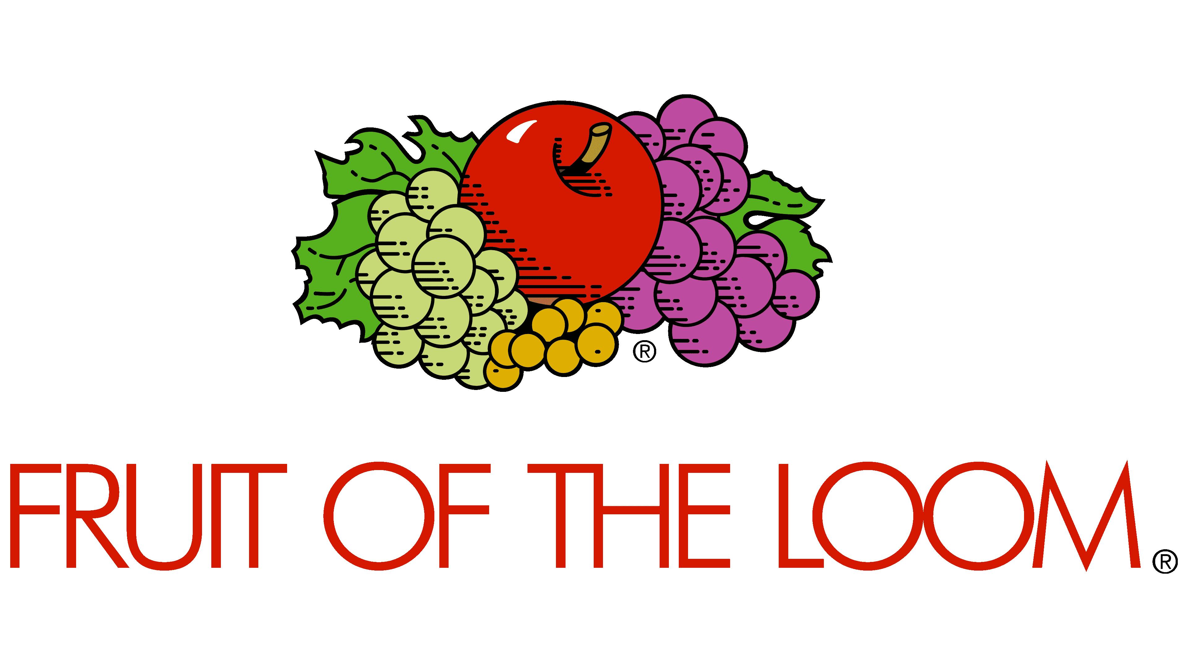
The modern version of the logo consists of two parts: the text and the icon. The designers removed the remaining elements. Fruits and berries are now less vibrant than the previous emblem but still colored. The only difference between them is in the colors. The artists tried to preserve their natural shades, so they made the bunches white and purple, the currants yellow, the apple red with a yellow stalk, and the leaves green (by the way, now they are all replaced by grapes).
The designers also worked with the name’s style: in the current version, it is set in grotesque, thin, elongated letters, except for the middle part. It is in small print and arranged in two lines.
Font and Colors
The logo’s fruit image is far from realistic; it is hand-drawn. Horizontal strokes highlight the commonality of the textile industry. Small stripes are visible on the apple’s grapes and left side. They resemble fabric made from many fine, intertwined threads.
Previously, all the letters in the emblem were serifs, but as a result of the last update, the layout changed: a geometric, chopped typeface was chosen for the logo. It is called the Futura Serie BQ-Book and was developed by the German designer Paul Renner, who took the 1919-1933 Bauhaus style as a basis.
Signature colors during the emblem’s modification ranged from bright to restrained. Most natural shades are present: red, pink, yellow, sand, purple, blue, green, white, and black.
FAQ
What is the meaning of Fruit of the Loom?
The word “fruit” in the name refers to the company’s products. “Fruit” symbolizes garments such as T-shirts, underwear, and socks made on a loom. The choice of this name indicates the naturalness and essential role of the brand’s products. Just as fruit is a fundamental, healthy part of the diet, the brand’s clothing is essential to daily life. They emphasize that their products are as desirable and valuable as fresh fruit.
Who owns the Fruit of the Loom brand?
Berkshire Hathaway, Inc. owns and operates the brand as a separate company. Although it operates independently and has its own management team, it benefits from strong support and oversight from Berkshire Hathaway, a well-known company led by Warren Buffett. This structure allows the brand to utilize the parent company’s vast resources and financial stability while managing day-to-day operations and making important decisions independently.
What is the original Fruit of the Loom logo?
The original logo was a colorful still life framed within a rectangle. The title “FRUIT OF THE LOOM” was displayed at the top of the frame. The design featured a variety of fruits, including apples, grapes, and currants. This vibrant and colorful image reflected the brand name and conveyed the natural quality and freshness the brand wanted to associate with its products.
How long has Fruit of the Loom been around?
It is one of the oldest clothing brands, spanning nearly two centuries. The brand is known for producing a variety of clothing, from underwear to casual wear. The company’s reputation for quality and reliability has stood the test of time. As it approaches its 200th anniversary, the brand continues to thrive by adapting to changes in the fashion industry while staying true to its heritage.
Is Fruit of the Loom branded?
Yes, it is a registered brand. This registration confirms that the brand is officially recognized and protected by trademark laws. This protection helps prevent unauthorized use of the name and logo. Being a registered brand is essential to maintaining its identity and reputation in the competitive apparel market. This ensures that all products, from lingerie to casual wear, meet the same quality standards, helping customers recognize and trust what they buy.
Is Fruit of the Loom a good brand?
Fruit of the Loom is widely known as a reliable brand, especially for screen printing options. Their products are designed to provide high-quality printing, making them an excellent choice for custom hoodies and other screen-printed clothing. The brand produces clothing suitable for various purposes, including workwear, school uniforms, and casual wear for men, women, and children.