


![]() Galatasaray Logo PNG
Galatasaray Logo PNG
The Galatasaray logo demonstrates how an elite football club has grown into an institution renowned for its teaching, whose players are considered sports stars. The emblem says: if the university initially patronized the team, now it glorifies the alma mater.
On October 14, 1905, Ali Sami Yen and classmates founded Galatasaray S.K. at Galatasaray School in Istanbul, aiming to compete with foreign teams. The school traced its origins to 1481 under Bayezid II. The early colors were red and white, but in 1908, the club adopted yellow and red.
Legal recognition came in 1912 after new association laws. From 1906, Galatasaray played in the Istanbul League and, with Horace Armitage, won titles in 1909, 1910, and 1911. Rivalry with Fenerbahçe S.K. grew into the Intercontinental Derby.
With the launch of the Turkish Super League in 1959, Galatasaray became a leading force, winning the title in 1962 and completing a league-and-cup double in 1963. In 1964, the Ali Sami Yen Stadium opened and became known for its intense atmosphere.
In 1988–89, under Mustafa Denizli, the club reached the European Cup semi-finals, eliminating AS Monaco FC before losing to Steaua București. In 1996, Gheorghe Hagi joined FC Barcelona.
The 1999–2000 season brought a domestic title and a UEFA Cup win, with a penalty shootout victory over Arsenal FC after eliminating Leeds United and Borussia Dortmund. Soon after, Galatasaray defeated Real Madrid to claim the UEFA Super Cup.
In 2011, the club moved to Türk Telekom Arena. It won multiple league titles between 2011 and 2024, reaching 25 in total, while European results remained limited to group and playoff stages.
Meaning and History
![]()
The first emblem of the club was drawn by Şevki Ege, known as student number 333. He depicted a flying eagle with wide-spread wings. The bird was holding a soccer ball in its beak. But this graphic sign did not find support from the general public. The second symbol became more popular as an abstract one containing the Arabic letters “gayn” and “šin.” It became the basis for the modern monogram logo.
What is Galatasaray?
Galatasaray is a Turkish professional football club. It was founded in 1905 at the Galatasaray High School and initially consisted of students. Now, it is a successful team that has won prestigious awards both domestically and internationally. The club has won 22 Süper Lig titles, 18 Turkish Cups, and 16 Turkish Super Cups.
1905 – 1923
![]()
The original emblem with the letters “gayn” and “šin” was adopted at Galatasaray’s fourth meeting. Its author is a talented student, Ahmet Ayatullah, who published and illustrated Kara Kedi himself. The archive of his pencil drawings contained an abstraction: a figure consisting of the first letters of the words “Galata” and “Saray” (in Arabic).
Both the club’s management and its members liked the sketch. After minor revisions, the sketch became the official coat of arms of Galatasaray. It looked unusual: the round part of the yellow “šin” was in the lower half of the red “gayn.”
1923 – 1961
![]()
In the 1920s, language reform was carried out, resulting in the European alphabet replacing the Arabic alphabet. This is how the “Ghayn-Šin” emblem got a modernized version with the letters “G” and “S.” It echoes the shape of the original: “G” stands for the bottom of “gayn,” and “S” is both the top of “gayn” and the bend of “šin.” The year the club was founded is written where the letters merge: 1905. The monogram is set in an oval with a wide yellow-and-black frame.
1961 – 1987
![]()
The letters no longer touch the rounded sides, although their position has generally not changed: “S” intersects “G” at the top, and “G” overlaps “S” at the bottom. The number “1905” has been reduced; the oval outline is thin and black.
1987 – 1993
![]()
The letters fit tightly together again, and even the dark outlines do not separate them. The inscription is shifted slightly higher: it, as before, is opposite the horizontal stroke “G.” The black line around the oval has become even thinner.
1993 – 2000
![]()
The designers changed the emblem’s composition, bringing the “G” to the front and leaving a small gap between the lower parts of the letters.
2000 – 2001
![]()
The oval disappeared, and the yellow “S” turned orange. Two five-pointed stars appeared above the monogram because Galatasaray had already won 10 football championships by that time.
2002 – 2018
![]()
The logo makers brought back the white oval by changing the outline color to blue. Also, they added another star on top to celebrate the club’s new sporting achievements.
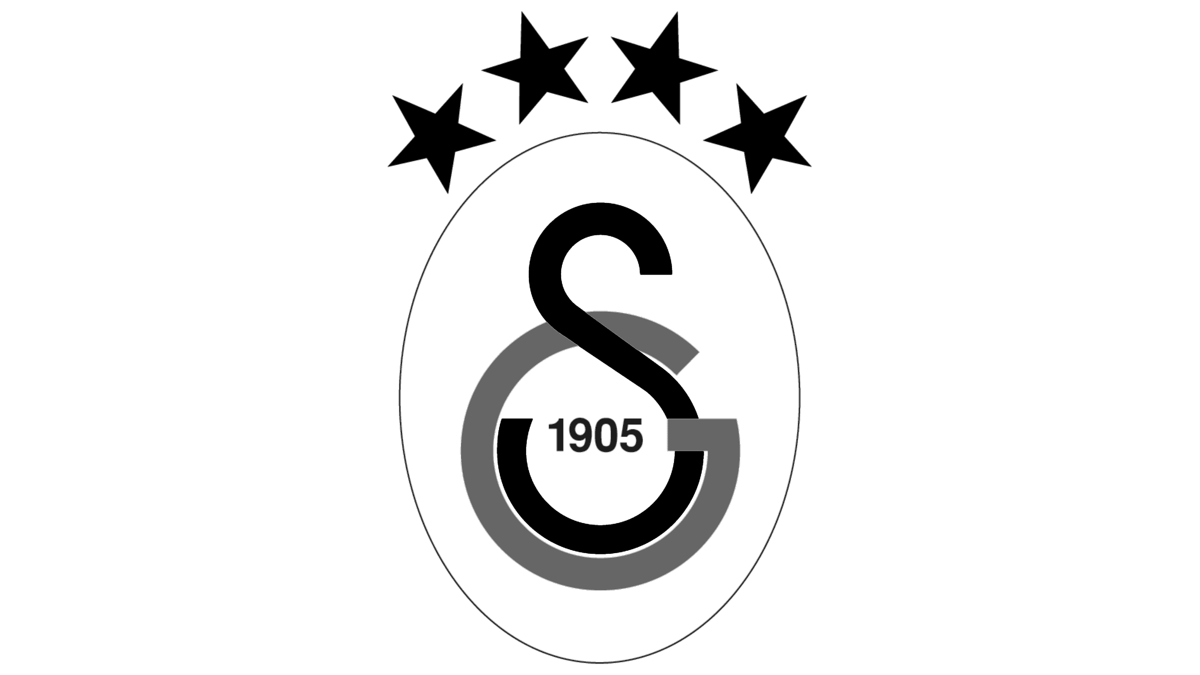
2019 – today
![]()
In 2019, a fourth star appeared over the monogrammed oval, marking the Turkish football team’s 20th championship victory.
Font and Colors
Galatasaray’s second logo, unlike the first, proved incredibly successful. Even though its structure is very simple, most versions include the club’s initials and the year of its foundation. At the very beginning, the Arabic letters “gayn” and “šin” were used. After the language reform, the designers changed them to “G” and “S,” trying to keep the monogram’s overall shape. This visual similarity underscores Istanbul’s geographical position, where two cultures collide: Arab (on the east side of the Bosphorus Strait) and European (on the west side).
The European version of the monogram contains sans-serif letters. They are not specific to any particular font: the designers adapted the “G” and “S” for the Galatasaray logo.
The color scheme is more thoughtful. It includes black (#000000), white (#FFFFFF), yellow (#FDB912), and red (#A90432). The combination of red and yellow became the club’s official palette back in 1908. It is a reminder of the roses that poet Gül Baba presented to the Ottoman Sultan Bayezid II.
Ali Sami Yen himself was responsible for selecting the shades. Before finding the right material for a football uniform, he visited several textile stores: one fabric was deep yellow with an orange touch. The other was dark red, almost cherry.