


![]() GEICO Logo PNG
GEICO Logo PNG
The GEICO brand has a text logo. The GEICO logo directly conveys the company name in a clean, sleek, and bold font. To make the information-style logo stick in the memory, the designers chose a bright color from a restrained palette, blue, almost cobalt blue. Massive letters convey confidence and the ability to withstand difficulties.
The line of business known as private insurance in America has a long history. Its prominent representative is the agency GEICO, whose name stands for Government Employees Insurance Company. It was founded in 1936 to insure motor vehicles and groups characterized by low insurance risk, such as government employees and military personnel. Today, the company is part of the largest holding company, Berkshire Hathaway, headquartered in Nebraska, and provides a wide range of services in its field.
Since entering the market, the agency has changed its image and logo several times, striving to make it more attractive and memorable. After the crisis and change of ownership, the latest version, designed in 1978, has not changed dramatically, except for a color change and the addition of original, interesting characters, “loading” the main element that remains unchanged.
Meaning and History
![]()
To talk about the emergence of new companies in America in the 1930s, during the Great Depression, was simply absurd. Creating them was considered the height of misunderstanding of the complexities of the economic situation. In 1936, the Goodwin family, contrary to popular belief, showed courage and foresight by creating a company that insured cars, government employees, and military personnel.
In 1948, Lorimer Davidson joined the company. As an investment banker, the family friend helped update the company’s investment background by bringing in new investors. One of them was Benjamin Graham, who would later settle scores with Warren Buffett, an entrepreneur and investor in many American companies. The one who, in 1965, bought up shares of various companies and became the owner of a controlling stake in Berkshire Hathaway; in 1976, he saved GEICO from bankruptcy by buying about 1 million shares.
Buffett bought his first shares of Public Employees Insurance Company in 1951.
As early as 1958, Lorimer Davidson took over the reins from Goodwin, who had decided to retire.
In 1959, the agency opened its headquarters in Chevy Chase, Maryland, aided by twenty years of successful insurance operations.
During the 60s, the company continued its successful growth, opening several new offices across America.
But the early 70s were a harbinger of failure. The breakup of the Goodwin family and the misguided policies of the new management led to a crisis. In 1976, the company’s stock fell from $61 to $2. At this critical moment, Buffett came to the rescue, investing $45,713.
Thanks to such a generous investment and careful underwriting, GEICO managed to stay afloat and continued its development in the 1980s.
In 1993, the company’s new chairman and CEO, Olsa Neisley, directed a significant portion of the company’s funds to advertising. Her actions yielded strong results, increasing customer traffic and boosting the company’s visibility. Such actions again attracted Buffett’s attention, who in 1995 offered to buy all remaining shares and in 1996 made GEICO part of his Berkshire Hathaway holding company.
The new owner started an active advertising campaign. The development of a new image and visual identity for the agency, promotion in mass media, on TV and the Internet, and mass mailings to mailboxes made the GEICO Gecko® brand universally recognizable, even though it rarely left TV screens in 2000. The company logo was everywhere and became an advertising icon, the most memorable logo. The company’s website, geico.com, created in 2004, was also promoted everywhere with the slogan “Geico.com – so easy, even a caveman can do it.”
Today, GEICO is a company with consistent monthly sales and steady growth. This is due to the original branding solutions based on the 1978 emblem. In this way, the company remains recognizable, demonstrating a commitment to its successful history. At the same time, original additions to the basic theme make it even more attractive and memorable.
1936 – 1951
![]()
Given the level of development of advertising and graphic technologies of the time, the company’s logo was quite simple. Executed in black, the emblem contained no images, only text. The first word was the accepted abbreviation “GEICO,” whose letters were slanted to the right and enclosed in gray triangular quotation marks. Below this word in smaller capital letters in two rows, aligned in the center, was the full name Government Employees, and below that, Insurance Company.
1951 – 1974
![]()
In 1951, to distinguish itself and visually align itself with government agencies, the company adopted the style of government service marks to convey the same responsibility and stability it had. The logo is circular, with a state eagle on a pedestal. In the form of “stars and stripes,” arranged in a circle at the top are seven stars, decreasing in size towards the edges, and the inscription continues with the company’s full name. Under the pedestal of the eagle is a banner with the inscription “For Service to the Motherland.” In 1969, a rectangular plate with a black outline was added below the circle in the image. The company name is written in large capital letters on it.
1974 – 1978
![]()
The logo undergoes dramatic changes. It uses a graphic element in the form of a figure whose upper edge is parallel to the lower edge and slightly longer than the lower edge. Both sides are equal in length and parallel. All corners are rounded, except for the transition from the upper contour to the parallel sides, to which small connecting segments lead at some angle. The central part of the lower contour forms a downward-pointing arrow, reminiscent of the union sign in mathematics. The company abbreviation is printed on the inner margin in thick black capital letters. Below it, in small black capital letters, is written “AND FRIENDS,” indicating that the company is expanding and already has subsidiaries.
1978 – today
![]()
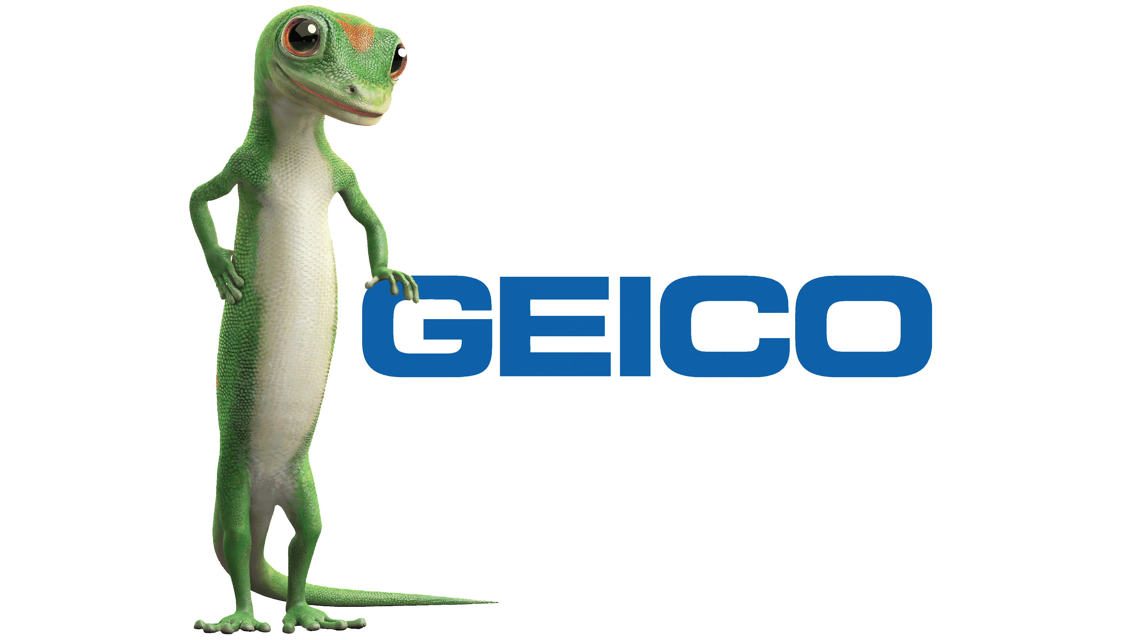
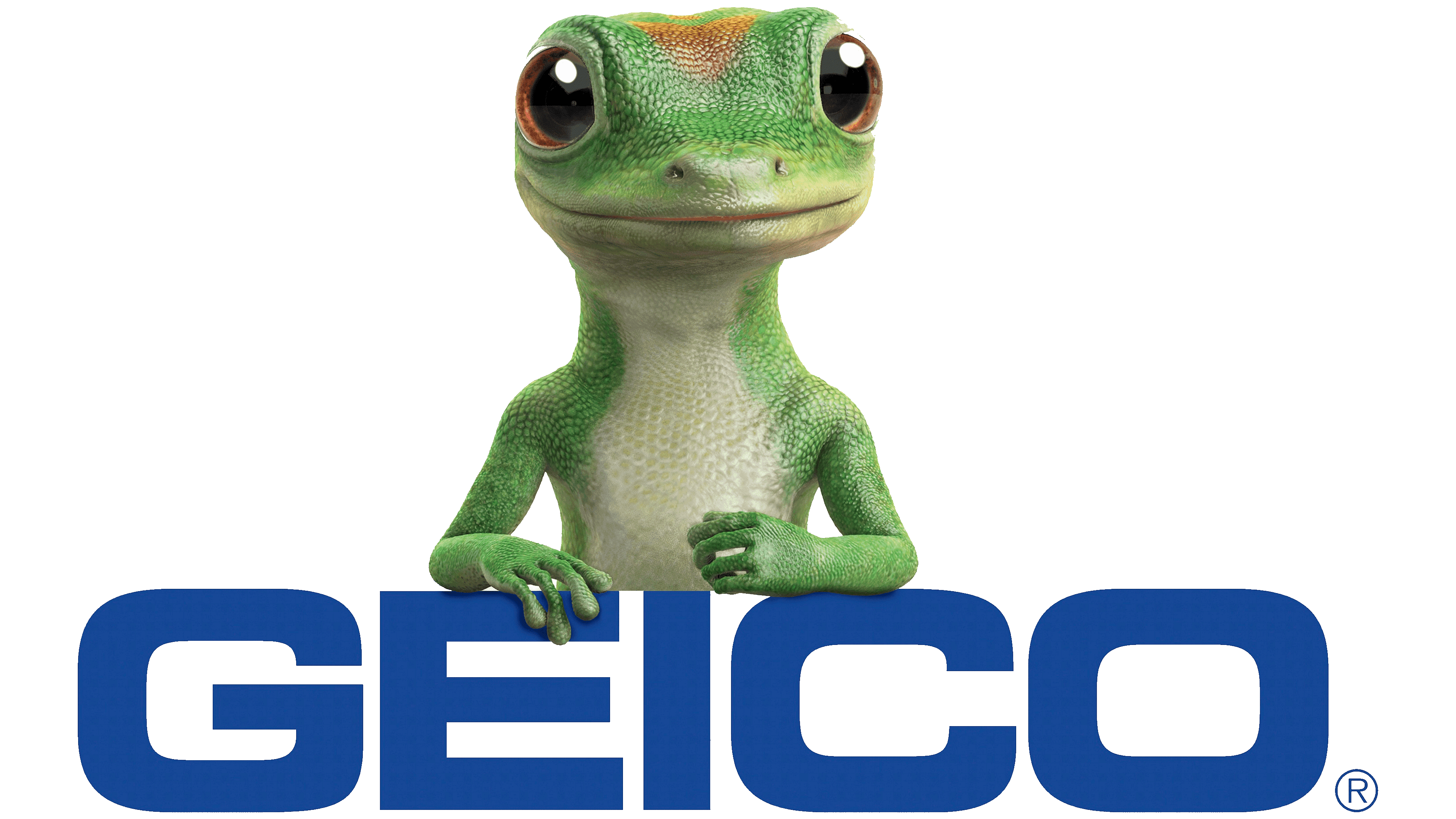
When designing the modern logo, it was decided to move away from the classic black color. Only text was used – the abbreviation of the name in bold letters. In the process of application, depending on the location, for example, in the first commercials, it was possible to change the font color to yellow. In 1996, a version appeared in which DIRECT was printed in white letters below the abbreviation on a plate filled with the colored abbreviation. During the site’s promotion, a version was used in which a link to the resource was placed under the main text in small print. From 1998 to 2005, a cheerful lizard, green-gray with orange on its head and black eyes, was placed below the text in full color. It is either lying on the letters or standing to the left of the text, resting on the first letter. In addition, in honor of Halloween, the last letter “o” was shaped like a pumpkin head. There was also a smartphone app that “got” its own icon.
Font and Colors
The last logo, which is still relevant today, shows only the company’s abbreviation. It is set in bold Pro Bold Extended font in dark azure. At the bottom of the letter “O” is the symbol ®. The logo is as concise and easy to read as possible, appearing in print materials and on digital television and the Internet. The latter was decisive, requiring only a slight reworking of the image using modern technology. This variant demonstrates that the company’s prominence does not require additional visual elements to attract attention; recognizability and ease of memorization are sufficient.
The emergence of smartphones created the need to develop a mobile version of the website and to simplify feedback without visiting the company’s office or calling an agent. An application was created, for which a simple icon was developed that retained the style of the company’s trademark. The icon is designed as a square with strongly rounded corners. Its space is filled with a dark, azure color, typical for the logo. In the center is the first letter of the logo, “G,” executed in Pro Bold Extended font in white.