![]() Georgetown University Logo PNG
Georgetown University Logo PNG
The roots of this institution go back to distant times, so the logo of Georgetown University and its seal are, in essence, history portrayed in graphic form. Primarily, they reflect devotion to God, country, and knowledge, love for the land and music, and the pursuit of victories. These feelings are concentrated in simple but symbolic images that succinctly embody the worldview.
Georgetown University is an American higher education institution offering 48 master’s and bachelor’s programs. Its students study law, diplomacy, medicine, and business, and participate in sports competitions at various levels through the Hoyas’ athletic department. The university was established in 1789 as a college and has grown into a prestigious educational institution with a rigorous admissions process. Its founder was Bishop John Carroll, located in Washington, D.C.
This educational institution was conceived as a college controlled by Jesuits from the Society of Jesus. The land was specifically acquired for it, with the purchase completed in the winter of 1789. The site’s location significantly influenced the university, as the administrative name of the Washington area was passed on to it: Georgetown University.
Initially, the college faced significant financial problems, but over time, it was reformed. For example, in the spring of 1815, the fourth US President, James Madison Jr., signed a law allowing the university to award higher education degrees. The main milestones of its history are reflected in its visual identity. Even the textual logo conveys a connection with those who were at the origins of the university. However, most of the evidence is present in the academic seal.
Meaning and History
![]()
The past inspires the entire visual identity of Georgetown University, yet it remains modern and relevant in the 21st century. It meets key requirements of typography and graphics, informatively reflecting essential information about the university and supporting communication at all levels.
What is Georgetown University?
Georgetown University is a higher education institution in Washington, District of Columbia. It was established in 1789 and was once affiliated with Catholics, but it has since moved away from this religious denomination and accepts students of all faiths. The university offers education in 48 master’s and bachelor’s degree programs. The university’s founder is the Society of Jesus, represented by Bishop John Carroll. Today, it is a prestigious educational center with a rigorous selection process.
before 2011
![]()
This logo consists of two parts: a wordmark and a seal. On the left is the name Georgetown University, divided into two lines and aligned to the right edge. Only the initial “G” is capitalized in the first word, and all other letters are lowercase. The second half of the inscription is entirely in uppercase. The elegant serif font resembles Gemerald Regular by GemFonts or Palladio FS Regular by FontSite Inc.
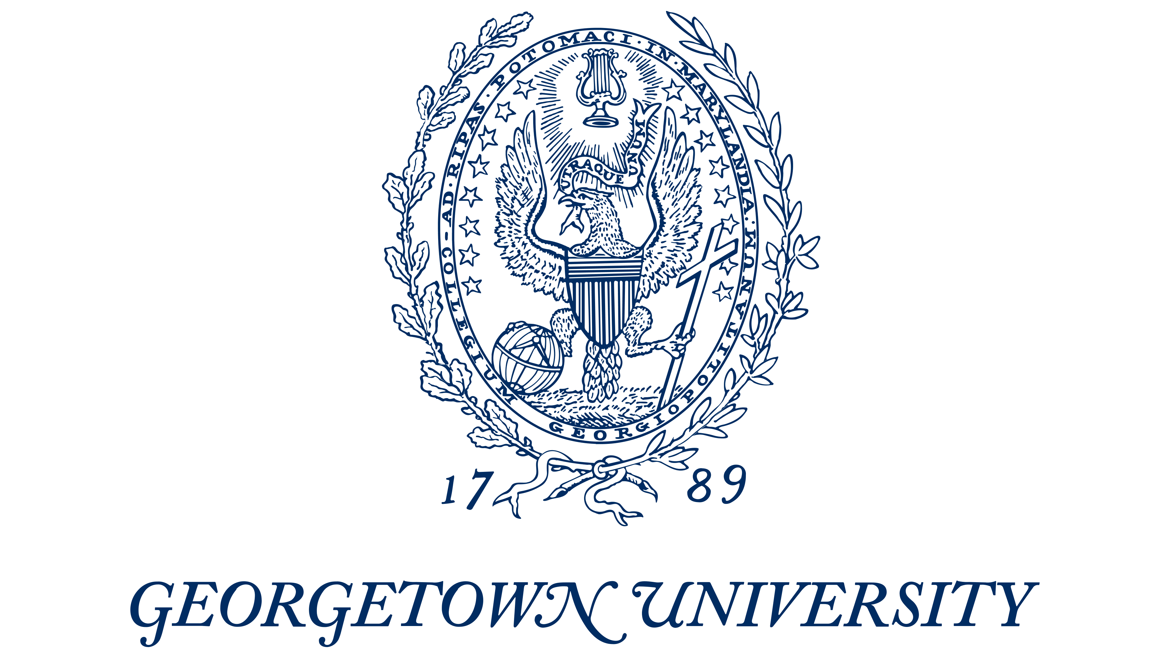
The seal depicted next to the wordmark has a long history. It inherited its shape and many elements from an oval emblem adopted in the late 1790s when Louis William Valentine was the university’s president. Changes were made to it over several centuries, but in 1977, a version closest to the original was approved.
- The eagle in the center, bearing a heraldic shield, refers to the Great Seal of the U.S., created in 1782. It symbolizes national unity, American freedom, and strength.
- The cross in the bird’s left claw represents the Christian heritage of Georgetown University, the oldest Catholic university in the U.S.
- The globe in the right claw signifies rational knowledge and underscores the institution’s global nature.
- The harp above the eagle’s head is a symbol of inspiration. It likely refers to the Faculty of Arts, where students study music, theater, painting, and other disciplines.
- The stars (8 on each side) represent the 16 states that were part of the U.S. when DuBourg managed the university.
- The unfolded scroll in the bird’s beak contains the Latin inscription “UTRAQUE UNUM.” It was taken from the sacred text, the Book of Ephesians, and, in this case, indicates the absence of contradictions between education and religion.
- The phrase “COLLEGIUM GEORGIOPOLITANUM AD RIPAS POTOMACI IN MARYLANDIA” in the oval frame reminds us that the institution was founded in the Province of Maryland, which was not yet part of the District of Columbia.
- The wreath made of two branches has different interpretations. Some researchers believe it represents an oak – a symbol of independence and strength. According to another opinion, the emblem features olive leaves – an embodiment of peace. A third version suggests it is laurel, associated with success.
- The number “1789” marks the founding year of Georgetown College, which later became Georgetown University.
2011 – today
![]()
The Georgetown University logo is a wordmark. It consists of the name of the educational institution, arranged in two levels with center alignment. The lower line harmoniously occupies the space between the first and last letters of the word in the upper row. The italicized inscription looks intellectual, old-fashioned, and elegant, as Adobe Caslon’s font dates back to the 18th century.
- Graceful “N” and “G” resemble monogram elements in a vignette style. They have elongated legs, extended silhouettes, and smooth curves.
- The glyphs are bold yet refined in some places, adding an air of aristocracy and grace. They are not connected but are positioned at a minimal distance.
- All letters have even serifs characterized by symmetry, smoothness, and well-proportioned features. The “G” and “N” also have points.
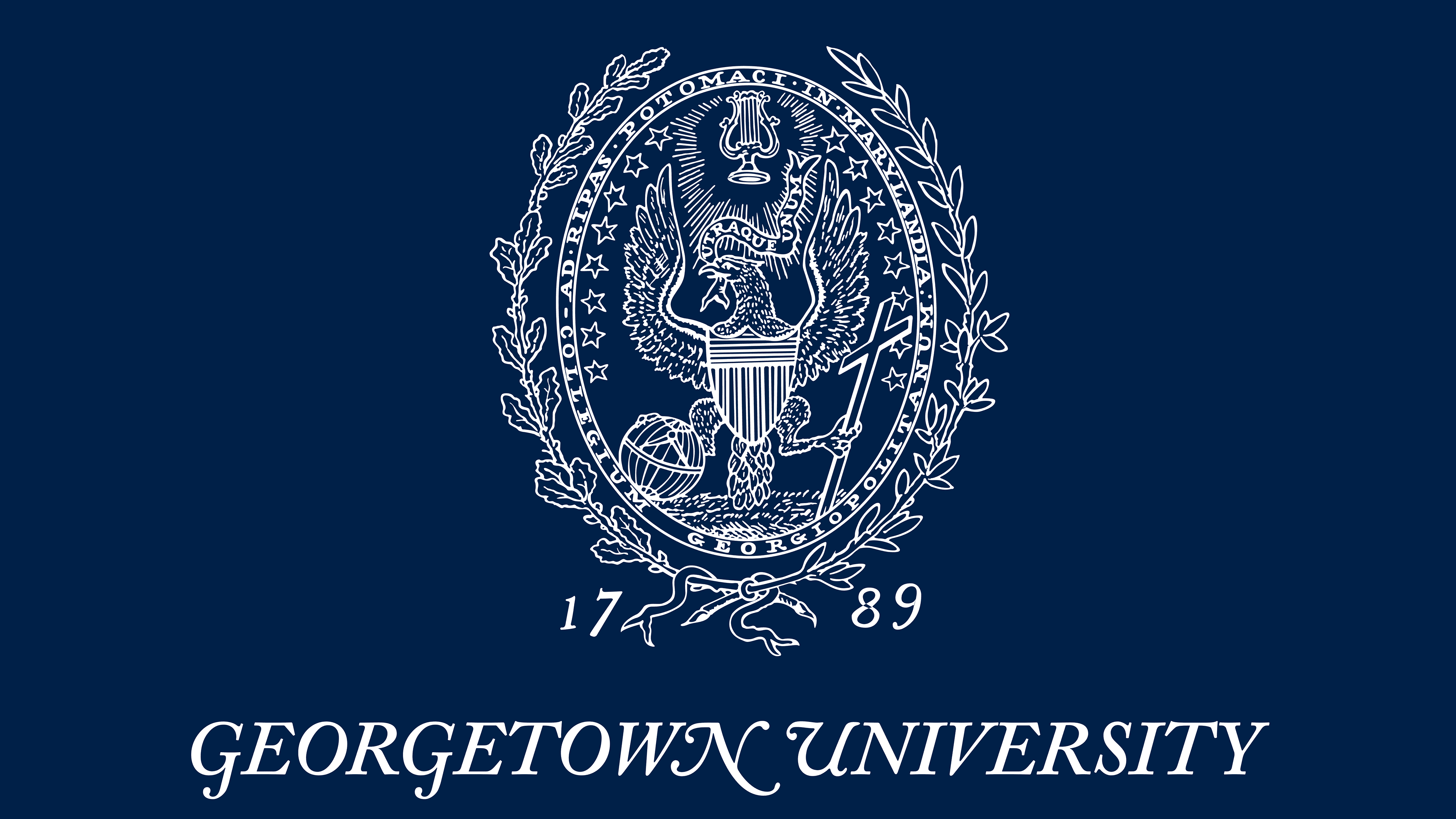
The text is set on a white background and is colored in a dark shade of blue. This is the official color of the university, called Georgetown Blue. It dates back to the Civil War era and, along with Georgetown Gray, symbolizes the union of students from the northern and southern regions of the country.
The Seal
![]()
The Georgetown University seal did not appear immediately: it was adopted during the tenure of its third president, Louis William DuBourg. The design is based on the Great Seal of the United States, with some elements replaced. This was done intentionally to emphasize the official nature of the emblem and the unity of the university and the country where it is located. The center of the emblem is an eagle, depicted with wings widely spread and raised above its head. The bird holds:
- in its beak a scroll with a Latin inscription (the university slogan “Utraque Unum”);
- in its right talon, a globe lined with meridians and parallels (symbolizing rational knowledge);
- In its left talon is a large cross (representing the Christian faith, as the Society of Jesus founded the university).
All elements are closely related. For example, the text on the fluttering ribbon explains the presence of the two lower details in the logo. That is, the inscription “Both are One” (translated into English) indicates that both rational knowledge (the globe) and faith in God (the Christian cross) are essential for a person. Therefore, there should be no conflict between science and religion.
The bird is surrounded by 16 stars (8 on each side), an inscription, and a wreath of oak and laurel branches tied together at the bottom with a ribbon. When the seal first appeared, it was oval-shaped. However, in 1844, designers made it around at the university’s request. It remained in this form until 1977, after which it was returned to its original design, the oval.
Font and Colors
Georgetown University’s visual identity is based on the Adobe Caslon font, which dates back to the 18th century. It was used in the founding documents: John Carroll wrote his proposal and applied to establish the university in this typeface. Hence, this font became the official one. Its modern free equivalent is Libre Baskerville Italic. The logo contains two colors: Georgetown Blue and Georgetown Gray. They are associated with the Civil War and symbolize the unification of young people from the North and South of the United States.