The Georgia Tech logo indicates the importance and value of technical knowledge. The university is the golden section of science. Here, they teach the basics, without which it is impossible to create things. The emblem is permeated with the themes of precision and harmony.
Georgia Tech: Brand overview
Meaning and History
The Georgia Institute of Technology concept dates back to 1865. At that difficult time (after the Civil War), a group of enterprising people represented by the politician Nathaniel Edwin Harris and the industrialist John Fletcher Hanson was firmly convinced of the need to train technically savvy personnel to support the industrial revolution in the region. Moreover, compared to the north of the United States, the south was inhabited mainly by agrarians, so there were few mechanical engineers. So, there was an urgent need for a technology school. In the fall of 1885, Henry D. McDaniel, Governor of Georgia, signed an executive order.
The educational institution began work in 1888. It occupied two buildings. In one of them (in the Tech Tower) were offices and administration; in the other were the engine room, boiler room, forge, and foundry. Gradually, its structure expanded as the number of programs taught and academic disciplines increased. Now, it is a huge institute with several foreign departments. It is well recognized by the historical values reflected in the seal and the emblem.
What is Georgia Tech?
Georgia Tech is a technological university in the state of Georgia. It is located in Atlanta, where it was opened in 1885. Today, the university has six colleges and 31 faculties and teaching programs emphasizing technology and science. It has very high popularity abroad: Georgia Tech has campuses in the country and abroad – in France, China, and Ireland.
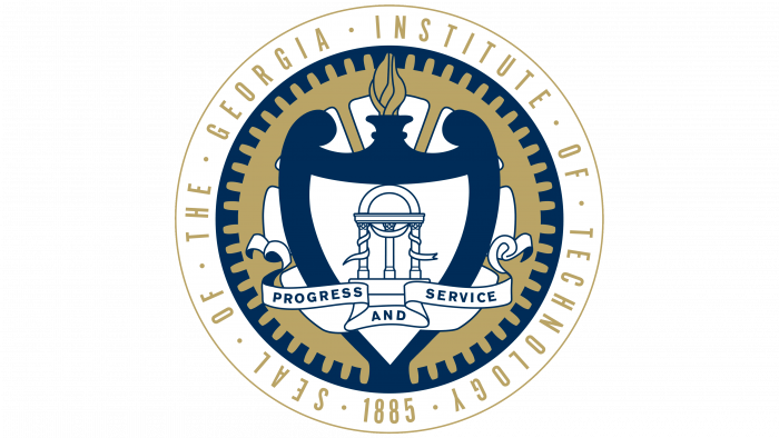
The round sign consists of an amphora—the personification of a vessel filled with knowledge. It occupies a central place, shaped like an irregularly shaped shield with a bold outline. As proof that the container is full, tongues of flame are visible above its neck—a burning lamp, a symbol of wisdom.
In the middle is an architectural structure of three columns under a high dome entwined with thin ribbons. The wide canvas is stretched below and bears the motto “Progress and Service.” All these elements are located against the background of a golden gear, surrounded by a thick band with the name and year of the educational institution’s foundation. The inscription is circular. A dot separates each word. There is a narrow edging line along the edge.
The main emblem outwardly resembles a monarchical crown but has nothing to do with it. This is the Kessler Campanile, a landmark building that has played a huge ideological role for the university. It was built for the Olympic Games in 1996. The structure has a schematic designation and consists of three high triangular spiers. Below them is a horizontal rectangle made with the same thin golden lines. To the left of the bell tower is the Georgia Tech inscription. Unlike the icon, it is large, bold, and rounded, occupying two lines.
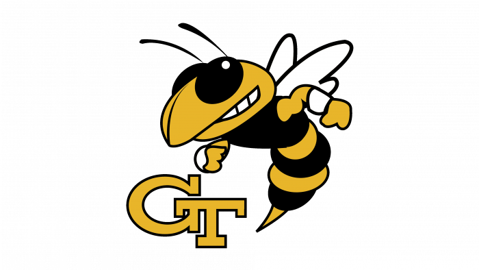
In addition to the old sign, the institute has a modern one—a gold abbreviation. It includes the first two letters of Georgia Tech. “G” sits above “T” and is connected to it by a front leg that extends over the bar. Both symbols are large, wide, and golden, with a thin line at the edge and large serifs.
Georgia Tech Yellow Jackets Logo
Georgia Tech’s sports arm consists of eight men’s and seven women’s teams that compete in 17 sports. They are the Atlantic Coast Conference, Division I NCAA, and Football Bowl Subdivision members. According to the survey, four varsity teams were named national champions in the last century: 17th, 28th, 52nd, and 90s. In 2007, the tennis players won a resounding victory over the UCLA team.
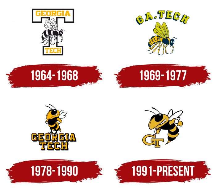
1964 – 1968
The Yellow Jackets sports club’s debut emblem consists of a large “T” with rectangular serifs and a flying wasp. In the upper and lower parts of the letter are the words “Georgia” and “Tech.” They are yellow caps with chopped corners at the “G,” “R,” and “O.” The insect is painted in black and white.
1969 – 1977
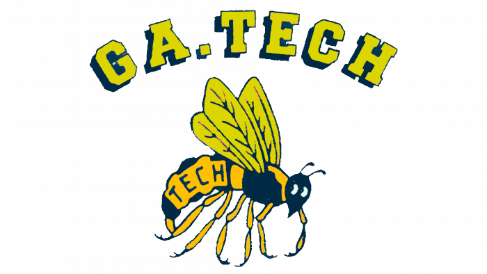
After the redesign, the wasp became colored: yellow legs, back, and abdomen, black and front, and green wings. The upper inscription is “GA. Tech. ” It is curved and provided with shadows on the right side, which makes it three-dimensional. On the belly of the insect is the word “Tech” in thin black sans serif type.
1978 – 1990
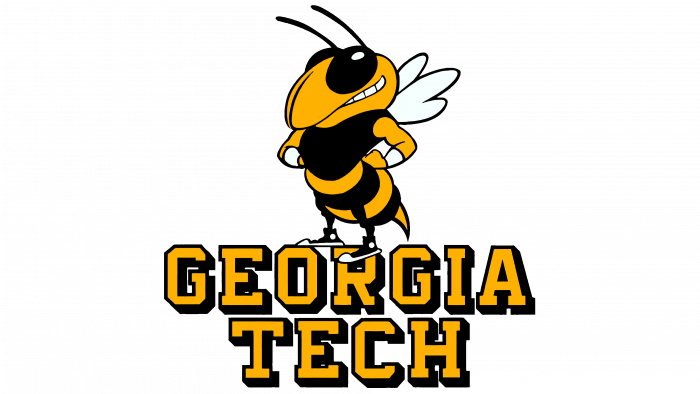
To modernize the logo of the university teams, the designers changed its style. Now, he is distant from realism because the artists have chosen a cartoon drawing technique. An anthropomorphic wasp appears on top of the words “Georgia Tech,” which span two lines. Each letter has shadows, so the inscription is perceived as three-dimensional. The wasp is depicted fighting – with large protruding eyes and clenched teeth. She has sneakers on her feet, which testifies to the sports orientation of the emblem.
1991 – today
In the current logo, the wasp does not stand but flies. To emphasize the formidable nature of a sports mascot, the developers highlighted the sting, drew the muscles, and added dynamics to the arms due to the scope. They abbreviated the long name of the educational institution to a two-letter abbreviation – “GT.” Symbols are placed diagonally, with large serifs, gold-colored and black-edged.
Georgia Tech: Interesting Facts
Georgia Institute of Technology, better known as Georgia Tech, is a top public research university in Atlanta, Georgia. Famous for its tough engineering, computing, and sciences programs, Georgia Tech has been a key player in tech innovation and education since 1885.
- Start: Founded in 1885 during the Reconstruction era to boost the South’s industrial economy, it began as the Georgia School of Technology, focusing on mechanical engineering.
- Growth: What started as a trade school is now a comprehensive university offering programs in sciences, liberal arts, business, and design, in addition to its top-notch engineering courses.
- Worldwide Reach: Georgia Institute of Technology is located in Atlanta; it has campuses in France and China, providing global learning opportunities and supporting international research.
- Research Excellence: Known for “Very High Research Activity,” Georgia Tech works on projects in many fields, such as aerospace, cybersecurity, and sustainable energy.
- Mascots and Symbols: Georgia Tech’s official mascot is Buzz, a yellow jacket. The Ramblin’ Wreck, a 1930 Ford Model A Sports Coupe, is a beloved symbol representing Georgia Tech’s engineering tradition.
- Invention Studio: This student-run maker space gives students access to tools and equipment to bring their ideas to life, encouraging creativity and hands-on learning.
- Famous Alumni: Notable graduates include Jimmy Carter, former President and Nobel Peace Prize laureate; Mike Duke, former CEO of Walmart; and Kary Mullis, Nobel laureate in Chemistry.
- Traditions: Georgia Tech is known for traditions like the Freshman Cake Race and the “Pi Mile Run,” showcasing its community spirit.
- Sustainability Efforts: The campus focuses on sustainability with LEED-certified buildings and initiatives promoting environmental stewardship.
- Economic Influence: Through its Enterprise Innovation Institute, Georgia Tech helps entrepreneurs and startups, fueling innovation and economic growth in Georgia and the Southeast.
Georgia Tech stands out for its rigorous academics, commitment to innovation, and dynamic campus life. It has significantly contributed to education, research, and community engagement in Georgia and beyond.
Font and Colors
The university seal, academic emblem, and Georgia Institute of Technology sports logo differ. They have no common elements, emphasizing the educational institution’s versatility and rich history. The management wanted to reflect all the most important aspects of this. Therefore, one graphic sign depicts a shield with an amphora and columns, the second an iconic tower, and the third a wasp.
The main university typefaces are Arial, Heebo, and Tungsten. The color palette is dominated by gold and white, first mentioned in the 1891 Atlanta Constitution. Navy blue (# 003057) is considered secondary. Moreover, the identity uses three shades of gold: Tech Gold (# B3A369), Buzz Gold (# EAAA00), and Gold Metallic.
FAQ
What is the tagline of Georgia Tech?
Slogan: “Progress and Service.” This motto is a core part of the university’s culture, influencing its academic programs, research, and student life.
The university continually strives for engineering, computer science, and science excellence. Renowned for its high academic standards, it produces research and technology that advance industry and society. It encourages students and teachers to use their skills and knowledge to solve real-world problems and contribute to society.
Is the GT logo copyrighted?
Yes, the logo is copyrighted. The Board of Regents of the University System of Georgia has registered the brand names, logos, and trademarks with the United States Patent and Trademark Office and the State of Georgia. This legal protection ensures that the logo and other brand elements are protected from unauthorized use.
Registering these elements as trademarks gives the brand control over its image and prevents misuse or misrepresentation. Registered trademark status means that any external use of the logo requires permission.
What is the symbol for Georgia Tech?
The Kessler Bell Tower is a symbol. Built-in 1996 for the Atlanta Olympics, this landmark represents the brand. Its spiral shape rises to a three-pointed apex resembling a crown.
The bell tower is a common meeting place and entertainment center in the heart of campus. Its image is used in promotional materials that reflect the brand’s personality. This iconic building reflects the spirit of the institute and its motto, “Progress and Service.”
What font is the Georgia Tech logo?
Logos and branding use specific fonts to represent a brand in different contexts. These fonts include Heebo, Arial, and Tungsten.
Heebo is used in sports departments for its clean and modern look. This font enhances the readability and visibility of sports-related content, reflecting the dynamic nature of college sports. Arial is a versatile, clear sans-serif font used in functional and administrative communications. Its simple style makes important information easy to read, which is important for academic and practical materials. Tungsten is a bold, condensed sans-serif font used for strong visual impact in prominent displays and headlines. It is effective in marketing materials and large-scale signage.
