 Gerber Life Insurance Logo PNG
Gerber Life Insurance: Brand overview
Gerber Life Insurance Company, based in Fremont, Michigan, came into existence in 1967 under the leadership of Max Kampelman. Initially, the company specialized in life insurance and focused on the needs of middle-income households. With the onset of the 1970s, the company began offering juvenile life insurance to help parents cover unexpected funeral expenses for a child. This offering soon became synonymous with the brand.
Gerber Life experienced steady growth during the 1980s and 1990s, expanding its range of insurance products. Direct marketing strategies and partnerships with agents and brokers expanded the company’s reach. By 1998, Gerber Life’s growth trajectory attracted the attention of Indiana-based financial services company Conseco, which subsequently acquired the company. The alliance with Conseco was crucial in strengthening Gerber Life’s market presence.
However, in 2002, a change occurred when Gerber Life became part of Western & Southern Financial Group, a diversified financial organization headquartered in Cincinnati. Under new management, Gerber Life expanded its juvenile and life insurance portfolios and also entered the health insurance business.
Gerber Life, currently located in White Plains, New York, is a subsidiary of Western & Southern. The company cleverly uses universally recognized images of Gerber babies in its advertising campaigns, having obtained licensing rights from Gerber Products Company. Today, the essence of Gerber Life’s business is meeting the life insurance and financial services needs of middle-class American households and corporations. The company’s success is evidenced by an impressive portfolio of insurance policies valued at more than $100 billion.
Meaning and History
1967 – today
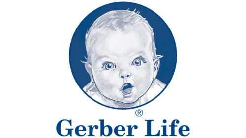
This insurance company is focused on families with children, so its logo shows a child. The image looks the same as the branded baby food jars of the same manufacturer. A curious baby looks at the world with wonder, and the company seeks to protect it from most troubles. Below the circle with the portrait is the company name written in a classic serif font. The letters are mostly lowercase, except for the first letter of each word. The emblem is painted in white, gray, and several shades of blue.
The shades of blue give the emblem a calm and trusting feel. It resembles the sky on a sunny day, creating a sense of security and comfort. The child’s face expresses excitement and curiosity, as if he is ready to explore but knows he is in no danger because the company has his back. The classic font brings to mind old school and reliability.
Gerber Life Insurance color codes
| Safety Blue | Hex color: | #004384 |
|---|---|---|
| RGB: | 0 67 132 | |
| CMYK: | 100 49 0 48 | |
| Pantone: | PMS 7686 C |
