The German motorcycle industry has an interesting and long history of development. Many of its brands are crucial to the country’s history and have left their mark on world history. German pedantry and quality have played an important role in this. However, the motorcycle industry played the most significant role from the early 30s to the late 40s, when production was focused on creating practical, durable, and long-lasting models for the Wehrmacht. During this time, original design solutions were developed, which could be useful in various cases. A striking example of such achievements was the appearance of tracked vehicles. The Second World War proved the serious advantages of the German production of motorcycle equipment worldwide.
What are German motorcycle brands?
Several successful motorcycle manufacturers are well established in the German domestic market: BMW Motorrad, Zundapp, Sachs, Adler, Brennabor, DKW, Hercules, Horex, Kreidler, Munch, MZ (Motorenwerke Zschopau), GmbH, Simson, NSU, Maico, Kalex…
Today, the German motorcycle industry continues the traditions of the past. However, having lost its dominant position in the post-war period, the country’s motorcycle production maintains high quality, reliability, and strict manly design. The real figures of production volumes and service life of the equipment and the growing sales of German equipment in the demanding American market evidence this. Today, motorcycle production in Germany is represented by several successful, well-known, and newly formed brands.
BMW Motorrad
The undisputed leader of the German motorcycle industry is the German brand BMW (Bayerische Motoren Werke). Founded in 1916 in Bavaria, the concern had several different production lines, mainly aircraft engines. The first motorcycle appeared in 1922. Thanks to innovative ideas in suspension, frame, and engine, which had no analogs then, this model immediately gained worldwide recognition. It became a distinctive feature of every brand product. The history of BMW Motorrad includes civilian and military motorcycles, the best sports models, enduro, motocross, and touring races.
The brand logo is among the ten most recognizable brands in the world. The history of its creation goes back to 1917. It adopted the round shape from its progenitor – the company Rapp Motorenwerken. It removed the image of a black horse and the name of the old brand, replacing it with an abbreviation; the color scheme referred to the flag of Bavaria. However, the ban on using state symbols in advertising had to be circumvented by placing these colors in a different order. The logo did not undergo major changes until 2020, when the sector with a black background was made transparent with a white border. A modern minimalist style was applied, symbolizing openness and accessibility and signaling the beginning of the brand’s “electric revolution.”
Zundapp
The company Zündapp – Zünder und Apparatebau G.m.b.H is found in German War Office documents in 1917 as a manufacturer of shells and detonators and was founded by Neumayer in Nuremberg as a joint venture with the state for defense contracts. After World War I, it came under Neumayer’s control. From that point on, production shifted to motorcycles. During the Second World War, the Wehrmacht ordered motorcycles with sidecars. The Zündapp KS 750 model was particularly in demand. The production of Zündapp Elcona sewing machines marked the post-war period. In 1984, the company went bankrupt and was sold with all its facilities to the People’s Republic of China, where it continued to produce motorcycles for Tianjin Motorcycle Co.
The logo was a sign of a heraldic shield with rounded corners, symbolizing protection and strength. The inner field was made of cobalt blue. The edges of the shield had a white border. To the left and right of it, there were unfolded stylized wings. Inside the shield, there was a composition including a zigzag arrow, a symbol of electric discharge, referring to the historicity – the production of generators and electrical appliances for military use, and also demonstrating the desire for new frontiers – the creation of an electric motor, which was used in 1972 on the Mokiki with a 500-watt electric motor.
Sachs
1886 was the year Karl Marschutz founded the now world-famous Sachs motorcycle (since 1904) and quality auto parts company. It all started with bicycles. The development of the motorcycle industry in Germany led to a need for spare parts, which the company immediately began producing, thanks to the arrival of Ernst Sachs, a toolmaker who later gave the brand its name. The brand was not officially registered until 1995. The company began to specialize in sporty off-road models but was unsuccessful. Its motorcycles list included scooters, mopeds, and the heavy Rodster.
Today, the brand is widely recognized thanks to its simple and concise emblem, which is made in blue. It is a sign with three symbols; the text under it is the brand’s name. The emblem consists of two elements below and above the central accent point. The elements symbolize spiral rotation; their shape widens towards the center and narrows towards the ends, resembling a crescent moon. The name is typed in lowercase type, Britannica Semi-expanded Heavy.
Adler
The German company Adler, which began production of motorcycles in 1880, existed until 1957. Its founder, Heinrich Kleier, assembled bicycles in a home workshop. A few years later, after becoming the director of Edmund Rumpler, he started to develop automobiles, which he did until the First World War. Since 1902, the brand has been installing its powertrains. The Second World War led to a decline in production. The company switches to the production of typewriters and motorcycles. The MB 250S model became particularly famous. Adler motorcycles are used to win championship races. In 1957, it was absorbed by the Trumpf company.
The company logo has retained its historical identity throughout the brand’s existence. The blue shield with a gray metal border was characteristic of many German brands of the early 20th century. Its lower part was made as a smooth arc without sharp edges. The upper part was also made in the form of an arc but went to the sides of the shield at an acute angle. Inside the emblem is a stylized image of a gray heraldic eagle spreading its wings, characteristic of German heraldry and the country’s coat of arms, which indicates the brand’s origin.
Brennabor
The brand was founded by three brothers, Reichstein, in 1871. The company manufactured cars, motorcycles, bicycles, and baby carriages in “Brandenburg a der Hefele.” Motorcycles were an additional line of business. The first motorcycle was produced in 1901. In 1908, a sports team was established based on the company, which successfully participated in motorcycle racing in international competitions on its machinery. From 1930 to 1942, Brennabor produced light motorcycle models on which it installed its engines. After the Second World War, the company was liquidated.
The emblem differed from the traditional execution of German logos of that time. It was two circles of different sizes, inscribed in each other – both with a gold border. The area between the outer and inner sides was filled with black color. In it, the stamp’s name was inscribed in lowercase letters on the circumference above and below, separated by a line. The font was highlighted in gold color. The inner space of the small circle was dark red. In the center was a white letter “B” – the first of the brand name. The white color attracted attention, making it an accent element. Black, red, and gold colors created an aristocratic and luxurious effect, which the manufacturers sought to reflect in their products.
DKW
Danish-born Skafte Rasmussen and his German partner Karl Ernst founded Ernst und Rasmussen in 1916. Located in Hemi, it was established to manufacture steam engines and parts for them. However, the partnership dissolved. Rasmussen, in 1916, received funding from the state for a steam engine project, which was patented under his brand name – DKW. In 1921, the development of motorcycles began under this brand. The first model was Reichsfahrtmodell. But the best was the DKW E 206 of 1925. After the war, production was expanded and divided. Since 1950, motorcycles have been produced under the brands IFA and MZ. Only the Ingolstadt company retained the brand name.
The emblem was a traditional image of a shield. The upper part with an arched edge was narrower than the lower part. It was connected to the wider lower part by small segments of the sides, depicted at an angle to the center. The bottom had a swollen shape. The contours are highlighted in gray. The inner space was occupied by an element resembling an arrowhead. Its upper part had an arched shape. The outlines were highlighted in black color. The inner space was filled with shades of green that waved from light green to darker shades on the left and right. At the top, the brand abbreviation was printed in white.
Hercules
Hercules was a German motorcycle company founded in Nuremberg in 1886 by technical engineer Karl Matusz. It was registered as a brand on September 10, 1910. It specialized in sports—motorcycles for competition, which were distinguished by the highest level. In the post-war period, its main customers were sports teams of the Warsaw Pact countries. After the complete collapse of this union, the company existed until 1997 and was closed.
The last logo of the brand was presented shortly before the factory’s closure. It was a circle symbolizing constancy, integrity, and perfection, in which the other signs of the emblem were inscribed. The circle had a yellow border and a white field, which created a harmonious combination and attracted attention. The inner space was occupied by a sign – a stylized first letter of the trademark “H,” the ends of the legs of which were beveled outward. Stylized wings showing speed and movement on both sides were depicted in two lines. These elements were rendered in dark blue and placed in a white rhombus. The latter was placed in a dark blue square, transitioning into a rectangle with rounded corners of the same shade. It contained the text name of the brand, made in lowercase letters of white color. The entire border was yellow, which visually emphasized each logo element. This composition was a stylized version of the image of the front of the car with a radiator and bumper, the production of which was carried out in parallel with motorcycles.
Horex
Horex is one of the rare German brands that did not supply its equipment to the Wehrmacht troops. Its founder in 1920 was Fritz Kleemann. As a sports racer, he created a motorcycle for himself in 1923 and won prizes. This marked the beginning of widespread production of motorcycles. The outbreak of World War II halted production, which was only restored in 1948. However, in 1960, the Daimler-Benz concern took over the brand, which had no interest in motorcycles. But in 1977, Friedl Münch became the rightful owner of the company name, releasing the Horex 1400 TI, and in 1989, the baton was continued by Japan with its Horex 644 OSCA. Series production was discontinued in 2014. Today, only the VR6 model is produced in small quantities by the 3C-Carbon Group.
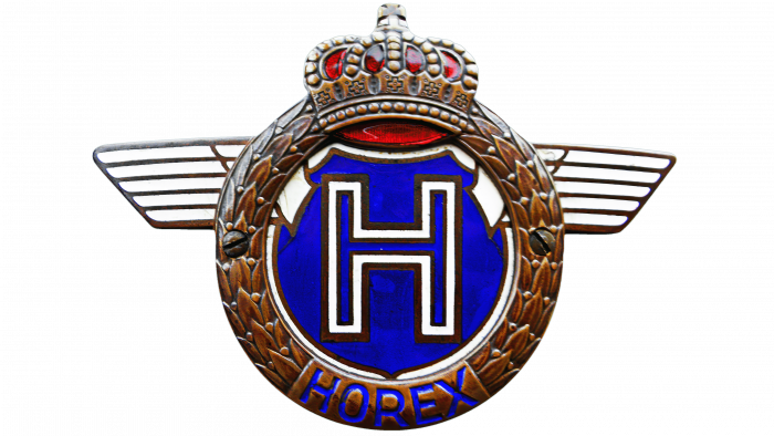
The emblem of the brand was luxurious and somewhat bombastic. Its outer element was a circle made in the form of a bronze laurel wreath, a regalia characteristic of the times of the Roman Empire. This circle is crowned with a stylized crown, imitating the headdress of Germanic emperors, with a cross in the upper part and on the circumference of the wreath. On the crown, there are bright red elements in the places where, in the original, there were precious stones. On the sides of the badge are stylized white outstretched wings, the contours of which are finished in bronze. The inner space includes – in the upper part – the inner space of the crown made of scarlet “satin.” Around the perimeter are the edges of a white mantle covering a dark blue field, in the center of which is the Latin letter “H” – the first letter of the brand name. Its outer and inner borders are bronze, and the middle is filled with white paint. The brand name is inscribed in dark blue Latin lowercase letters at the bottom of the laurel wreath.
Kreidler
Among the most famous global motorcycle brands of the 20th century, the German brand Kreidler stands out. Known since 1888 as a manufacturer of high-quality and stylish motorcycles based in Kornwestheim, it has become synonymous with quality and corporate style. Its motorcycles and mopeds have retained these characteristics to this day. In 1951, the company moved to Stuttgart, where a series of lightweight motorcycles had already been produced. 50cc racing motorcycles became famous for winning championships from 1971 to 1983. But in 1982, the company ceased to exist. Today, it is experiencing its rebirth.
The brand logo is simple and concise. Made in an attractive bright red color – a symbol of liberation, strength, and masculinity, it represents two elements. The first is a sign in the form of a circle, in the center of which is the letter “K” with a mirror image, located some distance from each other. In the center, they are crossed by an arrow with plumage from left to right. To the right of the mark is the brand name in lowercase letters in the redesigned Integral CF Bold font, which, with its simplicity, makes it easy to memorize all the symbols.
Munch
The Münch Mammoth motorcycle brand is the most famous in the history of the world motorcycle industry. Founded in 1940, the company became widely known in 1968, when former Horex designer Friedl Münch created the most successful model – the TTS Munch-4 1200th Mammut. This model used the NSU Prinz car’s engine, making the motorcycle a real sensation. However, the future was less promising, and in 1971, Friedl Munch sold the company.
Nevertheless, most motorcycle enthusiasts and professionals remember the company’s original logo well – simple and laconic. It was a rectangle with an upper line shaped like a reverse arc. The figure had a black frame. The whole logo was presented in two colors – black and white. Inside the large rectangle was placed an element of smaller size, completely repeating the shape of the outer one. Its field was filled with black, along with an inscription – the name of the brand in lowercase Latin letters, made in contrasting white color. Their graphic image created a sense of remoteness of the center of the text, creating the appearance of its bend in the center.
MZ (Motorenwerke Zschopau) GmbH
One of the German motorcycle brands, MZ (Motorrad Zschopau), was formed in 1956. It was formed in MZ Motorrad: Zschopau, based on one of the oldest German bicycle manufacturing companies, established in 1906. Two years later, it became part of the Zweirad Union concern, which united three other German brands – German Express, Victoria, and DKW. One factory was named VEB Motorradwerk Zschopau – MZ, after the name of the joined brand. Motorcycle production continued with mixed success. Technological changes led to a name change – from 1992 to 1999, the factory was called MuZ (Motorrad und Zweiradwerk). At the end of 1999, the company was acquired by Hong Leong Industries Berhad, which returned it to its former name. But after nine years, the production of motorcycles under the MZ brand was phased out.
The company’s merger with DKW influenced the formation of the brand logo. It was created based on the DKW logo, and its motif was repeated. Unlike the first version, the logo had only an arrow-shaped shield without a “top,” inscribed a reverse cone, resting with its apex in the lower central point of the shield. The base of the cone crossed the upper edge of the shield. The outline of the composition was made in gold. In the design of the free field of the figures, two colors in gradient execution were used – the shield’s field is green. The field of the cone is made of black and steel. Closer to the upper part of the shield, the corporate abbreviation MZ was applied across the whole composition, executed in slanted lowercase white font with black shadow. Its right slant symbolizes speed and movement. The left foot of the “M” and the right top line of the head “Z” extended beyond the borders of the shield and were incorporated into a single composition with a common gold border.
Simson
The end of the 19th century saw the birth of a company that left a significant mark on German history. It was Simson & Co., founded in 1856 by Jewish industrialists Loeb and Moses Simson. Until 1936, when the Nazi government expelled the family from the country, the company produced hammers, carbon steel rifles and barrels, steam engines, and in 1896, bicycles, for which in 1907 it was the turn of the Simson Supra racing car. World War I required the production of combat rifles and pistols for repair and rearmament. It was not until 1936, after the merger into BSW, that the new company manager encouraged the development and production of the first motorcycle, the BSW 98. In the German Democratic Republic, the company was renamed Volkseigener Betrieb Fahrzeug- und Gerätewerk Simson Suhl, with motorcycle production as the main priority. In New Germany, the company was renamed Simson Zweirad. In 2000, it became part of the Kontec Group.
The Simson emblem is largely characteristic of the German automobile and motorcycle industry. Its sign, made in monochrome black color, is characterized by brevity and simplicity of perception. A black circle with stylized black wings extended to the right and left of it, with the ends cut off at a certain angle, encloses a stylized Latin letter “S” in its inner space. Its design resembles the zigzag of a race track. Above the sign is the brand name Arial Nova Bold in black lowercase font.
NSU
NSU Motorenwerke AG traces its origins back to 1873 from Christian Schmidt’s mechanical workshop for knitting machines (Mechanische Werkstätte zur Herstellung von Strickmaschinen). Moving to Neckarsulm in 1880, the company added pedal bicycles to its products, and later automobiles and motorcycles. In early 1901, the company produced its first motorcycle under the NSU brand. During World War II, the company received slightly increased orders for the Kettenkrad and OSL 251 half-track motorcycles. The NSU Fox motorcycle did not appear until 1949. In 1955, the brand took the leading position in the world. In 1969, the company was absorbed by Volkswagenwerk AG.
The entire successful period of the brand’s existence was accompanied by the emblem, known at that time throughout the world. It was a stylized image of a fuel tank with a gold border, the inner field divided in half into black (top) and blue. This combination gives a strong visual effect. Blue is the color of organization, resilience, and perseverance. Black is the color of strength, creativity, and substance. Together, they symbolize unity and confidence in fulfilling all the characteristics inherent in each. The accent element of the logo is the text abbreviation of the brand – NSU, made in the center of the sign, crossing the border of colors. Its graphic image creates a visual convexity of the name by increasing the letters from left to right and right to left to the largest center. The letters are in light yellow. Their contours are highlighted in gold. This makes the text particularly striking against the general background and easy to remember.
Maico
In the middle of the XX century, the Maico brand was known as a manufacturer of excellent racing motorcycles. Against the background of the mass production of light motorcycles, scooters, and motorized bicycles in Germany after World War II, Maico developed and produced motocross racing models that are remembered in the history of motorcycle construction. The Maico brand (Maicowerk AG) was founded by Ulrich Maisch’s family as Maisch & Co of Pfeffingen in 1926 to manufacture engines. In the late forties, the company began producing motocross and enduro equipment, adding the popular Maicoletta scooter to the lineup. In 1983, the company went bankrupt.
The brand’s emblem consists of several elements – a triangular isosceles shield in the background, stylized unfolded fenders in front of it, and a stylized image of the shield mounted on the front fender of World War II motorcycles directly above the fenders. It and the letter “M,” the first letter of the brand name, applied throughout the composition from the bottom edge of the shield to its outer edges, are the central accent pieces. Except for the letter and the shield, most elements are in a green protective color. The letter is in white and black, which visually emphasizes its edges. The shield is made of bright red. The brand’s name is on the free field of the shield in black font, slanted to the right, symbolizing forward movement.
Kalex
Kalex Engineering is a product of the 21st century and a well-known motorcycle parts manufacturer. Its name is an abbreviation of several letters of the founders’ surnames – K LAUS Hirsekorn and Alex Baumgärtel. It was founded relatively recently – in 2008 in the city of Bobingen. But not as a motorcycle manufacturer. In 2010, Kalex led the Pons Racing team on a chassis. This chassis was the winner of the 2011 Moto2 World Championship. Today, it is a leading racing chassis manufacturer that has consistently won every championship in 2011 and since 2013.
The company’s logo contains no elements other than the textual name of the brand, enclosed in a rectangular frame with rounded corners. It is distinguished by the presence of a two-color scheme – black and orange, the combination of which was especially revered by knights in the Middle Ages. It symbolizes courage and honor, characteristic of the spirit of the company. The frame’s outline is the first two letters of the brand name, and the second one under the first word – “engineering” – is in black. The line under the black letters “KA” and the letters “lex” following them are orange. This diagonal arrangement of colors has a very strong impact on the viewer, making it especially memorable. The font is modern, technological, “faceted,” without roundness, and only with right angles, even in the letter “A.” The letter “X” has a diamond-shaped space at the point where its legs intersect.
FAQ
What motorcycle is made in Germany?
Germany has a long tradition of motorcycle production, with many brands renowned for their design and performance:
- BMW is a major player in the motorcycle world, known for its various models, including sports, touring, and heritage models.
- DKW was once one of the largest motorcycle manufacturers in the world. In the 1930s, it merged with Auto Union, now part of Audi.
- Hercules began business in 1886, making a name for itself with reliable, small two-stroke bicycles.
- Horex produced high-quality motorcycles and was particularly distinguished by models with an inline 6-cylinder engine.
- Kreidler was well known in the 1950s and 1960s for mopeds and small motorcycles.
- Maico is another heritage brand known for its powerful off-road and high-performance two-stroke motorcycles.
- Münch, founded by Friedel Münch, created the Münch Mammoth, a high-performance motorcycle with a large four-cylinder engine.
- MZ and MuZ started their activities in East Germany, with a rich road racing and motocross history.
- NSU was initially a major manufacturer of automobiles and motorcycles, playing a key role in developing the rotary engine.
- Sachs is known primarily for making engines, especially its small-engined motorcycles and scooters.
What is the best German motorcycle?
Choosing the best German motorcycle depends on what you value most. Germany has produced many notable brands of motorcycles:
- Zündapp was known for producing durable and reliable bicycles from the 1920s to the 1980s. Due to their durability, they were widely used during World War II.
- NSU was world-famous and a leader in developing the Wankel rotary engine.
- Münch produced high-performance custom motorcycles, such as the powerful Münch Mammoth, which are now collector’s items.
- MZ significantly advanced two-stroke engine technology and produced simple but efficient competitive motorcycles.
- Maico excelled in motocross and off-road racing, creating motorcycles loved for their excellent power-to-weight ratio and top-notch suspension systems.
- Kreidler dominated European race tracks in the 1960s and 1970s with small motorcycles and mopeds, setting numerous speed records.
- Horex created high-quality motorcycles with unique inline 6-cylinder engines.
- DKW helped popularize two-stroke engines. Their motorcycles, part of Auto Union (now known as Audi), were affordable and reliable.
These brands have significantly contributed to the motorcycle industry, offering unique features and innovations.
What is a European motorcycle?
The most popular motorcycles in Germany come from local and international brands. The Italian brand Piaggio led the market in 2021 with its stylish, functional scooters and small bikes well-suited for city riding. Following closely is the German brand BMW, known for its high-quality bikes designed for various riding styles, from touring to sport. The Japanese company Honda is also popular for its reliable and innovative motorcycles, offering a wide selection from commuter bikes to high-performance models. This shows the diversity of preferences in the German motorcycle market.
Are motorcycles common in Germany?
Motorcycles are common in Germany; many people own and use them regularly. The country encourages using motorcycles with laws that make it easy for car drivers to start riding. If you have a car license, you can obtain a license to drive motorcycles up to 125 cc without a separate driving test. This law helps more people ride motorcycles, increasing their popularity.
Who is the largest motorcycle manufacturer in Europe?
KTM Sportmotorcycle AG, based in Mattighofen, Austria, is the largest motorcycle manufacturer in Europe. The brand is known for its distinctive orange racing colors and innovative motorcycle designs. It offers a wide range of motorcycles for everyday road use and competition. Their success is due to a strong focus on research and development, allowing them to produce high-performance motorcycles suitable for amateur and professional riders.
