The Godiva Chocolatier logo embodies luxury and fine craftsmanship, featuring an elegant script and an image of Lady Godiva. Established in Brussels in 1926, the brand draws inspiration from the legendary figure Lady Godiva, known for her beauty, generosity, and bold spirit. These qualities are central to Godiva’s identity, renowned for producing some of the finest Belgian chocolates and celebrated for its rich flavors and exquisite textures. The logo represents Godiva’s dedication to artisanship and quality, marking the brand as a provider of luxurious indulgences. It communicates sophistication and celebration, making Godiva chocolates a prized gift and special treat while highlighting the brand’s status as a symbol of chocolate luxury.
Godiva: Brand overview
In 1926, Pierre Draps started Godiva in Brussels, Belgium, inspired by Lady Godiva’s generosity and nobility. He aimed to make high-quality pralines, truffles, and chocolates. Godiva quickly became a top chocolate maker in Belgium. The company grew in the 1940s and 1950s, opening more stores in Belgium and exporting chocolates to European countries. The Campbell Soup Company bought Godiva in 1966, starting its international growth. The first store outside Belgium opened in Paris in 1968.
Godiva became a global brand in the 1970s and 1980s, with stores in Asia, the Middle East, and North America. Its shops on New York’s Fifth Avenue and London’s Knightsbridge offered a high-end shopping experience. In 2008, the Turkish conglomerate Yıldız Holding bought Godiva, leading to further expansion, especially in China and Japan. Godiva added ice cream, hot chocolate, and cookies to its product range, improving its online sales and collaborations with luxury brands.
Godiva has over 600 stores and retail outlets in more than 100 countries. It remains a symbol of luxury and high quality in the chocolate industry. Godiva has always focused on quality, craftsmanship, and providing a luxury chocolate experience. It has adapted to changes in the chocolate industry and consumer preferences, keeping its unique brand. Godiva is in a strong position as the premium chocolate market grows because of its excellent quality, new products, and unique shopping experience. From its famous gold boxes to the delicious chocolates inside, Godiva sets the standard for luxury chocolate, continuing its tradition of excellence.
Meaning and History
What is Godiva?
Godiva is famous for its high-quality chocolates and confections. The company uses natural ingredients and advanced technology to create unique and exquisite flavors. Their product range includes chocolate bars, gourmet truffles, decadent cakes, and other sweets. Known as a luxury brand, Godiva chocolates are often chosen for gifts and personal indulgence.
1926 – 2005
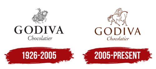
The first logo of the chocolate brand Godiva, created in 1926 and used until 2005, was richly detailed with intricate lines and heraldic decorations. This complex yet captivating image reflected the legend of Lady Godiva, a noblewoman who, according to legend, rode naked through a town on a horse to persuade her husband to reduce taxes for the poor. This story, embodying romance, self-sacrifice, and a quest for justice, became a core element of the brand.
The design mirrored the story’s themes of nobility and justice, suggesting that these values could bring real joy and relief. The logo helped the brand stand out in a competitive market by connecting it to a unique and revered history.
Designed in a ceremonial style, the first Godiva emblem respected tradition and historical heritage. The black-and-white drawing, heraldic inscription, and detailed depiction drew attention to the chocolate’s high quality and spoke to the nobility of its creation, effectively enhancing the product’s appeal and reputation.
2005 – today
Introduced in 2005, the brand emblem represents a step forward in design, capturing a sense of lightness and delicacy reminiscent of a cloud. This updated symbol features a lady with flowing hair, symbolizing the dreams and fantasies inspired by Godiva chocolate. Her hair, flowing into airy waves, represents boundless dreams that float freely, similar to the delightful taste of the chocolate that invites one into a world of fantasy and pleasure.
The emblem’s horse has been redesigned to show more dynamism and energy. It emphasizes progress and pursuing goals and encourages consumers to chase their dreams without fear.
The logo includes white elements and fine lines that highlight the light and airy texture of the chocolate as it melts in your mouth, offering satisfaction and a festive feeling. The brown color of the logo, chosen for its warmth and sweetness, complements the product packaging, creating a cohesive and appealing look. This color captures the essence of chocolate and adds sophistication and depth to the emblem, emphasizing the rich taste and quality of the products.
Font and Colors
The Godiva logo is crafted using an elegant, classic serif font known for its excellent proportion and readability. This design ensures the logo remains clear across various sizes and applications, which is essential for its wide usage.
The main name, “Godiva,” is in capital letters, making it prominent and visible. In contrast, the word “Chocolatier” is displayed in a smaller script font, adding a touch of finesse without distracting from the main brand. The serifs and subtle variations in stroke width enhance the logo’s luxurious and high-quality feel, reflecting the brand’s key attributes.
The text color is a rich, deep brown, reminiscent of chocolate, fitting for a premium chocolate manufacturer. This color choice evokes associations of indulgence and quality. A single-color text emphasizes simplicity and elegance, enhancing the logo’s recognizability and memorability.
The layout of the elements is meticulously planned: “Godiva” is centered above the smaller “Chocolatier,” creating a balanced and harmonious visual line. A serif font, precise kerning, and color palette collectively complement the logo, reinforcing the brand’s image as a symbol of luxury and craftsmanship.
FAQ
What does the GODIVA logo mean?
The GODIVA logo features Lady Godiva riding a horse. She is a hero from ancient England. Lady Godiva was unhappy because her husband, Leofric, the Earl of Mercia, imposed heavy taxes on Coventry’s people in the 13th century. She asked him to reduce these taxes, but he refused. In response, she vowed to ride naked through Coventry’s streets to convince him to change his decision. Honoring her vow, she rode while the townspeople stayed indoors out of respect for her. Moved by her act, the Earl lowered the taxes. The logo represents Lady Godiva’s bravery, kindness, and willingness to support others. It reflects the chocolate brand’s commitment to excellence, high-quality products, and generosity. The logo conveys a story of enduring values.
Is Godiva chocolate named after Lady Godiva?
Godiva chocolate got its name from Lady Godiva. She rode through Coventry, England, to speak out against high taxes. Her act showed generosity and bravery. In 1926, the Draps family started Godiva Chocolatier in Brussels, Belgium. They liked Lady Godiva’s tale for its bravery, inventiveness, and commitment to top-quality chocolate crafting. Their goal was to make outstanding chocolates that would mirror her famous act.
What is the GODIVA slogan?
Godiva has introduced a new marketing plan, using the phrase “Godiva is Chocolate” as its centerpiece. This approach highlights that Godiva’s chocolates are ideal for any moment, moving beyond their reputation as a brand for gifts or special times. They want to be the chocolate you think of first, not just for treating yourself but also when looking for a meaningful gift. The main ideas of this slogan include:
- Making Godiva synonymous with chocolate, aiming to be your go-to option.
- It reassures you of the premium quality of the chocolate, perfect for any time you want to enjoy a treat.
- Showing Godiva’s commitment to making every chocolate moment special, big or small.
Is Godiva chocolate Turkish?
Godiva Chocolatier is a well-known Belgian chocolate brand that is famous for its high-quality chocolates. While originally Belgian, the brand is now owned by Yıldız Holding, a large Turkish company. Despite the change in ownership in 2007, Godiva continues to produce chocolates using traditional Belgian methods. Yıldız Holding has a variety of business interests, including food and retail. Today, Godiva has stores across Europe, Asia, and the Americas, where it offers its chocolates to customers around the globe.
How long can you keep Godiva chocolates for?
Godiva chocolates are known for their great taste and quality. Store them properly for up to 2 weeks to keep them fresh after opening. They should be kept between 54 to 64°F (12 to 18°C) to prevent melting or hardening. Maintain humidity levels between 50% and 70% to ensure they stay in good condition. Also, avoid exposing the chocolates to direct sunlight to prevent them from melting or losing quality faster.
Why is Godiva so expensive?
Godiva chocolates are pricey because they’re made with top-notch ingredients and attention to detail. They choose the best cocoa beans, dairy, and flavors from around the world, which gives their chocolates a luxurious taste and feel that many people love. Using these high-end ingredients makes them more expensive than ordinary chocolates.
Godiva uses old-fashioned methods and the latest technology to make their chocolates to ensure every piece is perfect. They carefully temper the chocolate for a smooth look and spend much time on each truffle and praline. This careful process needs skilled workers and takes more time, adding to the cost.


