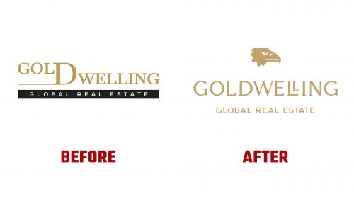
Goldwelling, a luxury real estate firm, has introduced a new visual identity to reflect its premium services and modern approach. The rebranding blends the company’s long-standing legacy with a forward-looking vision. The aim was to create a logo and identity that projects status and sophistication.
The new logo features an eagle’s head, representing wisdom, distinction, and wealth—qualities that align with the firm’s high-end real estate offerings. The eagle symbolizes strength and prestige, resonating with the company’s clientele. Paired with the idea of “gold” in the name, it reinforces the brand’s focus on luxury. The design ties the company’s identity to its name, combining “Gold” and “Dwelling,” symbolizing affluence and a home.
The typography received careful attention. Custom typographic characters were developed to blend traditional elegance with a modern touch. The typeface, Real Head Pro for the main logo and Real Text Pro for supporting materials, reflects the company’s use of advanced technology, like 3D virtual tours, while nodding to the timeless beauty of the real estate it represents. The result is a typeface that feels both classic and modern, providing a sophisticated yet approachable image.
Color plays a key role in the rebrand. Gold was chosen for its understated luxury, with a refined, modern shade replacing flashy metallic tones. Paired with a minimalist black-and-white palette, this creates a timeless look that exudes class and exclusivity. The restrained color scheme ensures versatility across digital and print mediums while maintaining a strong visual impact.
The logo is designed to work across digital and physical platforms, offering a consistent and polished appearance. The eagle’s head icon can stand alone on premium marketing materials, while the full logo works across the company’s website, social media, and printed materials. This flexible design allows the brand to maintain a cohesive presence on luxury property brochures or digital listings.
This rebrand reflects the company’s commitment to staying at the forefront of the luxury real estate market. The new logo and identity show a firm that values its history while embracing modern technology and trends to better serve its clients. The new look positions Goldwelling for continued success in the evolving real estate industry.


