


![]() Grubhub Logo PNG
Grubhub Logo PNG
“Eat at home,” the Grubhub logo urges. We will deliver your favorite dishes from cafes and restaurants directly to your table.” The image symbols encode novelty, variety, and the freshness of dishes, as well as a feast in the company of pleasant people.
Godric Gryffindor was born in the village later known as Godric’s Hollow in England’s West Country. Tradition described him as one of the strongest wizards of his age, with a name linked to Anglo-Saxon ideas of just rule. Around the 10th century, Gryffindor founded Hogwarts with Salazar Slytherin, Helga Hufflepuff, and Rowena Ravenclaw. The castle was hidden in the Scottish Highlands, where magic was feared and persecuted.
Each founder shaped the school through personal ideals. Gryffindor valued courage and honor, and believed any child with magical ability deserved training, regardless of origin. That belief led to his break with Slytherin, who wanted only pure-blood students admitted. After losing the argument, Slytherin left Hogwarts and secretly built the Chamber of Secrets with a basilisk inside.
Gryffindor was remembered as the finest duelist of his time, skilled with magic and with a sword. His ruby-set, goblin-made blade could appear to a true Gryffindor in moments of need. After killing the basilisk, the sword gained the power to destroy Horcruxes. It later helped Albus Dumbledore destroy Marvolo Gaunt’s ring, Ron Weasley destroy Slytherin’s locket, and Neville Longbottom kill Nagini.
Gryffindor also owned the Sorting Hat, later enchanted by all four founders to sort students by their traits and choices. His house later included Albus Dumbledore, Harry Potter, Hermione Granger, Ron Weasley, James Potter, Sirius Black, and Minerva McGonagall. The rivalry with Slytherin became part of Hogwarts life for centuries. In 1998, during the Battle of Hogwarts, Gryffindor students and alumni stood among the main defenders of the castle.
Meaning and History
![]()
Just Eat Takeaway is represented by various brands in 23 countries worldwide. Grubhub is her US subsidiary, which costs her more than $ 7 billion. After a new owner acquired the online service, the name was retained because marketers saw it as a powerful advertising tool. After all, as you know, the Grubhub brand has existed since 2004 and has already become famous throughout the United States. This restaurant food-delivery service became so popular that Uber Technologies Corporation almost bought it. But the enterprising leaders of Just Eat Takeaway were faster. Uber Eats remains one of Grubhub’s main rivals in the American market, alongside platforms such as EatStreet, Postmates, and DoorDash.
A well-thought-out identity system helps the company withstand the competition. At first glance, its logo is just an inscription without special features. However, the word mark has certain “tags” that identify its owner. These are the traditional red, bold sans-serif typefaces that the Grubhub identity cannot do without. In addition, using the brand name as a graphic sign positively affects brand awareness.
The online service’s iconography has changed several times. The last update was done in 2016 by the advertising studio Wolff Olins. It marked a watershed in the history of the food delivery service, as the specialists managed to increase Grubhub’s revenue and market value. The fact is that they not only changed the logo but also adapted the interface to it, added new functions, and proposed an innovative strategy for the service’s development. This holistic approach allowed it to reflect the brand’s ambition with simple visual tools.
What is Grubhub?
This is an American service for ordering food online with home delivery. Just Eat Takeaway owns it. It is headquartered in Chicago, Illinois. The platform has been operating since 2004, being founded by entrepreneurs Matt Maloney and Mike Evans. At this time, the website covers the services of all 50 states of the United States. Since 2014, its shares have been traded on the stock exchange.
2004 – 2011
![]()
In 2004, Matt Maloney and Mike Evans of Chicago launched the Grubhub website and registered a food-ordering company of the same name. The web developers decided it was a great business idea because restaurant diners get bored flipping through paper menus. While developing their online service, they did not forget the identity system’s most important thing.
The web service icon was a red rectangle with a radial gradient, with a light shade in the center blending into the dark edges. In the middle was a circle, stylized as a three-dimensional ball with highlights, shadows, black borders, and a blurry white outline. He denoted the planet as Earth, or as a collective image symbolizing the Grubhub universe, with catering establishments and numerous customers.
The improvised planet had a “satellite” – a dish with a cloche lid. Based on the trajectory, the serving dishes flew in a circle, encircling the ball. The artists depicted an annular orbit of the “satellite” and drew steam on top to clarify that the food was freshly prepared.
The image was complemented by advertising inscriptions intended to attract visitors’ attention. In the upper-left corner was a white arch reading “GrubHub.com.” She seemed to be lying in a red circle. The designers placed the website address on the logo because the Grubhub brand is inseparable from the online service. Below, with a slight leftward shift, was the orange slogan “WHO DELIVERS?” Thanks to him, it was clear what the company was doing. It was also used as an effective marketing tool – a call to action.
2011 – 2016
![]()
In the early 2010s, the platform owners removed unnecessary elements from the logo because Grubhub no longer needed advertising – customers already knew what services it offered. Thus, only one short inscription remained on the emblem, representing the brand’s name. It had an arched shape but was not very pronounced: one half (“grub”) began at the bottom and was directed upwards, and the second part (“Hub”) went from top to bottom. At the split point, there was a capital “H.” All other letters, including the first “g,” were lowercase. The word was easy to read thanks to its deep red color and clear geometric sans serif typeface. Numerous roundings made the brand symbol-friendly.
The Grubhub branding includes nothing except the inscription. However, this design is enough to attract customers’ attention because the word looks bright and resembles an advertising sign. It is a visual expression of a web service’s ambition, competitiveness, and desire to control the global market.
2016 – 2021
![]()
Grubhub’s most famous rebranding took place in 2016. Advertising agency Wolff Olins handled it, so the food delivery service received a new logo and a completely redesigned concept.
The Grubhub logo consists of an inscription in the Barlow Semi Condensed font. Texts on trains, buses, and road signs inspired the geometric grotesque. Its creator, Jeremy Tribby, drew inspiration from California street typography, so the letters are slightly rounded and low-contrast.
The specialists changed the lettering style, aligning the online platform’s name horizontally. All letters were converted to uppercase and set to a lighter weight. This version proved very durable: it survived even after the company changed hands and was taken over by Just Eat Takeaway.
The red color corresponds to the service’s corporate palette. It makes the Grubhub logo stand out and be visible against the backdrop of promotional materials. Red is also associated with hunger and appetite, making it a great choice for a food delivery company.
2021 – today
![]()
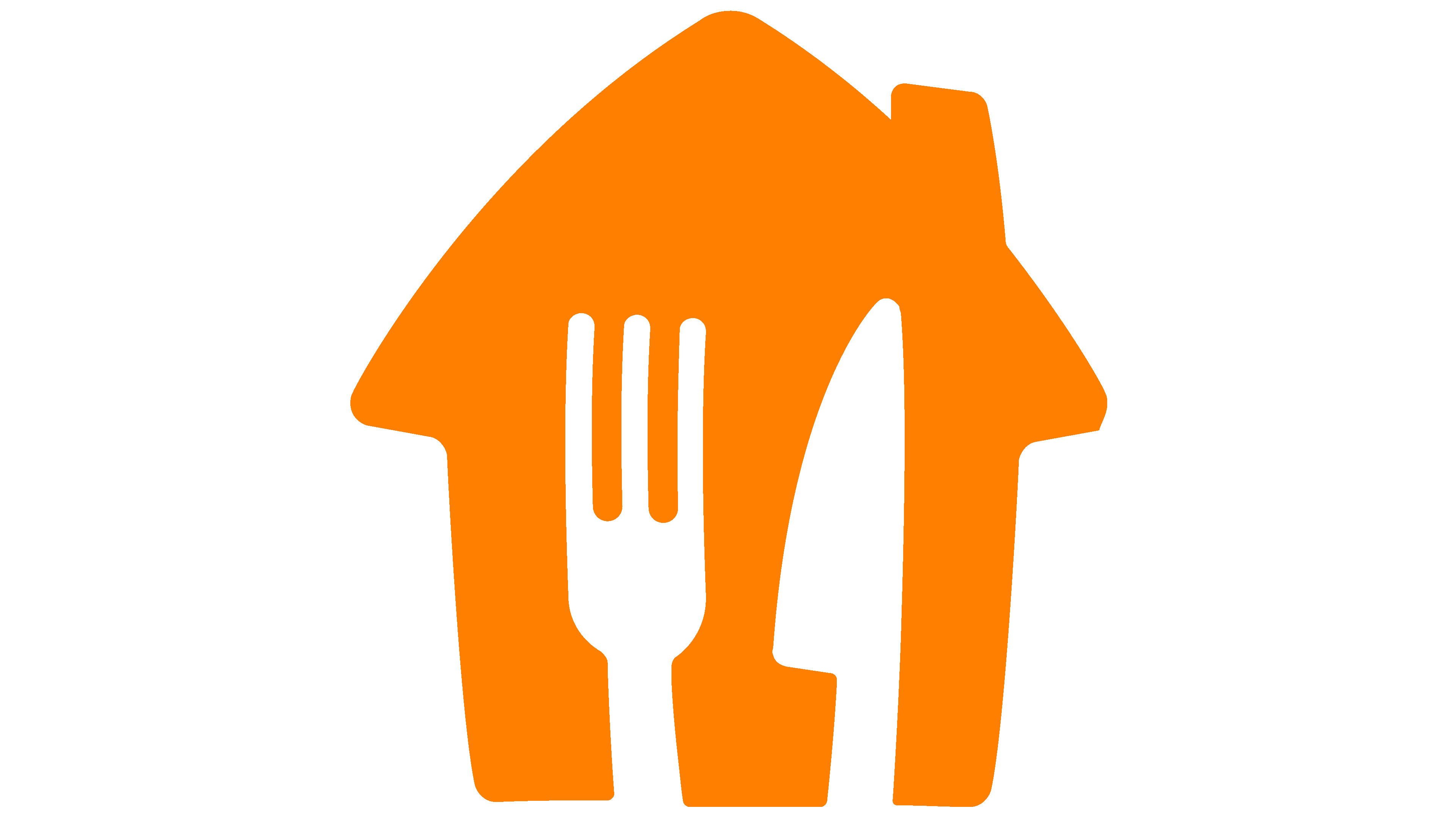
In June 2021, the Grubhub brand was finally acquired by the Dutch company Just Eat Takeaway.com N.V., which operates online food delivery services. He updated the logo a month later to match his new owner’s identity. So, on the left side, a symbol appeared in an orange house with a triangular roof and a pipe, as children usually draw it. It serves as the basis for knife-and-fork prints. The white cutlery silhouettes are shaped by negative space. This graphic was copied from JET, but the inscription “GRUBHUB” remains the same. It looks the same as the previous logo; only red has been replaced by orange.
Font and Colors
After the 2021 redesign, the font has not changed. It’s still a bold sans-serif Barlow Semi Condensed designed by Jeremy Tribby and inspired by street signage. Grubhub’s new orange color matches the official JET palette. It matches white, just like the parent company emblem.
FAQ
What is the primary color of the Grubhub brand logo?
Grubhub deliberately chose red for its logo. Red symbolizes energy and action, aligning with Grubhub’s fast, reliable food-delivery mission. The color red helps make the Grubhub logo stand out in advertisements and on app store listings, which is crucial in a competitive food delivery market. Additionally, red is associated with food, as it can stimulate appetite and convey warmth, supporting Grubhub’s aim of connecting diners with a variety of restaurants.
The choice of red also influences behavior, encouraging quicker decision-making, which could help users choose their meals more quickly on Grubhub. After merging with Seamless, both services adopted red in their branding. This shared color scheme enhances their recognizability and credibility among users, whether they opt for Grubhub or Seamless.
What is the purpose of Grubhub?
Grubhub aims to simplify food ordering for everyone and help restaurants attract more customers. It delivers meals to your doorstep and helps restaurants attract a larger crowd. The service is straightforward, offering a range of food choices for all budgets and dietary needs.
Grubhub is especially beneficial for smaller restaurants. These places often struggle to afford their delivery services or pay for ads. By joining Grubhub, they can get more orders and do well even when competition is tough. Additionally, Grubhub focuses on having a work culture that values diversity. They believe understanding different cultures and backgrounds helps them serve their customers better.
How does Grubhub work?
Grubhub makes getting your food online easy. Here’s how it works, from signing up to receiving your meal.
First, create an account on Grubhub’s app or website. Provide simple details, such as your name and email, and create a password. This allows Grubhub to recognize you for future orders.
Then, set up a payment method. Grubhub accepts credit cards, PayPal, and, in some cases, cash. Your payment details are stored to speed up future checkouts.
Now, start looking for places to eat. You can search by location, the cuisine you’re craving, your budget, and how quickly you need your meal. Grubhub will show you restaurants that can deliver straight to your address.
Find a place you like. Browse the menu on Grubhub, choose your dishes, and add them to your cart. Menus often include descriptions and photos to help you decide.
When you’re ready to finish, head to checkout. You can review your order, apply discount codes, leave a tip, and select your payment method.
Once you’ve placed your order, Grubhub will keep you updated. They’ll send notifications about your food being prepared and when it’s on its way to you. This keeps you informed about when to expect your delivery.
Does Grubhub refund food?
Grubhub offers refunds in some situations. Here’s an easier way to understand it:
- If you change your mind about an order and quickly tell Grubhub’s customer service, you can cancel it before the restaurant starts making it. This quick action could lead to a refund right away.
- If you want to cancel after it’s too late, or if there’s a problem with your order (such as incorrect or missing items or it not showing up), you must contact Grubhub’s customer service. Be ready with your order details to help resolve the refund issue more quickly.
If you contact Grubhub promptly and describe what went wrong, they may refund your order, depending on the circumstances.
Do Grubhub drivers have to accept orders?
Grubhub gives its drivers the power to accept or decline orders. Drivers can check an order’s details and, if it doesn’t suit them, they can press the “Reject” button. This action returns the order to Grubhub, which then looks for another driver. However, regularly declining orders can reduce a driver’s acceptance rate. Grubhub uses this rate to determine a driver’s Program Level, which affects the benefits they receive and how often they receive order offers.
What does the Grubhub logo mean?
The Grubhub logo is smart and straightforward, showing they deliver restaurant food to your home. It features a house, a fork, and a knife, symbols of home and eating. This design conveys that Grubhub offers a variety of food options delivered to your doorstep, so you can enjoy delicious meals without leaving your house. The orange logo evokes baked goods and feelings of warmth, comfort, and satisfaction. Since orange is associated with food and hunger, it’s a clever choice for Grubhub, a company focused on providing a wide range of food options from various restaurants.
Did Grubhub change its logo?
In 2021, Grubhub, a company that delivers food online, changed its logo to better connect with customers and stand out in a competitive market. The original logo was simple, using just the company’s name without fancy designs. The updated logo features an orange house, representing home delivery. It also cleverly includes the shapes of a fork and knife, showing that Grubhub delivers food in an easy-to-remember way.
The new logo aims to make Grubhub more recognizable and appealing, showing that the company is moving forward. By changing its logo, Grubhub aimed to build stronger relationships with its customers and distinguish itself from competitors.
What is the font of the Grubhub logo?
Grubhub updated its logo font to reflect its growth and to stand out. Originally, Grubhub chose the Barlow Semi Condensed Extra-bold font for its modern look, which is perfect for an online food delivery service. This font made Grubhub memorable in the crowded digital world. Later, as Grubhub grew, it created its font: Grubhub Sans Bold. This change meant Grubhub’s ads and app would have a unique look. Creating their own font was a way to make the brand more visible and easier to remember.
What does the Grubhub logo symbolize?
The Grubhub logo quickly shows it’s about easy food ordering. It features a house, suggesting home delivery, and a fork and knife inside, indicating food is delivered right to you. The company’s name is also there to clear up any confusion. The bright orange logo evokes tasty food, like fresh bread or pizza, and hints at Grubhub’s energetic, creative approach to bringing good food to your door comfortably and conveniently.
Why did Grubhub change their icon?
Grubhub updated its logo twice, in 2016 and again in 2021, to keep up with the times and better align with its new parent company. In 2016, with help from Wolff Olins, known for their creative branding work, they redesigned their logo to make it look modern and appealing. This change aimed to help Grubhub stand out and better connect with customers in the fast-moving food delivery market.
In 2021, after joining forces with Just Eat Takeaway.com (JET), a major global food delivery company based in the Netherlands, Grubhub refreshed its logo. This time, the goal was to show that Grubhub is now part of a bigger family. The new logo showcases an orange house with a fork and knife, representing Grubhub’s service of bringing food to your home.
These logo updates were important for Grubhub. They went beyond just changing the style; they were key moves to keep the brand current and help achieve its larger goals.
Why is Grubhub orange now?
In 2021, Grubhub changed its logo color to orange to match its new partner, Just Eat Takeaway.com, a major food delivery company based in the Netherlands that also uses orange. This change helped make Grubhub’s branding the same everywhere.
Changing to orange helped Grubhub stand out. Many food delivery services use red logos, so using orange caught people’s attention with its bright, lively feel. This was a smart move to help Grubhub stand out from other companies. Grubhub revealed its new orange logo at Lollapalooza in Chicago, a big music festival.
Why is Grubhub called Grubhub?
Grubhub’s name mixes “grub,” meaning food, with “hub,” indicating a central spot. This suggests that Grubhub is a top online platform for ordering food from local restaurants. The service focuses on being easy to use and offering many dining options in one location.
In its early days, Grubhub added “.com” to its name to emphasize its online nature. This was to demonstrate its goal of delivering food from local restaurants to customers’ homes via the internet. It simplified the process of getting your favorite foods without leaving home.