


![]() Gymshark Logo PNG
Gymshark Logo PNG
The emblem’s energy and massiveness indicate that the store is a clothing sales giant. The elements of movement in the Gymshark logo reflect the world of sports and the active lifestyles its customers lead.
Meaning and History
![]()
The British fitness brand was founded in 2012. Its creator, Ben Francis, didn’t see his occupation as a business-he just did what he loved. The young man could not find fashionable gymwear. So he decided to make them himself, using a stencil printer and a sewing machine in his parents’ garage. His grandmother taught him to sew, so the budding entrepreneur produced ten things a day. And Ben combined his hobby with his studies at university during the day and pizza delivery at night. Working as a delivery boy at Pizza Hut gave him the money he needed to keep the business afloat. Then he realized his hobby was very lucrative and dropped out.
When Gymshark got on its feet, Ben Francis wasn’t even 20 years old. His vast life experience helped him: despite his age, he became a stonemason, tried his hand at producing dietary supplements, created two iPhone fitness applications, and opened a store selling license plates. But only his passion for fashion brought him real fame.
Perhaps the former Aston University student benefited from an unusual marketing model. To popularize his brand, he gave away Gymshark clothing to YouTube and Instagram fitness stars, hoping they would wear it and promote it. Bodybuilders and trainers responded to the call, and it was even more effective than billboard posters. After all, the sports guru had millions of subscribers who, because of the COVID-19 pandemic, abandoned gyms and began exercising at home.
Ben Francis originally cared about the beauty and functionality of his clothes. He was just as concerned about visual identity, so the Gymshark logos were always thoughtful.
What is Gymshark?
This British sportswear manufacturer has transformed the approach to training gear through creative design and social media activity. The company offers premium clothing, including seamless leggings, compression pieces, and training tank tops designed for optimal fit and comfort. The assortment is particularly popular among fitness enthusiasts and professional athletes for clothing that enhances the figure and offers convenience during workouts. A key part of its success is collaboration with athletes and fitness bloggers, which has helped build a loyal audience.
Old
![]()
The original emblem looked like a seal, a kind of quality mark. In the center was a circle featuring an image of a muscular, anthropomorphic shark flexing its muscles. This image embodied athletic aggression. The drawing was surrounded by a ring of “GYMSHARK FITNESS” inscriptions. The words were one opposite the other and separated by square dots. The stencil font fits perfectly with the “brutal” design.
New
![]()
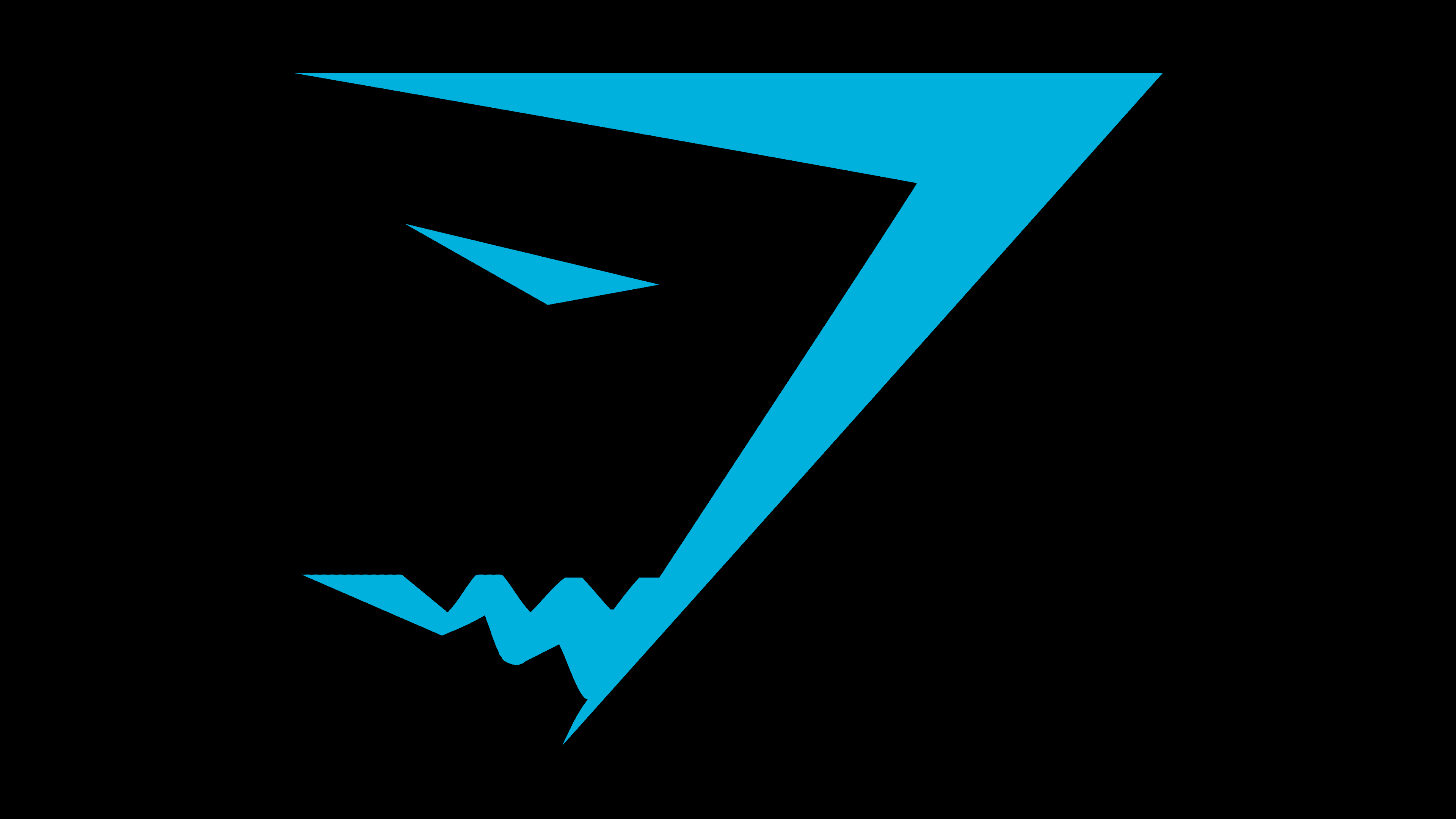
Before stepping down as CEO, Ben Francis had time to update the company’s logo. This happened when the clothing and fitness accessories manufacturer had already become popular and was in need of a reboot. The executives entrusted such an important task to certified designer Martin Williams from the West Midlands (Great Britain), who founded the agency Pixel Freak Creative. He tried to create an iconic brand for Gymshark, drawing on the experiences of Adidas, Nike, and other popular sports brands.
Martin Williams adhered to the principles of minimalism. Despite the simplicity of the shapes and lines, he created a powerful visual sign: the brand name, complete with a sharp-nosed shark’s head. And the drawing is schematic and consists of only three elements: an arrow, a mini-triangle, and a wavy stripe.
The shark on the logo plays around with the company name and reflects its “shark-like” approach to marketing. The predatory animal symbolizes the sportswear manufacturer’s dexterity. Unlike Adidas and Nike, it does not trade through large stores but sells products only online. And Gymshark does not spend millions of dollars on celebrity advertising; it promotes itself through popular bloggers on social networks.
In addition, the shark embodies anger, aggression, and danger. All these qualities can be associated with sports excitement, so the emblem has a deeper meaning than it seems at first glance.
Font and Colors

In Gymshark’s typography, there is a transition from an unusual stencil typeface to a bold grotesque. The latter is very similar to Bebas Neue Regular by Dharma Type. All the letters are bold and capitalized. The strokes are elongated vertically. Both the lettering and the shark’s head look laconic. The designer made them in black and white to avoid violating the canons of minimalism.