Hartford Insurance: Brand overview
Founded in 1810 in Hartford, Connecticut, Hartford is one of America’s most respected insurance institutions. The Hartford Fire Insurance Company originally originated as the brainchild of several prominent local businesspeople who sought to fulfill the insurance needs of the community.
In the late 19th century, as the turn of the century approached, Hartford realized the need to diversify and began to expand its insurance offerings beyond its foundational fire insurance products. A significant transformation occurred in 1968 with the merger with ITT Corporation, resulting in a name change to ITT-Hartford. However, a name change occurred in 1995 when the company returned to its roots, renaming itself The Hartford Financial Services Group to reflect its core insurance business better.
The Hartford Company’s journey of more than two centuries has been monumental. It has solidified its reputation as a dominant player in the property and casualty insurance industry in the United States. Hartford offers a wide range of services targeting a variety of clients, from individuals and businesses to large organizations.
Today, this well-respected Fortune 500 organization operates from its base in Hartford, Connecticut, and is backed by a strong team of more than 19,000 employees. While the company primarily utilizes independent agents and brokers for distribution, it also works directly with clients. Notable is its partnership with AARP, where Hartford has been the preferred insurance provider for its members for a quarter century.
Meaning and History
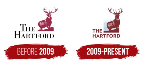
before 2009
2009 – today
The noble deer on the Hartford Insurance logo symbolizes the noble goals of the American investment and insurance company. The animal stands on a hillside, proudly raising its head with beautiful branching antlers. The deer calmly and confidently looks forward, going far beyond the boundaries of the square, which symbolizes the limitless possibilities of the insurer. Its dark body against the background of gray mountains looks clear and imposing. There is a two-level title on the left and below. It is made in flat font with capital letters and is colored in a dark coffee shade with red undertones.
The deer looks like it knows what it’s doing – like a wise friend giving sound advice. The gray mountains in the background make the deer stand out even more, like a spotlight on a stage. The dark coffee color of the title feels strong but not too flashy, like a sturdy old book you can trust. The red hue of the letters brings a touch of excitement, like a secret ingredient in a favorite recipe.
Hartford Insurance color codes
| Tuscan Red | Hex color: | #822b2f |
|---|---|---|
| RGB: | 130 43 47 | |
| CMYK: | 0 67 64 49 | |
| Pantone: | PMS 7622 C |
