HDFC Life: Brand overview
HDFC Life entered the insurance market in 2000 as a joint venture between India’s leading housing finance company, Housing Development Finance Corporation Limited (HDFC), and international investment giant Standard Life Aberdeen. At the time of inception, HDFC held 72.37% stake, and Standard Life held 26%.
Within the first month of its inception, HDFC Life introduced its first offerings: the HDFC SL YoungStar and HDFC SL Critical Illness plans. These initiatives marked the beginning of the company’s rapid growth. In the years that followed, the company’s commitment to creating innovative insurance products and expanding its distribution channels propelled it to the forefront among private life insurers in India.
Ten years after its founding, in 2010, HDFC increased its stake in HDFC Life to 74%, subsequently reducing Standard Life’s stake to the remaining 26%. Two years later, in 2012, the company carved a niche for itself by accumulating assets worth over $10 billion.
In 2017, HDFC Life decided to go public with an initial public offering (IPO) and listing on Indian stock exchanges. HDFC adjusted its stake to 51% to comply with regulatory requirements for foreign ownership.
Today, with assets under management in excess of $28 billion, HDFC Life holds a dominant position in India among private life insurers not affiliated with any bank. Its widespread influence can be seen in its impressive network of 547 branches, which serve over 61 million customers across the country as of 2022.
Meaning and History
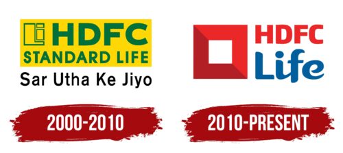
2000 – 2010
2010 – today
This Indian insurer has a vibrant logo that combines seriousness, expression, positivity, and joy. These qualities are evident in the dark and light shades of red, flowing lines, straight edges, and distinct shapes. First, it is a wide frame, inside of which there is a small white square. A diagonal line of two shades divides the figure into equal parts. On the right side is a two-level inscription. In the upper row is the abbreviation HDFC written in capital angular letters. Below it is the word “Life” written in soft outline characters.
The diagonal line in the middle is reminiscent of a quick brush stroke, adding a touch of artistry. The different shades of red are reminiscent of a sunset, which is often associated with a new beginning. The contrast between the angular “HDFC” and the soft “Life” seems to say, “We are firm, yet caring.” The logo seems attractive and, at the same time, creates a sense of stability.
HDFC Life color codes
| Lapis Lazuli | Hex color: | #025f9e |
|---|---|---|
| RGB: | 2 95 158 | |
| CMYK: | 99 40 0 38 | |
| Pantone: | PMS 7691 C |
| Pigment Red | Hex color: | #eb2727 |
|---|---|---|
| RGB: | 235 39 39 | |
| CMYK: | 0 83 83 8 | |
| Pantone: | PMS Bright Red C |
| Fire Brick | Hex color: | #b22025 |
|---|---|---|
| RGB: | 178 32 37 | |
| CMYK: | 0 82 79 30 | |
| Pantone: | PMS 1795 C |
