


![]() Heinz Logo PNG
Heinz Logo PNG
Despite its 150-year history, the Heinz logo has changed infrequently, with a later variation of the emblem used alongside the current logo. All this speaks of the company’s conservatism, stability, and commitment to unchanging values.
Heinz began in 1869 in Sharpsburg, Pennsylvania, when Henry John Heinz started selling horseradish at local markets. His first partnership with Clarence Noble failed, but the business later returned in a stronger form. By 1876, Heinz and L. C. Noble were selling tomato ketchup in clear glass bottles. This practical move lets buyers see the product’s quality before purchase.
By 1888, the company had grown into H. J. Heinz and offered more than 60 products. The “57” idea became one of the brand’s best-known identifiers, even as the real product range moved far beyond that number. In the early 1900s, Heinz expanded outside the United States, opening production in the United Kingdom, Canada, and Australia. At the same time, advertising presented the brand as a broad food producer rather than a single-product business.
World War II changed the company’s role, as Heinz became a supplier for the US Armed Forces and adjusted its products for military use. After the war, the company expanded its range to include barbecue sauces, frozen meals, and baby food during the 1950s and 1960s. It also expanded across Europe, Latin America, and Asia. In the 1980s, Heinz introduced Dip & Squeeze ketchup packaging for customers eating away from home.
The 1980s and 1990s brought acquisitions and asset sales as Heinz focused on core food categories. In 2013, Berkshire Hathaway and 3G Capital bought Heinz for $28 billion and took it private. In 2015, Heinz merged with Kraft Foods to form Kraft Heinz, placing two major American food businesses under one corporate structure.
Meaning and History
![]()
Since its founding in the mid-19th century, Heinz’s logo, typically red or black, has symbolized its strong identity. Over the years, Heinz has made only subtle changes to this logo, reflecting a commitment to stability and reliability. This conservative approach to branding underscores the company’s respect for its heritage and traditions, which have played a crucial role in building a long-standing trust with consumers.
What is Heinz?
A 150-year-old Pennsylvania food company with $25 billion in sales. It offers six product types, including sauces and ketchup bottles, salad dressings, snacks, baby food, and desserts. The most famous product is organic ketchup.
1869 – 1957
![]()
The entrepreneur chose a simple logo: the word “Heinz” in red. The name on the logo is the founder’s surname, a typical practice of the 19th and early 20th centuries. The companies were family-owned, with the owners often living on or near the second floor of the office. The owner’s name guaranteed the company’s recognition, reputation, and reliability.
Interestingly, John Heinz named the firm after his brothers after his company went bankrupt. Only 13 years later could he give the company his name. Therefore, Heinz on the logo meant John and Frederic Heinz.
The visual sign appeared after 1975. In 1869, the business and the company’s name were joined. Therefore, the emblem could not use only one participant’s name. Only after the bankruptcy and the founding of a new company in 1875 did Heinz wholly own it.
Henry Heinz was not ashamed to use the family name for the emblem, as his products were of very high quality. He mentioned that he began putting his name on the labels when he was certain he was offering safe food. As proof, Heinz began using transparent packaging, which was uncommon in the market, allowing buyers to see the quality of his product. And later, he went even further, becoming the first to offer in-store tastings of his products. Therefore, the word “Heinz” was associated with most premium goods, and it was sufficient on the logo.
The inscription distinguishes:
- Font with tapered ends. He made the letters slightly “pot-bellied,” like elongated jars with narrowed necks in which the goods were packed. It seemed that each letter was drawn with a pen from a drop of ketchup, which the businessman had been producing since 1876 (another indication of the logo’s appearance after the bankruptcy).
- There was wide spacing between letters, indicating that the owner did not conceal the contents of his goods. Bottles, like the letters in the logo, can be carefully examined from all sides.
The red color was not chosen by chance. It is the color of ripe tomatoes, the main ingredient of the composition. Red also testified to a great love for his work. Thanks to her, Henry was named the King of Ketchup in 1896, and his product was featured in the New York Times.
Interestingly, the first slogan, “57 varieties,” comprised Henry and his wife’s favorite numbers and did not correlate with the company’s assortment. Indeed, by the end of the 19th century, the company’s price list included more than 60 products developed according to Henry’s recipes.
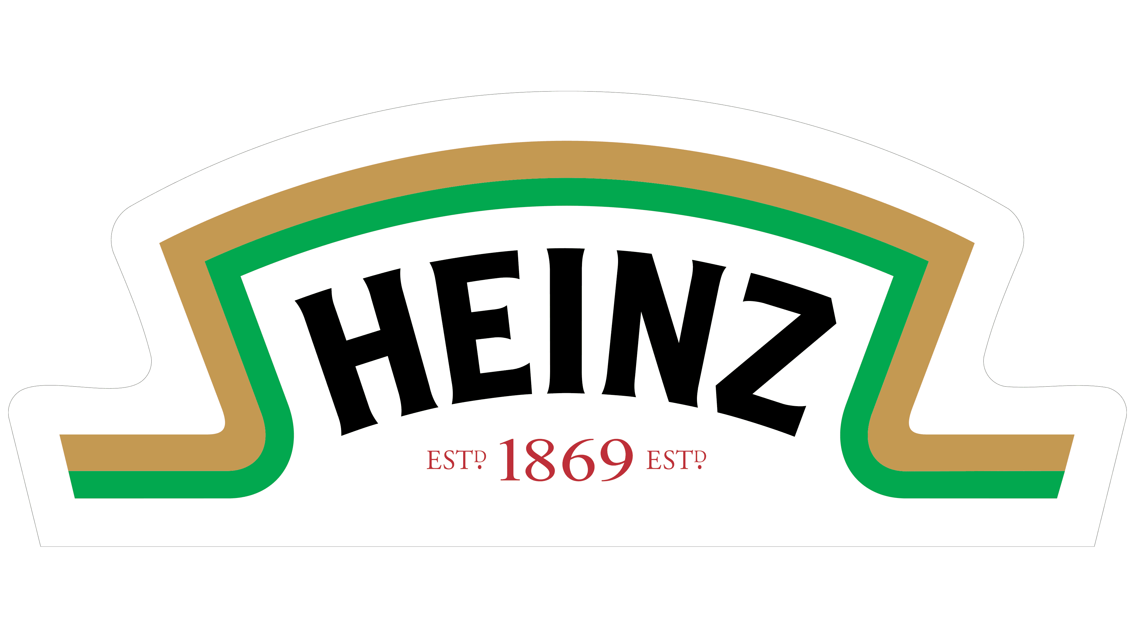
1957 – today
![]()
The logo update reflects the firm’s significant expansion. The founder’s name is still written in large capital letters, stretched upwards, arranged in an arch.
There are several separate divisions associated with the Heinz name. Several factories were opened, and in 1936, Heinz Seed was created (selecting and cultivating the best tomato varieties). The company’s products include sauces, bottled ketchup, mayonnaise, and canned goods.
The logo covers all this abundance, the heading, and the surrounding area. It also shows special concern for the company’s employees. In Henry Heinz’s day, his employees were provided with life insurance, and all medical expenses were covered.
The name stretches towards the sun, showing blossoming and growth. Upper-case letters represent the company’s products, each ranked first or second in its segment.
The arched inscription looks friendly and homely. Heinz has always strived to make his dishes look exactly like home cooking.
The black color of the inscription shifts the focus from ketchup, pointing to various products. It is a shade of power, strength, and dominance over competitors.
1989 – today
![]()
Heinz Ketchup is used to prepare for space flights. In 1990, it was officially approved as food for astronauts. This is one of the few goods worldwide that spread beyond Earth.
The red backing in an arched style signifies leadership and reaching the top, indicating that the tomatoes helped the company achieve such heights. It also shows the best products in the premium segment. The substrate can change color to black, white, or cucumber green in various products associated with naturalness.
Interestingly, the company originally wrote the name on the substrate in the shape of a cucumber.
The white color of the inscription indicates the pioneer. It also demonstrates the whiteness and naturalness of all products. The owner personally vouched for her. The company monitors quality from the planting of raw materials to their canning.
The first and last letters of the logo feature swirls that resemble ribbons from a cash register.
Font and Colors
The main colors of the logo are white and red.
- Red represents vivid impressions, excellent taste, passion for their work, and the desire to present the best results.
- White represents care for sterility and cleanliness, cultivating completely organic raw materials without chemical preservatives.
The logo font resembles Vario Italic but features unique swirls for the H and Z.