The Hellmann’s logo represents the brand’s long-standing commitment to quality, rooted in its rich history as one of America’s top-selling mayonnaise brands. Since Richard Hellmann first sold his mayonnaise in a New York City deli in 1913, the brand has become famous for its creamy, distinctive flavor. The logo embodies trust and tradition, highlighting Hellmann’s role as a kitchen staple and a market leader for over a century. This emblem underlines their mayonnaise’s consistent quality and delicious taste, making it a favorite in various dishes.
Hellmann’s: Brand overview
In 1903, German immigrant Richard Hellmann opened a deli in Manhattan, New York, where he began selling his homemade mayonnaise, quickly winning over his customers. By 1912, Hellmann saw the unique appeal of his mayonnaise and decided to sell it in distinctive blue glass jars with yellow labels, branding it as “Blue Ribbon Mayonnaise” to signify its high quality.
The 1920s were a time of growth for Hellmann’s, as it started reaching customers outside New York, expanding along the East Coast. By 1932, Hellmann’s mayonnaise was popular across the East Coast, Midwest, and South. That year, Richard Hellmann sold his brand to Best Foods, Inc., further propelling its growth.
Following World War II, Hellmann’s diversified its offerings, introducing salad dressings and tartar sauce. The brand also expanded internationally, entering markets in Canada, the UK, Venezuela, and more.
The 1960s brought another milestone for Hellmann’s when it introduced its memorable slogan, “Bring Out the Best,” highlighting its commitment to quality. The new millennium saw Hellmann’s joining the Unilever family, leading to global expansion and the launch of new products, including lighter and organic mayonnaise and vegan options.
In recent years, Hellmann’s has focused on sustainability, using free-range eggs since 2007 and improving environmental practices. Today, Hellmann’s is a beloved brand in over 50 countries, known for its signature taste and texture.
Meaning and History
What is Hellmann’s?
Hellmann’s, owned by Unilever, is a leading international mayonnaise brand that started in a New York deli and has grown to be recognized worldwide. Known for its creamy texture and smooth taste, Hellmann’s uses quality ingredients like fresh eggs, vegetable oil, and vinegar. The brand offers a variety of products, including classic mayonnaise and versions infused with different spices.
1913 – 1929
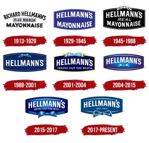
From 1913 to 1929, Hellmann’s introduced its first product with a logo that quickly became iconic. The logo included the seller’s name, the sauce’s name, and “Hellmann’s Blue Ribbon Mayonnaise,” all in an arched text that conveyed the brand’s elegance and uniqueness. This design also hinted at the product’s future success in the market.
The Hellmann surname was prominently displayed, highlighting the founder, Richard Hellmann, who brought credibility and trust to the product with his eleven years of business experience.
Including a blue ribbon in the logo emphasized the high quality and excellent mayonnaise taste. Traditionally, the best products at fairs are given blue ribbons, symbolizing superior quality. This element in the logo was used to set the mayonnaise apart from competitors and align it with the best in production traditions.
1929 – 1945
Since 1929, Hellmann’s has updated its logo to keep up with market changes and consumer preferences. The logo now serves as an effective marketing tool. It looks like a label on the packaging, which makes it stand out and easy to recognize.
The original name, “Hellmann’s Blue Ribbon Mayonnaise,” was changed to “Hellmann’s Mayonnaise.” This shorter name is easier to remember and emphasizes the main product.
The design also removed the blue ribbon image previously used to symbolize high quality. The logo uses a blue color scheme to represent quality and trust. White letters suggest freshness and quality, matching the sauce’s color.
The new logo features a shape that makes the jar appear fuller, adding to its visual appeal and suggesting a generous amount of product.
1945 – 1988
After the war, as companies updated their images, one well-known company chose a simple and solemn logo design. This new emblem stood for the brand’s ongoing commitment to quality and high standards. The logo featured a black-and-white color scheme, conveying classic and timeless values, underscoring that some principles remain steadfast despite challenges.
The logo’s design was clear, with white letters on a black background, making the brand easily recognizable. Its rectangular shape with convex sides added a sense of volume and dynamism, showing the company’s dedication to progress even after the war.
The logo included the word “genuine” under the main name, highlighting the use of quality ingredients. This was significant when many companies were reducing costs at the expense of quality. In contrast, this company maintained its commitment to high-quality and natural ingredients valued by consumers.
The white ribbon at the top of the logo symbolizes a gift, adding a festive and exclusive touch to the design, hinting that each product is a special quality offering.
1988 – 2001
In 1988, the company decided to update its logo’s color scheme as part of a strategic rebranding effort. They chose a blue background to convey depth, calm, and confidence, reinforcing the brand’s professionalism and reliability, which are important for their target premium market.
The new logo’s simplicity and clarity perfectly matched the premium product concept. Its clean lines stood out in a world full of visual clutter, strengthening its reputation as a symbol of quality and reliability and showing the brand’s commitment to excellence and innovation.
They also added a blue bow tie to the logo, bringing a sense of lightness and fun. This element reminds people that, despite its professional image, food is also a source of joy. The bow tie, suggesting festivity, communicates that the company’s products can turn everyday meals into special occasions, adding an element of fun to daily life.
2001 – 2004
When Unilever acquired the brand, it rebranded to update the product’s look and strengthen its market presence with new design elements. These changes aimed to showcase the product’s unique qualities and increase its appeal.
A notable update was the addition of a yellow border around the emblem. This bright touch attracts attention and underscores the high-quality, creamy taste of the mayonnaise. Yellow represents energy and optimism, linking the product to high standards and enjoyment.
They also introduced a blue bow in the logo, adding a festive and exclusive feel. The blue bow suggests lightness and quality, positioning the mayonnaise as ideal for special occasions. It reminds consumers that this mayonnaise enhances meals, turning everyday dishes into celebratory treats.
The slogan “bring out the best,” placed next to the logo, emphasizes the product’s premium quality. It suggests that using this mayonnaise can elevate the flavors of any dish, turning it into a culinary delight.
2004 – 2015
The brand emblem introduced in 2004 features a unique design that reminds people of a grand celebration under the spotlight. The emblem looks like a stage where the brand stands out as the evening star, drawing attention and admiration. This design highlights the product’s unique market position and influence on consumers.
The emblem uses white text and arches that help create a festive mood. White represents purity, exclusivity, and grandeur, adding elegance to the emblem. These elements highlight the high quality and prestige of the product.
Additionally, a blue bow tie on the emblem adds a touch of lightness and refinement. The bow tie resembles a formal suit, linking the brand to special, celebratory moments in people’s lives. It makes the logo seem part of a special occasion, underlining the product’s role in enhancing festive gatherings.
The emblem also features a master of ceremonies image, presenting the product as the main attraction of the evening. This design suggests that choosing this mayonnaise can transform any meal into a standout dish, enhancing the celebration.
2015 – 2017
In 2014, the brand launched a new packaging design for its product with a cap placed uniquely at the bottom of the container. This update made the product look fresher and improved its functionality, making it easier and more intuitive for consumers.
At the same time, the brand updated its emblem to focus more on the lower half, where a famous bow, representing elegance and high quality, was prominently featured. This change in the emblem was aligned with the new packaging design, emphasizing the ease of opening the mayonnaise from the bottom, which helped increase brand recognition and showcased the brand’s dedication to innovation.
Additionally, white elements representing purity and high quality were moved to the top of the emblem. Their new position, along with the smooth curves of the redesigned container, emphasized the unique and functional aspects of the packaging. These changes gave the product a new look and highlighted the brand’s focus on meeting its customers’ needs and enhancing convenience.
2017 – today
The company’s logo combines classic shapes with modern colors, reflecting its commitment to honoring traditions while adapting to a rapidly changing world. It illustrates the brand’s goal of maintaining established values while meeting modern consumer expectations.
The new emblem features several elements that contribute to a unified brand image. The prominent display of the well-known brand name sets the product apart from competitors and reminds consumers of the brand’s long-standing reputation and trustworthiness. An elegantly integrated premium bow tie enhances the logo, emphasizing the product’s high quality and adding a touch of sophistication.
The year marked on the emblem represents the company’s founding, signaling the extensive experience and craftsmanship that contribute to the product’s excellent taste, which consumers highly appreciate. This detail highlights the brand’s enduring heritage and the valuable knowledge passed down through generations, ensuring top quality.
Font and Colors
The Hellmann’s logo embodies classic elegance and tradition, with a brand name in a style highlighting quality and heritage. This choice reflects the company’s rich history in food production since 1913, evoking associations of craftsmanship and care in each product, which enhances consumer trust.
The bold font improves readability and makes the brand recognizable on any packaging or advertising. The design blends decorative elements with simple shapes, maintaining excellent readability while balancing ornamentation with functionality. The inscription “EST. 1913” is in a more restrained sans-serif font, complementing the main logo without drawing attention away and subtly emphasizing the brand’s longevity and stability.
Using dark blue as the background symbolizes reliability and professionalism, while the white font stands out sharply against the dark backdrop. Combining blue and white is associated with purity and freshness, which is crucial for a food brand.
Hellmann’s logo effectively combines font style and color palette to create a strong and memorable brand image that reinforces consumer trust, relies on enduring traditions, and ensures the brand name is widely recognized.
FAQ
What is the slogan of Hellmann’s?
Since 1987, Hellmann’s has been recognized for its catchy slogans “Bring out the best” and “Bring out the Hellmann’s.” These sayings promote Hellmann’s mayonnaise as an essential element for improving the taste of any dish. The underlying message is that using Hellmann’s makes regular meals special because of its high quality and great taste.
The slogan “Bring out the best” shows Hellmann’s dedication to quality. It implies that their mayonnaise makes any meal taste better, transforming simple foods into enjoyable experiences. The slogan “Bring out the Hellmann’s” motivates people to use Hellmann’s for a tasty meal. These slogans have made Hellmann’s a well-known brand with better food taste.
What is the full name of Hellman’s?
Richard Hellmann, Inc., known for Hellmann’s mayonnaise, started with a deli in New York in 1903. The deli’s homemade mayonnaise gained popularity, leading Hellmann to focus on its production and sales. By 1916, he formally established Richard Hellmann, Inc., shifting from a small deli to a significant company. Although Hellmann initially added horseradish and pumpernickel bread to his offerings, he soon focused on improving his mayonnaise’s taste and expanding its distribution. This decision helped make Hellmann’s a well-known brand around the world.
Why is Hellman’s mayonnaise so expensive?
Hellmann’s mayonnaise is pricier than other brands, and here’s a simpler explanation of why:
- Wholesale prices have gone up by 33% since 2020. Stores have to charge more to keep making money. This affects all mayonnaise brands, including Hellmann’s.
- Egg prices have risen because of bird flu, which has reduced the number of chickens that can lay eggs. Since eggs are important for making mayonnaise, this makes it more expensive.
- More people are eating eggs as a cheap source of protein. This higher demand makes eggs more expensive, raising the cost for companies like Hellmann’s to make mayonnaise.
- Hellmann’s uses top-notch ingredients to ensure its mayonnaise tastes great. However, focusing on quality and keeping a good reputation can make its mayonnaise costlier. People trust and value Hellmann’s name, contributing to its higher price.
All these reasons together make Hellmann’s mayonnaise more expensive. The increase in costs for wholesale and eggs, along with the brand’s commitment to quality, play a part in its price. Many feel the taste and quality of Hellmann’s justify the extra expense.
Who is Hellmann’s target audience?
Hellmann’s aims to cater to people who enjoy their products, focusing on women aged 25 to 54. This group usually buys groceries and values the quality and trustworthiness of the food they purchase. They are passionate about cooking and strive to make delicious, high-quality meals for their families. Hellmann’s supports this goal by offering dependable, tasty ingredients that improve homemade meals. The company appreciates its loyal customers, who prefer their products. Hellmann’s aims to keep these customers happy and motivate them to spread the word about their positive experiences with the brand, helping to promote it through word-of-mouth.
