


![]() Hells Angels Logo PNG
Hells Angels Logo PNG
The Hells Angels logo perfectly demonstrates the internal spirit of the motorcycle club, which law enforcement considers a syndicate of organized crime. The brutal emblem evokes such thoughts, as it contains classic images that hint at defiance, freedom, and uniqueness, drawn from riding Harley-Davidsons.
The Hells Angels Motorcycle Club (HAMC) was founded on March 17, 1948, in San Bernardino, California, by World War II veterans, many of whom had served in the Air Force, adopting their name from a renowned wartime fighter squadron. Embracing Harley-Davidson motorcycles, the club quickly developed its iconic identity, with distinct symbols and patches, notably the winged skull known as the “Death Head.” Their rebellious image was solidified after the American Motorcyclist Association (AMA) races in Hollister, California, where bikers became synonymous with defiance against mainstream society, earning the label “1%ers.” In the 1960s, the club rose to prominence through associations with the counterculture movement and participation in events headlined by the Rolling Stones, notably acting as security at the infamous Altamont concert, which ended tragically. Expansion brought international chapters across Europe and Australia, but also intensified scrutiny from authorities like the FBI, who investigated the group for organized crime activities, resulting in major legal confrontations, including charges against influential members like Sonny Barger. Despite ongoing legal challenges and violent rivalries, the organization persisted, establishing itself as the world’s largest motorcycle brotherhood and continuing to influence biker culture globally.
Meaning and History
![]()
The basis of the Hell’s Angels logo is the club’s name, making it stylish and iconic. The “deadly” nickname was suggested by Arvid Olsen, a serviceman from the Hell’s Angels squadron of the Flying Tigers. From there, the extreme phrase originates, conveying the brutality characteristic of motorcycle enthusiasts. Notably, this motorcycle club prefers to ride Harley-Davidsons, which also aligns with the harsh style of its visual identity.
What is Hells Angels?
Hells Angels is an American motorcycle organization from the city of Fontana, California, where it appeared in 1948. It was founded by Otto Friedli, who left Pissed Off Bastards. According to other reports, it opened in 1951 in San Bernardino due to the efforts of Dick White, who left Road Runners. Regardless, the club’s age is counted from the first date, not the second. As of 2023, the corporation comprises 6,000 members from 467 chapters located in 59 countries around the world. The headquarters is in Oakland.
1948 – today
![]()
The Hells Angels emblem is divided into three groups. The first includes the club’s name, arched at the top and set in an Old English font. The ornate letters with spikes in the middle of each leg combine well with an airiness due to the standalone glyphs. However, the space between them is not too wide, maintaining normal word readability. The letter’s ends are split in two and sharpened, creating a sense of the prickly character of motorcycle riding enthusiasts.
The second part consists of a skull image in a helmet: red at the front and black on the sides and back. It features a medium-length horn, empty eye sockets, and tightly clenched teeth. Behind the head is a spread wing. The pointed element wraps around the skull and hangs at the forehead, forming a kind of protection. The feathers are neatly highlighted in black, serving as an outline and a background. Below it, to the right, is the third part of the logo, the abbreviation “MC.” Unlike the top inscription, it’s strict, geometric, even, and set in uppercase letters of the correct shape.
Font and Colors
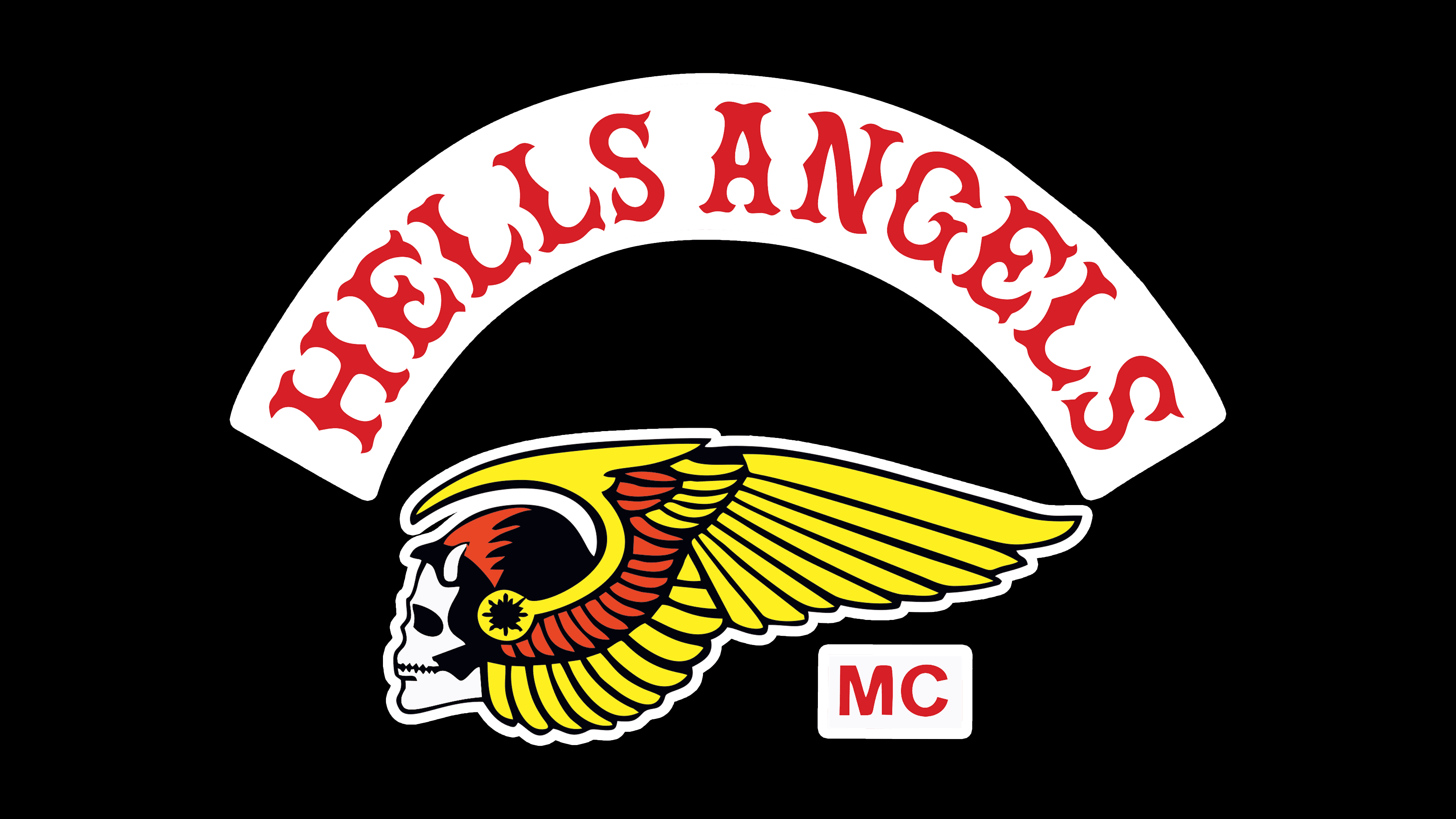
The inscriptions are set in two typefaces: the first is Bosox by Lee Gordon, and the second resembles News Gothic FS Bold by FontSite Inc. The arched line impresses with an Old English font with spikes and split ends. The abbreviation features classic print glyphs straight, with smooth edges.
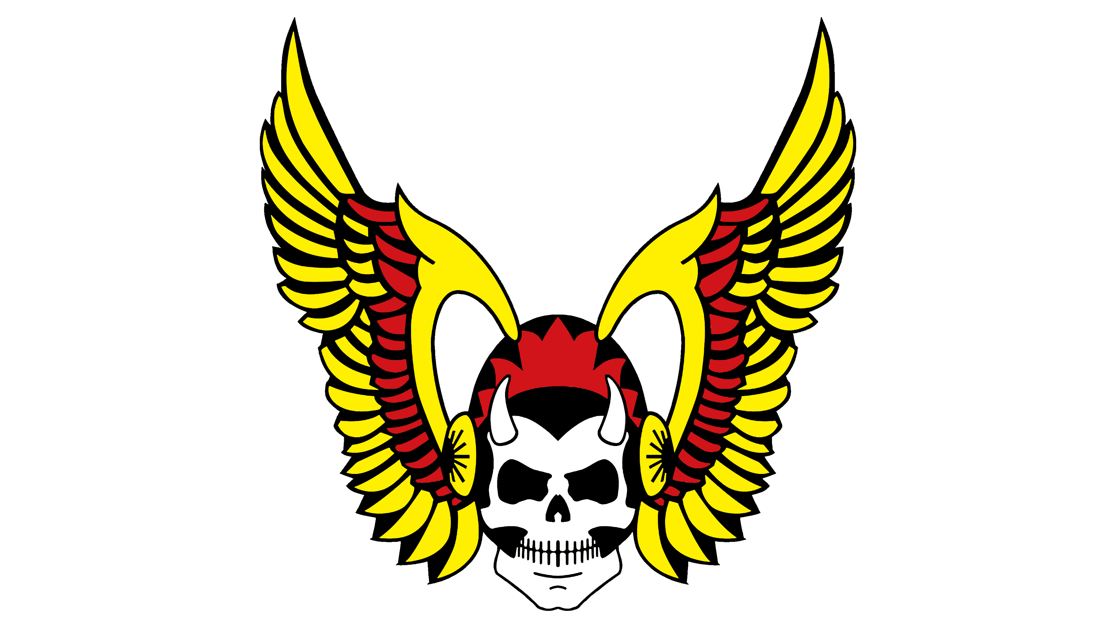
The Hells Angels logo’s color palette includes four colors: red, white, yellow, and black. Red is divided into two subtypes: a dark shade decorates the helmet and feathers, while a bright one highlights the text well. Black serves as the background, shadows, and contour outline.