


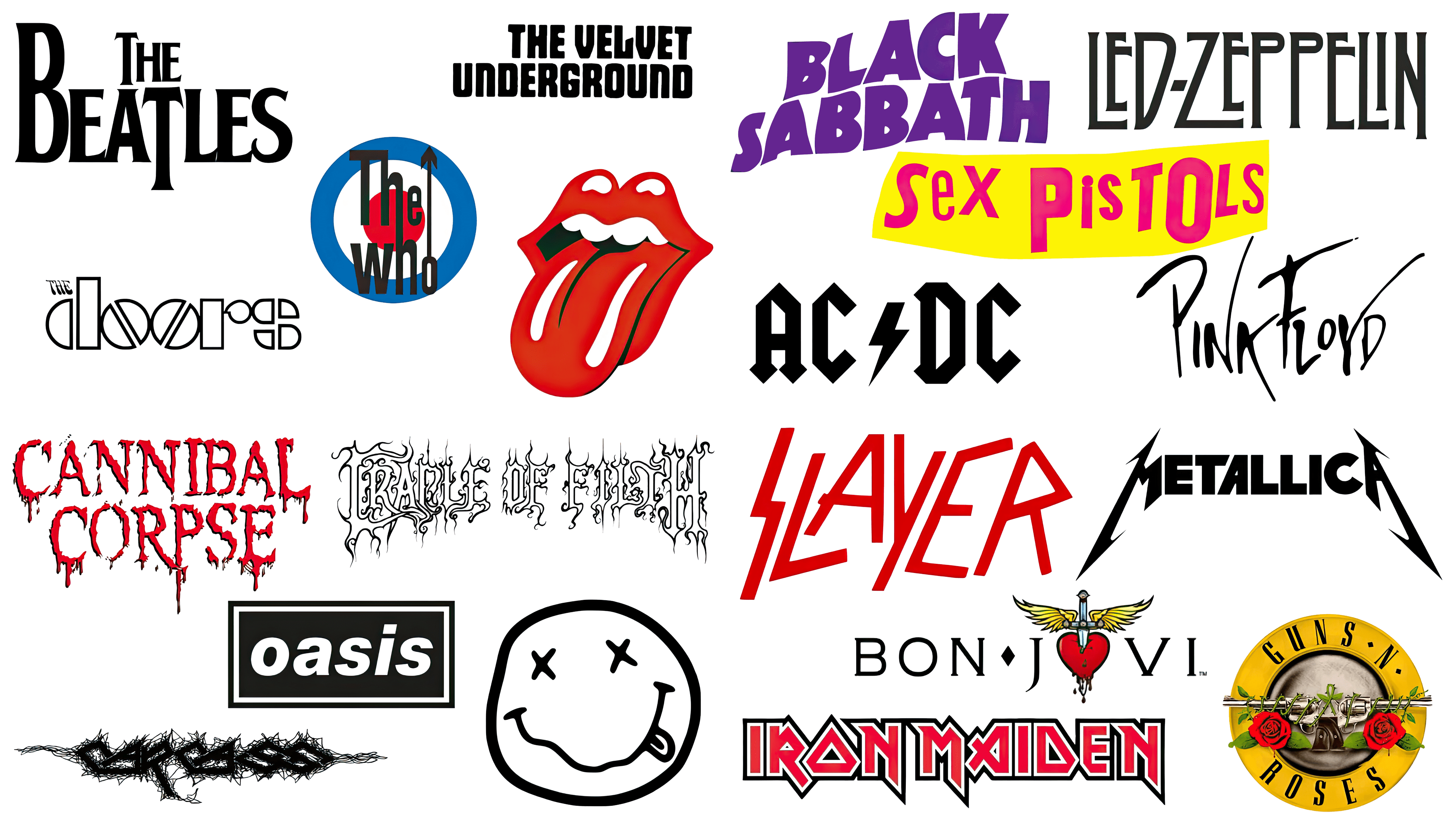
The evolution of rock band logos from the 1960s to the present day is a fascinating journey, reflecting the changes in music styles, culture, and artistic expression. Iconic logos like The Rolling Stones’ Tongue and Nirvana’s smiley face have become symbols recognized worldwide, transcending their origins to become part of popular culture. These logos are so well-known that they can instantly identify the band they represent, often seen on merchandise and in various media.
Over the decades, band logos have evolved significantly, often mirroring the music’s style and the band’s image. Generally, there’s a notable trend correlating a band’s sound and the complexity of its logo. Heavier, darker bands tend to have more intricate, sometimes nearly indecipherable logos, often dominated by black and white. This is particularly evident in metal bands, whose logos often feature elaborate, gothic-inspired fonts and imagery. If you’ve seen posters for metal festivals, you’ve likely seen this design aesthetic.
However, not all bands conform to these general trends. There are always exceptions where bands choose to differentiate themselves through their logo design. An example is a heavy metal band that opted for a bright, colorful logo, deviating from the typical dark, complex designs in their genre. This sets them apart and highlights the diversity and creativity within the rock and metal music scenes. Such deviations from the norm demonstrate the dynamic and evolving nature of band branding and the music industry as a whole.
The 1960s (the start of the rock era)
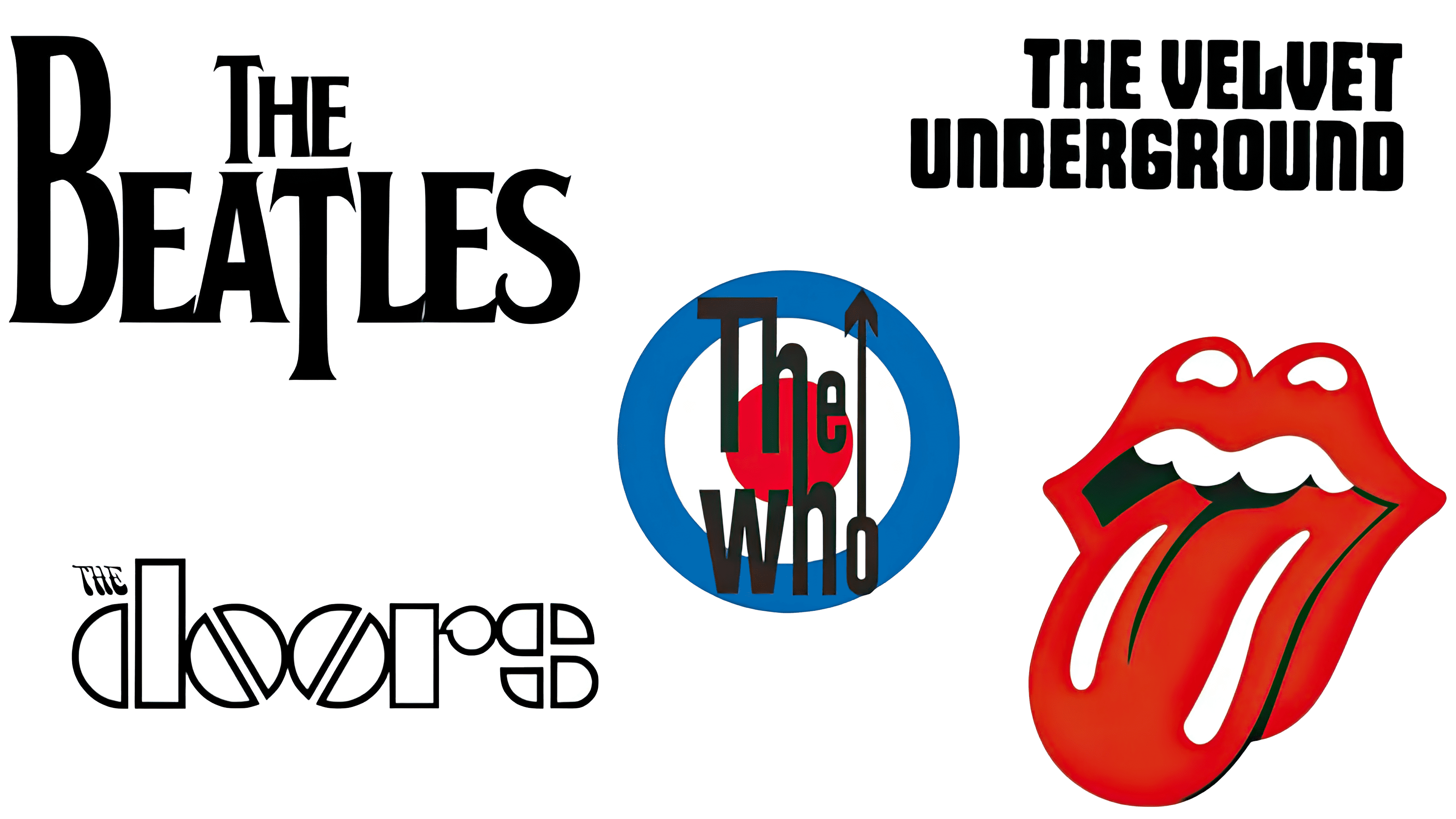
In the 1960s, when rock music was gaining momentum, band logos were often straightforward, primarily featuring the band’s name. This simplicity mirrored the era’s design ethos, focusing on clarity and recognizability. For instance, The Beatles, The Doors, and The Velvet Underground had logos that were essentially their names in basic fonts and colors.
The Beatles’ logo is an intriguing case. It’s a classic example of branding evolving. The logo, known for its unique ‘drop-T,’ wasn’t a major part of their album artwork. Interestingly, it gained prominence from its placement on Ringo Starr’s drum kit. The design, created spontaneously by the Ludwig drums supplier, had an enlarged ‘B’ and ‘T’ to play on the word ‘Beat,’ tying into the band’s name and musical style.
As the 60s progressed, band logos began to take on more artistic and experimental forms. The Rolling Stones’ logo, created in 1970, marked a significant shift. Designed by Jon Pasche, then an art student, the logo featured bold red lips and a protruding tongue. It was a departure from the norm, combining cultural references with a hint of rebellion and sexuality, reflecting the band’s edgy persona.
The Who’s logo blended simplicity and symbolism. The joined ‘h’s in their name symbolized unity, while the arrow in the ‘o’ added a touch of masculinity. The background, with the Union Flag motif, represented their British roots and became emblematic of the mod subculture.
The 1970s (metal and punk)
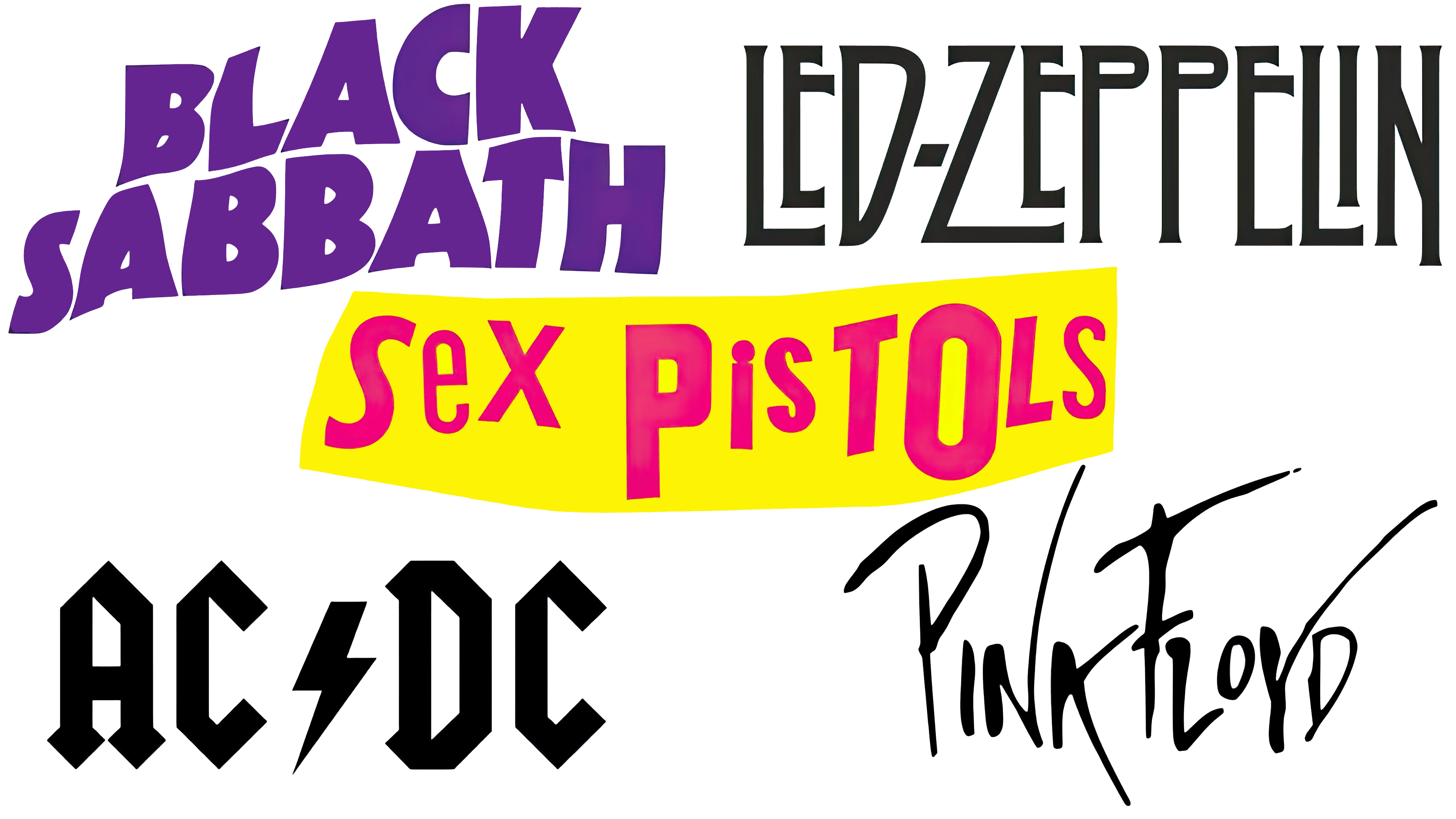
In the 1970s, as rock music branched into various subgenres, band logos started to reflect this diversity and became more experimental. This era marked a departure from the simplicity of the 60s, with logos beginning to embody the unique styles and attitudes of the bands they represented.
Bands like Led Zeppelin and AC/DC, known for their blues-influenced hard rock and significant influence on heavy metal, adopted logos distinct from those of their predecessors. Their logos used typefaces that were more gothic and somewhat intimidating, reflecting the heavier, more aggressive nature of their music compared to that of 1960s rock bands.
Black Sabbath, often hailed as the first metal band, used its name in its logo but with a style that matched its pioneering role in the heavy metal genre. Their logo was more than just a name; it embodied the band’s groundbreaking, darker musical style.
In stark contrast, the Sex Pistols’ logo was intentionally rough and haphazard, capturing the raw, DIY spirit of the punk scene. It appeared to be crafted from newspaper clippings, lacking consistency and polish, which perfectly mirrored the rebellious, unrefined ethos of punk music.
On the other hand, some bands like Pink Floyd retained simpler logos, more reminiscent of the previous decade. Pink Floyd’s more straightforward logo style aligned with their rock music, which was less about rebellion and more about experimental, psychedelic soundscapes.
The 1970s were a pivotal time in the evolution of rock music and its visual representation. Band logos became a crucial part of a band’s identity, reflecting their musical style and their cultural and subcultural affiliations. This era laid the foundation for the diverse and creative expressions in band logos that would continue to evolve in the decades to follow.
The 1980s (Hard rock and thrash metal)
During the 1980s, the landscape of rock band logos continued to evolve, mirroring the era’s diverse musical styles. This decade was characterized by a mix of straightforward, text-based logos and more experimental designs, reflecting the dynamic nature of the music industry at the time.
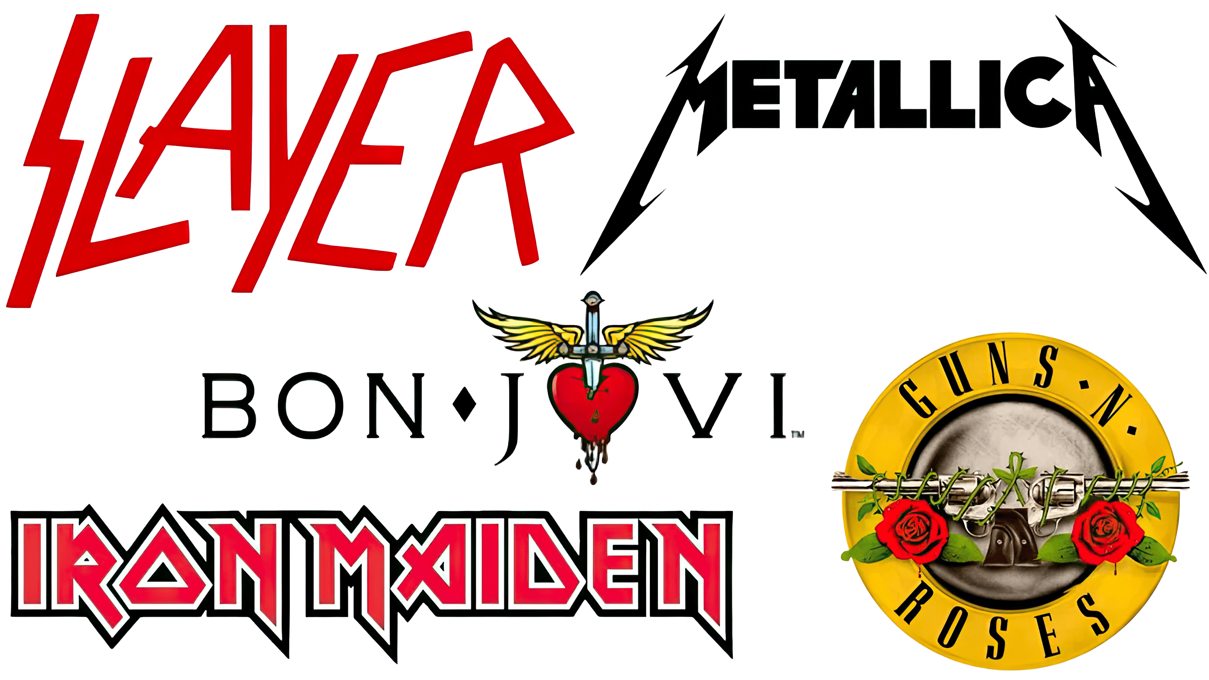
Heavy metal was flourishing, with British bands like Iron Maiden and Judas Priest enjoying success. At the same time, in the United States, thrash metal bands such as Metallica and Slayer were rising to prominence. The logos of these bands often incorporated black, a staple of heavier music, symbolizing the intensity and darkness associated with metal. Additionally, red became more prevalent in these logos, representing anger, passion, and danger. The design elements in these logos typically featured sharp edges and straight lines, moving away from the softer, more rounded typography of previous decades.
In contrast, bands categorized as hair metal or hard rock, like Bon Jovi and Guns N’ Roses, opted for less intense typefaces but incorporated more imagery into their logos. For example, the Guns N’ Roses logo directly visualizes the band’s name with images of guns and roses, creating a striking juxtaposition between violence and love. Similarly, Bon Jovi’s logo from the mid-1980s combined a heart and a sword, again contrasting love and violence.
These logos from the 1980s served as brand identifiers for the bands and as symbols reflecting the themes and attitudes prevalent in their music. The designs captured the essence of the era’s rock music, from the aggression and intensity of heavy metal to the more theatrical, flamboyant style of hair metal, showcasing the rich diversity of rock music and its visual representation during this period.
The 1990s (Grunge, Britpop, and more extreme metal)

As the 21st century neared, the trend in rock and metal band logos shifted towards more extreme designs, particularly in the death metal genre. These logos began to reflect the music’s intense, often controversial themes.
Cannibal Corpse, a death metal band known for its horror-influenced themes, is a prime example. Their logo, featuring all-caps red letters that resemble dripping blood, immediately conveys a sense of horror and intensity. This design would not be out of place on a horror movie poster and clearly conveys that Cannibal Corpse’s music is far from mainstream pop.
Another example is Carcass, an extreme metal band whose logo is deliberately hard to decipher, reflecting the complexity and intensity of their music. This style became increasingly common in death metal, where logos often prioritized visual impact over readability.
Cradle of Filth also followed this trend, with a logo that, while slightly more legible than Carcass’s, still presents a challenge to read at first glance. These logos are not just identifiers; they are artistic expressions of the music’s themes and the band’s identity.
However, not all 1990s bands adopted this extreme style. Nirvana, the grunge icon, is known for its simple yet iconic smiley-face logo, which has an effortlessly cool, imperfect feel. This design starkly contrasts with the complex logos of death metal bands, reflecting the more accessible and mainstream appeal of grunge music.
Similarly, Britpop band Oasis opted for a cleaner, black-and-white logo. Their design, reminiscent of the 1960s logos, reflects their musical influences and the Britpop movement’s connection to earlier rock traditions.
These diverse logo styles from the 1990s highlight the broad spectrum of rock and metal music during this period. From the extreme, intricate designs of death metal bands to the simpler, more iconic logos of grunge and Britpop, logos became integral to a band’s image and the music culture they represented.
The 2000s (Varied music)
In the post-millennial era, band logos have become a melting pot of influences from previous decades, resulting in a diverse, eclectic range of designs. This period reflects a blend of past styles with contemporary sensibilities, catering to the evolving tastes of music audiences.
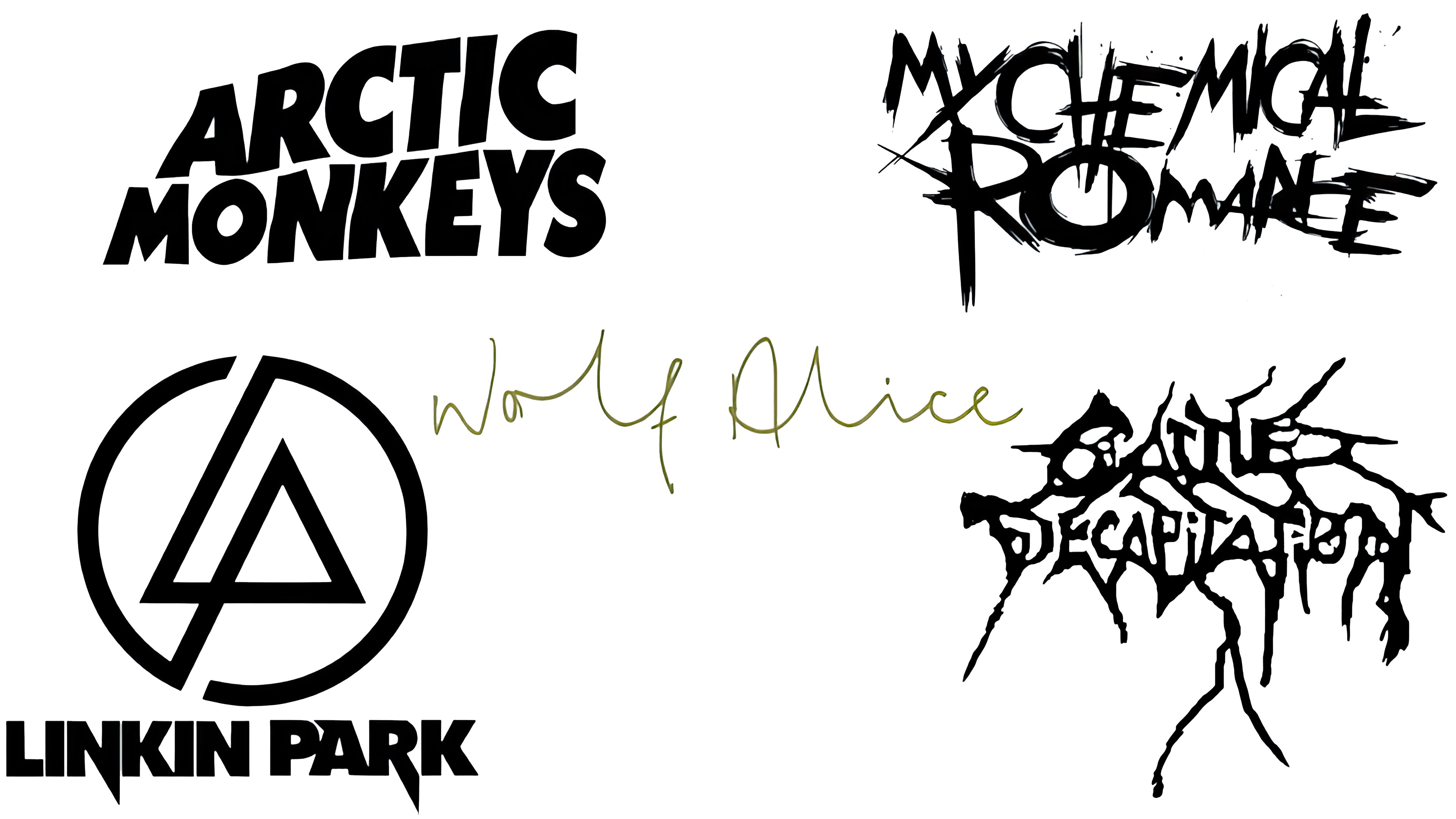
Contemporary extreme metal bands like Cattle Decapitation, known for their deathgrind genre, often draw inspiration from the logos of earlier bands in similar genres. These logos typically feature intricate, bold designs, maintaining the tradition of complex, visually striking imagery.
My Chemical Romance, a prominent emo band of the 21st century, showcases versatility in its logos. Their designs combine elements from different eras, such as the rough, hand-drawn aesthetics of punk and the bold, uppercase typography characteristic of hard rock and heavy metal logos. This fusion reflects the band’s unique style and the emo genre’s blend of emotional intensity and punk roots.
Linkin Park’s logo is a notable example of combining symbolic imagery with text. Their logo features a symbol representing the initials ‘L’ and ‘P’ alongside the band’s name in strong, thick black capitals. This design mirrors the band’s original heavy rock sound, blending symbolic and textual elements to create a distinctive identity.
In 2013, Arctic Monkeys, influenced in part by Black Sabbath, adopted a logo with a font similar to Black Sabbath’s. This shift in logo style signified a change in their musical direction, paying homage to their new influences.
Wolf Alice, a British indie band, opted for a simpler, more understated logo design that looks almost handwritten, like a signature. This style harkens back to the simpler, more minimalist logos of the 1960s, reflecting a shift towards more classic and understated design elements.
2020s
In the 2020s, band logos continue to evolve, reflecting shifts in culture and technology. A key trend is the influence of digital advancements. With the rise of social media and music streaming platforms, logos are more adapted to digital formats, ensuring a band’s recognizability online.
Minimalism and versatility have become important aspects of logo design. Bands aim for logos that are easily scalable and look good across different media, from digital displays to physical merchandise.
At the same time, there’s a trend towards incorporating retro elements, reflecting a nostalgia for past decades. This can serve as a nod to a band’s musical influences or as a way to appeal to an audience that values vintage style.
Bands are increasingly seeking unique and personalized logos that reflect their individuality and musical style. This leads to eclectic designs that blend elements from various eras and genres.
Furthermore, some bands are paying more attention to sustainability and ethical considerations, which may be reflected in their logos. This aligns with a growing awareness of environmental and social responsibility among musicians and their fans.
While there are discernible trends in logo design across different eras, many bands are increasingly putting their unique spin on these trends. The choice of logo design is often influenced by the band’s musical genre, with some bands preferring simpler logos while others lean towards more creative and elaborate designs. This diversity in logo styles underscores the individuality of bands and the varied tastes of their audiences in the modern music landscape.