Social media logos, ever-present on various platforms, have become firmly embedded in the visual psyche of huge audiences around the world. Their ubiquity means that even minor changes can spark serious discussion, debate, and reaction.
Traditionally, rebranding, especially for a logo – a crucial element of brand identity – has been approached with great caution. Companies typically spend a tremendous amount of time researching, iterating designs, and soliciting user feedback before presenting a final version. This caution stems from understanding users’ emotional and cognitive associations with these visual elements.
Twitter’s recent rebranding initiative, led by Elon Musk, is markedly different from the typical path. The almost improvised nature of the changes, combined with a crowdsourced design method, emphasizes a dynamic and bold approach to brand evolution.
While Twitter’s real-time rebranding may be an exception, the concept of logo evolution is not new. Many digital platforms, even relatively young ones, have undergone visual updates. This constant refinement is indicative of evolving digital trends and user expectations.
It’s a known fact that redesigns, especially for well-established platforms, can evoke strong emotions in users. Whether it’s nostalgia for an old design, resistance to change, or outright criticism, companies often find themselves at the crossroads of innovation and tradition.
The emergence of the “X” logo, the standard Unicode symbol, emphasizes the intricacies of logo design in the digital age. The convergence of design simplicity and the challenge of maintaining originality is becoming apparent. The balance between maintaining uniqueness and universal recognition is a challenge faced by today’s brands.
Logos, especially for world-renowned brands, have tremendous power. They encapsulate the brand’s personality and values and serve as a constant point of connection between the brand and its users.
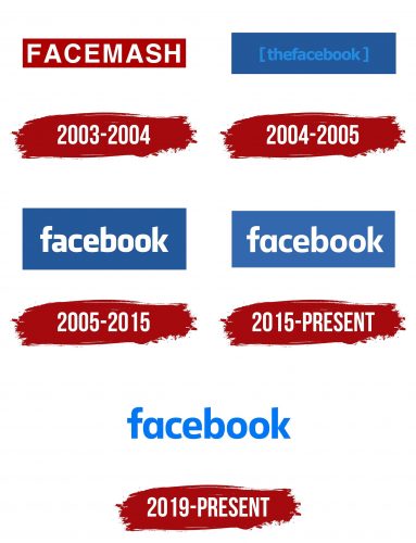
Facebook is a household name today, and it started out modestly as a networking platform exclusively for Harvard University students. It was originally known as “Facemash,” then its name changed to “Thefacebook,” before the company finally settled on the name “Facebook.”
With ambitions to reach beyond the university community, there was a need for a credible and professional style. Founder Mark Zuckerberg asked Mike Buzzard of the Cuban Council to conceptualize a logo that would stand the test of time. Taking the Klavika typeface designed by Eric Olson as a base, Joe Kral, under Buzzard’s guidance, refined and created a wordmark that has become recognizable around the world.
An interesting aspect of the logo color is its blue hue. Zuckerberg’s color vision deficiency, deuteranopia, played a role in this choice. He was best at distinguishing blue, which made it a natural choice for the platform’s primary color.
The genius of Facebook’s logo lies in its simplicity and versatility. Despite the rapid evolution of the platform, it remained clear, recognizable, and versatile, allowing it to remain unchanged for an entire decade.
2015 marked the first major change to the Facebook emblem since its inception. However, the changes were minor. The logo, created in collaboration with Facebook’s internal team and Eric Olsen, underwent many nuances. Unnoticeable to the untrained eye, these changes gave the logo a modern look and brought it in line with contemporary design concepts.
With the development of mobile technology, a new era in logo design has arrived – app icons. Realizing the paramount importance of this medium, Facebook changed its logo to be better perceived on smaller screens. The logo went from a traditional blue square to a brightly colored gradient circle, reflecting the aesthetics of the Messenger platform.
Facebook’s branding journey has been a master class in logo evolution. The company’s approach has been methodical: engaging professionals early on, avoiding unnecessary changes, and making adjustments only when necessary. This strategy has ensured design consistency, allowing the platform to expand seamlessly and resonate with billions of people around the world.
The recent rebranding of parent company Facebook to “Meta” signals a broader vision that encompasses both social media and areas such as artificial intelligence and VR. This transition marks a new chapter, but it also honors the company’s founding principle of evolution with consistency.
Over the past decade, Instagram has become a formidable force in the social media sphere. This trajectory of growth, innovation, and global appeal is reflected in the strategic evolution of its logo design.
When Instagram first appeared on the digital scene in 2010, its branding was represented by a word mark. Over time, this mark has undergone a number of changes. However, given that Instagram inherently targets smartphone users, the real essence of its branding was encapsulated in the app’s icon.
The earliest icon, created by CEO and co-founder Kevin Systrom, paid homage to the Polaroid camera, evoking a sense of nostalgia. Interestingly, this choice was somewhat inappropriate, as the image on the icon was not directly related to Instagram’s core offerings.
After realizing the discrepancy between the Polaroid-inspired logo and the app’s functionality, Systrom turned to Cole Parise for help. Rise, a versatile individual with a background in design and photography (as well as one of the app’s first beta testers), took it upon himself to redesign the icon. After several six-month sketches, the duo settled on a camera-centric icon that was more in line with Instagram’s photographic essence.
In 2016, the digital landscape was undergoing a transformational change. Instagram, a company with no patience for delay, unveiled its logo with a strict minimalist look. The shift was the culmination of nine months of work by in-house designers. However, the radical departure from the previous design caused a whirlwind of reactions from a huge number of users. The intensity of this reaction has even led prominent publications such as the New York Times to introduce phrases such as “The Great Instagram Logo Madness of 2016.”
While the 2016 redesign sparked a lot of reaction, looking back, it was a strategically sound turn in the right direction. With the design world moving away from skeuomorphism and favoring more streamlined designs, Instagram’s redesign was timely. Keeping the detailed 3D camera icon could have caused Instagram to become an anachronist, especially with specialized cameras fading into the background, giving way to modern smartphone photography technology.
Medium
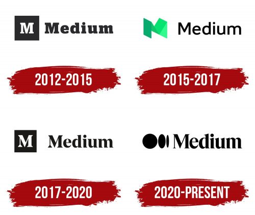
In 2012, a new digital platform called Medium emerged, created by Evan Williams, creator of digital giants such as Blogger and Twitter. His drive to create Medium was driven by a desire to create a platform where people could share their stories without the character limits imposed by platforms like Twitter.
A simple monochrome logo was used to create Medium. At the center of the logo is a slanted letter “M” created using the Stag font. This was an unmistakable hint to the platform’s main audience – writers.
By 2015, dissatisfaction with the original logo had become more pronounced. Medium’s then-art director, Erich Nagler, raised concerns about the logo’s lack of versatility and its inability to reflect the changing nature of the platform. Collaboration with font designer Rod Cavazos of PSY/OPS led to a new design.
However, the logo presented was met with mixed reviews. Critics noted the inappropriate minty hue, which is most often associated with financial applications. The folded paper motif was labeled bulky, and its departure from the essence of the letter was evident. Even the letter spacing, a crucial design element, came under scrutiny.
A few years later, Medium unveiled another logo. This latest version, a collaborative effort between Medium’s internal team and design agency Manual, resembled the original. This updated logo sort of bypassed the 2015 redesign, becoming a direct successor to the original. The journey felt less like a series of redesigns and more like a return to Medium’s founding ethos.
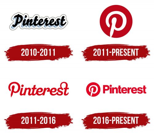
In the ever-changing world of social media branding, Pinterest stands out for its stability in logo presentation. Since its introduction in 2010, the platform’s emblem has undergone a noticeable, albeit subtle, change.
Upon its emergence in 2010, Pinterest quickly discovered and carved out a profitable niche by positioning itself as the premier digital pinboard for curated visual content. The centerpiece of this style was the iconic “P” symbol. This emblem, rendered in its original form, transforms the initial letter of the platform into a symbolic pin that captures the essence of Pinterest’s unique offering.
A critical component of effective branding is its communicative nature. For Pinterest, the combination of the “P” emblem with the “Pin it” directive epitomized this principle. This well-chosen design combination clarified the core function and ethos of the platform, becoming a clear reference point for potential users and enthusiasts.
2017 marked a season of revisions for Pinterest. But instead of embarking on a complete overhaul, the platform showed prudence by retaining the inherent “P” icon. The remodeling touched on the brand identity as well. The goal was clear: to create a sleeker, more professional image using the improved Neue Haas Grotesk typeface.
In the broader context of rebranding digital platforms, Pinterest’s strategy emphasizes the benefits of evolution over revolution. By retaining the underlying iconography and slightly updating the peripheral components, Pinterest maintained its identity and catered to modern aesthetic preferences.
Snapchat
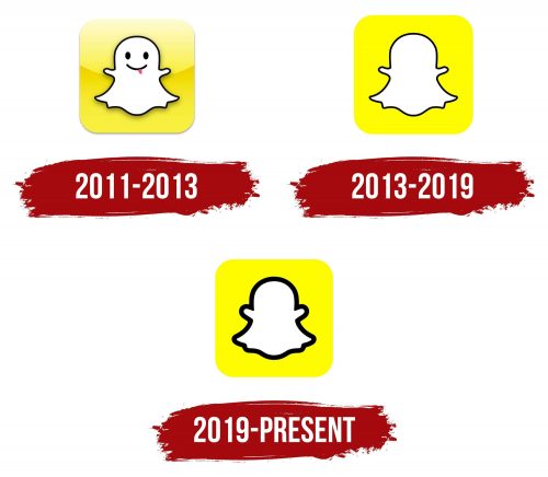
Snapchat’s emergence into the digital world in 2011 had a unique promise: to give users the ability to share ephemeral photos and videos. The unique selling proposition was matched by an instantly recognizable ghost logo. The choice of the ghost reflected the ephemeral nature of the platform and created an iconic image in the minds of users.
The appearance of the ghost emblem has an interesting backstory. Company founder Evan Spiegel conceptualized and created this symbol before the platform even had an official name. Taking inspiration from the music world, specifically rapper Ghostface Killah of the band Wu-Tang Clan, the logo soon gained an internal nickname within the company: Ghostface Chillah.
When choosing a color for the brand, Spiegel settled on yellow, a shade that was conspicuously absent from the palette of other major apps at the time. The bright hue ensured visibility on smaller screens and made Snapchat instantly recognizable, validating the principle that simplicity is often the best strategy.
2013 saw the first notable change to Snapchat’s logo. The logo and the introduction of the Stories feature were simplified. The removal of facial features from the ghost made it more versatile, especially for display on smaller devices. At the same time, the yellow hue was changed to Pantone 100% Yellow, increasing its brightness and appeal, especially to the platform’s youthful audience.
In 2019, Snapchat once again changed its beloved ghost emblem. This time, a bolder black outline was added to the ghost. While this change caused some debate among users, the rationale behind it was to improve accessibility. The thicker outline improved the visibility of the logo, allowing it to reach a wider range of users.
Snapchat’s logo creation story clearly demonstrates the importance of creating a strong visual identity from the beginning. With a few thoughtful changes, the platform retained its original essence, proving that sometimes the best designs stay true to their origins by adapting to the changing needs of the audience.
Twitter / X
While Facebook has followed a consistent branding strategy, Twitter’s path has been more eclectic. Fluctuations in this platform’s logo design may reflect fluctuations in its direction. The company has been in operation since 2006 but only reached profitability in 2018. The problems seem to have intensified after Elon Musk acquired the company in 2022, leading to a further drop in user numbers.
If we look back at the early history of Twitter’s logo, one of the initial designs was created under severe constraints. Swedish graphic designer Linda Gavin was tasked with creating an eye-catching design in one day. The result? A wordmark that featured the word “Twitter” in a playful and fun font that exuded warmth and community.
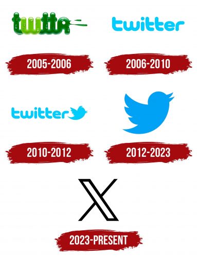
The year 2006 marked the introduction of an icon that became synonymous with Twitter: a bird. Over the years, this bird motif has undergone several incarnations. From 2006 to 2012, various variations of the bird appeared, some of which were even created by Twitter co-founder Beez Stone. Each variant retained the characteristic blue hue but differed significantly in design. This led to inconsistency, which occasionally caused confusion among users and site owners.
By 2012, Twitter realized the need for a more unified brand image. At that time, the platform introduced an improved bird silhouette. The design, modeled after the mountain bluebird, ingeniously incorporates three intertwined circles, resulting in a symmetrical, geometrically balanced icon. Doug Bowman, the company’s in-house designer, was the genius behind the creation of this much-loved symbol, which has since become a recognizable platform symbol around the world.
Amidst speculation and criticism, unexpected changes emerged, indicating a possible deviation from the bird’s usual design. At the same time, it was later clarified that it was not the new official logo, but the incident further reinforced the feeling that Twitter’s branding strategy was becoming increasingly unpredictable.
Despite not being the largest social network, Twitter has carved out a niche for itself and has even introduced new terms like “twitter” and “twittersphere” into our lexicon. However, Elon Musk took the bold step of changing the brand identity, renaming the platform “X” and adopting the Unicode symbol 𝕏 as the logo. The excitement didn’t end there. The logo was quickly changed under Musk’s leadership, seemingly illustrating the platform’s constant search for a stable identity.
YouTube
Before YouTube became a well-known and significant player in digital entertainment, it began as a little-known venture by three former PayPal colleagues, Chad Hurley, Steve Chen, and Javed Carimon. Debuting on Valentine’s Day 2005, this new service took its first steps into an uncertain digital world.
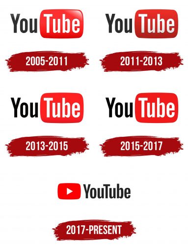
The emblem of the first YouTube utilized a simple but effective design strategy. To accelerate brand recognition, the term “Tube” was encased in a red rounded rectangle reminiscent of classic televisions. This design, using Alternate Gothic font number 2, became the visual embodiment of YouTube for the next six years.
By 2011, as bulky CRT televisions gave way to their slim, flat-panel counterparts, YouTube’s logo was transformed. The new version of the logo was a flatter rectangle with a richer shade of red to keep it looking modern. In the following years, namely 2013 and 2015, the design of the emblem underwent further changes, albeit less noticeable.
Ten years after its creation, the YouTube logo underwent its most significant metamorphosis in 2017. The new version, designed in-house, abandoned the iconic TV-like frame encompassing “Tube.” The design opted for a side-to-side alignment to create a more optimized wordmark. This solution was created to adapt and optimize for different displays, even the most compact ones. The rebranding included the creation of a custom font and the use of #FF0000, a rich red color that reflects the RGB essence of video images.
The digital world is no stranger to a tumultuous reaction to brand change. However, the evolution of the YouTube emblem is notable in that it did not cause a massive public outcry. This shows that the design was carefully thought out and took into account user preferences.
