


![]() Hollister Logo PNG
Hollister Logo PNG
The company logo is full of flight, dreams, and youth. It’s more than just a clothing brand. The Hollister logo spreads its wings, supporting customers on their path to self-realization. It creates images for bold and unconventional people, elevating them above everyday life.
Hollister Co. was created inside Abercrombie & Fitch at the end of the 1990s, during the peak of its popularity under CEO Mike Jeffries. The brand aimed to reach a younger audience at lower prices while maintaining distance from the parent label. Cultural visibility grew in 1999 when LFO mentioned Abercrombie & Fitch in “Summer Girls”.
On July 27 2000, the first Hollister store opened at Easton Town Center in Ohio, followed by test locations in several other states. The concept targeted teens aged 14–18, offering casual clothing in a California-inspired style. The company framed Hollister as an alternative within its own portfolio rather than a direct extension.
A fictional backstory was introduced about founder John Hollister and a 1922 origin in California. In reality, the brand had no link to surfing culture. Stores used themed interiors and scent marketing, echoing Abercrombie & Fitch but adjusted for a younger audience.
Expansion moved quickly. Canada followed in 2006, and in 2008, the first overseas store opened in London. By 2013, the network reached about 587 stores with sales above $2B. Competition intensified with American Eagle Outfitters and Aéropostale in the same segment.
In the mid-2010s, mall traffic declined, affecting both Hollister and Abercrombie & Fitch. After Jeffries left in 2014, the company reduced its reliance on sensory marketing and shifted toward digital channels. By 2019, Piper Jaffray ranked Hollister as one of the most popular brands among US teens, driven by growth on Instagram and TikTok.
Meaning and History
![]()
Originally, Hollister Co. used the image of a soaring seagull with spread wings, introducing the logo simultaneously with the opening of its stores. This retail enterprise sells fashionable items and targets many countries, including Canada, Japan, France, Spain, Australia, and the Netherlands.
Over the past 20 years, the company’s emblem has hardly changed, maintaining full visual authenticity. The company used its symbolism on labels and in print to attract customers and increase brand interest. This was linked to the growth in consumer demand, as large logos on t-shirts became fashionable at the beginning of the century.
What is Hollister?
This is an American brand creating beachwear inspired by Southern California youth culture. The assortment includes swimwear, outerwear, jeans, and T-shirts that capture the vibe of the California coast. A distinctive feature is the stores, designed like beach houses with music, dim lighting, and a signature scent evoking the surfing culture. Special focus is placed on jeans, cozy hoodies with logos, and vibrant patterns that reflect the spirit of freedom and carefree living.
However, over time, the company’s management noticed a 9 percent drop in sales and began to investigate the cause. It turned out that trends had changed; a different style is now in vogue, and the teenage environment is incredibly demanding. Thus, the era of textual logos on t-shirts and sweatshirts ended when Abercrombie & Fitch (the brand owner) introduced new standards and removed the logo from its prints. As a result, its design was slightly adjusted in 2014.
Font and Colors
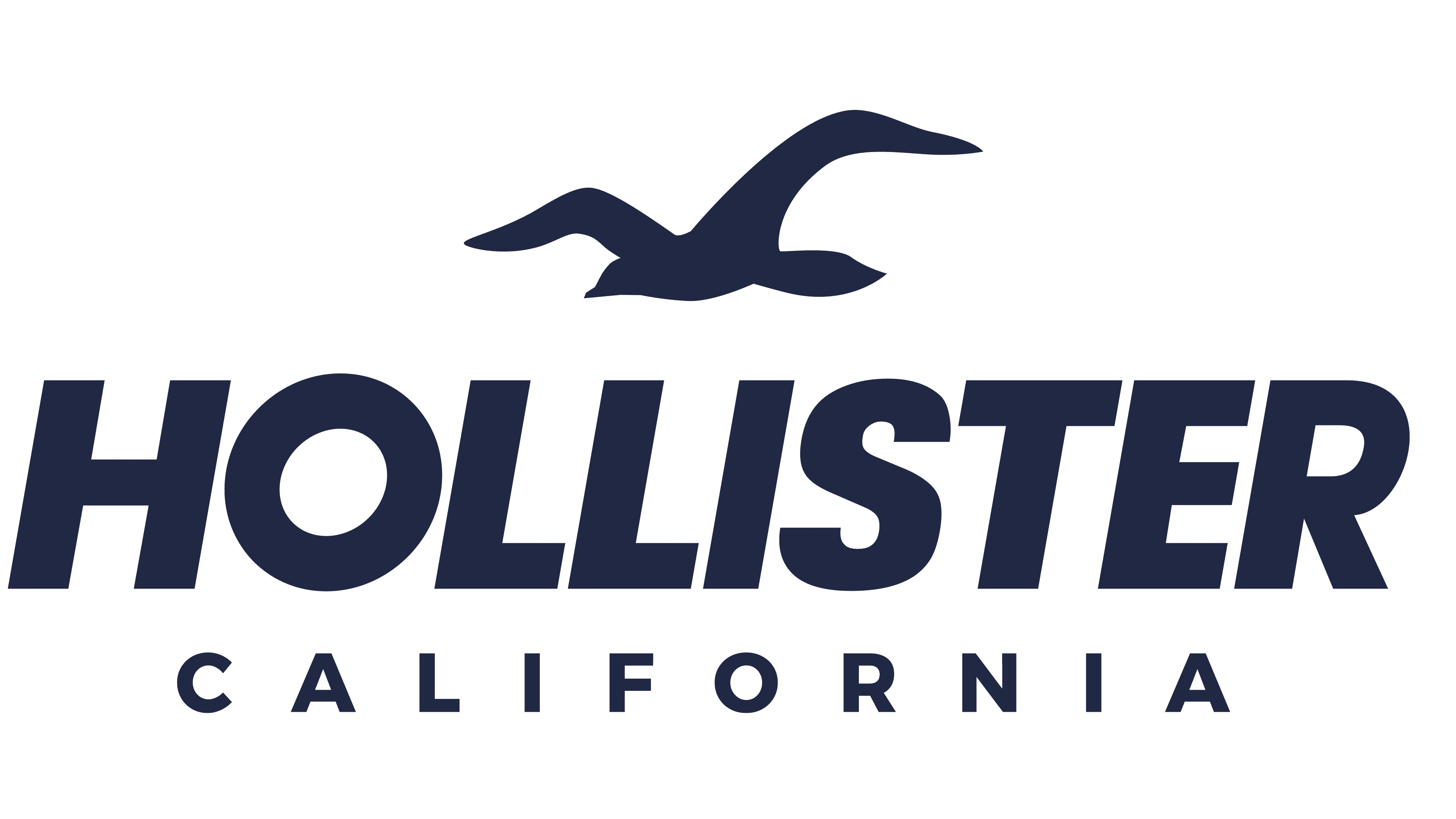
The most recognizable element of Hollister branding is the image of a seagull with wings spread in flight. It evokes key associations that the manufacturer strives for: drive, energy, relaxation, and leisure. This is because the image of a seabird evokes pictures of the coastal zone, salty breeze, soft sand, and warm surf. The second reason for choosing the seagull emblem is freedom, which youth aspire to. This represents independence, limitless horizon, free wind, and a surfer gliding on the waves.
The logo uses a classic font, but the wording is different. “Hollister” is executed in a minimalist font with straight lines, precise angles, serifs, and vertical drops. For California, designers chose small, serifed characters. All letters are thin and uppercase.
The emblem’s color varies depending on where it is placed. Inscriptions on clothing are mostly white or dark brown; on promotional products, burgundy; and labels are black. A dark brown-red hue is also in use, symbolizing courage and decisiveness.
FAQ
What is the Hollister brand?
Hollister is a fashion brand of Abercrombie & Fitch that focuses on producing a range of goods for teenagers, including clothing, footwear, accessories, and face and body care products.
What does the Hollister logo represent?
The Hollister logo combines simplicity and understanding of imagery. The first element is the brand name, typed in a large sans-serif font in uppercase. The second important element is the soaring seagull. The bird embodies freedom and independence inherent to the target consumer demographic, teenagers. It symbolizes the California coast, leisure, hot sand, and surfing.