 Home Instead Senior Care Logo PNG
Home Instead Senior Care: Brand overview
In 1994, in Omaha, Nebraska, Paul and Lori Hogan embarked on a mission to fulfill their mission by founding Home Instead. Driven by a desire to offer seniors the opportunity to age with dignity from the comfort of their own homes, they offered personalized in-home senior care services. Realizing the potential of their idea and wanting to reach a broader demographic, a year later, in 1995, they moved to a franchise model. The first franchise location appeared in Lincoln, Nebraska.
Three years later, by 1997, the number of Home Instead franchises reached 27 across the United States. This expansion continued to gain momentum, and by early 2010, more than 700 franchises were open. The brand did not limit itself to the U.S.: international expansion began in 2005, starting with Canada. The company is now present in 12 countries on four continents.
A significant milestone was reached in 2014 when Home Instead served its one-millionth customer. Moving forward to the year 2020, the company boasts a large workforce of over 100,000 dedicated caregivers. Home Instead’s services include companionship, specialized dementia care, personal care, hospice support, and more. Each service allows seniors to maintain their independence while enjoying the comfort of their homes.
To this day, Home Instead remains a family-owned and operated business from its original base in Omaha. The company has established its reputation as one of the world’s leading home care providers for seniors, with a network of more than 1,200 franchisees.
Meaning and History
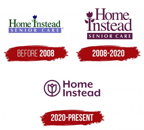
before 2008
2008 – 2020
2020 – today
The logo of the American home care company for the elderly is designed to be welcoming and comforting. It features only rounded edges, symbolizing the company’s commitment to smoothing out the challenges faced by the elderly, making the symbolism very friendly. Adding to the positive vibe is a flower with three petals positioned on the left side within a solid circle. This flower adds a touch of warmth and care to the logo, reinforcing the company’s nurturing approach.
The medical organization’s name is displayed on the right side, primarily in lowercase letters, but with the first letter of each word capitalized to stand out. The text is arranged on two levels in purple, with rounded glyphs to maintain the logo’s soft and approachable look.
This logo’s design reflects the company’s mission of providing gentle and attentive care to the elderly. The use of rounded shapes and the comforting symbol of the flower convey a message of safety and compassion. The choice of a purple color for the text adds a touch of dignity and quality to the services offered. Overall, the logo effectively communicates the company’s values and services, presenting itself as a friendly and trustworthy provider in the home care sector.


