


![]() Houston Dynamo Logo PNG
Houston Dynamo Logo PNG
The Houston Dynamo logo symbolizes growth, progress, new achievements, and well-earned glory. The emblem is charged with the spirit of victory. Its shape and colors seem to pulse with energy. The orange shade reflects the heat of Texas and the passion of the fans, while the strong geometry emphasizes the team’s character, which always plays with intensity and faith in the result.
The Houston Dynamo is an MLS club in the Western Conference, established on December 15, 2005, following the San Jose Earthquakes’ relocation to Texas due to the lack of a soccer-specific stadium.
On November 6, 2005, MLS commissioner Don Garber approved Anschutz Entertainment Group’s move, on the condition that the Earthquakes’ name, colors, logo, and history remain in San Jose. The Houston franchise took over the players, coaching staff, and operations.
Before the 2006 season, Anschutz Entertainment Group launched a public vote to choose a new name. “Houston 1836” received the most support, ahead of options such as Mustangs, Apollos, and Buffalo, referencing the city’s founding year, as with TSG 1899 Hoffenheim and Hannover 96.
The name caused backlash, as 1836 also marked Texas’s independence from Mexico. The concept featured a silhouette of Sam Houston, prompting criticism from Latino supporters and raising concerns about the club’s audience.
On March 7, 2006, the franchise was rebranded as the Houston Dynamo, referencing a team that played in the United Soccer League in 1984 and 1985. The term also reflected the city’s industrial base and energy sector.
On February 26, 2008, Anschutz Entertainment Group announced a partial sale. The ownership structure later included Golden Boy Promotions and Brener International Group, with shares held by Ted Segal, James Harden, Ben Guill, Oscar De La Hoya, and Gabriel Brener.
Meaning and History
![]()
After the San Jose Earthquakes soccer club relocated to Texas and became known as “Houston 1836,” it introduced a new logo featuring a five-pointed star. However, during rebranding, the emblem underwent significant changes. The only constants on the “Houston Dynamo” emblem have been the official colors: orange, dark blue, white, and light blue (the colors of the Houston flag).
What is the Houston Dynamo?
It is an American professional soccer team located in Houston, Texas. It was formed at the end of 2005 and competed in the Western Conference of the MLS. The club is owned by Ted Segal, who holds the majority of the shares.
2006
![]()
Houston 1836 entered MLS history as one of the most unusual club projects, even though the team existed under that name for a very short time. The new Houston team was named after the year the city was founded to emphasize the connection. However, the name announced in January 2006 caused strong backlash among residents of Latin American heritage. For many, the name became a painful reference to the Texas War of Independence. Under public pressure, the club quickly changed its name, but the Houston 1836 mark has since become an important episode in the city’s soccer history.
The mark was built around a large five-pointed star associated with Texas state symbolism. The star shape featured sharp edges and color separation. The inner black field was surrounded by a double border in white and orange.
Inside, in the star’s upper sector, an orange silhouette of a horse rider was placed, evoking cowboy culture and imagery of the old American South. Below, centered, was the word HOUSTON in white uppercase letters. The typeface is close to Bank Gothic or Microgramma Bold.
The most striking component of the logo was the large number 1836, centered in the mark and outlined in bright orange, with gray light and shadow transitions. The numerals were styled to reference posters and signage from the Wild West era, with decorative serifs. This approach added a sense of historical distance and an adventurous mood.
In the lower segment of the star, the designers placed a soccer ball rendered in the club’s black, orange, and white color scheme. The ball panels alternated, creating a sense of volume. Decorative curls appeared on the sides, associated with ornamental forged details typical of Western styling.
2006 – 2020
![]()
After the high-profile renaming in March 2006, the Houston Dynamo began a new chapter with the introduction of a redesigned mark. The club’s identity changed direction. The previous image was replaced by a shield filled with tension, symbolism, and a competitive spirit.
The emblem’s foundation became a triangular shield with a wave-like top line and a sharp bottom point. An orange line with a thin, light-blue edge runs around the perimeter of the shield. At the center is the word DYNAMO set in white uppercase letters. The lettering features a double outline. Inside the letters are thin, light-blue lines, with a wider orange outline on the outside, creating a sense of depth. Above the main word, following the curve of the top of the shield, is the word HOUSTON rendered in simple white sans serif letters. Below it is a soccer ball. It is designed in a black-and-white pattern, with added orange elements that tie all parts of the mark into a single system.
At the bottom of the emblem is a white five-pointed star. It refers back to the former Houston 1836 mark and echoes the symbolism of the Texas state flag. Orange rays extend outward from the star, filling the lower field of the shield and giving the image a sense of internal energy.
2020 – today
![]()
The current Houston Dynamo FC logo distances itself from earlier versions of the club mark while retaining the key themes of energy and visual intensity associated with Houston. The new logo is a hexagon, slightly vertically elongated, outlined in orange. The interior of the shape is filled with black.
At the center is a complex, stylized monogram formed from intertwined letters H and D. The characters are composed of double-contour lines that run parallel and never intersect. The bright orange color and angular lines refer to neon signage and electrical circuit diagrams. The industrial associations do not diminish the mark’s sporting character. On the contrary, they enhance the sense of power and internal drive.
Below the monogram, the club name is arranged on two lines. The top line features the word HOUSTON in large uppercase sans-serif letters. Below it is the line DYNAMO FC, set in a smaller size and a similar style.
The lower part of the hexagon is occupied by an orange lightning bolt that develops the energy theme. The symbol is rendered cleanly and simply, without complexity. It fits into the overall structure of the mark. It serves as a visual marker of the composition’s completion, distilling the emblem’s core idea into a single, compact image.
Font and Colors
The sun on the Houston Dynamo logo has dual significance in the club’s history. Given the team’s origins, the appearance of this element is quite logical. After all, the team was previously based in sunny San Jose, which left a certain mark on its image.
Furthermore, the sun is nicknamed “Dynamo,” a name derived from the dynamo-electric machine’s full name. As is well known, the celestial body also generates energy, which means the emblem developers bet on semantic associations.
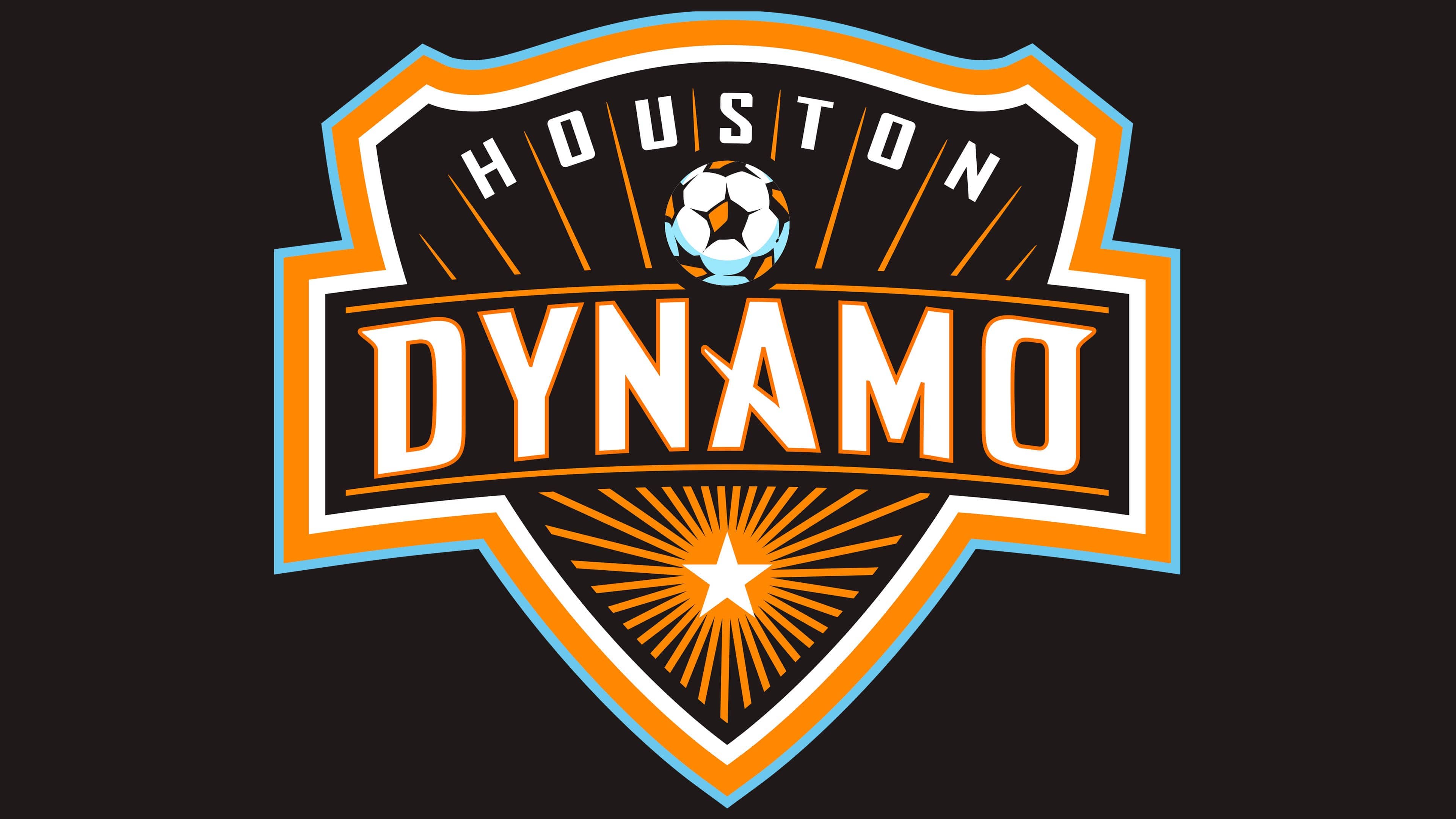
The current logo features a shield that, alongside a soccer ball, a five-pointed star, and a glowing sun, displays two inscriptions. The first, “Houston,” is located at the top and takes the shape of an arch. The letters are written in a geometric sans-serif font with straight lines and right angles. Only the letters “O,” “U,” and “S” have slightly rounded corners.
The word “DYNAMO” is centered, running across the shield from left to right. A unique font was created specifically for the club’s nickname, lacking serifs on all characters except “D” and “O.” The “A” also appears unconventional, with its central stroke diagonal.
Both inscriptions are white, but the letters in “DYNAMO” have additional orange outlines. This makes the club’s name stand out against the black background. The sun and its rays are also orange, as is the wide line around the shield. Blue is also used – it’s included in the outer part of the edging and forms a shadow at the base of the soccer ball.