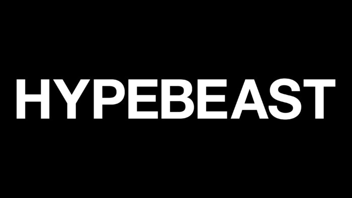
The Hypebeast logo echoes the completely serious style of the brand because it is businesslike, sleek, and practical. There are no graphic elements in it – not even serifs. This approach is associated not only with the desire to show its focus on ordinary consumers. The emblem also serves as an inscription on the printed edition of the same name and represents the online magazine.
Hypebeast: Brand overview
| Founded: | 2005 |
| Founder: | Kevin Ma |
| Headquarters: | Hong Kong |
| Website: | hypebeast.ltd |
Hypebeast is a Hong Kong-based fashion company whose online store, website, print magazine, and brand share the same name. It focuses on streetwear and youth clothing in individual styles. The time of its appearance is 2005. Created, designed, and inspired by Kevin Ma.
Surprisingly, the founder of the Hypebeast trademark was not previously associated with fashion and everything that accompanies it. No way. It was an average young man from the field of finance. His specialization is business and psychology. After graduating from an educational institution, he began to work in his chosen profession, but he realized that this was not at all what he would like to do all his life. Most of all, Kevin Ma adored music, street culture, and fashion.
After reassessing their inner values, the young man decided to create his project, which he called Hypebeast. In it, he collected various facts and news about what interested him. Carried away, the young financier turned his hobby into his main business. At first, he focused on sneakers and blogged about them. Then Kevin began to talk about the most trendy new products and promoted products in the fashion market.
In 2012, the streetwear, digital, and lifestyle web resource moved to e-commerce. He started selling products of those brands that his founder liked. The store sold products of the editor’s favorites: Hentsch Man, Carven, Band of Outsiders, Agi & Sam, APC, 3.1 Philip Lim. Then the list expanded and replenished with other brands focused on street style. At the same time, a printed magazine appeared. So the project turned into a full-fledged company with its own identity.
Meaning and History
Its logo is simple and clear. It dates back to the debut of the fashion news site and has remained the same throughout the rest of the time. The visual identity brings out the character of the owner of the Hong Kong company, as he is a practical financier with a passion for trends. Hence the restraint of the emblem, where there is nothing superfluous – only the name. As a result, the term “hypebeasts” appeared, denoting a trendy youth subculture.
What is Hypebeast?
Hypebeast is a fashion magazine (digital and print), online store, blog, and trending. They are owned by a Hong Kong company created by former financier Kevin Ma. The brand was launched in 2005.
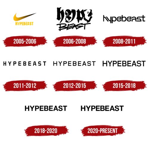
2005 – 2006
The Nike swoosh on the Hypebeast logo indicates that these brands have collaborated to release a joint line of fashion clothes or shoes. The large swoosh is on top and is painted yellow with a black gradient on the elongated part. The name of the media platform is completely yellow. It is located at the bottom and is written in illegible bold type.
2006 – 2008
Here the name Hypebeast is split into two lines. The first half is decorated in an unusual style: large vague letters with curly elements look like graffiti. Moreover, if “h,” “y,” and “p” are black and are on a white background, then “e,” on the contrary, is formed by a negative white space inside a black spot. “BEAST” uses a very different kind of graffiti font. The glyphs in this part of the word are slanted to the left and have jagged edges that give a sense of movement. The chosen style reflects creativity, energy, and individuality – the main components of street fashion.
2008 – 2011
To develop this logo, the designers used lettering to make each letter unique. The black word “hypebeast” is written in one line and is made in a special style that combines grotesque and monospace font elements. Some glyphs are mirrored: for example, “h” looks like an inverted “y,” and “p” looks like “d.” The “a” has no bottom line, and the two “e’s” have vertical and horizontal elements forming right angles. This creates visual contrast with the smooth curves of the “h” and “y.” In addition, many of the letters have slashes that are characteristic of fonts like Notched. This design emphasizes the innovative and modern character of the brand.
2011 – 2012
This logo contains the black word “HYPEBEAST” in uppercase. It uses a bold sans-serif similar to Graviton’s modified Estricta Black, with rounded corners and soft curves.
2012 – 2015
There is a new version of the inscription. The typeface now roughly resembles Stawix’s Crique Grotesk Medium, but the logo has thinner letters and a different “S” shape. Another analog is Labrador A Bold from Typesketchbook.
2015 – 2018
The designers have changed the font, making glyphs thicker and reducing letter spacing. This worsened the readability of the inscription, but in this way, the brand name became more visible in different media.
2018 – 2020
To fill the logo with internal dynamics, we had to balance the shape of the letters. The “S” has changed the most, acquiring smooth curves. This typeface is very similar to Nimbus Sans L Bold by URW++ or GGX88 Regular by Typodermic Fonts Inc.
2020 – today
The logo is based on the brand name. The inscription is made in a geometric font of an ideal shape. All letters are balanced in line thickness, despite the angles and curves. The text uses a strict uppercase font with small spacing between glyphs. Despite the minimum inter-character space, the characters do not merge but remain separate, which simplifies the readability of the name.
The word “Hypebeast” is located horizontally and occupies one line. Its key feature is that all stripes are perfectly smooth – there is not the slightest protruding stroke or serif. Such a grotesque is not characteristic of fashion-related brands since it does not even have a monogram or monogram. Everything is as practical and dry as possible. However, it also testifies to the revolutionary nature of fashion and the proximity to the street subculture in the style of the 80s of the last century. Moreover, the inscription is static and monochrome.
Font and Colors
For his brand’s logo, Kevin Ma chose a simple but massive typeface, reminiscent of K-Type’s Helvetiquette Bold and Sequel Sans Body Semi Bold (designed by OGJ Type Design). Their closest free counterpart is Alte Haas Grotesk Bold, with slightly blurred corners.
Hypebeast’s signature visual identity palette is simple and practical. It consists of a combination of black (inscription) and white (background). This contrast is considered classic and rebellious simultaneously, which is ideal for street style.
Hypebeast color codes
| Black | Hex color: | #000000 |
|---|---|---|
| RGB: | 0 0 0 | |
| CMYK: | 0 0 0 100 | |
| Pantone: | PMS Process Black C |

