


![]() IBEW Logo PNG
IBEW Logo PNG
The IBEW logo reflects the union’s connection with the electrical industry. It symbolizes energy, strength, and technological development while emphasizing the organization’s professionalism. The emblem suggests that electricity is in safe hands.
Meaning and History
![]()
The origins of the modern IBEW logo date back to 1891. That’s when the original seal of the union was created and used for marketing purposes. The organization faced financial issues, so it generated income by selling badges with emblems to its new members. C. J. Sutter from Minnesota conceived the original design. On November 28, 1891, he proposed using an image of an upraised fist clutching 22 lightning bolts as the seal. It was a left hand, placed within a ring with the inscription “NATIONAL BROTHERHOOD ELECTRICAL WORKERS OF AMERICA” – a reference to IBEW’s first name.
In 1910, the Union Label and Service Trades Department, AFL-CIO, officially recognized the logo. In 1924, it was also recognized by another regulatory body: the U.S. Patent and Trademark Office. As a result, the union gained the right to depict its seal in the press. In 1973, the organization was permitted to use it in all materials. At that time, the left hand was replaced with the right hand. The exact reason for this change is unknown. An unofficial version suggests that the raised left fist became associated with the communist regime, so to avoid negative symbolism, a right fist was added to the IBEW emblem in 1971.
Before this, the logo had also frequently changed: in 1908, one lightning bolt was removed, and by 1916, only 16 remained. In 1953, the original number of lightning bolts proposed by C. J. Sutter was restored. In 1971, there were 15, and in 1999, 10. Now, they represent the union’s founders who gathered at the first convention: James Dorsey, Joseph Berlovitz, C. J. Sutter, William Hedden, J. T. Kelly, Henry Miller, Harry Fisher, E.C. Hartung, F. J. Heizlenan, and T. J. Finnell.
What is IBEW?
IBEW stands for International Brotherhood of Electrical Workers. This international organization protects the rights of workers in the electrical industry, provides support in labor matters, and offers opportunities for professional growth. It was founded in 1981 in the USA and has since become one of the most influential unions in the electrical installation industry. As of 2023, Kenneth W. Cooper serves as its president.
1891 – 1953
![]()
C. J. Sutter created the original IBEW logo. It depicted a raised left hand clenching 22 zigzag lightning bolts. Above it was the inscription “ORGANIZED NOV. 28,” and below it “1891.” This part of the emblem was placed inside a large white circle, set in a black ring with the text “NATIONAL BROTHERHOOD ELECTRICAL WORKERS OF AMERICA.” The outer frame was decorated with a twisted rope pattern.
1953 – 1971
![]()
In 1953, a colored version of the seal with 22 red wavy lightning bolts was approved. They surrounded the fist like rays of sunlight, without touching it. The central circle turned orange and still contained the company’s founding date, but it was all shifted upwards. The white inscription “INTERNATIONAL BROTHERHOOD OF ELECTRICAL WORKERS” was in a blue ring, and the outer red frame contained the black text “AFFILIATED WITH AMERICAN FEDERATION OF LABOR.”
1971 – 1999
![]()
The central circle became dark beige, and the number of lightning bolts was reduced to 15, reverting to a zigzag shape. However, the main change to the logo was to replace the left hand with a right hand so the fist would not be associated with communism. The central ring was repainted in black, making the company’s white name stand out more. The outer part of the emblem acquired a dark burgundy shade. Inside was the golden inscription “AFFILIATED WITH AMERICAN FEDERATION OF LABOR & CONGRESS OF INDUSTRIAL ORGANIZATIONS & CANADIAN LABOUR CONGRESS.”
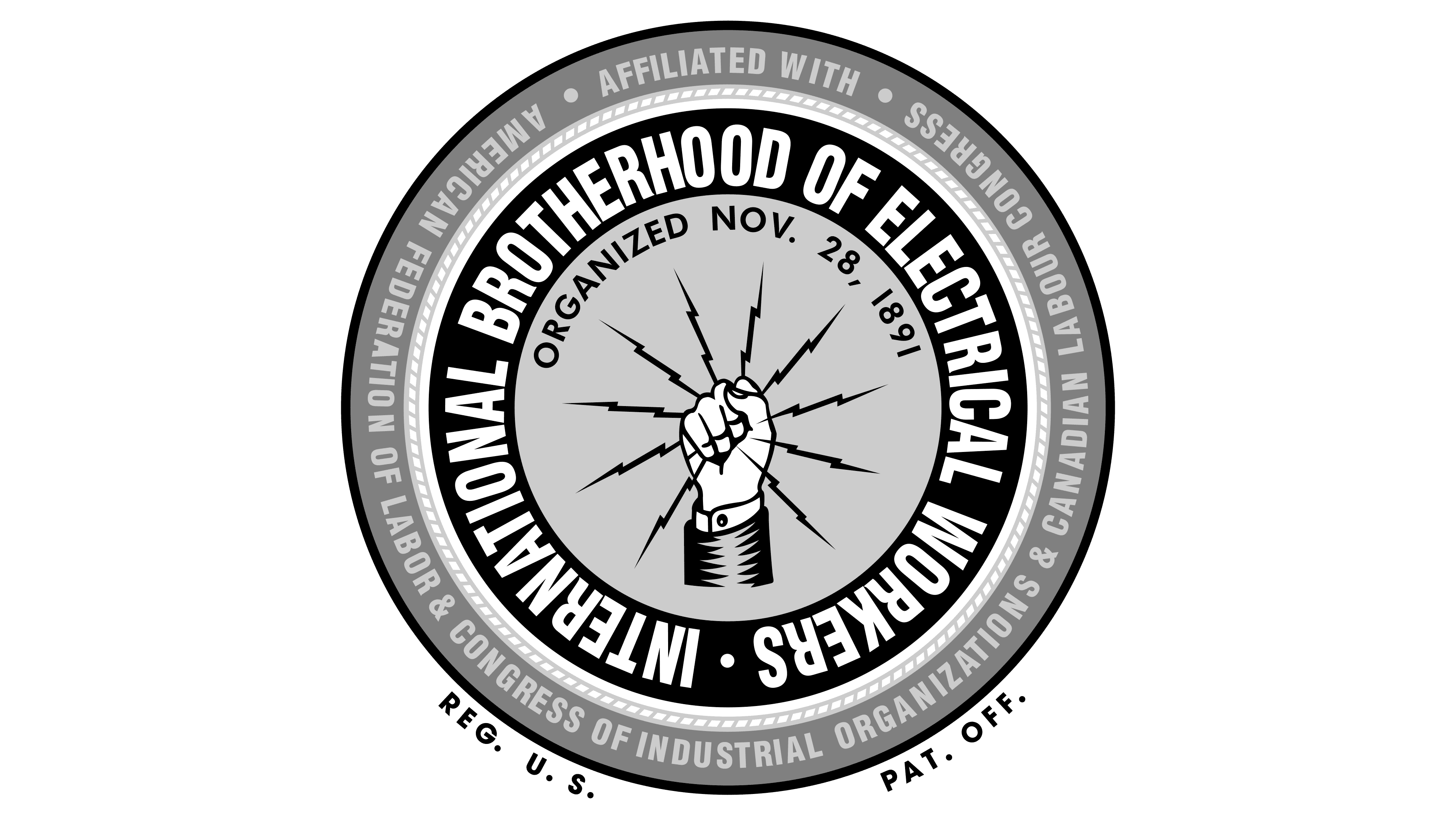
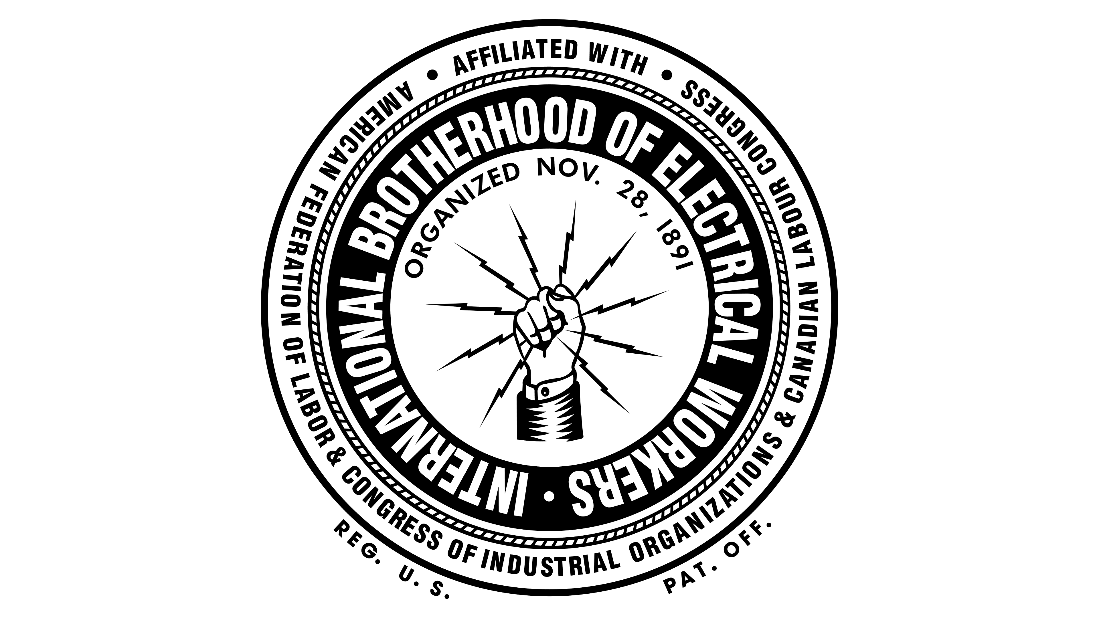
1999 – today
![]()
The IBEW logo appeared in 1891, but its current form was officially adopted in 1999 under the leadership of J. J. Barry. He decreed that the image should contain ten lightning bolts, each dedicated to one of the creators of the National Brotherhood of Electrical Workers. The lightning bolts are arranged in a circle, like clock hands, and clenched in an upraised fist. This is a right hand in a sleeve, with a shirt cuff visible. Figuratively, it represents Zeus’s hand, which firmly holds power over electricity. Although C. J. Sutter is credited with this original design, the emblem of American Electrical Works (1886-1934) looked remarkably similar. Possibly, Sutter drew inspiration from its advertising.
The fist is within a dark beige circle and placed under an arched inscription “ORGANIZED NOVEMBER 28, 1891” in blue. This circle, in turn, is enclosed in a wide blue ring. It bears the full name of the union: “INTERNATIONAL BROTHERHOOD OF ELECTRICAL WORKERS,” written in large white letters with slightly slanted strokes. The next layer is a pattern styled like a twisted rope. Beyond that is a dark-red ring with gold text “AFFILIATED WITH AMERICAN FEDERATION OF LABOR & CONGRESS OF INDUSTRIAL ORGANIZATIONS & CANADIAN LABOUR CONGRESS.” Outside the seal, there are two more inscriptions: “REG. U. S.” (on the left) and “PAT. OFF.” (on the right).
Font and Colors
The IBEW logo uses several similar fonts. All are semi-bold grotesques with vertically elongated letters. There are minor differences between them, reflected in the thickness of the strokes or the cut ends. Such typography simplifies the display of the seal in various sizes and enhances the clarity of the inscriptions.
The color palette is also diverse. It includes white, blue, dark beige, red, and gold. This combination became official in 1999.