The IHOP logo depicts a well-fed and satisfied customer. A complete set of nutrition for the whole day is in the “box” of the emblem. Meals are light and prepared from fresh and healthy ingredients. “What would you like to try today?” the sign asks.
IHOP: Brand overview
IHOP used the “I” prefix in its name before it became fashionable. She started doing this in 1973 when her full name, International House of Pancakes, was shortened to four letters. The first restaurant of the chain opened even earlier – in 1958. There, they served traditional breakfasts in the form of omelets, toast, waffles, and pancakes. Gradually, the number of catering outlets increased, and lunches and dinners were added. Now, the Dine Brands Global corporation owns the brand and all establishments.
In 1958, Al and Jerry Lapin kickstarted what would become a beloved dining institution by opening the first International House of Pancakes (IHOP) in Toluca Lake, a suburb of Los Angeles. They introduced a novel restaurant idea focused on pancakes and the appeal of enjoying breakfast at any time of day. This concept quickly resonated with Americans, propelling IHOP to expand rapidly. By the mid-1960s, just a few years after they started franchising in 1961, there were already more than 50 IHOP locations across the United States.
During the 1970s, IHOP broadened its menu offerings to include omelets and waffles, further enhancing its breakfast appeal. This era also saw the company celebrate the opening of its 100th restaurant, a significant milestone that underscored its growing presence. Additionally, IHOP marked a new chapter in its history by going public and listing its shares on the New York Stock Exchange.
The following decades, the 1980s and 1990s, witnessed IHOP’s continued growth nationally and internationally. The brand kept pace with changing consumer preferences by introducing new menu items and updating restaurant designs.
A pivotal moment came in 2007 when IHOP acquired Applebee’s, creating one of the world’s largest full-service restaurant franchising companies. This strategic move significantly expanded IHOP’s footprint and diversified its dining portfolio.
IHOP has shown a keen ability to innovate and adapt to the latest culinary trends and shifts in consumer dining habits in recent years. Introducing new menu items like burgers and sandwiches complemented its traditional breakfast offerings, reflecting the brand’s versatility. IHOP also effectively leveraged social media and digital marketing, engaging new generations of customers. In 2018, the brand temporarily rebranded as “IHOb” to highlight its burger menu, sparking widespread media attention and public interest.
Today, IHOP boasts over 1,600 restaurants in more than 15 countries, maintaining its iconic status as a breakfast haven. Its extensive menu of pancakes, waffles, omelets, and breakfast classics continues to attract diners worldwide.
Meaning and History
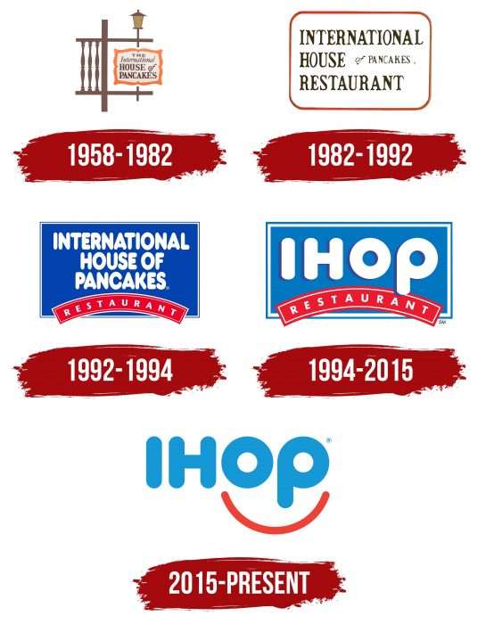
Throughout the history of the IHOP company, several major redesigns have occurred related to the renewal of the structure. The most important of these occurred in 1973: the International House of Pancakes chain shortened its name to an abbreviation and, at the same time, expanded the list of dishes. However, trademark logos changed often and were not always accompanied by global events.
As far as we know, the last symbol appeared in 2015, although restaurant owners announced another image change in 2018. They said they would flip the last p to make a b. As it turned out later, this was a clever marketing trick to promote the hamburger line. The brand has retained its old identity and continues to use the familiar logo. Many fans were delighted with this news because the “IHob” caption reminded them of the o.b. tampon emblem. The IHOP brand name is associated only with Citibank signs with a red arc in its current version.
What is IHOP?
IHOP is an abbreviation for the full name of the International House of Pancakes. It denotes a restaurant chain specializing in breakfast but is not limited to them: the menu also includes lunch and dinner. The brand was founded in 1958 and is currently part of Dine Brands Global Inc.
1958 – 1982
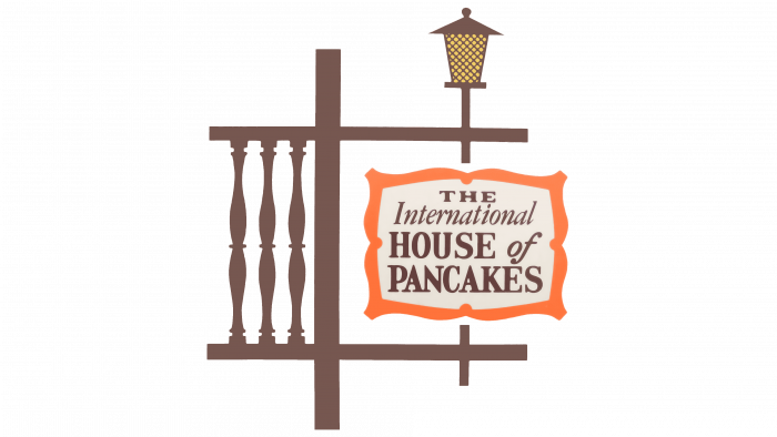
When International House of Pancakes opened its first restaurant, its logo looked welcoming. It was styled as a chalet-style sign. On the left was a white plaque with the name of the brand. The word “THE” was in bold flattened serif; for “International,” it was thin italic; for “HOUSE” and “PANCAKES,” it was bold serif, and the preposition “of” was written in oblique sans serif letters. The combination of different typefaces and registers made the inscription original. The text was placed in a red curly frame. To the left of the plaque, the artists depicted a brown fence on top – a decorative lantern on a pole. These road signs were popular in the United States in the 1970s.
1982 – 1992
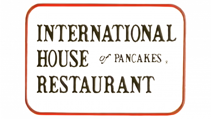
In 1982, only one inscription plate remained from the complex multi-component logo. The article “THE” disappeared, but “RESTAURANT” was added at the end. The designers slightly changed the typography: for “of,” they chose a new italic sans serif; for “PANCAKES,” they chose a thin serif typeface; and for the rest of the text, they chose a stylized typeface with high contrast and forked edges. The red curly frame has turned into a rectangle with rounded corners.
1992 – 1994
After the redesign, the phrase “INTERNATIONAL HOUSE OF PANCAKES” began to use a bold, bubble-like typeface. The word “RESTAURANT” was written grotesquely and moved down into a red-arched figure. This changed the text to white and the base to a large blue rectangle.
1994 – 2015
The restaurant chain owners decided to popularize the brand’s abbreviated name, IHOP. The brand has existed since 1973 but has never been featured on a logo. As a result of a small reshuffle, the phrase “INTERNATIONAL HOUSE OF PANCAKES” disappeared, giving way to an abbreviation. Moreover, the last letter, “P,” looked italicized because its vertical stroke was below the line level. The blue base and red sign with the word “RESTAURANT” have not changed.
2015 – today
The iconic IHOP symbol was used for over two decades until company executives noticed it looked like a sad emoji. They solved this problem simply by turning the red arch into a smile. At the same time, the round parts of the letters “O” and “p” began to depict the eyes, and the vertical stroke between them assumed the function of the nose.
The designers at Studio Tilt had to remove the word “RESTAURANT” not to spoil the smile’s charm. At the same time, they removed the background rectangle so that the restaurant chain logo now looks like a light blue “IHOP” inscription with a red arc that “hugs” the last two letters. The new design was first tested in 28 establishments before being extended to all food service outlets. To grab the attention of potential customers, marketers have launched themed Summer of Smiles events.
IHOP: Interesting Facts
The International House of Pancakes, better known as IHOP, is a popular American restaurant chain focusing on breakfast foods, especially pancakes.
- Beginning: IHOP started on July 7, 1958, in Toluca Lake, Los Angeles, by Al and Jerry Lapin and investors Al and Trudy Kallis. They aimed to offer a variety of pancakes in a welcoming environment at a time when pancakes were mainly made at home.
- Variety from the Start: The first IHOP menu had 15 pancake types, showing a commitment to choice and creativity.
- Growth: What began as a single diner has expanded to over 1,800 locations worldwide, including in the U.S., Canada, Mexico, and beyond.
- Name Change Stunt: In 2018, IHOP briefly became IHOb to promote its burgers, sparking lots of talk and online buzz, though the change wasn’t permanent.
- Breakfast: Beyond breakfast, IHOP serves lunch and dinner items like sandwiches, burgers, and salads to attract diners all day.
- Pancake Secret: IHOP’s fluffy pancakes are made with a special batter recipe and cooked on a nonstick grill at 350 degrees Fahrenheit.
- Open All the Time: Many IHOPs are open 24/7, even on holidays, offering a dining option almost any time.
- Giving Back: On National Pancake Day, IHOP gives away free pancakes and asks for donations to charities like children’s hospitals.
- In Pop Culture, IHOP is often mentioned in movies, TV shows, and music, symbolizing classic American dining.
- Evolving Menu: IHOP keeps up with dietary trends by offering healthier choices, like omelets with egg whites and gluten-friendly pancakes.
IHOP’s story, from a single spot in Los Angeles to a global presence, shows its ability to innovate and remain beloved for its pancakes.
Font and Colors
Having removed the blue rectangular frame and turned the red arch upside down, IHOP decided to erase any negative associations. Her trademark is a fun emoji that conveys the joy of a delicious breakfast and a friendly atmosphere. This is an attempt to please a younger audience.
The restaurant chain has simplified its symbol by proving it is ready for the age of social media. The minimalistic lettering is adapted for digital use because it has no unnecessary detail. This is the result of the work of Studio Tilt specialists, who had to turn the logo into the face of the brand and make it understandable and human. On the other hand, independent experts criticized the emblem for its unnaturalness. A smile expresses happiness, but when performed by IHOP, anthropomorphization looks a little creepy – like a madly smiling clown with round eyes.
The designers used heavy, rounded typography to make the letters look like breakfast pancakes. At the same time, “O” and “p” resembled eyes and noses, which was achieved by converting “p” to lowercase while maintaining a large value.
The familiar IHOP red and blue palette has not changed since 1992, except for the disappearance of white in 2015. This is the core of the brand’s identity, as many know the chain for its gabled blue roofs. A red smile balances out the lettering but does not dominate because it is thinner than the strokes of the letters.
FAQ
What font does IHOP use?
IHOP uses the Helvetica Rounded Bold font on its website, which is friendly and easy to read. This choice aligns with IHOP’s aim to be welcoming. The font is a softer take on the classic Helvetica, ideal for a restaurant aiming for a warm atmosphere.
As a member of the Helvetica family, popular among various brands, Helvetica Rounded Bold gives IHOP a mix of professionalism and a relaxed feel, which draws a wide audience. The font is key in making IHOP’s communications clear and demonstrates its dedication to a pleasant customer experience.
Does IHOP serve oatmeal for breakfast?
IHOP has introduced oatmeal to its breakfast menu to provide healthier options. They announced this on a Friday, enhancing their Simple & Fit menu with more whole-grain choices. The new oatmeal option caters to customers looking for nutritious and wholesome breakfasts. IHOP aims to appeal to a wide audience, especially those who prioritize healthy eating, by offering diverse menu items that cater to various dietary requirements. This approach allows everyone to find something that suits their diet and lifestyle, promoting a balanced diet.
Is IHOP only in America?
IHOP, known as International House of Pancakes, has become a favorite in the US and worldwide since its start in Toluca Lake, California, in 1958. Today, you’ll find IHOP in the Middle East, Canada, Latin America, the Caribbean, and Asia, adapting their famous pancakes and breakfast items to match local tastes.
IHOP customizes its breakfast in Kuwait, Saudi Arabia, and Dubai to align with local preferences. In North America, including Canada and the U.S. Virgin Islands, IHOP sticks to the classic American breakfast style. Latin American countries and Puerto Rico enjoy a blend of traditional flavors with IHOP’s offerings. In the Philippines, IHOP has become well-known, showing the universal appeal of their breakfast.
This international success demonstrates the potential for American breakfast to be embraced globally, with IHOP leading the way in breakfast and casual dining across more than 70 locations outside the US.
How do you pay at IHOP?
Paying at IHOP is convenient because they accept a variety of payment methods. Whether you prefer using cash, debit cards, credit cards, or IHOP gift cards, there’s an option that suits everyone. This flexibility ensures that the payment process is hassle-free whether you’re stopping by for a quick coffee or a full breakfast.
To stay current, IHOP also embraces modern payment technologies. They offer quick contactless payments that minimize physical contact for added safety. Additionally, mobile payment apps allow you to pay with your phone in certain locations, making transactions speedy and convenient since you won’t need to carry your wallet.
Which country has IHOP?
IHOP, or International House of Pancakes, is well-known worldwide. With over 1,750 locations, including every state in the U.S., Puerto Rico, and Guam, this restaurant chain is recognized not only in America but across the globe.
Outside the U.S., IHOP has made its mark in Mexico and Canada by blending its classic menu with local dishes. In South America, countries like Ecuador and Peru enjoy IHOP’s signature breakfasts and diner-style meals, adding an American twist to their dining options. IHOP’s presence extends to the Middle East and Asia, including Egypt, India, and Pakistan, where the restaurants adapt by incorporating local cultural elements into their menus. Central America, with IHOP locations in Panama, also experiences this blend of American diner culture.
Is the IHOP logo a smile?
The IHOP logo was redesigned to resemble a smile. Tilt Studio, the creative force behind the update, aimed for a design that would make people happy and welcome. Some thought the previous logo to appear somewhat sad, prompting the redesign. In the new logo, the “o” and the lower part of the “p” mimic eyes; the vertical part of the “p” suggests a nose and a red smile sits underneath. This clever design emphasizes IHOP’s friendly and welcoming atmosphere, ensuring guests feel positive as they dine. Essentially, the logo embodies the joy and comfort IHOP wants every customer to experience.
When did IHOP change its logo?
In 2015, IHOP, also known as International House of Pancakes, decided to refresh its brand image and update its logo. The company noticed that the old logo unintentionally resembled a sad face due to a red arch above the word ‘RESTAURANT.’ To create a more welcoming and cheerful atmosphere, IHOP redesigned its logo. The goal was to present a more positive and inviting image, moving away from the unintended negative impression left by the old logo. This makeover was aimed at reinforcing IHOP as a place where the enjoyment and contentment of a delicious meal are paramount. The new logo, characterized by its smiley appearance, reflects IHOP’s commitment to ensuring a pleasant dining experience for its guests.
What does the logo symbolize IHOP Logo?
The IHOP logo, redesigned by Studio Tilt from Kansas City, captures the joy people feel enjoying a good meal, such as pancakes and banana pudding. The design cleverly transforms the letters’ O’ and ‘P’ into the eyes and nose of a smiley face, with a red arch below them creating a wide, joyful smile. This smile symbolizes a satisfied customer.
Previously, the red arch had the word ‘Restaurant’ across it and was quite broad. The new design narrows this arch, simplifying the logo and emphasizing the concept of happiness. This change was thoughtfully made to present IHOP as a more welcoming and joyful place. The logo is meant to be more than a symbol; it represents the warm, enjoyable atmosphere IHOP strives to offer.
Why did they change the IHOP logo?
In 2015, IHOP updated its logo because the old one unintentionally made the restaurant seem unwelcoming, resembling a frown. This appearance was far from the friendly vibe IHOP aimed to project. Realizing that the downturned ‘lips’ of the logo might suggest disappointment, IHOP was determined to transform it into a symbol of happiness.
The redesign focused on making the logo convey cheerfulness, signaling that IHOP is a place where good moods are served alongside meals. By narrowing and lifting the arch in the logo, designers turned the perceived frown into a welcoming smile.
This makeover was significant for IHOP, marking a shift in how the restaurant is perceived. The new logo embodies joy, assuring customers of a pleasant dining experience. The updated logo reflects IHOP’s commitment to providing a wonderful experience to all who dine there.
What does the IHOP logo mean?
The IHOP logo, updated in 2015, aims to evoke the joy of eating pancakes. The redesign focuses on the positive emotions customers feel at IHOP. The logo creatively uses the ‘O’ and ‘P’ from IHOP to form a smiling face, with the ‘O’ and ‘P’ representing eyes and a curved line underneath as a smile. The logo’s smile represents IHOP’s commitment to making dining a delightful experience. It symbolizes the pleasant experiences at IHOP, offering a glimpse into the joyful, fulfilling meals they strive to serve.
What is the slogan for IHOP?
IHOP, short for the International House of Pancakes, is known for being a cozy spot for a good meal. They’ve created catchy slogans to highlight what they offer, playing a significant role in their advertising and showcasing IHOP’s spirit.
One famous slogan, ‘Come hungry, leave happy,’ captures IHOP’s commitment: to serve satisfying meals that leave you feeling good. It’s a straightforward promise that your hunger will be met with delicious food, ensuring you leave happier.
They even put a playful spin on this with ‘Come hungry, leave regretful, but still a little high,’ humorously suggesting that thanks to their tasty dishes, you’ll still feel good even if you overeat.
One slogan was so effective it earned IHOP an award, underscoring the impact of their marketing. Slogans like ‘Come hungry, leave happy’ are central to IHOP’s appeal, guaranteeing a pleasant and fulfilling experience. These memorable phrases invite everyone to enjoy a meal that ends with a smile.
What are the colors of IHOP?
Since 1992, IHOP has used blue, red, and white in its logo, slightly changing the shades over time. Blue, the dominant color, creates feelings of trust and calm. Red brings energy and matches the exciting dining atmosphere IHOP wants. White was originally for the letters against a blue background, making the IHOP name pop.
In 2015, the design changed. The letters turned blue, and the logo’s arc became red. This update kept the color theme and linked them closer to IHOP’s identity. With these changes, white is the background, highlighting the blue and red colors. The combination of blue, red, and white in the IHOP logo is striking, conveying the warm and lively experience the restaurant seeks to give every visitor.
