The emblem indicates where customers should move to relax and try delicious burgers. The In-N-Out logo is a great motivator that grabs attention and increases diner traffic.
In-N-Out Burger: Brand Overview
The Snyder couple opened the first In-N-Out Burger in 1948. The budding businesspeople changed the popular ordering system, allowing customers to eat only in the car. They allowed people to go inside the building, naming their company In-N-Out. The chain now has more than 300 restaurants and is owned by Snyder’s direct heirs.
1948, Harry and Esther Snyder opened the first In-N-Out Burger in Baldwin Park, California, pioneering a fresh take on fast food. They introduced a focused menu of quality, made-to-order burgers, aiming for freshness and customer satisfaction.
In a groundbreaking move, In-N-Out launched the first drive-thru window, allowing diners to order and receive food without leaving their cars. This feature set the brand apart and became synonymous with In-N-Out’s identity.
Through the 1950s and 1960s, the brand slowly expanded within Southern California. In-N-Out emphasized quality and consistency, carefully planning each new location rather than rushing to expand.
His son Rich took the helm after Harry Snyder’s passing in 1976. He guided In-N-Out into further expansion across Northern California and Nevada, yet it remained primarily a West Coast chain.
The brand’s cult status burgeoned during the 1980s and 1990s, fueled by word-of-mouth praise for its high-quality ingredients and secret menu, which allowed customization.
After Rich Snyder died in 1993, his brother Guy assumed leadership. He continued to grow the brand into new territories like Arizona and Utah while maintaining its focus on quality.
Into the 2000s and 2010s, In-N-Out’s reputation as a cult favorite among celebrities, chefs, and everyday patrons grew. Its secret menu became a piece of pop culture, and its commitment to quality and simplicity helped it stand out in a crowded fast-food market.
Today, In-N-Out operates over 350 locations across seven states. Despite its regional footprint, the chain commands a loyal fanbase that often heralds it as the best burger chain in America.
Meaning and History
In-N-Out Burger offers three kinds of burgers: drinks, shakes, and freshly made fries. Despite their short menu, these fast food establishments are very popular in the western United States. Their logo couldn’t go unnoticed, as it is eye-catching for its brightness and obtrusiveness. A big yellow arrow points to the restaurant, urging people to stop and order. This is an example of successful branding, where the visual symbol is a powerful marketing tool.
What is In-N-Out Burger?
This is an American fast food chain that is popular in the Southwest region of the United States and California. It represents a category of local fast food establishments that serve three varieties of burgers, as well as milkshakes, sodas, and french fries. The restaurants are owned by the Snyder family and are now run by the granddaughter of the founders (2022 data). N-Out Burger has a very strong and powerful logo, which is why it hasn’t changed since 1954.
1948 – 1954
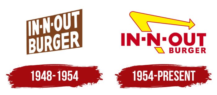
The first In-N-Out Burger logo was placed on triangular billboards. The simple inscription looked imposing, thanks to the bold font and upper-case letters. The network’s name was divided into two lines of equal length. “IN-N-OUT” used short square hyphens. White text stood out against a brown background.
1954 – today
After the redesign, a long yellow boomerang-like arrow was added to the wordmark. Its appearance is explained by the slogans of the time: “We all work under the same arrow” and “The arrow points to pride.” The V-shaped element points to the left, so advertising signs with the logo are usually placed to the right of the restaurants so that the arrow points in the right direction.
The “IN-N-OUT BURGER” lettering has been retained, but its color and scale have changed. The letters are now dark red. The second word has been reduced so much that it fits completely under “OUT.”
The arrow best embodies the dynamic that is inherent in the name In-N-Out. And it not only calls for action but also points the way. And its boomerang curve suggests that customers will be back for more than one burger or French fry. The combination of symbolism and psychological impact makes the logo a marketing success.
The logo is used on road signs and inside restaurants. It has become an iconic element of In-N-Out Burger branding, without which the chain is impossible to imagine. The Snyder family is not hurrying to change it, realizing the importance of tradition and sticking to the 1954 design.
In-N-Out Burger: Interesting Facts
In-N-Out Burger is a favorite among fast-food lovers for its tasty burgers and unique history and business approach.
- Drive-Thru Innovation: In 1948, In-N-Out opened in California as the first drive-thru hamburger stand, using a two-way speaker box. This idea changed fast food by letting customers order from their cars.
- “Secret” Menu: Famous for its “secret menu,” In-N-Out offers items like “Animal Style” burgers and fries and “Protein Style” burgers wrapped in lettuce, catering to various tastes.
- Freshness First: The chain commits to freshness, avoiding microwaves, heat lamps, and freezers. It bakes its buns and cuts fries in-house, and its beef is fresh, never frozen.
- Careful Expansion: In-N-Out slowly opens new locations to maintain high ingredient quality. They build only near their distribution centers to ensure their food stays fresh.
- Family Ownership: Since 1948, In-N-Out has been family-owned, allowing it to focus on quality and stay true to its founders’ vision.
- Bible Verses: The packaging discreetly includes Bible verses, a tradition since the 1980s that shows the family’s faith.
- Great Workplace: Known for treating employees well, In-N-Out offers good pay, benefits, and career opportunities, contributing to its positive service and atmosphere.
- Loyal Fans: The chain has a dedicated following, with fans visiting right after arriving in the Western U.S.
- Giving Back: In-N-Out supports communities through its foundation, helping children who have been abused.
In-N-Out’s story highlights the impact of staying true to high standards, valuing employees, and keeping things simple. Its success and expansion, while maintaining its core values, showcase its unique place in the fast-food world.
Font and Colors
A bold font with an equal thickness of lines was chosen for the trademark’s name. The serifs are absent to avoid overloading the logo with unnecessary details and distracting attention from the main thing—the big yellow arrow. In terms of the appearance of the letters, the typeface is very similar to Futura No. 8. This font family is represented by only one style. The original version of the grotesque was developed in the 1920s, and then it was digitized. Some designers say this typeface features clean and bold lines, similar to contemporary fonts like FOTR Black, Conneqt Black, or Hebden Grotesque.
The bright color scheme is used not only to attract attention but also to whet the appetite of potential customers. Red and yellow have been the traditional colors of the In-N-Out Burger chain since 1954. The designers combined saturated shades so that the logo elements did not merge. An indent between the lettering and the arrow separates the red letters from the outline.
FAQ
What is the slogan of In-N-Out Burger?
In-N-Out Burger’s “Quality you can taste” motto reflects their commitment to excellence. This phrase isn’t merely catchy; it’s a pledge that their food stands out from other fast-food options, showcasing top-notch ingredients and careful preparation in every bite.
In-N-Out’s philosophy uses fresh, never-frozen, high-quality beef and other ingredients. They dedicate themselves to selecting and preparing these components meticulously, ensuring that each meal is superior.
Unlike many fast-food chains prioritizing convenience or cost-saving measures, In-N-Out prioritizes quality. Their motto, “Quality you can taste,” genuinely influences all aspects of their operation, from ingredient selection to customer service.
What is the purpose of In-N-Out Burger?
In-N-Out Burger aims to deliver exceptional, fresh food and to make every customer feel important while being profitable and maintaining clean, welcoming premises. They focus on using only the best and freshest ingredients for their burgers, fries, and shakes, avoiding frozen or processed alternatives. Cleanliness is also a priority, ensuring their restaurants are just as well-known for their hygiene as their delicious food.
A strong belief in the importance of customer satisfaction drives the company. This philosophy has garnered a loyal following and distinguishes it from its rivals. In-N-Out Burger prioritizes making every customer’s visit memorable. It is dedicated to serving great food and ensuring that customers leave feeling better than when they arrived.
What is so special about in and out burger?
In-N-Out Burger stands out in the fast-food industry for several reasons. Its focus is on creating delicious food using fresh ingredients. It avoids frozen meat and additives, choosing fresh beef for its burgers. Its buns, lettuce, and tomatoes are always of the highest quality. It has its facilities in California and Texas to ensure its meat is always fresh.
Their menu is simple, featuring just burgers, fries, and shakes. This simplicity allows them to excel in what they offer rather than spreading themselves too thin. Their consistent menu over the years shows their commitment to quality.
In-N-Out has a passionate following similar to that of a beloved sports team. Its locations are primarily in the Western U.S., adding to its brand excitement. The company expands carefully to maintain the quality of its food.
The company is also known for being a great employer. They pay and treat their staff respectfully, creating a positive atmosphere for employees and customers.
In-N-Out is environmentally conscious and mindful of health, although they don’t often publicize these efforts. This consideration for the environment and healthy eating adds to their appeal.
Why do they call it in and out the burgers?
In-N-Out Burger is named for its quick service and quality food for people on the go. You just drive in, place your order, and leave with your food in no time. When it first began, this concept was revolutionary.
Harry Snyder, the founder, dedicated his nights to crafting a system that allowed customers to order and receive their meals without leaving their cars. His breakthrough was inventing a two-way speaker box, making In-N-Out one of the earliest fast-food restaurants to have an efficient drive-thru. From the beginning, the company has focused on quickly serving fresh, tasty food. This dedication to quality and their fast service has won them many fans.
What is the meaning of the In-N-Out Burger Logo?
The In-N-Out Burger logo, introduced in 1954, is key in representing the brand. Its bright yellow arrow symbolizes In-N-Out’s commitment to delivering quick, tasty food without making customers wait too long. It also indicates the company’s focus on efficiency and quality in its burger-making process.
Beyond speed, the arrow serves a practical purpose by guiding customers to In-N-Out locations. This emblem narrates the story of a brand that values quality, teamwork, and customer satisfaction above all.
What does the logo symbolize In-N-Out Burger Logo?
With its bright yellow arrow, the In-N-Out Burger logo symbolizes the restaurant’s commitment to fast and convenient dining. The founders, Harry and Esther Snyder, introduced a novel concept in fast food by offering a drive-through service. This innovation allowed customers to receive their meals without the need to park, streamlining the dining experience.
The yellow for the arrow is intentional, capturing attention and conveying a sense of happiness and vitality, which aligns with the brand’s promise of speedy and positive service. Though appearing straightforward with a limited menu, the company’s strategy has significantly influenced the fast food industry by emphasizing convenience and quality. The In-N-Out logo, highlighted by its yellow arrow, embodies the founders’ vision of improving fast food.
DID In-N-Out change its logo?
In-N-Out Burger is well-known for holding on to its traditions, particularly with its logo. The company only changed its logo once, adding a yellow arrow that quickly became central to its brand identity. This bright and distinctive arrow symbolizes In-N-Out’s dynamism and forward movement.
After the logo update in 1954, In-N-Out saw no reason for further changes. The yellow arrow is now familiar, appearing in all their marketing materials. It effectively communicates what In-N-Out stands for: delicious food, quick service, and teamwork. The phrase “We all work under the same arrow” emphasizes the unity and shared purpose among In-N-Out employees. The yellow arrow guides customers to their locations and symbolizes In-N-Out’s ongoing commitment to excellence.
What does the arrow mean In-N-Out?
The arrow in the In-N-Out Burger logo is crucial for several reasons. It acts as a beacon, guiding people to where they can enjoy a good burger. You can spot it on roadside signs on the left side of their logo, making it visible to drivers looking for their next meal.
The arrow also represents In-N-Out’s values. Phrases like “We all work under the same arrow” and “The arrow points to pride” highlight the company’s ethos. The choice of yellow for the arrow’s color is deliberate, resonating with feelings of happiness and energy. This color aligns with the brand’s positive atmosphere and aims to make customers feel welcome. It’s eye-catching and inviting, enhancing the brand’s appeal.
