Independent, an art fair established in 2010, has launched a new logo and brand identity designed by Team. This rebranding includes Independent 20th Century, which started in 2022 and focuses on avant-garde movements from 1900-2000. These fairs showcase internationally recognized artists and highlight lesser-known narratives, offering fresh perspectives on established artists. Independent is known for its curatorial excellence and has become a respected platform in the art fair ecosystem.
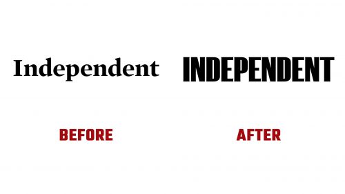
The old logo had a traditional serif typeface that resembled a newspaper brand. The new logo embraces a bold typographic approach, reinforcing the art fair’s independence and strength. Using F37’s K9 typeface as a base, subtle flares were added to the characters, giving the wordmark a unique personality without excessive embellishment. This refined yet bold aesthetic conveys the art fair’s authoritative presence in the contemporary art world.
The new wordmark is strong and imposing, capturing the essence of a stand-alone fair. The design reflects the fair’s role as a leader in the art community, committed to showcasing cutting-edge art. Custom modifications to the K9 typeface add a distinctive touch, setting Independent apart from other art fairs with a minimalist approach.
The graphic device extracted from the “I” in the logo is a notable element of the new identity. The exaggerated flared serifs of the “I” create an unconventional holding shape that interacts with typography and artwork. This motif adds visual interest and tension to the layouts, making them dynamic. These shapes are versatile, showcasing the creativity of the new identity system.
The color palette is predominantly black and white, aligning with the minimalist and sophisticated aesthetic typical of museum-gallery-art-fair identities. The unique “I” shapes introduce a fresh element, distinguishing Independent from other institutions. Combining classic and contemporary elements ensures the visual identity is timeless and modern.
As a complementary typeface, the new identity includes a deadpan sans serif, Klim’s Söhne. While somewhat conventional, it provides a clean and neutral backdrop that allows the bold logotype and graphic motifs to stand out. The interplay between the custom logotype and the secondary typeface creates a balanced and cohesive visual language that adapts to various contexts and applications.
The team’s work with Independent involved developing a framework and brand architecture that reflects the organization’s evolution. The refined messaging and brand architecture clarify the Independent’s transformation and position the organization for future growth as it expands its ambitions and offerings.
The new identity’s key feature is the expressive brand motif based on the logotype’s “I” glyph. Depending on the context, this motif is adaptable, ranging from restrained to expressive. It provides a flexible visual system that works seamlessly across Independent’s offerings, from promotional materials to digital platforms. The digital-first color palette enhances this flexibility, ensuring the brand remains dynamic and engaging in various media.
The new visual identity preserves historical context while modernizing it, giving classic details a contemporary twist. This approach ensures that the Independent’s identity is rooted in tradition and forward-looking, reflecting the fair’s role as a bridge between contemporary art’s past and future. The enamel lettering inspired by NYC infrastructure adds a touch of local flavor and authenticity, grounding the brand in its urban context.


