Inter&Co, a leading digital bank in Latin America, has introduced a refreshed logo as part of its rebranding to reflect its global expansion and growing market presence. The new look marks a significant phase for the bank, emphasizing its mission to offer innovative financial services while staying connected to its roots.
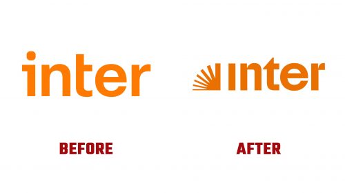
The previous logo had a minimalist design, with a simple orange color palette focused on the brand name “Inter.” The rounded typography emphasized ease of use and accessibility, reflecting the company’s commitment to openness and simplicity in its early branding.
The updated visual identity introduces more dynamic elements while keeping the core parts of the original design. One of the most noticeable additions is a stylized image of rays from the left of the word “Inter.” These rays suggest new opportunities and forward movement, tying in with the bank’s vision of helping clients explore the future of digital financial services. The rays give the emblem energy and motion, which aligns with the bank’s focus on staying ahead in the competitive financial world.
The typography remains modern and easy to read, continuing the bank’s approachable identity. The rays add impact and make the logo more memorable. By sticking with the orange color palette, the new design maintains continuity with the past while signaling optimism and enthusiasm—qualities the bank brings to its customers.
The ampersand in the logo highlights partnership and unity, reflecting the brand’s values as it expands globally. This element shows the bank’s commitment to offering a wide range of financial products and services through its platform, emphasizing customer collaboration.
The custom-designed typeface Citrina is influenced by classic geometric fonts like Futura, blending modernity with timelessness. Its spacious letterforms ensure legibility and impact, especially in smaller sizes, making the design versatile across different platforms.
The new identity represents the bank’s ambition to lead in Latin American and global markets. The clean lines, modern typography, and meaningful rays create an approachable and innovative brand identity. This rebranding highlights Inter&Co’s focus on delivering a seamless digital banking experience and its growth goals.


