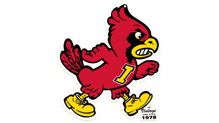
 Iowa State University Logo PNG
The Iowa State University logo is full of love for knowledge. The emblem shows energy, constant hard work, and dedication to one’s work. This characterizes the university from the best side and attracts new students.
Iowa State University: Brand overview
| Founded: | March 22, 1858 |
| Headquarters: | Ames, Iowa, United States |
| Website: | iastate.edu |
Meaning and History
Before it became a full-fledged university, the institution was called the Iowa Agricultural College and Model Farm. That was the name given to it when it was founded in 1856 when the Iowa General Assembly signed an ordinance to that effect. But the official opening did not take place until 1858. The buildings were under construction on farmland covering 648 acres until that time. Now the university is a developed infrastructure with many buildings, among which there are even architectural and historical masterpieces.
Unlike the seal, the university emblem has no graphic elements, so it is textual and consists only of the name of the institution of higher education. The inscription occupies two lines: “Iowa State” at the top and “University” at the bottom. The words are in uppercase serif type. All the characters are separate except for the “V.” It is connected to the adjacent characters, “I” and “E.”
Seal
The academic seal has a circular shape and several concentric rings of different widths. This makes it look like a vinyl record with soundtracks and a label. In the middle of the university sign is a laurel wreath, joined at the bottom. It has six paired leaves on each side and one on the top. It surrounds a motto written in English, “Science with Practice.” This is followed by five thin white stripes, followed by the abbreviated name of the university and the phrase “Of Science and Technology. To the right and left, they are separated by five-pointed stars. The inscriptions are serif on the inside and chopped on the outside.
Iowa State Cyclones Logo
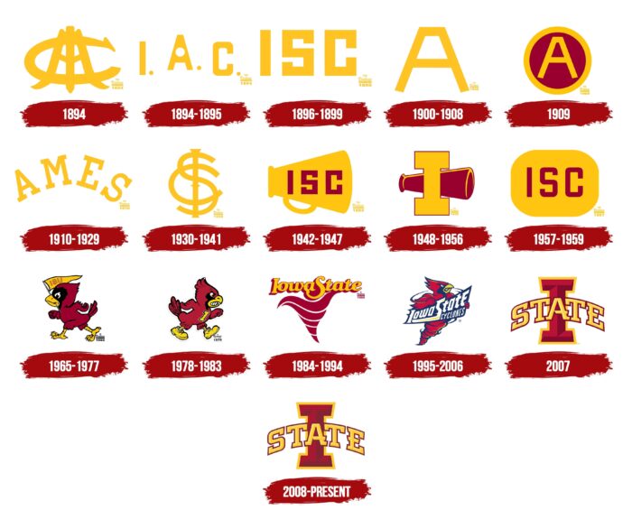
The Iowa State University athletic department got its unusual name in 1895 when it defeated its rivals 36-0 in an away contest. The next day, the Chicago Tribune compared the Iowa athletes to the cyclones that were raging in the state at the time. Sixteen teams in 12 sports compete under the university’s personal sign. They are part of the Big 12 Conference and NCAA Division I (soccer). The club has accumulated 16 logos in its long history.
1894
The debut logo features a monogram consisting of the first letters of the words “Iowa,” “College,” and “Model.” The “A,” which stands for “Agricultural,” is also evident in their intertwining. The characters are made large, closely intertwined with each other.
1894 – 1895
The logo was immediately given a different shape, as the first version was completely unreadable. To make the inscription understandable, the designers separated the letters by arranging them one by one. They chose the abbreviations “I,” “A,” and “C,” derived from the phrase “Iowa Agricultural College.” The signs are simple, geometric, chopped, complete with dots on the right side.
1896 – 1899
A text emblem with three uppercase characters belongs to this period: “I,” “S,” AND “C.” This is an abbreviation for the new name of the school – “Iowa State College.” The designers removed the slight rounding at the corners present in the last version.
1900 – 1908
After the redesign, the athletes performed under a large “A.” It is single, with no frames, embellishments, or additions. It is characterized by a flat, not pointed top and a diagonal cut of the feet, making the letter appear to be standing on the inner edges.
1909
The Athletic Department adopted a new sign, the classic “A,” on a burgundy background with a gold border. This version looks like a seal.
1910 – 1929
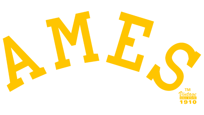
The university administration decided to move away from the traditional “name-higher education institution” tie-in. It approved a new sign consisting of the word “Ames.” The city’s name where Iowa State University is located is placed in an arch and typed in capital serif type. The shape of the letters is strict, geometric.
1930 – 1941
The logo looks like a complex monogram. It consists of an abbreviation of the name Iowa State College. The symbols are so intertwined that it becomes unclear which letter goes first. So the designers made them different in height: the tallest one is an “I,” the middle one is an “S,” and the smallest one is a “C.”
1942 – 1947
The letters in the logo were repainted from gold to burgundy and placed on the background of the horn. The style of the lettering is the same as in 1896.
1948 – 1956
The style of the logo was changed again; the horn was lengthened and repainted, the letters were almost eliminated, leaving only the uppercase ‘I.’ It was very large, in the form of a column, with rectangular serifs.
1957 – 1959
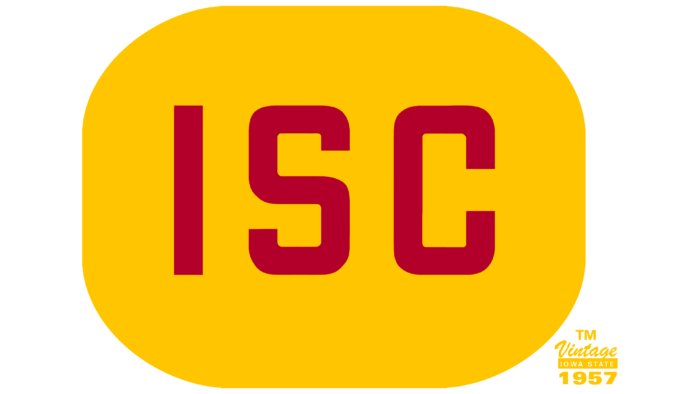
The horn and letter were replaced by the familiar abbreviation “ISC.” The dark maroon capital lettering is placed on a flattened oval on the sides.
1965 – 1977
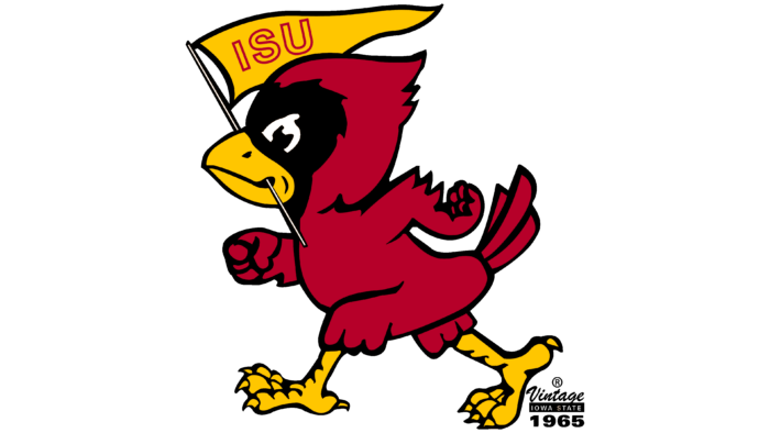
After a long break, the emblem received a major change. It now features the Cardinal, the teams’ mascot. It is colored with the same name (Cardinal). The anthropomorphic bird holds a flag with the outlined text “ISC” in its beak. It is determined and moves to the left.
1978 – 1983
The artists ennobled and “pissed off” the mascot a bit. The Cardinal has clenched teeth, raised head feathers, and a ruffled tail. Yellow boots appeared on his paws and a large “I” on his chest with a black outline.
1984 – 1994
The designers suggested accentuating the name of the athletic department and drew a swirl that symbolized a tornado, perfectly echoing the word “Cyclones.” The sign consists of five pieces of varying length and the phrase “Iowa State” written in a rounded font.
1995 – 2006
The emblem features a symbiosis of a tornado and a cardinal. The bird has a clenched right fist and, with its left “hand,” holds the name of the University Athletic Club. It is painted white and placed diagonally.
2007
Another redesign brought a completely different logo: it features an arched “State” in the background of a large “I.” The letters are capitalized, three-dimensional, as is the background symbol. Each element is framed in a contrasting color.
2008 – today
The developers have lightened the shades of red without changing anything else.
Iowa State University: Interesting Facts
Iowa State University (ISU) in Ames, Iowa, has a rich past and many unique features.
- Land-Grant Trailblazer: Opened in 1869, ISU was the first university established under the Morrill Act, which aimed to promote education in agriculture, mechanics, and military tactics.
- Birthplace of the Digital Age: Professor John Vincent Atanasoff and Clifford Berry created the Atanasoff-Berry Computer, a key step towards the modern computer, between 1937 and 1942.
- Agricultural Excellence: True to its land-grant roots, ISU excels in agriculture, managing research farms statewide that advance farming science and innovation.
- Veishea Tradition: Until 2014, ISU hosted Veishea, one of the biggest student-run festivals named after its original colleges. It was stopped for safety reasons.
- Cyclone Spirit: Though nicknamed the Cyclones, ISU’s mascot is Cy the Cardinal, a name inspired by a whirlwind football performance in 1895.
- Scientific Breakthroughs: ISU researchers have made notable advances in computer science and plant genetics, influencing fields worldwide.
- Sustainable Campus: ISU is recognized for sustainability efforts, from energy conservation to promoting alternative transport, not to mention its scenic campus and public art.
- Notable Alumni: Graduates include George Washington Carver, an influential scientist, and Carrie Chapman Catt, a key figure in the women’s suffrage movement.
- Reiman Gardens: This 17-acre campus garden boasts a butterfly house, thousands of tulips, and themed gardens.
- Space Exploration: ISU has ties to space exploration, with alumni becoming NASA astronauts and faculty contributing to space research, including Mars Rover projects.
Iowa State University’s mix of historical depth, academic strength, and dedication to research and innovation marks it as a distinguished institution in U.S. higher education.
Font and Colors
The Iowa State University identity is united by a common color palette, predominant burgundy. Otherwise, the signs are completely different in style, shape, and components.
The logos use two types of typefaces: ITC Berkeley Old Style (grotesque) and Univers (serif design). According to university regulations, they go well together. The official colors of the emblems are Cardinal red and Gold yellow. The university uses them in all of its visual identity signs.
Iowa State University color codes
| Red | Hex color: | #c8102e |
|---|---|---|
| RGB: | 200 16 46 | |
| CMYK: | 0 92 77 22 | |
| Pantone: | PMS 185 C |
| Maximum Yellow Red | Hex color: | #f1be48 |
|---|---|---|
| RGB: | 240 191 72 | |
| CMYK: | 0 21 70 5 | |
| Pantone: | PMS 136 C |
