


![]() Iowa Wild Logo PNG
Iowa Wild Logo PNG
The Iowa Wild logo highlights the hockey club’s competitive spirit and athletic identity. Its style reflects the team’s character, stability, and professional growth within the league.
The Iowa Wild’s history started in 1994 as the Houston Aeros in the IHL, later moving to the American Hockey League. In 2000, the Aeros became affiliated with the Minnesota Wild of the NHL and won the Calder Cup in 2003.
In 2013, the franchise relocated to Des Moines as the Iowa Wild. Their debut at Wells Fargo Arena attracted over 10,000 fans. After five difficult seasons without a playoff berth, the team reached the division finals in 2019, losing to the Chicago Wolves.
Recently, the Iowa Wild has consistently developed players for the Minnesota Wild, including forward Marco Rossi and Swedish goaltender Jesper Wallstedt, who became the youngest goalie in AHL history to score a goal.
Off the ice, the team actively supports local community initiatives and youth hockey. Since 2013, the Iowa Wild has become a key part of Des Moines’ sports culture.
Meaning and History
![]()
What is Iowa Wild?
It is a professional hockey team from Iowa competing in the American Hockey League. The team originated after relocating from Texas, previously known as the Houston Aeros. The club won its debut game in front of a record local hockey crowd. The roster features a combination of young talents and experienced NHL players. The team reached the AHL playoffs for the first time in its sixth season.
1994 – 2002
![]()
The creation of the Houston Aeros team in 1994 to participate in the International Hockey League (IHL) was accompanied by the development of a new identity, independent of the club of the same name from the 1970s in the WHA. The logo was unique and intended for the IHL franchise based in Houston until the transition to the American Hockey League (AHL) in 2001.
The emblem’s main symbol was a Douglas B-23 Dragon aircraft flying toward the viewer, with a stylized front fuselage section enhanced with aggressive details, including drawn eyes and sharp teeth, similar to shark designs on World War II fighter planes. This added aggressiveness and dynamism to the composition, matching the energy of a sports team. The aircraft is depicted bursting from a dark ring, a metaphor for speed, strength, and moving forward.
The typographic part of the emblem features the club’s name, “AEROS,” set in large, slanted, non-standardized capital letters. The letter “O” is shaped like a blue circle with a white five-pointed star inside, symbolizing Texas’s state symbols. Above the main inscription is the smaller word “HOUSTON,” whose geometry follows the main font, preserving the unity of the composition.
The color palette featured dark green and dark blue as the dominant shades, complemented by gray and red accents, and highlighted with white outlines. Green and blue are associated with Texan identity and symbolize the team’s seriousness and professionalism. At the same time, red accents emphasize the sports spirit and fighting character.
The logo’s design conveyed a dynamic, aggressive, and intense hockey tempo, helping the Aeros establish a recognizable image in the United States’ sports landscape.
2002 – 2004
![]()
After the Houston Aeros relocated from the International Hockey League to the American Hockey League, a new logo was created to meet the league’s requirements and visual standards. The previous image of the Douglas B-23 Dragon military aircraft was replaced with a modern jet fighter shown in profile, which aligned with the club’s name and emphasized the team’s renewed sports image.
The aircraft is rendered in bright sky blue with dark blue accents, including four stars on the wings and fuselage. The stars symbolized the team’s pride in its Texan roots. The aircraft’s color was intended to emphasize dynamism and lightness, enhancing the perception of the club as a young, ambitious AHL participant.
The logo’s typography is divided into two parts, each set in a different font to enhance visual contrast. The word “AEROS” is set in bold, voluminous geometric capital letters in white, outlined in dark, emphasizing the brand’s solidity and strength. The word “HOUSTON,” placed above, is set in a light, narrow sans-serif font with wide spacing, creating a sense of airiness.
The overall design style was oriented toward the sports identity of the early 2000s, when professional sports used modernist motifs, clean lines, and clarity of form. This helped the club define itself more clearly in the new league and attract a younger audience.
2004 – 2006
![]()
After the Houston Aeros joined the American Hockey League, their emblem underwent a modernization, with the main focus on a radical update to the color palette rather than on changes to the elements. The image format remained the same: a frontal projection of a jet aircraft, with the inscriptions “HOUSTON” above and “AEROS” below; however, the logo visually took on a different emotional tone.
The change of palette became the key distinction of the logo. Bright blue and sky-blue shades gave way to dark emerald and rich burgundy. The aircraft, previously associated with lightness and air, is depicted in burgundy, with green lines contrasting along the outline and in construction details. The upper part is highlighted with a white outline window. The use of dark, saturated colors emphasizes the team’s seriousness and determination, reflecting its sporting ambitions.
The typographic part of the emblem was preserved in form and style: the inscription “AEROS” continues to use a strong geometric sans-serif in capital letters, outlined in green and filled with white to enhance visual contrast. “HOUSTON” is written in a light font of the same type, with thin lines and increased spacing between letters, balancing the composition and emphasizing the geographic affiliation of the club.
Symbolically, the visual composition, with its shift in color palette, took on a deeper, more confident tone, aligning with the club’s identity, its renewed sports aesthetics, and its perception within the American Hockey League. The new palette made the logo feel more solid and balanced, reflecting the team’s image as a disciplined, powerful collective.
2006 – 2013
![]()
After an unsuccessful experiment with a modern reinterpretation of the club’s visual identity, featuring a jet aircraft in a red-and-green palette, the team decided to respond to fans’ wishes by returning to familiar symbolism associated with its winning seasons. The bomber reappeared on the emblem, but the partner club, the Minnesota Wild, reworked the presentation.
The aircraft retained the original military-aviation stylization known from the first version: the same aggressive character, resembling a shark’s mouth with teeth and eyes. But the palette changed, now dominated by deep shades of green, complemented by burgundy elements and contrasting white. These conveyed a distinct emotional undertone: solidity, authority, and a connection to traditions.
At the top of the emblem is a compact “HOUSTON” inscription, rendered in a thin sans-serif font with increased letter spacing, which emphasizes the overall balance of the composition. Below is the massive “AEROS” inscription, rendered in a large, geometric sans-serif in a saturated white-and-green palette. The stylized letter “O” with a white star inside remained unchanged, serving as a reference to Texas’s state symbols.
The reason for reverting to the old symbol was the negative reaction from fans, who perceived the previous emblem as an unjustified departure from the club’s traditions and an excessive emphasis on modern styling. The return of the bomber, but in new, calmer, and deeper colors, was an attempt to restore a connection to the club’s championship past and to express respect for its history, origins, and the importance of traditions to fans.
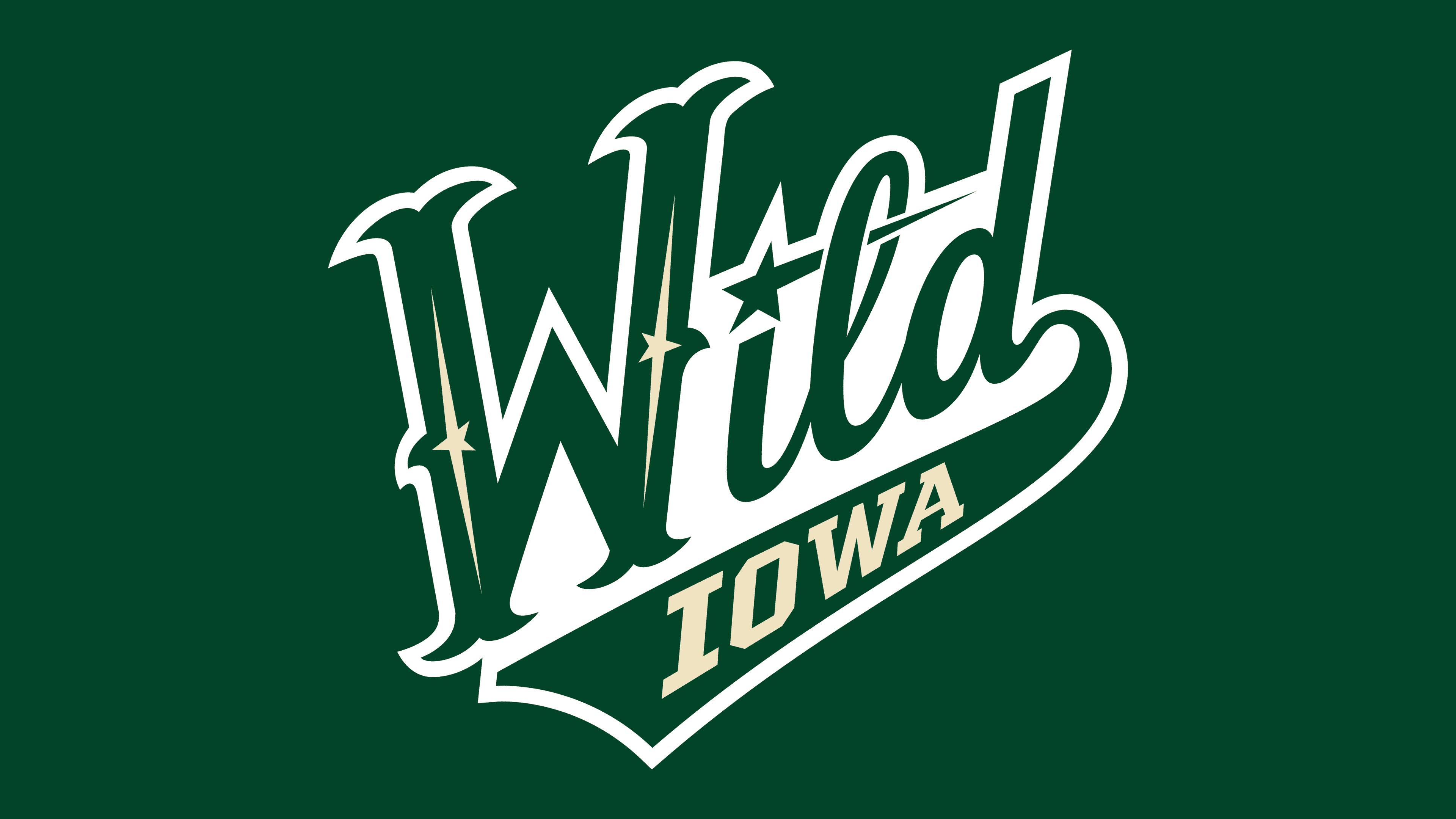
2013 – today
![]()
The relocation of the hockey club from Houston to Des Moines was accompanied by a name change to the Iowa Wild and a new identity, expressed through a logo unveiled in the spring of 2013. The design was developed by a team of designers in Iowa, with graphic specialist Travis Green playing an important role in the process. He also worked on the design of the game uniforms and the arena’s visual materials.
The basis of the new symbol was a customized script-style font inspired by the design of the Minnesota Wild’s third jersey and certain details of the Houston Aeros’ visual tradition. The lettering has a handwritten character. The letter “D” ends with an elongated line that smoothly transforms into a ribbon to accommodate the inscription “Iowa.” This conveys continuity and connection between the partner clubs, emphasizing the unity of the Iowa Wild and Minnesota Wild brands.
The new emblem’s color scheme combines a rich shade of Forest Green for the main “Wild” inscription and a soft beige tone (reminiscent of Minnesota Wheat) for the word “Iowa.” The club’s corporate palette also includes the shades Iron Range Red and Harvest Gold. Still, they are not used in the logo composition; instead, they serve as additional corporate colors for the club’s identity.
Abandoning complex figurative elements and symbolism of previous years, the new logo is minimal and emotionally expressive. It evokes associations with motion and team energy, reminiscent of a signature or handwriting, giving it individuality and recognizability.
Font and Colors
The logo uses a dark green tone from the Forest Green palette, which sets the overall character of the composition. Inside the main strokes of the letters are elongated beige elements in the Minnesota Wheat tone, adding a decorative accent and creating the effect of refracted light. The word “Iowa” is set in the same beige tone on a solid green background, which enhances contrast and visually links it to the upper part of the composition.
The font for the word “Wild” features elongated strokes, smooth curves, and sharp serifs at the tops of the glyphs, evoking a handwritten calligraphic style adapted to a sports aesthetic. The inner lines and diagonals are designed to guide the gaze to the right side of the composition, creating a sense of motion. The word “Iowa” is set in a solid sans-serif font with straight strokes and clear geometry, which contrasts with the fluidity of the upper word and reinforces the perception of the lower block as a stable and supportive element.