The use of an animal as a heraldic symbol characterizes the logo of the American hockey club Nashville Predators. The depiction of the silhouette of a saber-toothed tiger’s face symbolizes the team’s tactics and purposeful aspirations.
Nashville Predators: Brand overview
| Founded: | 1998 |
| Founder: | Predators Holdings LLC |
| Headquarters: | Nashville, Tennessee |
| Website: | nhl.com |
Meaning and History
The unique logo of the Nashville hockey players appeared even before the team was formed. Initially, the choice was between country music symbolism, closely associated with the region, and a fang found in the city. In 1971, during construction works, builders unearthed a prehistoric cave.
As a result of laying the foundation for one of the buildings, they dug up a bone and a fang in the ground. After examination, it was found that both fragments belonged to a saber-toothed tiger: a paw and a nine-inch-long tooth belonged to an animal that lived in these parts about 80,000 years ago.
The athletes decided to take the image of the predatory animal as the basis for the emblem:
- It is the main attraction of Nashville and has a precise connection to where the club was created.
- It is distinguished by a fierce nature, wild character, swiftness, physical endurance, and readiness to attack.
- It looks impressive, so it looks good on hockey paraphernalia.
The most curious thing in the history of the Nashville Predators emblem is that it arose not after but before the team was created. Having received the franchise in 1997, the management immediately presented a logo quite unusual for hockey symbolism. Against the backdrop of ice themes, a six-color tiger with a sharp fang stood out. However, at the insistence of the owners, it remained on the logo.
As for the textual part (the name of the club), it was decided to offer it to the residents to choose from. In a short time, the club received almost 75 variants, from which three were voted for: Attack, Fury, Ice Tigers. One was liked by fans, another by hockey players, and the third by the owners. In the end, Craig Leipold came up with a fourth option, which did not cause any objections. Thus, the inscription “Predators” appeared on the paraphernalia.
Throughout the franchise’s existence, it has had only two logos: the debut and the modified one. The first version was created by the local design studio JDK Design. It came up with the image, appearance, and palette.
What is Nashville Predators?
The Nashville Predators is an NHL hockey team. It was founded in 1998 and has been playing in the Western Conference ever since. The team’s name was chosen in honor of the saber-toothed tigers that once inhabited the territory of modern-day Tennessee. The team plays its home games at the Bridgestone Arena, one of the loudest ice arenas in the NHL, and has repeatedly made the playoffs. In 2017, they reached the Stanley Cup final, and in 2018, they scored the most points in the NHL regular season.
1998 – 2011
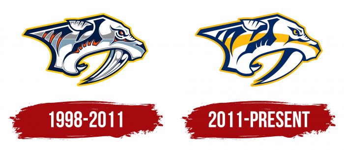
The first emblem was complex for visual perception due to the large number of colors. It depicted the head of an ancient saber-toothed tiger in profile with an open mouth, from which protruded powerful, sharp, and long fangs. The animal’s ears are pressed, eyes narrowed, withers straightened, and directed forward. The image of the animal consists of claw-like strokes and strict lines. The head has a double outline – blue and yellow.
2011 – today
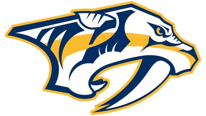
After the redesign, the logo’s color palette was simplified: instead of six colors, artists left only three. Moreover, they added more specificity to the pupil: the eye became clear, precise, and well-expressed. In addition, many small details were removed, which made it easier to perceive hockey symbolism.
Nashville Predators: Interesting Facts
The Nashville Predators are a professional ice hockey team from Nashville, Tennessee, and they’re known for being energetic, having fans who love them a lot, and having a cool team vibe. They started playing in the NHL in 1998.
- Starting Up: The Predators joined the NHL in 1998. Although some were unsure about having a hockey team in a city famous for music, the Predators quickly became a big part of Nashville’s sports world.
- Why “Predators”?: They got their name because workers found an old saber-toothed cat skeleton while building a bank in Nashville. This discovery inspired their logo and mascot, Gnash, a saber-toothed cat that fans and kids like.
- Where They Play: The team’s home games are at Bridgestone Arena in downtown Nashville. This venue is in the middle of the city’s music scene and hosts not just hockey games but concerts and other events.
- Their Best Years: From 2014 to 2020, the Predators did well with Peter Laviolette as their coach. They got to the finals of the Stanley Cup in 2017 but didn’t win, losing to the Pittsburgh Penguins.
- A Fun Tradition: Predators fans throw catfish onto the ice during games for good luck, similar to a tradition by Detroit Red Wings fans who throw octopus. It gets the crowd going and shows team spirit.
- Helping Out: The Nashville Predators Foundation helps people in Nashville by supporting kids and families through different programs. It shows the team cares about more than just hockey.
- Loyal Fans: The fans, called “Smashville,” are super enthusiastic and make games at Bridgestone Arena fun and loud. This has helped make their arena a tough place for visiting teams.
- Great Defense: The team is known for its excellent defense, with players like Shea Weber and Roman Josi leading the way. Josi even won the Norris Trophy in 2020 as the best defenseman in the league.
- Music Everywhere: Since Nashville is “Music City,” the Predators include music in their games. Bands play during breaks, and famous musicians sing the national anthem or are seen at games.
The Nashville Predators stand out in the NHL because of their play, unique team traditions, and connection with their community and fans. They’ve helped make hockey popular in the southern United States.
Font and Colors
The main focus of the logo is on the graphic part, as it is directly connected to Nashville’s history and reflects its heritage. During the construction of one of the city’s most grandiose architectural objects (UBS Tower), a working crew discovered the skeleton of an unknown animal. It turned out to be a saber-toothed tiger named Smilodon Floridius, which lived on Earth about 80,000-11,500 years ago, before the start of the Anthropocene era. Since the club’s name perfectly resonated with the predator theme, it was decided to choose this image – aggressive, frightening, and memorable.
The Interdiction font, designed by Daniel Zadorozny, was used in the early versions of the textual sign. However, since the inscription was illegible, in 2011, the team changed the font. The balanced ratio of curves and decorative elements now looks harmonious in combination with the appearance of the main emblem. All letters are uppercase, chopped.
The debut logo consisted of six colors: red, white, yellow, blue, silver, and dark gray. In the current version, only three colors are present, which remained after the 2011 redesign. These are mustard (#ffb915), white (#ffffff), and dark blue (#011840).
Nashville Predators color codes
| Gold | Hex color: | #ffb81c |
|---|---|---|
| RGB: | 255 184 28 | |
| CMYK: | 0 31 98 0 | |
| Pantone: | PMS 1235 C |
| Navy | Hex color: | #041e42 |
|---|---|---|
| RGB: | 4 30 66 | |
| CMYK: | 100 90 13 68 | |
| Pantone: | PMS 282 C |


