


![]() New York Islanders Logo PNG
New York Islanders Logo PNG
The “New York Islanders” logo is purely hockey-related, incorporating the sport’s fundamental elements: a stick, ice, and a puck. It embodies the athletes’ determination, focus, and high professionalism. The emblem’s style is abstract, with the team name taking center stage.
The New York Islanders were established in 1972 as part of the NHL’s expansion to Long Island, New York. The move was driven by competition with the World Hockey Association, which planned to place the New York Raiders in the Nassau Veterans Memorial Coliseum. Local authorities rejected the rival league and instead supported the NHL franchise.
Ownership ties linked the project to Roy Boe, also associated with the New Jersey Nets. The team debuted on October 7, 1972, losing 2–3 to the Atlanta Flames. The name reflected Long Island geography, while early concepts included “Long Island Ducks” before the final choice.
The original logo depicted the outline of Long Island, excluding the New York City boroughs and focusing on Nassau and Suffolk counties. Rivalry with the New York Rangers became central to fan culture, with chants referencing the Rangers’ long Stanley Cup drought.
During the 1980s, the Islanders secured multiple Stanley Cup titles, reinforcing their status in the league. However, the 1990s brought decline amid management changes and stronger divisional competition.
A major identity shift in the mid-1990s introduced the “Fisherman” logo, featuring a stylized figure in a raincoat with a hockey stick. The redesign drew criticism and comparisons to commercial branding, leading to the nickname “Fish Sticks.”
By 1997, the club restored its traditional emblem, returning to the circular mark with a hockey stick. Later uniforms referenced past championships through striping details. The team mascot, Sparky the Dragon, was introduced as part of modern fan engagement efforts.
Meaning and History
![]()
The logo’s history began when advertising manager John Alogna from East Meadow hired Jacob Morris Strongin, a graphic designer from Syosset, California. He asked him to create a unique logo for the “New York Islanders.” Their collaboration resulted in a version featuring the acronym “NY” and the inscription “Islanders” superimposed on the administrative map of Long Island, Nassau, and Suffolk.
What are New York Islanders?
The “New York Islanders” is a professional hockey team from Elmont. It is a member of the NHL, competing in the Eastern Conference and representing the Metropolitan Division. Founded in 1972, its home stadium is UBS Arena. The team has won the Stanley Cup four times and made the playoffs 19 times (1980-1984).
1973 – 1995
![]()
From 1973, the “New York Islanders” changed their logo four times. The primary color palette included blue, orange, and white. The first and last two logos did not differ much, but the 1996-1997 season logo was a complete contrast; it was the worst move by the Islanders’ management in the club’s history.
1995 – 1997
![]()
Before the new NHL season started, the owners attempted to give the Islanders a fresh look. The previous logo was replaced with a fisherman in a coat and hat, holding a blue stick, standing in front of red-blue gates. The fisherman was topped by the word “Islanders,” written in white font outlined in orange and blue. The inscription was washed by orange and two blue waves. This “New York Islanders” logo became the worst in the team’s history, turning the “Islanders” into a complete laughingstock in the NHL.
1997 – 2010
![]()
The old logo was restored in the 1998 season. The owners realized they had made a huge mistake and did not understand the fans’ passion. The Islanders were the first to realize that the Wild ’90s were a big mistake. They quickly “drowned” the fisherman and returned to the classic logo, changing the color scheme to a darker one. Thus, royal blue was replaced with dark blue. The logo was outlined in bright orange. The island drawing was also improved. The letters “NY,” the hockey stick, and the image of Long Island remained unchanged.
2010 – 2017
![]()
The Islanders’ penultimate logo was introduced in 2011. It combined the features of the first and previous logos and was again done in royal blue. The letter “Y” now had four stripes instead of three. What’s the point? Of course, the Islanders won the four Stanley Cups.
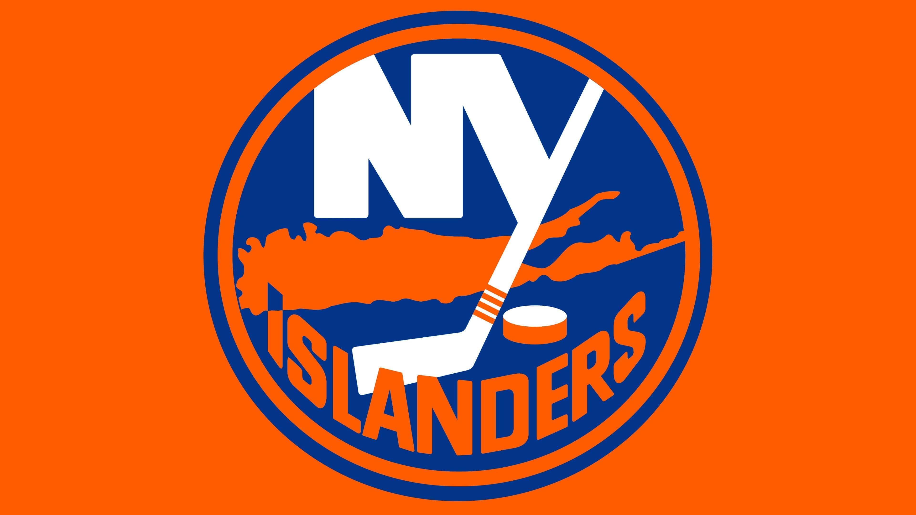
2017 – today
![]()
The modern variation is almost an exact copy of the previous logo. It retained the same structure and arrangement of elements: a map in capital letters with the name “New York” in the background. Additionally, the letter “Y” is replaced by a stylized sports stick with four orange stripes, representing the number of Stanley Cup victories won in 1980. To the left of it is a hockey puck.
Below is the word “Islanders”. The top part of the letter “I” points to Uniondale in Nassau County, where the team’s home stadium is. For this, the top quarter of the capital letter is painted in a contrasting blue color so the point is visible on the map. The only difference from the previous version is the color scheme, which has become more subdued.
Font and Colors
From its first year, the team adopted a round logo resembling a hockey puck viewed from above. It contains detailed information about the New York Islanders hockey club, located on Long Island, with its stadium in Uniondale. The club has won the Stanley Cup four times. This is graphically conveyed using the “NY” acronym, a hockey stick, a puck, four stripes, a card, and the second word from the franchise name. A thin orange ring surrounds these iconic elements.
The team also has another emblem that is drastically different from the others. Fans nicknamed it “The Fisherman” to depict a bearded fisherman in a cloak and hood holding a hockey stick. He is shown against a hockey goal background, with a two-tone wave in front. This version only lasted for two seasons before being discontinued.
The logo’s inscription is in a smooth sans serif font, a standard grotesque. The letters are elongated, narrowing at the edges of the word “Islanders” and widening in the middle.
The emblem’s palette is tri-color, consisting of the club’s official shades: royal blue, orange, and white. When transforming the logo, the shades varied from dark to light.
FAQ
What does the “New York Islanders” emblem mean?
The team’s emblem consists of a round background resembling a puck. On it are stylized letters N and Y, denoting the city where the franchise is based, and a hockey stick with four stripes at the bottom in honor of the four consecutive Stanley Cup victories. Below the acronym is Long Island, and even lower is the club’s name.
Did the “New York Islanders” change their logo?
No, the New York Islanders have not radically changed their logo in recent years. Therefore, it looks the same as it did at its inception. The only significant change occurred in 1995-1997 when a Long Island resident, a fisherman in a boat, was added. The latest changes occurred in 2017, adding another outlining ring to the emblem.
Who designed the “New York Islanders” emblem?
John Alogna, an advertising manager at the East Meadow Club, inspired the idea. He contacted designer Jacob Morris Strongin, who tasked him with developing the necessary logo. The result was the legendary sign featuring an island, a puck, and a stick, stylized as the letter “Y.”
Why are the “Islanders” blue and orange?
The Islanders franchise chose blue and orange because these colors symbolize the life and nature of Long Island. The first is the color of the sea (HEX # 00539B), and the second is the shade of the setting and rising sun (HEX # F47D30).