


![]() Chicago Wolves Logo PNG
Chicago Wolves Logo PNG
The Chicago Wolves hockey club logo reflects the team’s character and sports traditions. Its design emphasizes competitiveness, strength, and stability in professional hockey.
The Chicago Wolves began in 1994 when Don Levin and Grant Mulvey acquired an International Hockey League (IHL) franchise. Home games were held at the Allstate Arena in Rosemont, near Chicago.
In their debut season, the Wolves reached the Turner Cup playoffs. They captured their first Turner Cup in 1998 by defeating the Detroit Vipers, and won again in 2000.
After the IHL folded in 2001, the Wolves joined the American Hockey League (AHL) and were affiliated with the NHL’s Atlanta Thrashers. They immediately won the Calder Cup in their first AHL season.
Under coach John Anderson, the Wolves secured their second Calder Cup in the 2007-2008 season. Later affiliations included NHL teams such as the Vancouver Canucks, St. Louis Blues, and Vegas Golden Knights.
In 2020, a partnership with the Carolina Hurricanes was established, culminating in their third Calder Cup victory during the 2021-2022 season. The Wolves now have five total championships.
Meaning and History
![]()
What is Chicago Wolves?
It is a hockey club from a Chicago suburb that competes in the American Hockey League (AHL). The team has won AHL championships, claiming the Calder Cup, and previously played successfully in the International Hockey League (IHL). Known for frequently changing NHL affiliates, the club has partnered with teams including the Atlanta Thrashers, Vancouver Canucks, and Carolina Hurricanes. Home games are held at the Allstate Arena in suburban Rosemont.
1994 – 2001
![]()
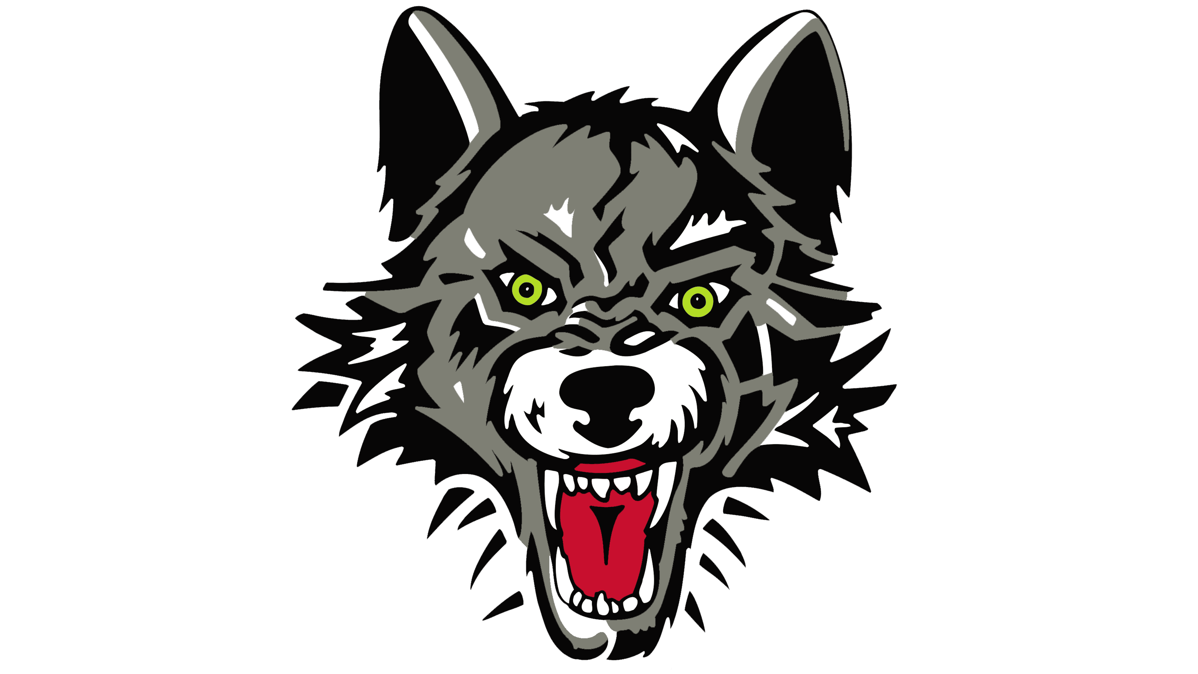
The Chicago Wolves logo combines expressive graphics with a symbolic representation of team spirit, featuring an animal and hockey elements.
The artwork and composition feature a stylized, front-facing illustration of a wolf’s head with an open mouth and bared teeth, accompanied by the outlines of a hockey puck and stick in the background. Artist Andy Baron created the image in close collaboration with Grant Mulvey, the conceptual originator behind the club’s identity. Detailed line work emphasizes the design’s aggressive nature: the wolf’s face is defined by sharp, jagged strokes that imitate fur, and the angular silhouette lines enhance the sense of motion.
The shades of gray and black in the animal’s coloring convey toughness and energy, visually complementing the sharpness of the forms. The wolf’s eyes, bright green with vivid pupils, were chosen specifically to convey wildness, controlled aggression, and the club’s competitive determination. The red tongue and white fangs add an intimidating element, visually reinforcing the team’s fighting spirit.
The hockey stick and puck behind the wolf are drawn in white lines with minimal detail, indicating the sport without detracting from the main image. Their outlined style supports the central graphic, emphasizing its emotional impact without overloading the composition.
The technical production and final vector rendering of the logo were handled by Silver Hammer, which adapted Baron’s initial sketches to meet the club’s digital and print standards.
Mulvey and Baron’s original graphic concept was executed professionally, making the Chicago Wolves logo a recognizable visual symbol of the team for years to come.
2001 – today
![]()
Since 2001, the Chicago Wolves logo has changed its color palette, while the composition and graphic details have remained the same. The updated version features a slightly muted palette, most noticeable when compared directly with the original. The wolf’s fur shifted from its original #969384 to a more subdued, cooler tone, #7e7f74. This reduced the contrast and gave the overall visual impression a calmer, softer feel.
The tongue’s red also changed, with the original bright scarlet (#e51536) replaced by a deeper red (#c8102e). This adjustment gave the image more solidity and visual depth. These subtle color refinements made the emblem feel more balanced and mature while preserving the design’s original emotional energy.
Font and Colors
The current Chicago Wolves logo features a limited yet impactful palette of shades of gray, black, red, and green. The dominant gray fur color (#7e7f74) is accented with black outlines and details, creating depth and a sense of motion. Black in the outlines and background elements (puck and stick) enhances contrast and gives the composition visual stability.
The red tongue provides a vivid emotional accent, symbolizing aggression, determination, and the hockey club’s fighting spirit. The wolf’s eyes are a bold, neon green, reinforcing the wildness and confidence established in the original concept.