


![]() Vegas Golden Knights Logo PNG
Vegas Golden Knights Logo PNG
The young Vegas Golden Knights club’s logo, not associated with a mascot, features non-traditional symbolism for hockey clubs. The emblem plays on the name, reflecting its knightly theme and symbolizing the seriousness and intimidation associated with the chosen concept.
Professional hockey in Vancouver dates back to 1911, when Lester and Frank Patrick founded the Pacific Coast Hockey Association and the Vancouver Millionaires. In 1915, the team won the Stanley Cup, the only top-level title in the city’s history. After the league collapsed in the 1920s, Vancouver spent two decades without pro hockey.
In 1945, a new team, the Vancouver Canucks, entered the Pacific Coast Hockey League, later renamed the Western Hockey League. The club won multiple titles, including back-to-back championships in 1969 and 1970. An NHL bid in 1967 failed, but the league later promised a future expansion spot.
In May 1970, Vancouver joined the NHL alongside the Buffalo Sabres, paying a $6 million fee. The team played its first game on October 9, 1970, against the Los Angeles Kings, losing 1:3, and secured its first win two days later over the Toronto Maple Leafs. Early seasons brought weak results.
In 1974, Frank Griffiths bought the team, leading to its first division title in 1975. Despite long struggles, the club reached the Stanley Cup Final in 1982 but lost to the New York Islanders. In the late 1980s and early 1990s, players like Trevor Linden and Pavel Bure shaped the roster.
In 1993–94, Vancouver returned to the Stanley Cup Final, losing in seven games to the New York Rangers. In 1999, Daniel and Henrik Sedin were drafted, becoming key figures in the 2000s. In 2010–11, the team won the Presidents’ Trophy and reached the final, where the Boston Bruins claimed the title.
Meaning and History
![]()
Unlike many other clubs, the “Vegas Golden Knights” does not draw parallels between the logo and the mascot. Its mascot is a Gila monster lizard, while the emblem predictably depicts a knight’s helmet. Developing the decal took a long time. The first unofficial version appeared in 2016, nearly half a year before the final version was approved.
And it had nothing in common with what we see now: designers did not consider a knightly theme, as the team did not yet have a relevant name. They placed the words “Vegas Hockey,” written in white font with cut corners, next to the National Hockey League logo, choosing a solid black background for contrast.
What is Vegas Golden Knights?
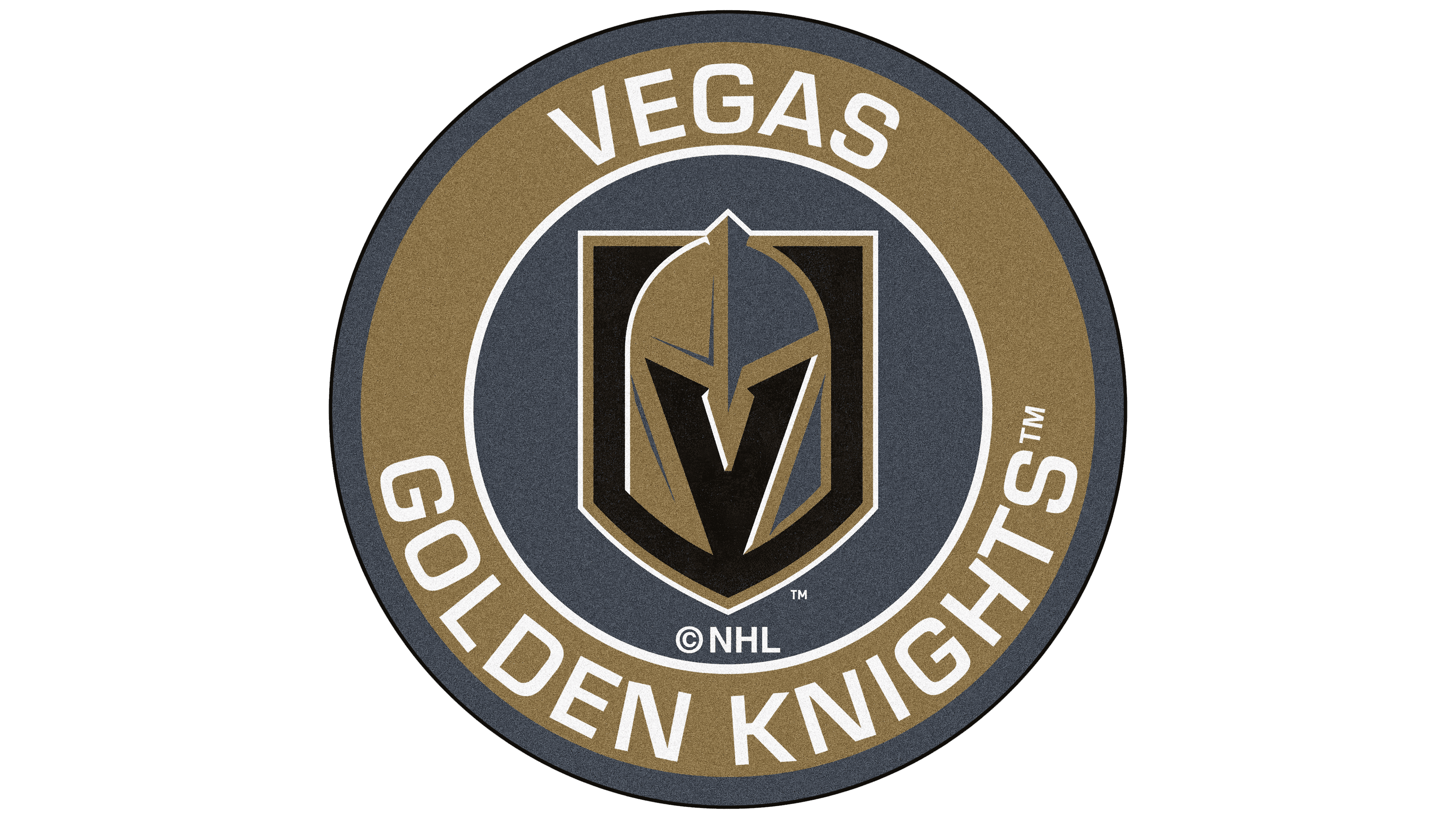
This newly formed hockey team joined the NHL in 2017 and has since been a member of the Pacific Division. It gained fame for reaching the Stanley Cup final in its first season and making three more Stanley Cup playoff appearances. The club represents the city of Paradise, Nevada, and holds its home matches at the multifunctional T-Mobile Arena.
The final emblem is vastly different from the unofficial original. Since the “Vegas Golden Knights” had already been named when the team was created, artists tried to play on that name. To do this, they drew the most important part of the knight’s armor: the helmet. It’s depicted within a rectangular coat of arms, with a sharp base that extends slightly beyond its limits.
The hockey club’s graphic sign reflects a knightly theme, as indicated by the main attributes of medieval warriors: a shield and a helmet. However, the first element is more often seen as heraldic, as many sports organizations use it in their logos. Therefore, the central element became the gladiator’s helmet. Designers believed it perfectly conveyed the chosen concept, looking serious and intimidating enough. Therefore, they did not add any inscriptions or other elements, opting for a concise design.
Font and Colors
At first glance, there’s nothing remarkable in the team’s emblem: a helmet on a shield seems like a banal embodiment of the phrase Vegas Golden Knights. But in reality, it’s much deeper and more symbolic. If you look closely, you can notice that the front part of the helmet forms the letter “V.” This is a nod to the club’s hometown, Las Vegas. “Las” is intentionally omitted to avoid cluttering the club’s name with a fourth word. Additionally, locals often use the shortened version, “Vegas”.
There are no actual inscriptions on the logo. The only letter on the shield has large beveled serifs. It’s entirely black and visible in the negative space. The helmet, in turn, is painted in two colors: gray and pale gold. At the same time, it seems three-dimensional and protruding forward, i.e., not drawn on the shield but positioned right in front of it. This effect is achieved through a successful combination of multicolored shapes and lines.
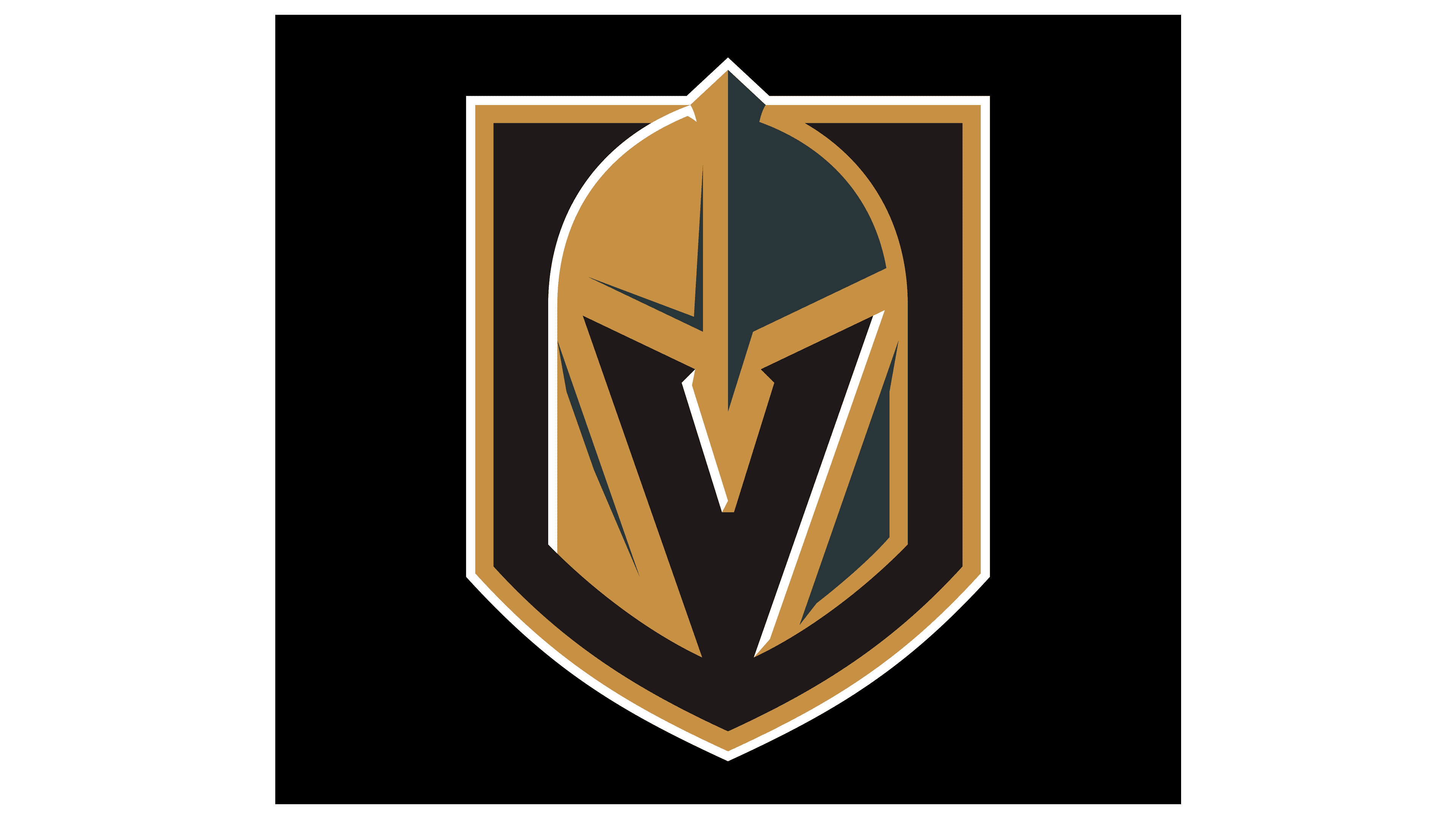
Each color present on the emblem has its hidden meaning. For example, the black shadow forms the letter “V” and adds depth to the image, creating a sense of invisible presence. The steel shade of gray reflects durability and strength. The gold color, in turn, is a direct reference to the team name, Vegas Golden Knights. It’s also inextricably linked to Nevada, where gold mining has long been conducted.
FAQ
Where did the “Vegas Golden Knights” come from?
In 2014, the National Hockey League granted a franchise to Las Vegas. The choice fell on the city of Paradise, which had a suitable multifunctional stadium. In 2016, the offer was approved. Thus, the “Vegas Golden Knights” team was born.
What does the “Golden Knight” logo represent?
The “Golden Knight” logo contains a large knight’s helmet, divided into two parts: gray and gold. In the background is a black coat of arms. Designers used negative space to depict the letter “V” from the word “Vegas” in the headgear.
Who owns the “Vegas Golden Knights”?
The Black Knight Sports & Entertainment consortium, owned by American businessman William P. “Bill” Foley II and the famous Maloof family, owns the hockey club.
How to draw the “Golden Knights” logo in Las Vegas?
To do this, you need to use a specialized graphics program and follow tutorials, which are plentiful online.