The Ottawa Senators logo is representative and noble, as it features an ancient centurion. It embodies indomitable strength, courage, and determination. The proud profile is at the very center of the emblem, serving as a beacon of victory for players in hockey tournaments.
Ottawa Senators: Brand overview
| Founded: | 1992 |
| Founder: | Estate of the late Eugene Melnyk |
| Headquarters: | Ottawa, Ontario, Canada |
| Website: | nhl.com |
The “Ottawa Senators” is a hockey team located in Ottawa, Ontario. The club plays in the Atlantic Division of the NHL’s Eastern Conference. Notably, the “Ottawa Senators” franchise has one of the most unusual and curious histories. The club has two founding dates: 1883 and 1992. Originally, the “Ottawa Senators” existed from 1883 to 1934. Hockey appeared in Ottawa in 1883 when the amateur club Ottawa HC was founded in Ontario. From 1883 to 1909, the team changed its name several times. For example, in 1890, the team was renamed “Ottawa Generals.” From 1903 to 1907, it was called the Silver Seven. The team received this name for quite prosaic reasons: Silver – the team owner paid players silver nuggets for each Stanley Cup won (in the era of amateur hockey, players were forbidden to receive money for playing), Seven – in honor of the number of players on the team and the rink.
In 1909, the team became fully professional and changed its name to the Senators. The first mention of the nickname “Senators” appeared in a game report in 1901. It was related to the fact that the team was based in the capital of Canada, where the country’s Senate was located.
From 1917 to 1934, the team won 11 Stanley Cups.
The “Ottawa Senators” wore red-white-black sweaters with horizontal stripes. This color scheme was maintained until 1934, when the team was forced to leave the NHL for a long time due to financial difficulties. Despite this, the four-time Stanley Cup winners rarely had an emblem: only in the post-championship seasons was a red-black shield sewn onto the sweater, indicating their championship status. Before disbanding, in the 1929-1930 season, the team introduced an “O” logo on the chest of the sweater.
In 1934, the “Senators” were going through hard times due to serious financial problems, so they had to move to St. Louis, Missouri, USA. The club changed its name to the St. Louis Eagles. Did this name have any connection to American patriotism? Unfortunately, no one knows. After the 1934-1935 season, the team disappeared, and the NHL disbanded the “St. Louis Eagles” players to other league teams.
In 1990, businessman Bruce Firestone, a native of Ottawa, approached the NHL with a proposal to create a new franchise with the old name and old black-red-white color scheme. It took Bruce Firestone two years to convince the NHL leadership to accept a new franchise from the capital of Canada. In October 1992, the “Senators” played their first game against the “Montreal Canadiens” as an NHL member. The “Ottawa Senators” emblem features a profile of a Roman legionnaire. The second patch on the shoulder contains the Latin letter “S” and the Roman numerals “MDCCCXCIV.”
Spartac, an anthropomorphic red-haired lion, is the official mascot of the “Ottawa Senators.”
Meaning and History
Throughout its modern history, the “Ottawa Senators” franchise has maintained the same key visual concept of the logo. It managed to become one of the few teams that simply modernized, slightly altered, or adjusted the main team logo. Strength and determination – that’s what the “Ottawa Senators” logo conveys. It was adopted in May 1993, shortly before the hockey players’ first season, which ended at the end of that year. It was designed by Tony Milchard. In addition, the logo contained the team name, placed on a military shield. It was later removed. In 2008, the “Senators” updated the old logo and have been using it ever since. According to club owner Eugene Melnyk, the new “Ottawa Senators” logo symbolizes “strength and determination.” As a young franchise, it has only three emblems in its career: debut, transitional, and ongoing.
What is Ottawa Senators?
It is a professional Canadian hockey team. It is based in Ottawa and plays home matches at the Canadian Tire Center. The club is part of the NHL, where it competes in the Atlantic Division and represents the Eastern Conference. It was founded in December 1990 but officially began competing only in 1992.
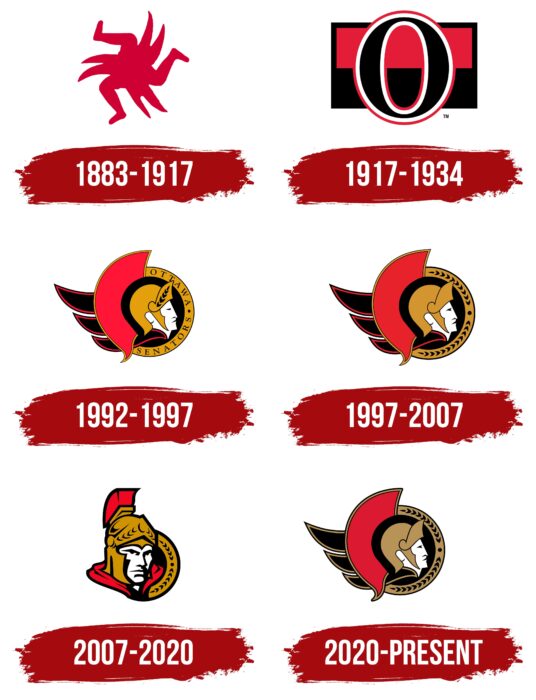
1883 – 1917
The team’s first graphic symbol looked like a Kolovrat, only not with eight but with nine rays. It looked very strange, as it consisted of three legs pointing in different directions and connected in the center. Double claw-like figures were depicted between each pair of limbs. These were three “claws” or six protruding pointed stripes. This Ottawa Senators logo was completely painted in a rich red color. It symbolized tremendous speed and sports enthusiasm. The legs, bent at the knees, resembled stylized hockey sticks.
1917 – 1934
After the redesign, the “Kolovrat” disappeared, giving way to a large black letter “O” with a white stroke and a red outline. It used a contrasting font with vertically elongated glyphs. The background was a flag divided into two color blocks: a red top and a black bottom. It was placed in a dark rectangular frame.
1992 – 1997
The first Ottawa Senators logo was presented in Ottawa in 1992. Its design was quite simple yet symbolic. It featured a Roman emperor or centurion. The logo’s color palette included red, black, and gold. The emperor was depicted in profile in a golden helmet with laurels. Two semicircles rounded the image. The red-black resembled a warrior’s helmet, and the gold semicircle contained the inscription “Ottawa Senators” in black letters.
1997 – 2007
For the next nine years, the “Ottawa Senators” hockey club had a logo more or less identical to the previous one. The team name on the gold semicircle was replaced with a black laurel. Other design elements remained unchanged.
2007 – 2020
The third and latest “Ottawa Senators” logo was introduced in 2008. After a series of changes proposed by the franchise owner, the visual identity sign became even more decisive and strict. The “Ottawa Senators” emblem underwent significant reworking and acquired a more modern look without losing its characteristic style. It still depicted a Roman emperor, a member of the Roman Empire’s senate, but not in profile, but head-on. His face is stoic and stern, with prominent cheekbones and strong features. The centurion’s frontal gaze also speaks of this, expressing courage, determination, and steadfastness – qualities necessary for achieving victory.
The Roman general’s head is adorned with a golden helmet with a raised visor. Metal plates also protect the sides of the face, and burgundy feathers protrude from the top. The collar of the cloak draped over the shoulders is the same color. The facial features are formed by intersecting thick black lines. To the right is part of a shield with a laurel wreath pattern.
2020 – today
In 2020, the “Ottawa Senators” returned to their classic logo with the centurion facing right. The designers returned the head position in profile and kept the same face shape as in the 1997-2007 version. In general, almost the entire composition is copied from the old version of the emblem: both the semicircle, supplemented with a laurel wreath and the figurative elements on the left. Only the color scheme has changed. The semicircle and the contours of the headdress acquired a dark gold hue, and the large red detail, reminiscent of the plume on the emperor’s helmet, became burgundy.
Ottawa Senators: Interesting Facts
The Ottawa Senators are a hockey team with a long and interesting story, having been around in two different forms.
- Two Versions: The team we see today started in 1992, but there was an original team back in 1883. That first team was one of the founders of the NHL in 1917 and won 11 Stanley Cups before moving away and stopping. The new Senators brought back Ottawa’s love for hockey.
- Back in the NHL: Ottawa got its NHL team back in 1990, and by 1992, the Senators were playing again after 58 years.
- First Big Win: Their first win in this new era was a big surprise: They beat the Montreal Canadiens, who had just won the Stanley Cup in 1992.
- Changing Arena Names: They’ve played in the same place since 1996, but its name has changed a few times, from The Palladium to the Canadian Tire Centre.
- Top Team One Season: In 2002-2003, they won the Presidents’ Trophy for having the best record during the regular season.
- Stanley Cup Final: The Penguins made it to the Stanley Cup Final in 2007 for the first time since returning, but they lost to the Anaheim Ducks.
- Alfredsson’s Impact: Daniel Alfredsson, who played for 17 seasons and was captain for a long time, is a big part of the team’s history, holding records for goals, assists, and points.
- The Hamburglar: In the 2014-2015 season, goalie Andrew Hammond, also known as “The Hamburglar,” had an amazing run, winning 20 of his first 23 starts and helping the team make the playoffs.
- Rivalry with Toronto: They have a big rivalry with the Toronto Maple Leafs, making for some exciting games, especially in the early 2000s.
- Helping the Community: The Ottawa Senators Foundation works hard to provide children and teenagers with health, education, and social programs.
These highlights tell the story of a team that has seen a lot of changes but always plays hard and helps out where they live.
Font and Colors
The character on the logo has always remained the same – the image of a Roman general or centurion. Only the position of his head changed. In the earliest versions (the first two), he is depicted in profile and looks to the left. In 2007, after the redesign, the developers turned his head, drawing him almost head-on. The artists also detailed their facial expressions, depicting them with dark strokes, which had not been observed before. Until that moment, the eyes, nose, and lips were shaped like triangles.
The centurion wears a large helmet with wings on the back. Previously, there was an inscription “OTTAWA SENATORS” in the form of a semicircle in front of it. Now, there is a fragment of a wreath of laurel branches and leaves. Moreover, all logo variants are simple and do not contain many elements.
The inscription is only present on the first logo. It is made in a classic font with serifs. The thin letters are spaced out so they stand far apart from each other.
The “Ottawa Senators” hockey team borrowed the official palette of the Ottawa Amateur Athletic Association, of which it was a part. After the dissolution and disappearance of the sports association, the club owners began to use it as a successor. The logo includes all four corporate colors: white, black, red Hex: #CF0820, and gold Hex: #C09205.
Ottawa Senators color codes
| Red | Hex color: | #bc2035 |
|---|---|---|
| RGB: | 188 32 53 | |
| CMYK: | 23 100 85 9 | |
| Pantone: | PMS 187 C |
| Black | Hex color: | #010101 |
|---|---|---|
| RGB: | 1 1 1 | |
| CMYK: | 0 0 0 100 | |
| Pantone: | PMS Process Black C |
| Gold | Hex color: | #aa9868 |
|---|---|---|
| RGB: | 170 152 104 | |
| CMYK: | 33 34 72 2 | |
| Pantone: | PMS 7503 C |
FAQ
What does the Ottawa Senators logo mean?
The logo represents strength and determination. To convey this, an image of a centurion—a Roman emperor in a golden helmet, a member of the Roman Empire’s senate—was used. He has strong facial features and a stern look. The background features a round shield.
Has the Ottawa Senators team changed its logo?
The Ottawa Senators team changed its logo twice: in 1997 and 2007. The first change was minor: a laurel branch styled as an ornament appeared on the round shield instead of the name. The second time, designers presented the warrior’s head not in profile but head-on, adding volume to the emblem.
Where are the Ottawa Senators located?
The team is based in Ottawa, the capital of Canada. It also represents the Eastern Conference in the NHL’s Atlantic Division.
When did the Ottawa Senators change its logo?
The Ottawa Senators logo underwent a significant change in 2007. At that time, the image of the centurion was placed head-on, adding three-dimensionality, sternness, and decisiveness to it.
