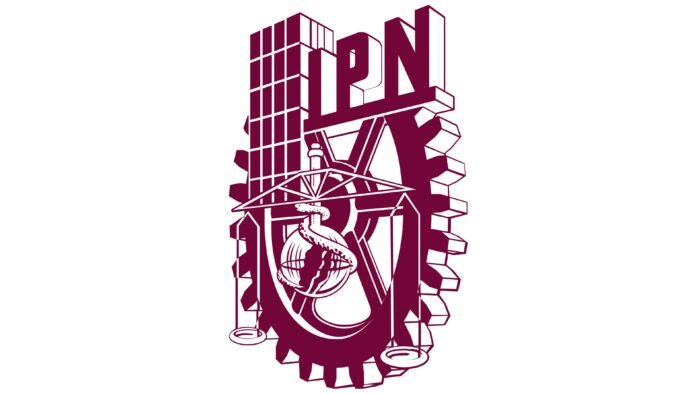
The Mexican university’s IPN logo contains several symbolic elements. The scales of Themis represent the Faculty of Law, the snake represents the Faculty of Medicine, the gear represents the Faculty of Engineering, and the multi-story building represents the Faculty of Architecture. At the same time, the purple color of the emblem represents wisdom and perfection.
IPN: Brand overview
| Founded: | 1 January 1936 |
| Headquarters: | Mexico City, Mexico |
| Website: | ipn.mx |
Meaning and History
IPN is known worldwide, first of all, thanks to the engineering and architectural faculties. With each academic year, the level of curricula improves, as evidenced by the stability of the university in authoritative international rankings. Both versions of the National Polytechnic University logo contain elements associated with these faculties. Special attention in terms of brand recognition is played by the institute’s motto, which translates as “Technology in the service of the Motherland.” Thus, the university management points out that thanks to their educational program, thousands of students from all over Mexico have the opportunity to acquire all the necessary skills in engineering specialties.
What is IPN?
This is an opportunity to get a quality education at an adequate price, which for undergraduate and graduate programs is 1000 US dollars. Traditionally, specialties related to engineering and computer science are considered the most authoritative at the university.
Old
The old version of the IPN logo consisted of many elements. In this case, the base color is burgundy. The monotony of the picture makes it outdated, not causing positive emotions. The emblem is based on a white gear with burgundy contours, which create a sense of the three-dimensional image. In principle, this detail of the mechanisms was not chosen by chance since many people associate it with technology and engineering. At the top are three white capital letters “IPN.” Burgundy shadows also convey three-dimensionality. In addition, thick lines in letters give the impression that there is little or no spacing between characters. The classical bold type was chosen for writing, except for the diagonal line in “N,” which is significantly shortened.
To the left of the name of the educational institution is a high-rise building, which most likely symbolizes the main building of IPN. At the bottom of the gear, scales with balanced sides are displayed. This is a reference to the fairness and transparency of the educational process. Around them is a snake.
New
The only redesign of the logo to date has made it more modern and confident, inspiring confidence among applicants. While the burgundy and white color palette remained identical to the previous version, the darker hues allowed the logo’s fresher look. In general, the chosen colors are associated with wisdom and perfection, indicating the high standards and traditions of the IPN.
The basis of the logo is also gear, but now it is turned to the viewer at an angle. The right side is somewhat closer than the left. A complex mechanism with a rectangular case appeared inside the gear. The snake has become less visible but has not been completely removed from the logo. It is connected directly with the Faculty of Medicine, while Libra is with the Faculty of Law. In the upper right corner of the gear on a rectangular platform is the university abbreviation “IPN.” It is also made in white letters with burgundy shadows. On the left is the body.
The experience of the presented university shows that even minimal changes in the logo can make it stronger and more impressive for the target audience.
Font and Colors
The verbal inscription is made in classic bold type. At the same time, the use of shadows made it possible to create a three-dimensional inscription that looks interesting and confident. Unlike most educational institutions in North America, the inscription occupies an insignificant place in the logo and does not play an important role.
In both versions of the logo, the basis was the “white and burgundy color scheme.” While the lack of bright hues doesn’t add to the friendliness of the image, it indicates the direction of the polytechnic in areas where IPN is strong.
IPN color codes
| Tyrian Purple | Hex color: | #720638 |
|---|---|---|
| RGB: | 114 6 56 | |
| CMYK: | 0 95 51 55 | |
| Pantone: | PMS 1955 C |


